Founded in 1961, Delta Cafés can consider itself to be a national pride. In a country where coffee embodies an essential moment in daily life, expectations of quality run high and there are strict criteria about how the perfect serve should be. Over time, “Let’s have a coffee!” has become synonymous with the ideal excuse to meet friends and spend time engaged in good conversation. The role of a coffee brand couldn’t be more relevant.
If the Portuguese have a Love Brand, Delta is arguably the top choice. Travelling the country from north to south, you will spot the triangular logo woven into the fabric of the nation. Proudly sat on a fancy terrace, displayed on a supermarket shelf, placed in a home kitchen, or laid next to a barista’s coffee machine, filling the air with its rich aromas. A love affair being constantly validated in research as the Portuguese brand with the best reputation, or the most valued and beloved.
Naturally, the seal of assured quality has grown its presence to expand beyond its origins. Now being sold in over 40 countries, with international markets representing more than 30% of sales, it is estimated that around the globe 10 million Delta cups of espresso are being served and enjoyed daily.
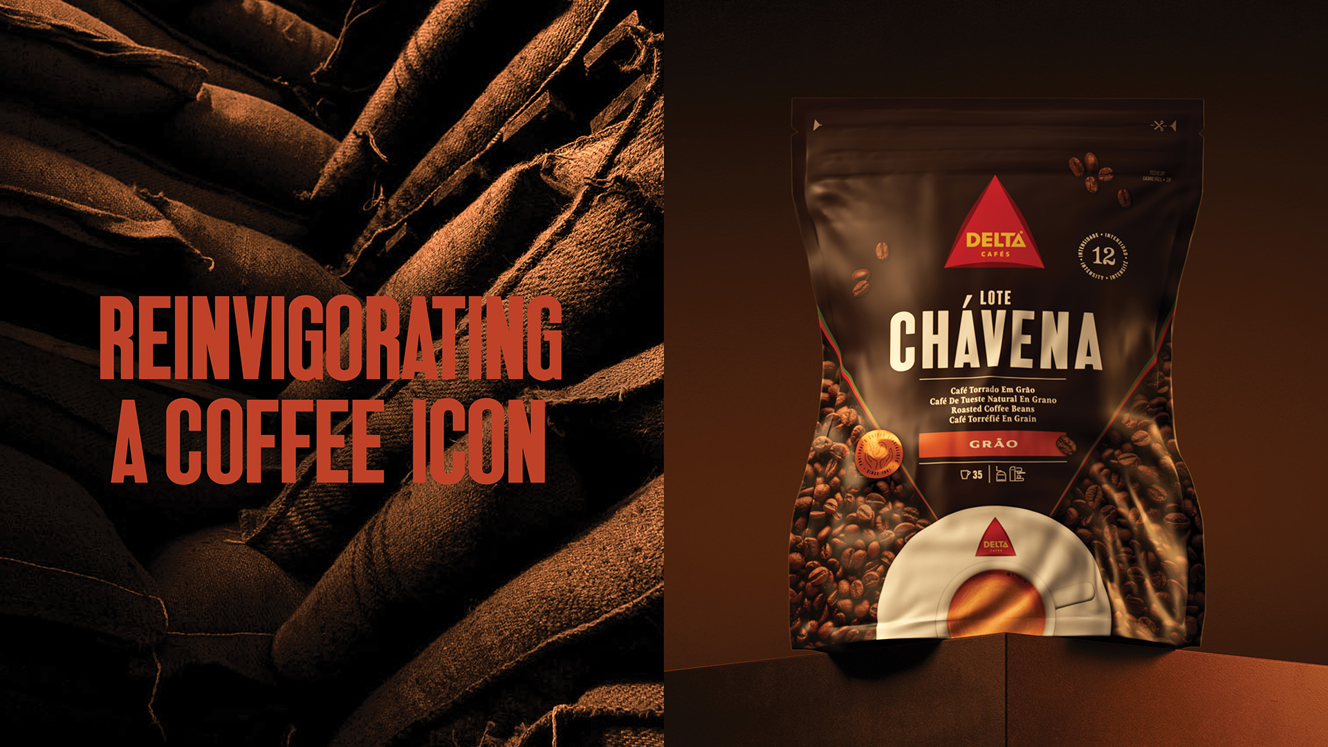
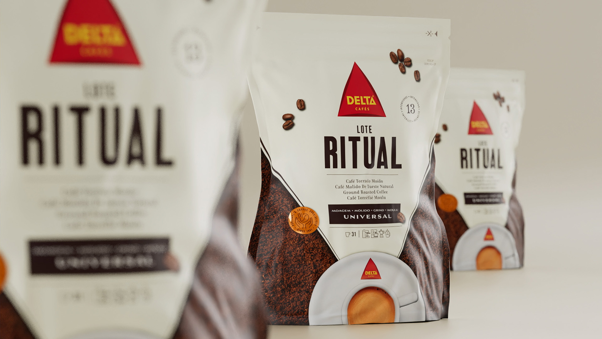
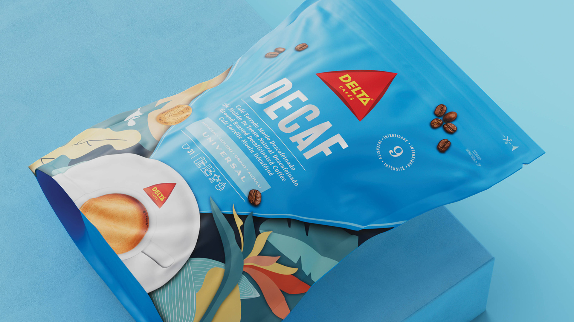
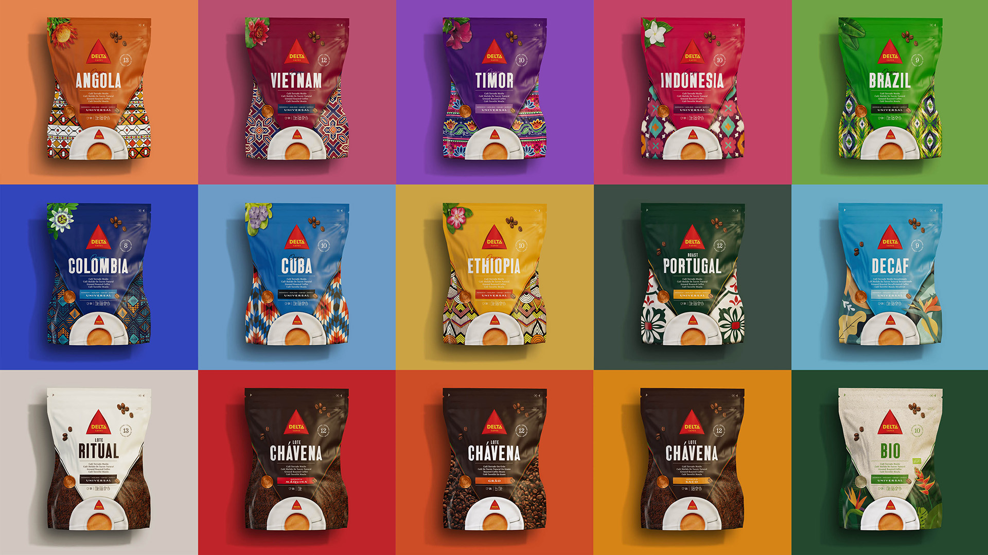
With a brave modern twist, Delta Café packaging has been invigorated with a fresh glow. The new design language honours the brand’s distinctive assets such as the iconic triangular brand shape and accompanying perfect espresso pour, delivering a contemporary bold look and boosting shelf impact. The new look elevates the brand perception to the deserved value, in a perfect balance between disruption and continuity, reflecting its quality and market leadership. Respecting the brand’s DNA and heritage, whilst better showcasing its innovative character.
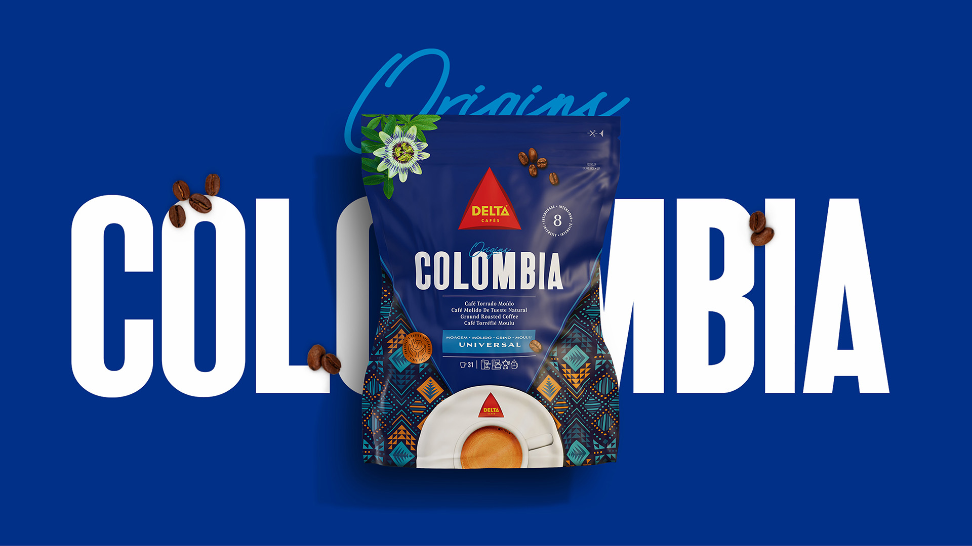
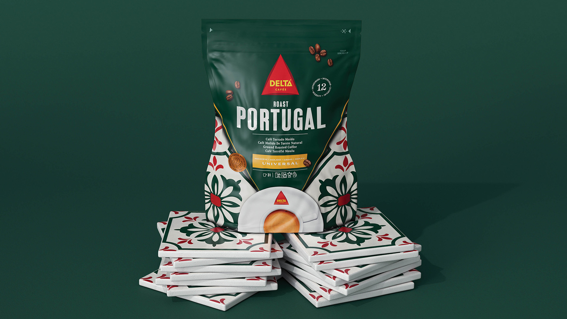
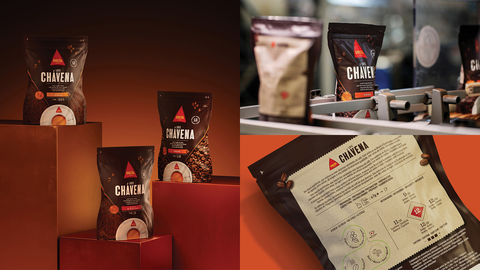
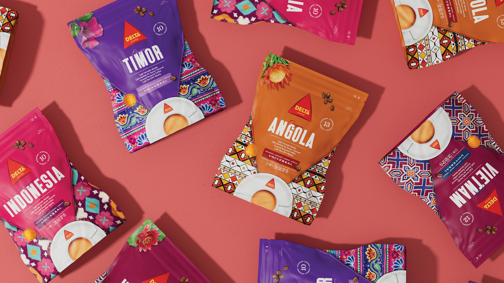
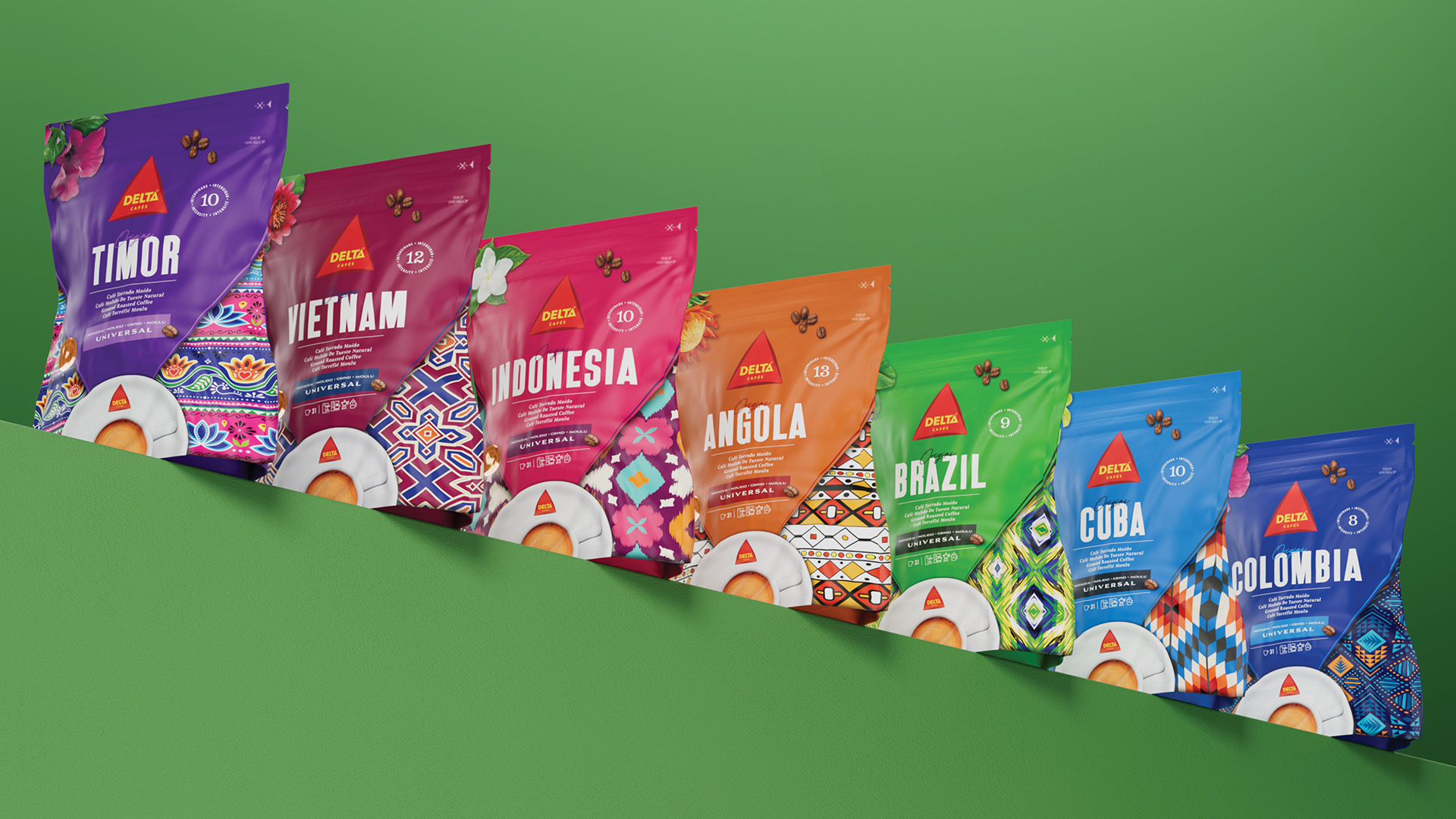
A new visual system optimizes consistency across an enhanced portfolio architecture and guarantees seamless shelf navigation while ensuring flexibility for future growth. The new design strategy features an ownable navigational system: core elements such as the product name, intensity level, grind info, plus the new iconography are held centred within the familiar triangular shape, purposefully guiding us to the brand’s distinctive espresso top view. A refreshed typographic language combines condensed boldness with delicate serifs, enhanced with the atmospheric elements and motifs that underlie the character of each of the unique selected blends. Captivated with colourful illustrations, “Origins” is inspired by rich national textiles and patterns, standing beside “Roast Portugal” which embraces the archetypal Portuguese tiles displayed in proud colours.
Distinctive assets have been introduced to enrich the journey, building up on the brand´s coffee connoisseur character: detailed info about each unique blend, the coffee cycle captured in an illustrative wheel, a precise preparation guide reinforced with fresh iconography, or the simplified iconographic expression of the product’s attributes, all consolidate the brand’s specialist traits. All wrapped up with a bright and bold golden new stamp, celebrating expertise developed since 1961 and ensuring quality in every single pouch.
In addition to the vigorous redesign process of the existing 5 ranges, we are proud to introduce to the diverse portfolio the launch of the “Ritual” range, crafted for daily consumption. Conceptualised from idea to execution, in a vision that began with the naming itself, briefed to reflect not only the strategic positioning of this product within the brand’s local portfolio, but also to connect harmoniously with international markets.
The new visual language unmistakably awakens the brand’s emotional essence and authenticity in a Delta way: a Love Brand is reborn.
CREDIT
- Agency/Creative: Peter Schmidt Group
- Article Title: Delta Cafés Packaging Redesign, Reinvigorating a Coffee Icon
- Organisation/Entity: Agency
- Project Type: Packaging
- Project Status: Published
- Agency/Creative Country: Germany
- Agency/Creative City: Lisbon
- Market Region: Europe
- Project Deliverables: Brand Strategy, Brand World, Packaging Design, Packaging Guidelines
- Format: Pouch
- Substrate: Plastic
- Industry: Food/Beverage
- Keywords: Packaging Design
-
Credits:
Executive Creative Director: Pedro Vilar
Design Director: Filipa Serra
Design Director: Ann Kalkschmidt
Consulting Director: Adriana Seixas
Consulting Director: Magdalena Hicks
Designer: Nicole Lang
Designer: Christina Dumont
Designer: Patrick Baedje
Production Director: Marcel Reinert


