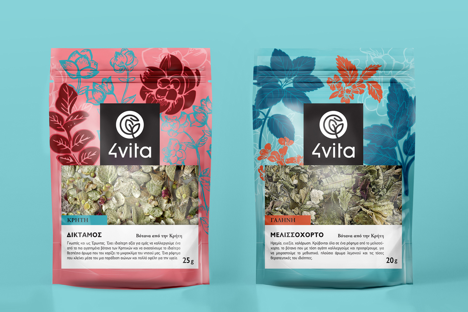
4vita is a family business with privately-owned herbal crops on the island of Crete in Greece. The fields of 4vita is a living laboratory where grows Cretan herbs while many of them are grown organically. Cretan tea, Lemon verbena, Mint, Cretan sage, Lemon Balm, Cretan Dittany, Chamomile and Marjoram are some of the herbs that are cultivating with much care and love in the farm.
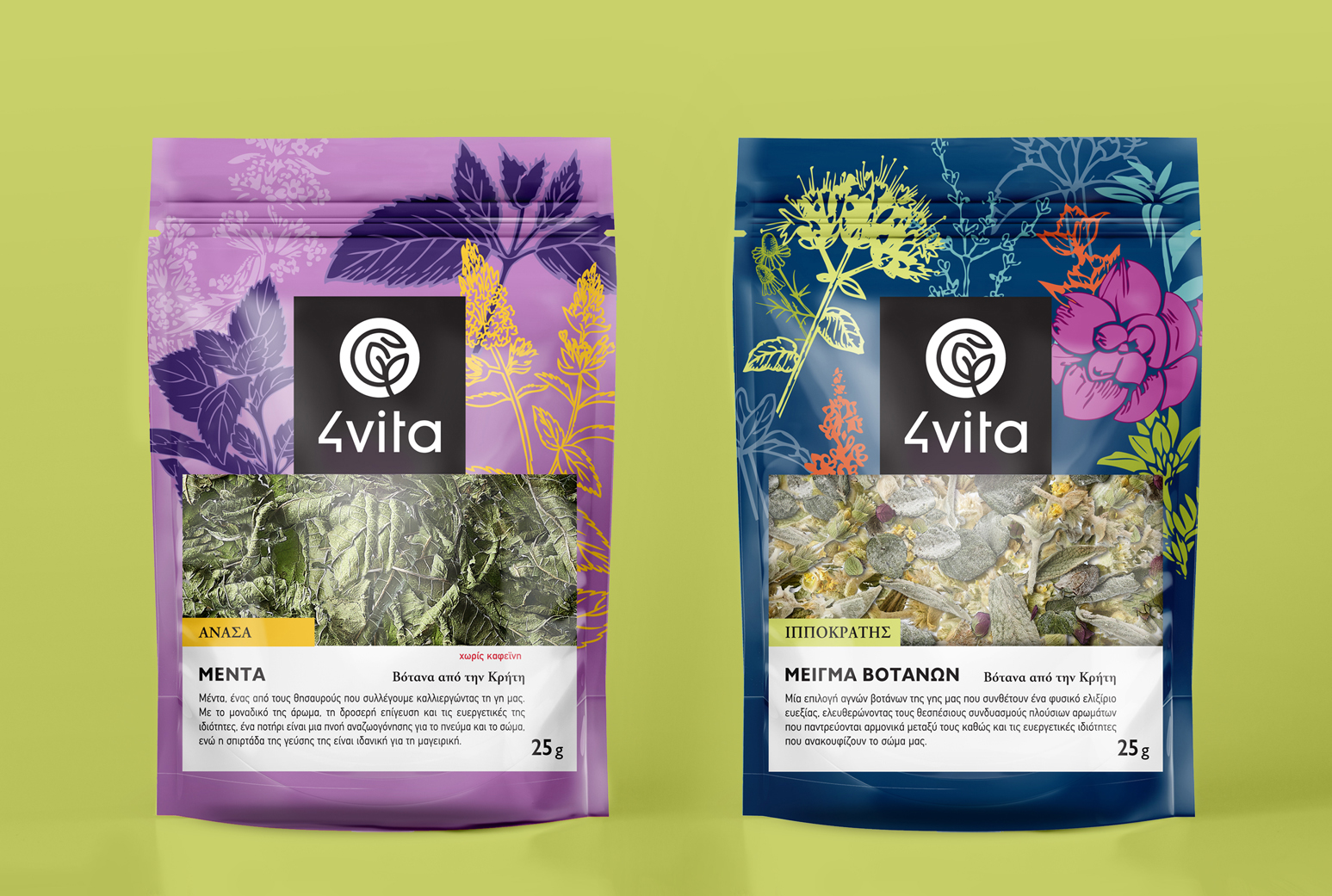
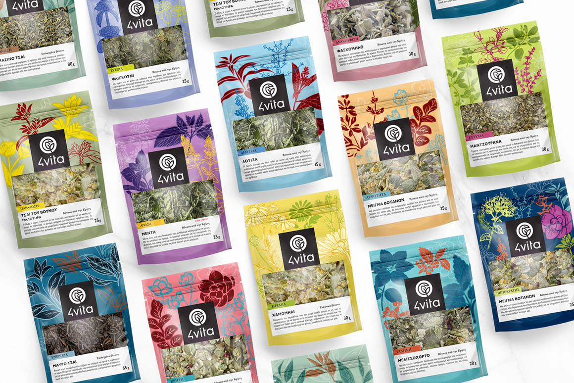
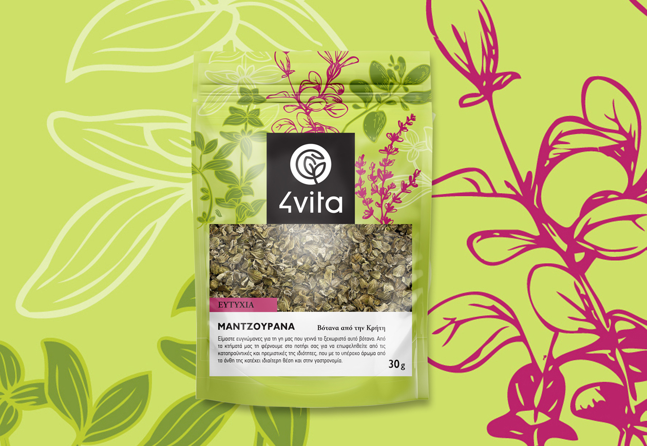
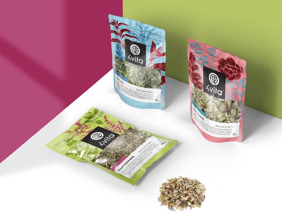
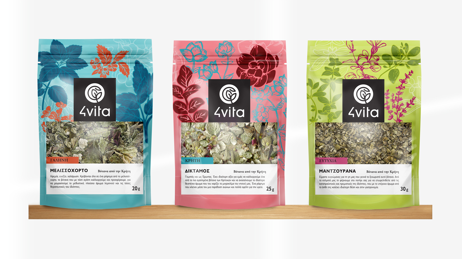
A visit to the herb crops of 4vita is enough to lead you to a sea of colors. Colors combine with light, earth, sky and create the most beautiful canvas. The colors of high contrasts and tones that flood you with a happy mood, generously shared by nature, gave us the inspiration for the design of the packaging. This feeling is so strong from the moment you step into the farm that becomes a need to draw and to make it an image of life. All these colorful palettes we used were so far from the usual of describing natural products such as brown and green in low tones, but we preferred to invest in feeling.
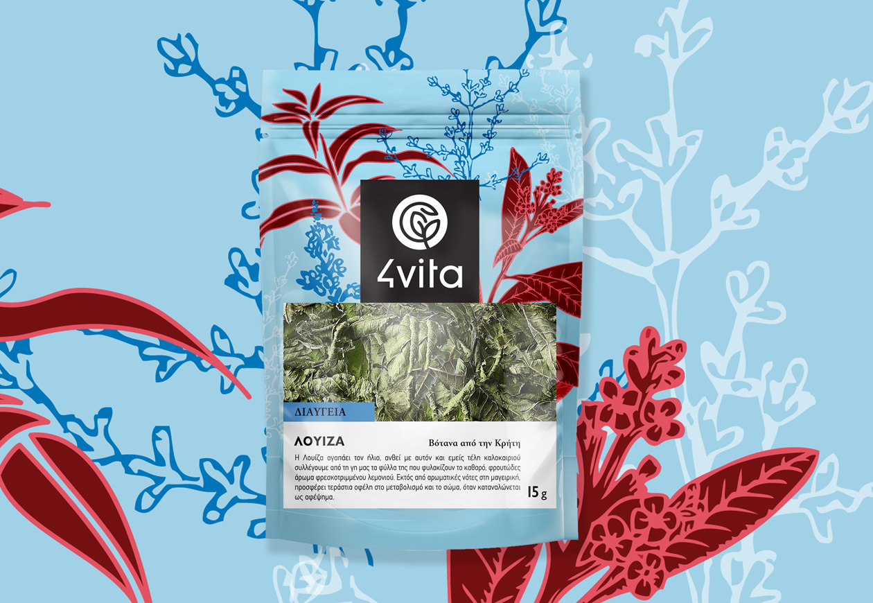
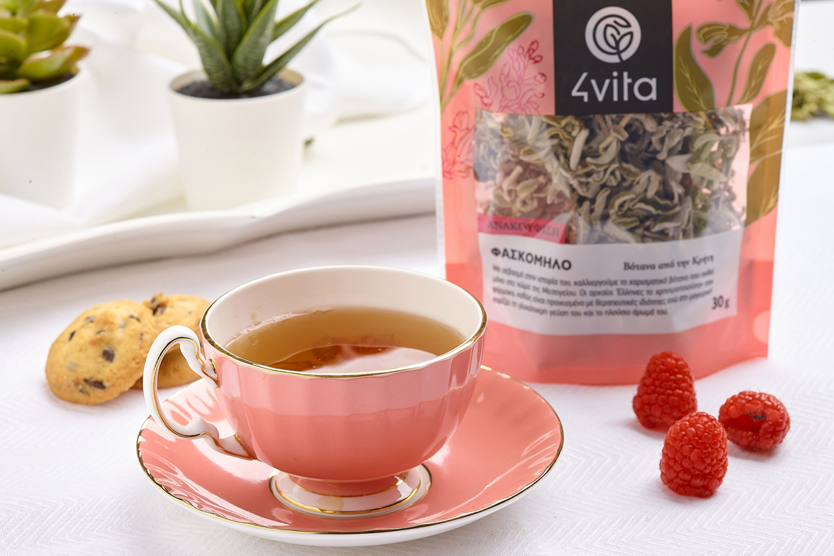
The line drawings of each package in the series are contained in a harmonious color palette, thus defining the visual identity of the series. The texts on the face of the package are not only information but also give a communicative character to the product. The title on each packaging expresses the most important benefit of the herb making it easy for the consumer to choose between all the different packages of the series. The logo of 4vita in the black rectangular communicates and emphasizes on the packaging making the consumer start to recognize the brand at first sight. The final design has a modern approach with vintage illustrations adjusted in the simplest way and balanced with two main colours. The attraction to nature is always a desirable experience for anyone, so for this project, the attraction of the consumer on the packaging was the first and most important goal for us giving him the feeling that he is in a flowered field. The visual identity we wanted to create is related to the well-being we experience close to nature, following a way of life with substance and health.
CREDIT
- Agency/Creative: deep blue design
- Article Title: Deep Blue Design Creates Herbs Packaging Design For 4vita
- Organisation/Entity: Agency, Published Commercial Design
- Project Type: Packaging
- Agency/Creative Country: Greece
- Market Region: Europe
- Project Deliverables: Brand Identity, Brand World, Branding, Graphic Design, Illustration, Packaging Design
- Format: Pouch
- Substrate: Plastic


