


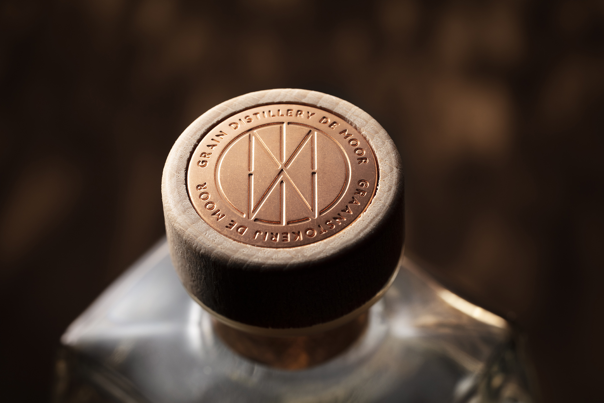
Distillery De Moor is a family business guaranteeing passion and craftsmanship since 1910. The production is rooted in years of experience. The traditional products that they produce from way back have a permanent place in their range, and are still manufactured according to the recipe of yesteryear.
This particular distillery is one of the last hot distilleries in Belgium, which means that the whole process happens in-house, from the grain to the liquid, all the while respecting traditional craftsmanship. Not thinking in volumes, but rather in quality, the end result is always honest and true. Labeling happens manually and in-house.
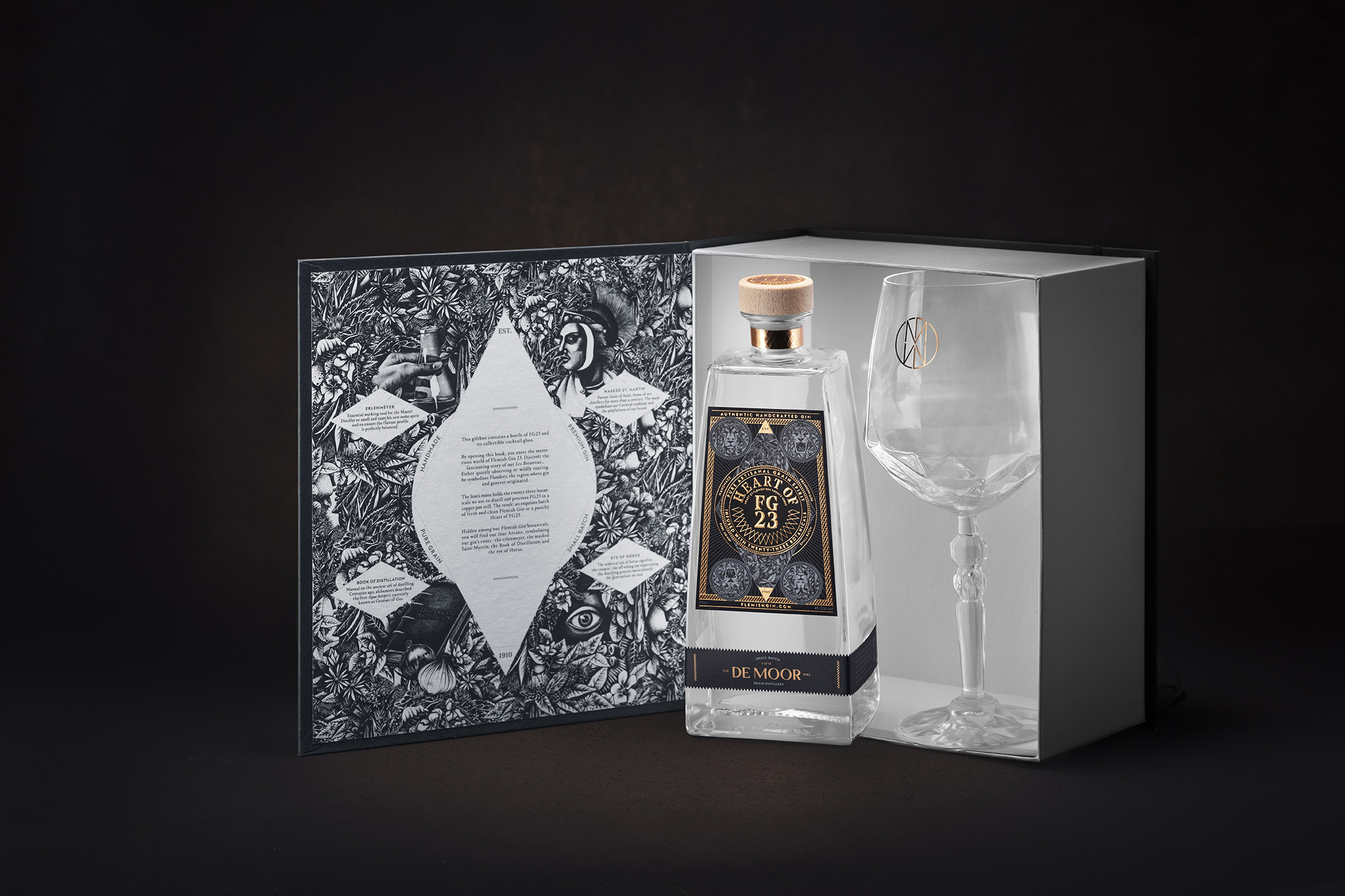
De Moor produces next to their family gins ‘Flemish Gin 23’ and ‘The Heart of Flemish Gin 23’ another 15 gins to complete their permanent offer. The Diffords guide for spirits, comparable to the ‘Michelin Guide’, awarded the ‘FG23’ a 5-star rating and ‘The Heart of FG23’ a 5+ rating.
The input of the head of distillation is crucial. The process of distillation is not a precise science, but happens organoleptically. He has to master the art of separating the liquid at the perfect moment through taste and smell. No batch is therefore the exact same, which requires a constant tasting and smelling to compose the desired blend. It’s his responsibility to create a consistency in the quality of the final products.
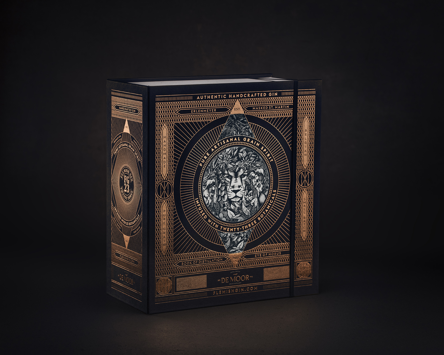
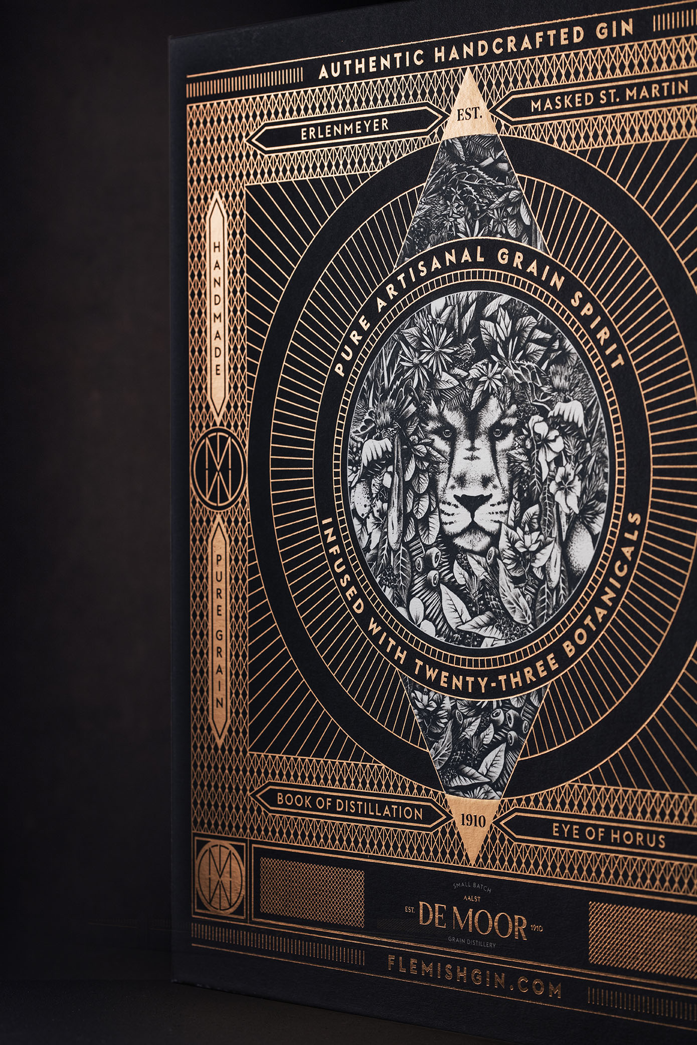
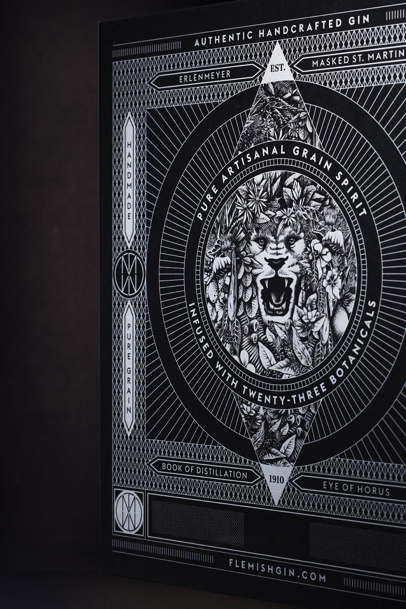
Why a botanical two-faced lion?
Distillery De Moor is rooted in the carnival culture of Aalst, one of the biggest cities in the province of East-Flanders. The origin of gin comes from this area, where it has been produced since the middle ages. The lion is Flander’s regional symbol, and refers therefore directly to both the roots of the distillery as well as the origin of gin.
The FG23 gin is a grain distillate made from 23 different botanicals, so the lion’s mane is therefore replaced by a botanical collage.
The two-faced lion also refers to the dualistic character of De Moor, which is not only an artisanal distillery, but also a business and shop selling wine and spirits. This duality is visible through the mirror-like lay-out, as well as the construction of the logo. The gin labels are inspired by the graphic environment of playing cards.
The custom illustrations tell the story of De Moor. The conical flask refers to the craft and the artisanal product. Saint Martinus, patron of the city of Aalst wears a mask to create a link with the carnival culture. The recipe book hints at the ancient secret family recipe. The All-Seeing Eye signifies the craftsmanship of the distiller.
CREDIT
- Agency/Creative: Sign Brussels
- Article Title: De Moor Flemish Gin 23 Craftsmanship Packaging by Sign Brussels
- Organisation/Entity: Agency
- Project Type: Packaging
- Project Status: Published
- Agency/Creative Country: Belgium
- Agency/Creative City: Brussels
- Market Region: Europe
- Project Deliverables: Branding, Logo Design, Packaging Design
- Format: Box
- Substrate: Pulp Carton
- Industry: Food/Beverage
- Keywords: Brand Architecture, Brand Creation, Brand Identity, Brand Redesign, Brand Refinement, Brand World, Branding, Graphic Design, Identity System, Illustration, Packaging Design, Product Architecture, Rebranding, Research, Structural Design, Tone of Voice
-
Credits:
Graphic designer: Cedric Zwaenepoel


