


Fryums have long held a special place in Indian kitchens. It’s nostalgic, quick to make, and endlessly fun to eat. Whether it’s the satisfying puff in hot oil or the vibrant shapes that spark curiosity, they bring joy across generations. For kids, they’re a crunchy treat; for adults, a reminder of simpler times.
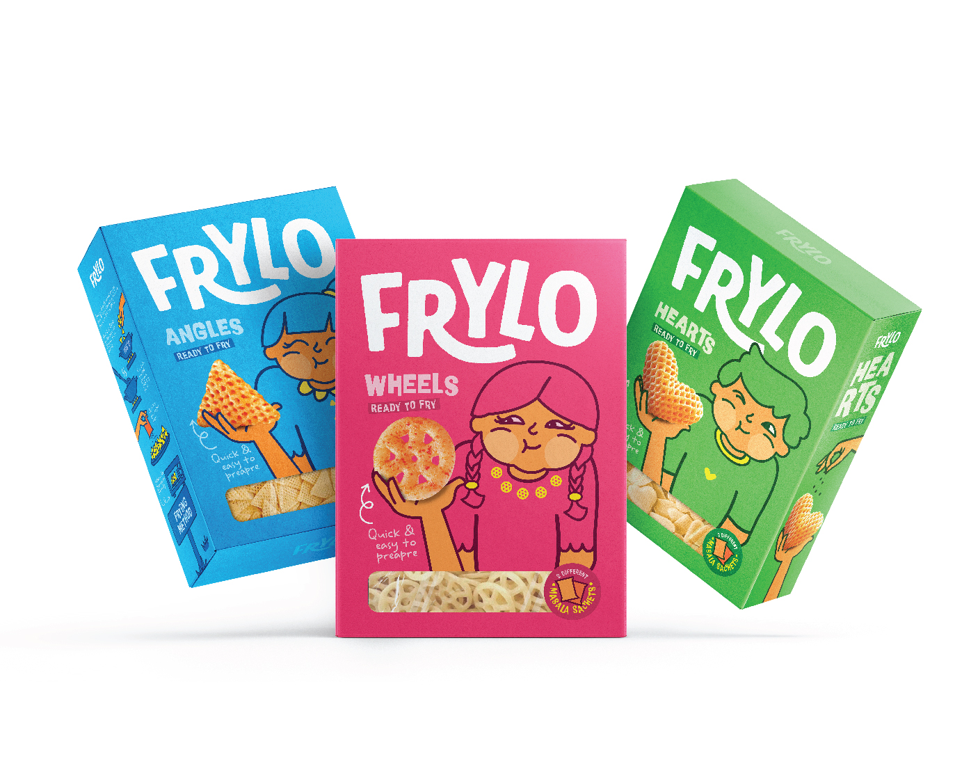
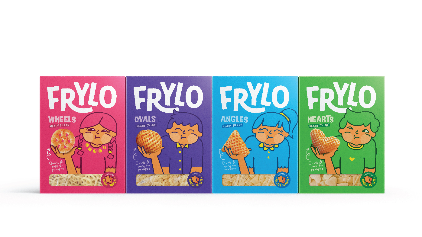
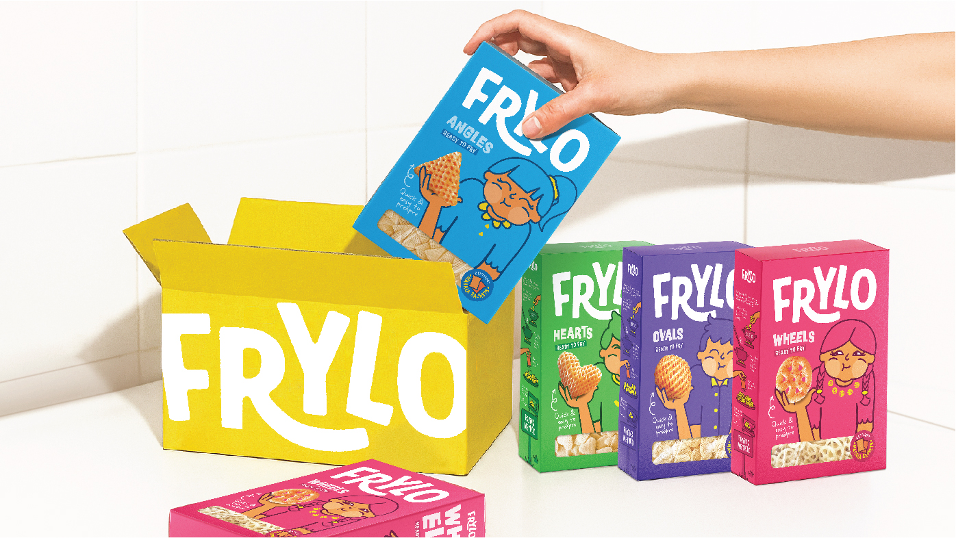
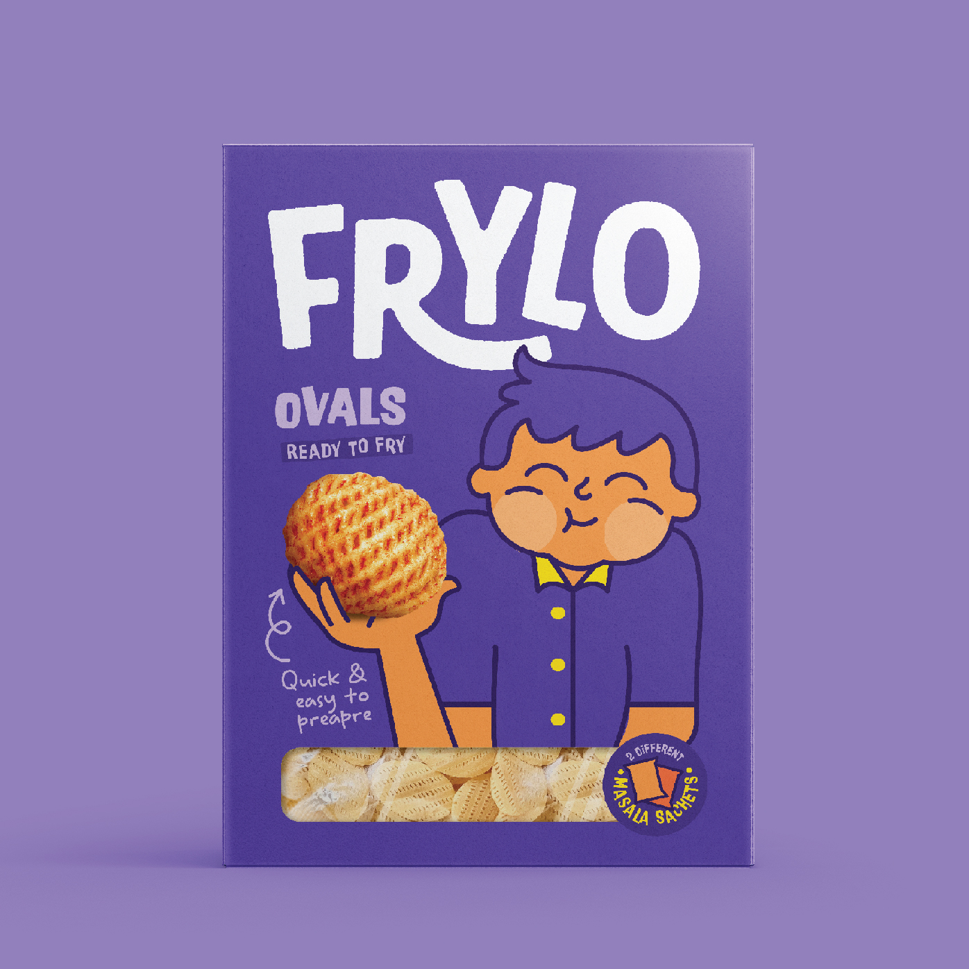
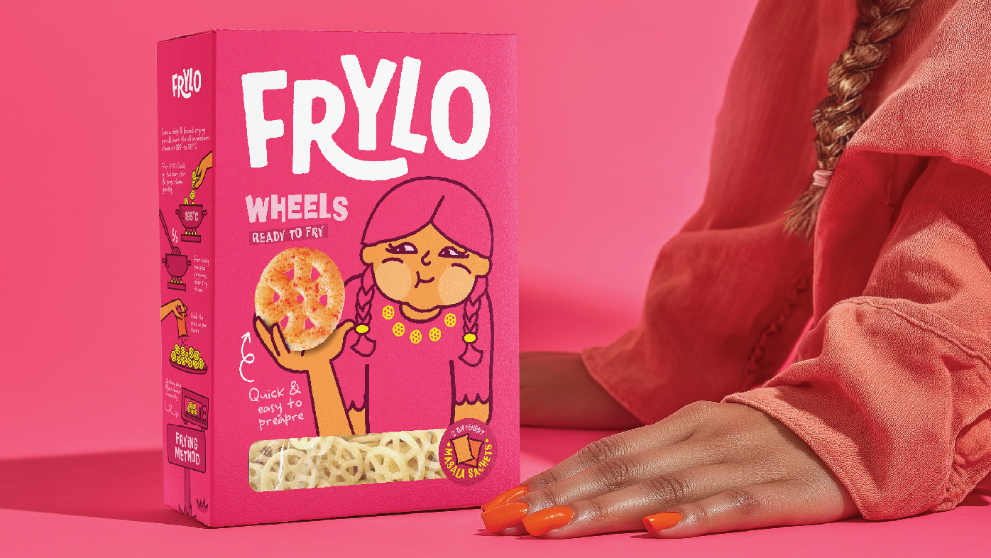
For Frylo’s ready-to-fry snack range, De Icebreaker Creative Studio set out to create packaging that would stand out on the shelf and stay in your memory. The goal was simple: make it instantly recognisable, emotionally inviting, and functionally smart. Each fryum shape took center stage, brought to life by a cheerful illustrated character full of energy, charm, and a dash of mischief.
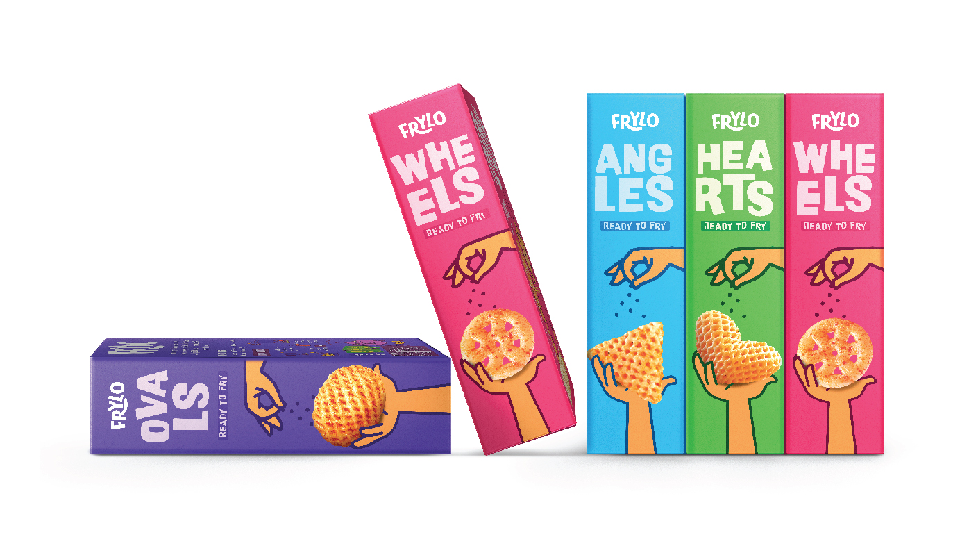
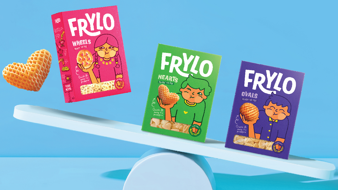
To hold this playful universe together, the studio built a clean and scalable visual system. Each variant follows a clear structure: bold background colors that anchor the pack; transparent product windows that showcase the product inside. This consistent framework ensures the brand remains cohesive while allowing room for fun.
But what truly sets Frylo apart is its character-driven approach. Each new Fryum shape arrives with its own illustrated mascot, bringing new faces, colours, and poses into the mix. These characters add depth and personality, making the packs feel less like SKUs and more like members of an ever-growing crew.
The result is a system that balances structure and spontaneity. It’s thoughtful and repeatable, yet never dull. It allows the brand to grow effortlessly, maintaining consistency while keeping the range fresh, expressive, and delightfully unpredictable.

CREDIT
- Agency/Creative: De Icebreaker Creative Studio
- Article Title: De Icebreaker Studio Builds a Flexible, Fun-Loving Design System for Frylo’s Fryums
- Organisation/Entity: Agency
- Project Type: Packaging
- Project Status: Published
- Agency/Creative Country: India
- Agency/Creative City: Ahmedabad
- Market Region: Asia
- Project Deliverables: Illustration, Packaging Design, Tone of Voice
- Format: Box
- Industry: Food/Beverage
- Keywords: food packaging design, packaging design, snack packaging, branding
-
Credits:
Creative Head: Pankti Sheth
Art Director & Illustrator: Dhavanshi Shah


