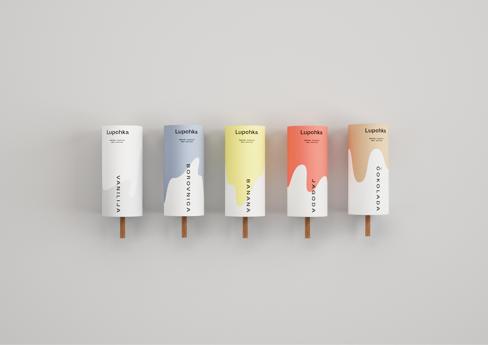
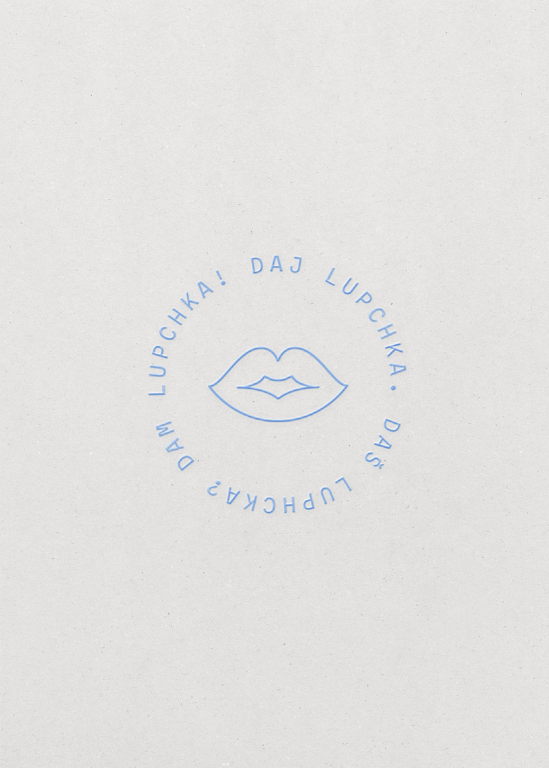
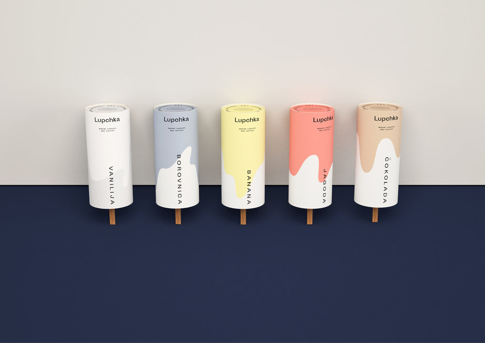
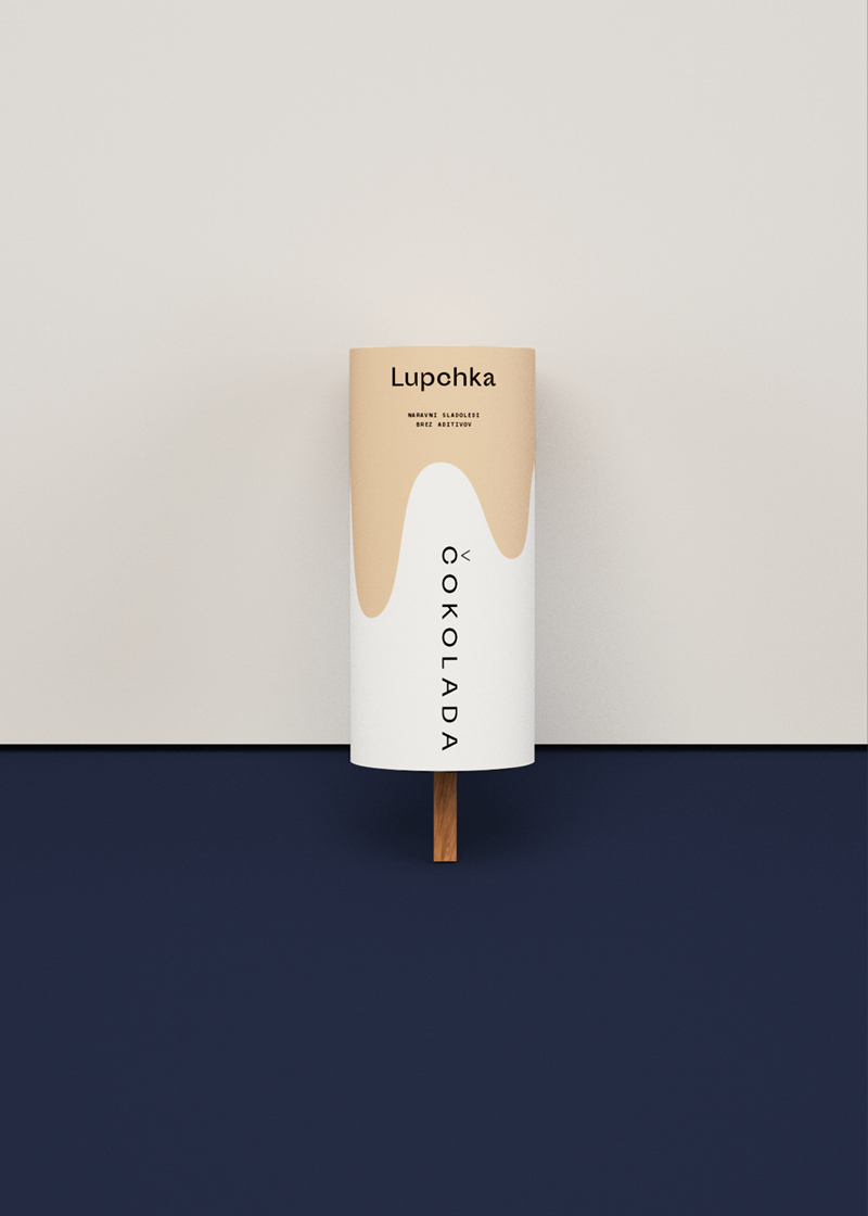
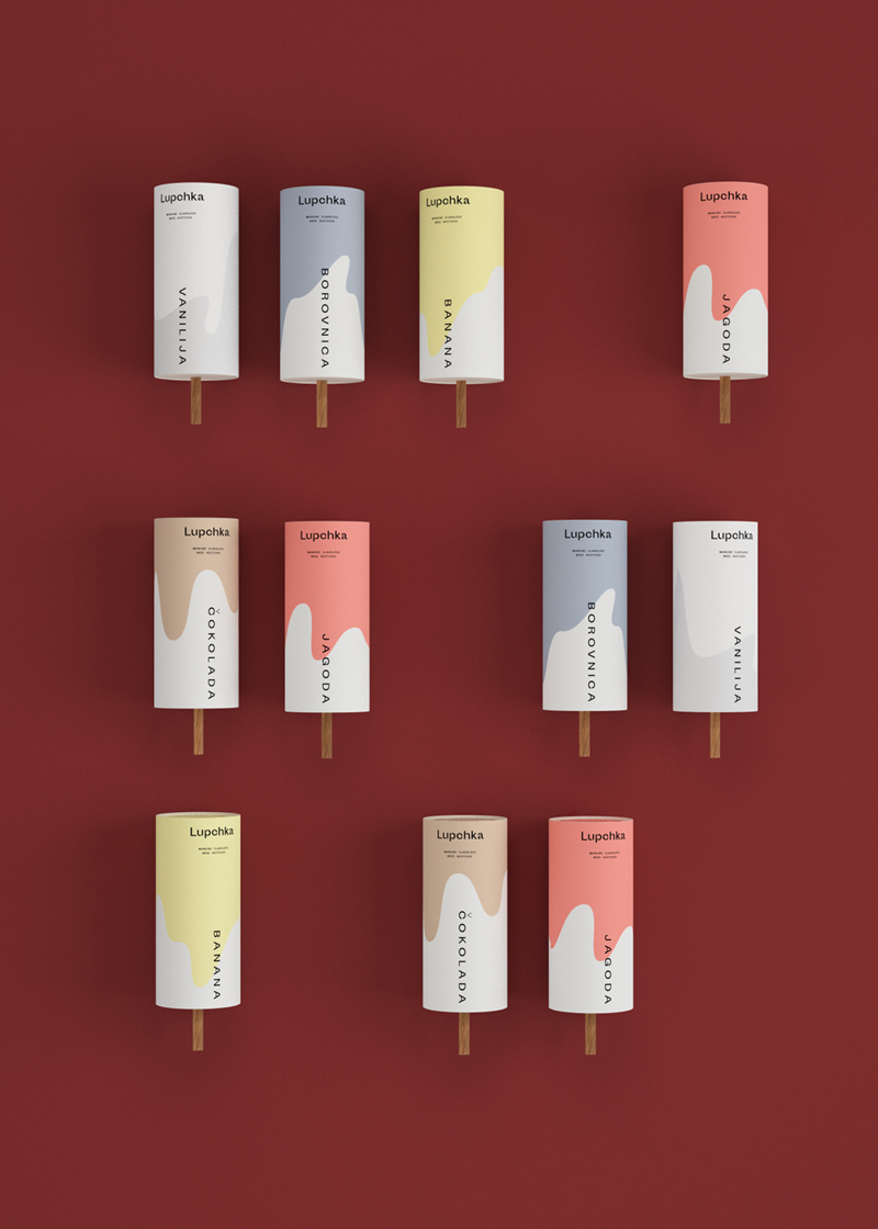
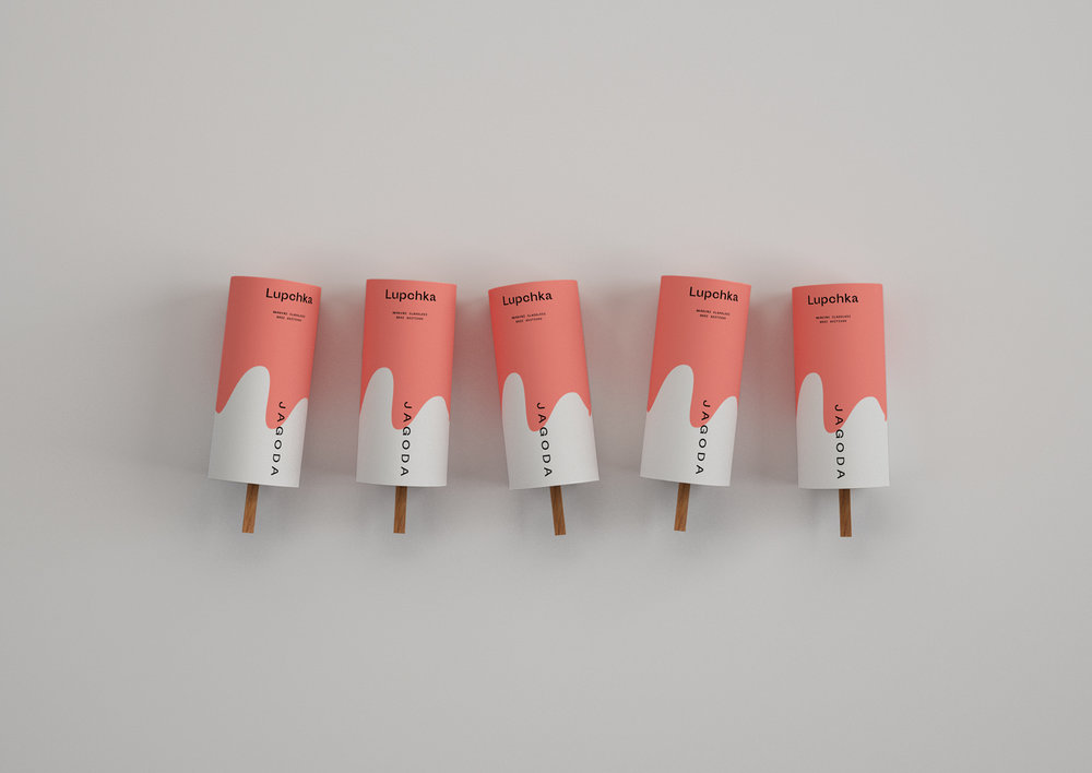
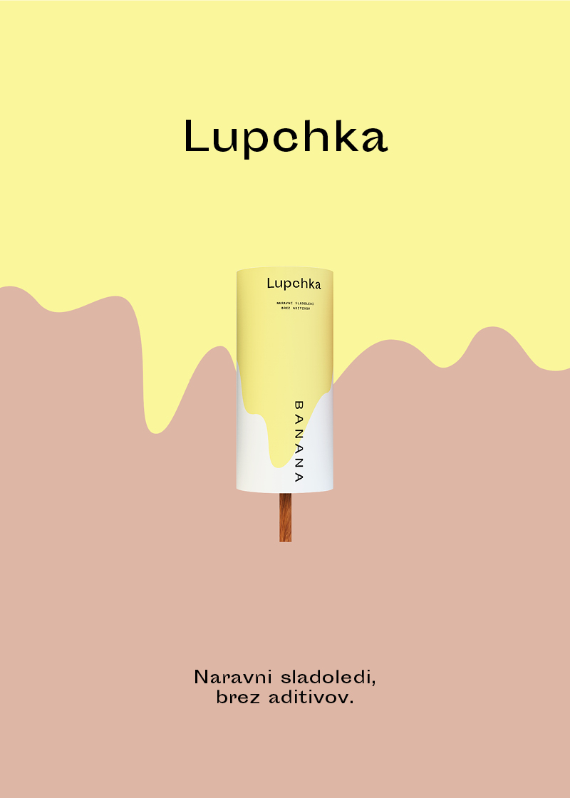
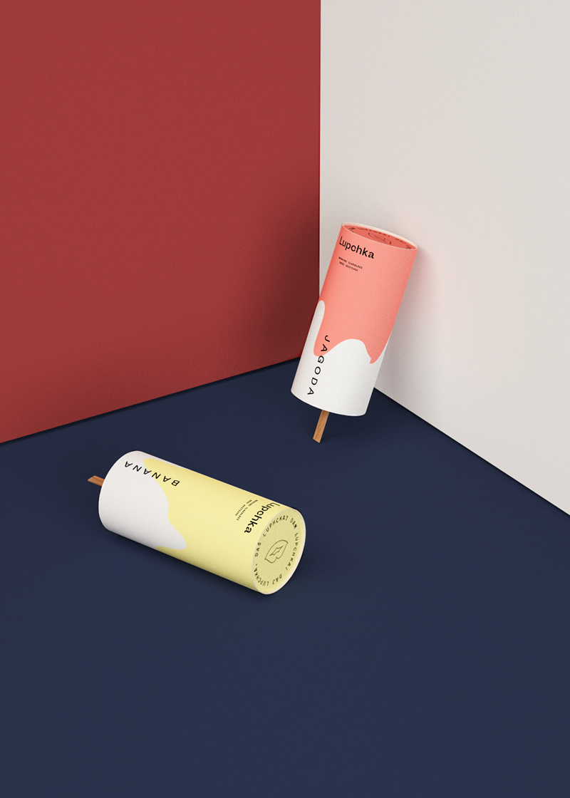
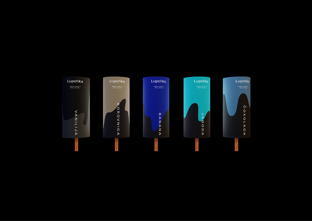
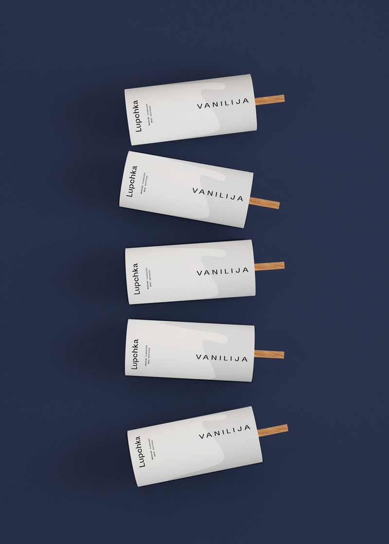
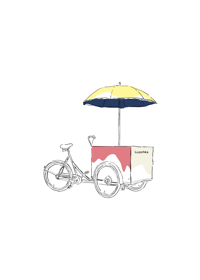
” We gave a newcomer in the market of natural ice cream production a playful name, identity and packaging. Fresh and youthful appearance of color spilling ice creams provide a unique look.
As a special feature to the packaging we thought of a “glow in the dark” ink colouring for hot summer nights.”
CREDIT
FEEDBACK
Relevance: Solution/idea in relation to brand, product or service
Implementation: Attention, detailing and finishing of final solution
Presentation: Text, visualisation and quality of the presentation


