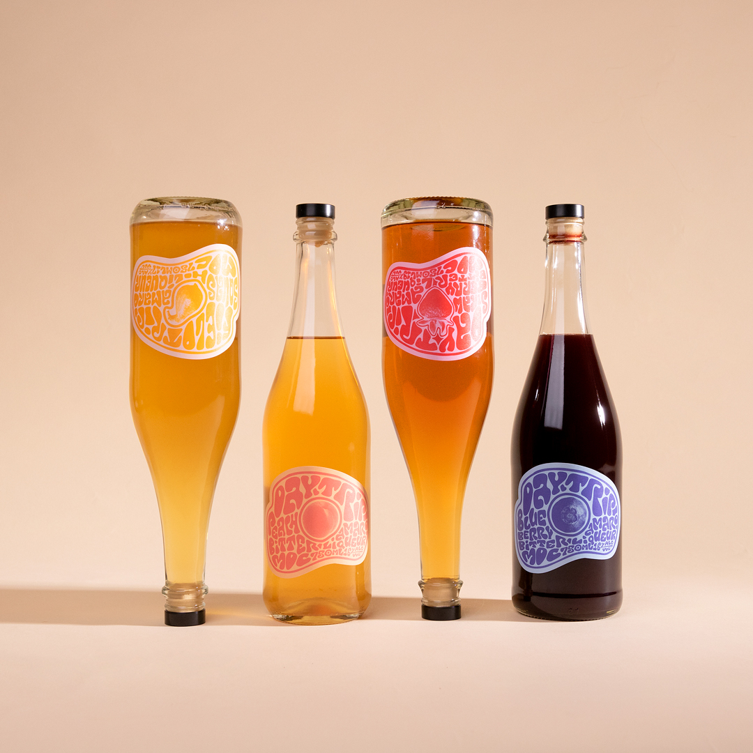
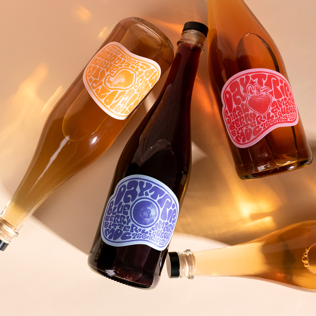
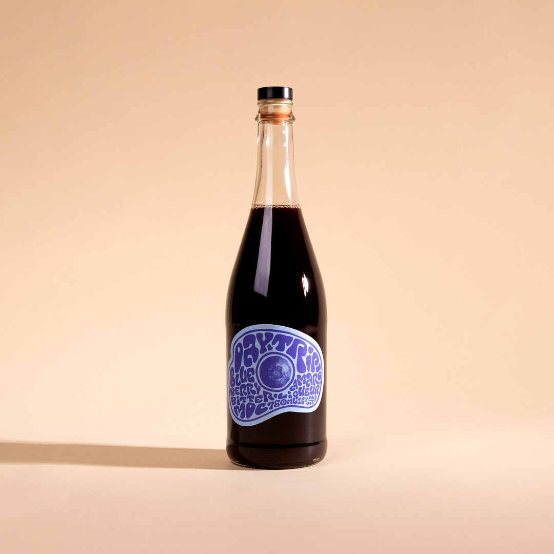
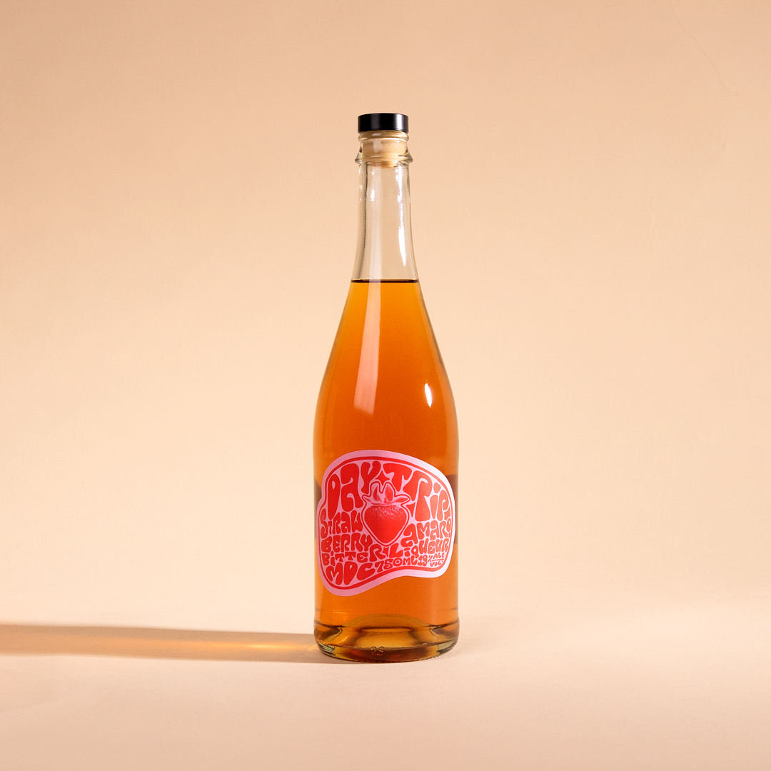
Matchbook Distilling Co. wanted to lean into the light-hearted, funky vibes of their growing Amaro line. The designs are meant to evoke a carefree moment in time, a season, a feeling, true to the origins of Daytrip. It also reflects a feeling of movement and morphing into something new, following the story of how these sprits came to be.
In the words of Matchbook, located on the North Fork of Long Island NY, the story of Day Trip begins with the Mattituck Lions Strawberry Festival – a local carnival devoted to all things strawberry. One year, some 2 tons of strawberries were somehow leftover and, it seemed, destined for the compost pile. Our friend Joey, a Mattituck Lion and the manager of his family’s vineyard, rescued the strawberries and brought us a big tote of strawberry wine. We distilled 100 gallons into a strawberry eau de vie and added it back into the wine with a whole mess of vibrant botanicals. Nettle, quassia, jasmine, rose, nutmeg fruit… leaving that to macerate for a few months before filtering, sweetening and bottling. We thought we were making a Strawberry Vermouth — the first in a whole series of fruit vermouths we’d release — that is before the government insisted any vermouth be made from wine grapes. With that, a quick pivot, a detour, a Day Trip Strawberry Amaro was born.
Some aperitifs come together in this holistic way where its hard to pick out the various ingredients — others allow their constituent parts to shine. Day Trip is the latter — strawberry is front and center stage, with the woody and bitter flavors of the quassia quickly following up. Some green notes from the nettle, perfume notes from the florals. it represents, to me, a drive through the North Fork, past the vineyards and the fields of flowers and the peaceful waters punctuated with dramatic rock formations. Day Trip is ushering in the warmer months and the summer celebrations that will soon crown the seasons Strawberry Queen.
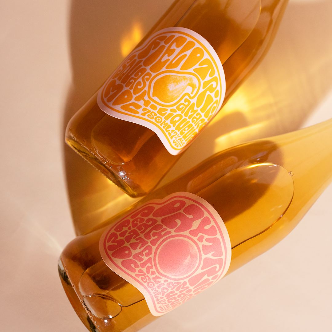
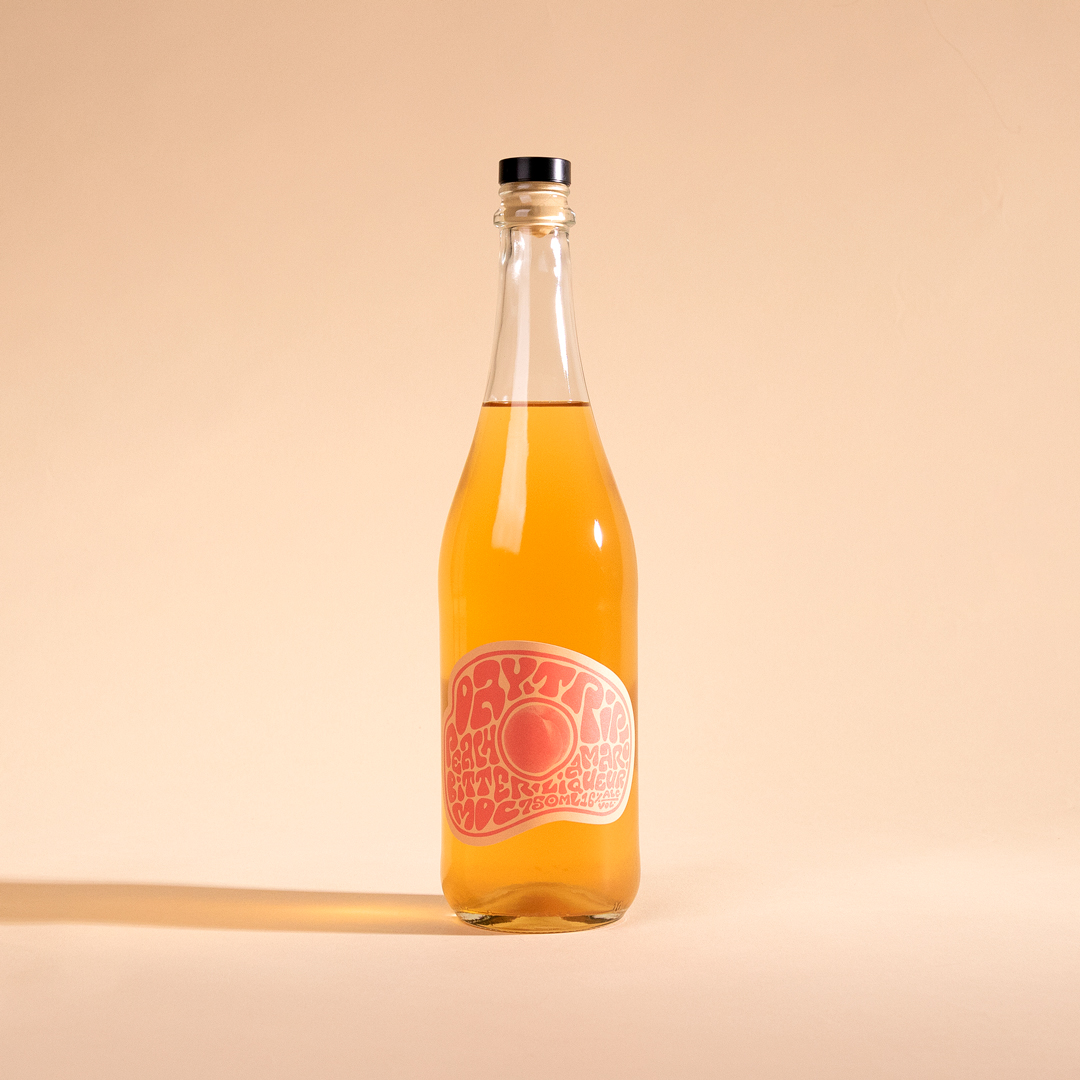
The design was inspired by the fluid typography of Wes Wilson, and these hand-lettered labels center around the locally sourced ingredients of each release that produce these bright flavors. The center imagery is textured in a screenprint-style reminiscent of traditional print making, further reflected in the simple two-tone design of the label design.
The outer die follows the morphing typography, natural and true to the organic roots of the product.
CREDIT
- Agency/Creative: Watermark Design
- Article Title: Daytrip Amaro Liquor Label Design
- Organisation/Entity: Agency
- Project Type: Packaging
- Project Status: Published
- Agency/Creative Country: United States
- Agency/Creative City: CHARLOTTESVILLE
- Market Region: North America
- Project Deliverables: Brand Architecture, Graphic Design, Lettering, Packaging Design
- Format: Bottle
- Substrate: Glass Bottle
- Industry: Food/Beverage
- Keywords: WBDS Agency Design Awards 2023/24
- Keywords: 70's, screenprint, lettering, bright, fun
-
Credits:
Creative Director: Darcey Lacy
Designer/Illustrator: Rebekah Seiler


