121 – Tic Tac
Tic Tac was looking for a new seasonal package inspired by “El día de los Muertos”, the
Mexican Day of the Dead celebration.
The design had to reflect all the richness, joy and the colors that surround this festivity and
appeal to Mexican millennials and young adults.
121 developed a design proposal with a vector illustration technique that incorporated some
of the most important elements of the holiday.
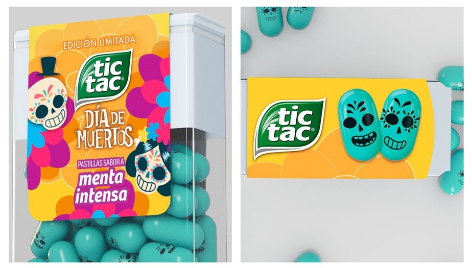
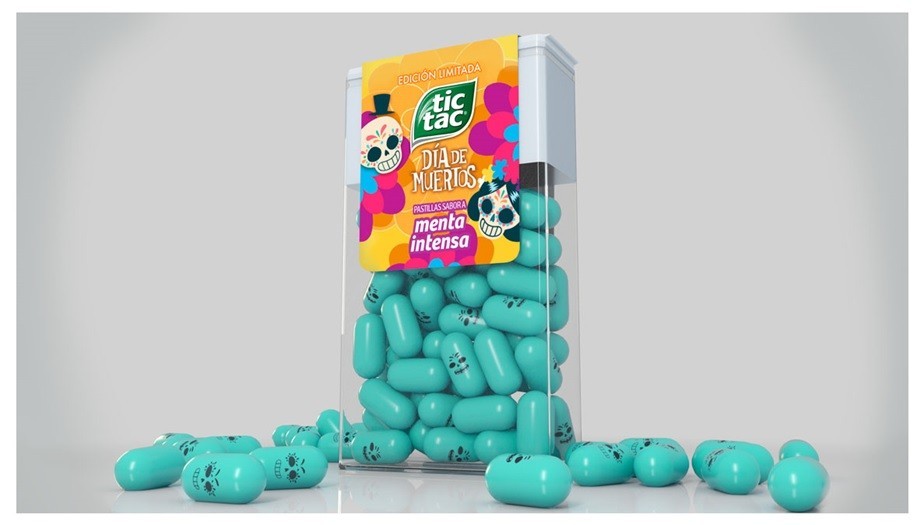
The marigolds, the flowers that supposedly guide the souls of the deceased to their new
destination were present in the vibrant yellow background of the package and the subtle
texture that mimicked its petals.
Also, the design featured two sugar skulls: a male and a female. These elements are a
reference to the traditional sweets that appear on the festivity altars and represent
La Catrina and El Catrín, two typical skeletons that have become a symbol of the Day
of the Dead.
Additionally, not only the label takes inspiration from this celebration, but the actual mints
are decorated with a skull print.
Overall, the packaging turned out to be a bold, colorful and lively design that embodies the
essence of the Day of the Dead.
The product was released in the Mexican market in October 2018.