


David Carranca – Oro di Napoli – Guardians of the Eternal Flame
Oro di Napoli is a living tribute to true Neapolitan tradition, an ode to the sacred bond between fire, hands, and heritage. It is not merely a place where pizza is made, but a space where time itself pauses , where every flame, every movement, and every scent carries the memory of centuries.
To enter Oro di Napoli is to step inside a ritual. The air is filled with warmth and rhythm, the quiet sound of dough breathing, the slow heartbeat of the oven glowing in amber tones. Here, the fire is not a tool. It is a living being, a guardian of transformation, the same element that once forged civilization and now gives life to an ancient craft.
Every gesture tells a story. The mixing of flour and water, the rise of the dough, the shaping by hand , all done with a patience that defies the modern rush. It is a choreography of devotion, passed down from generation to generation. The pizzaiolo becomes both artisan and poet, translating heat into flavor, and tradition into a fleeting moment of perfection.
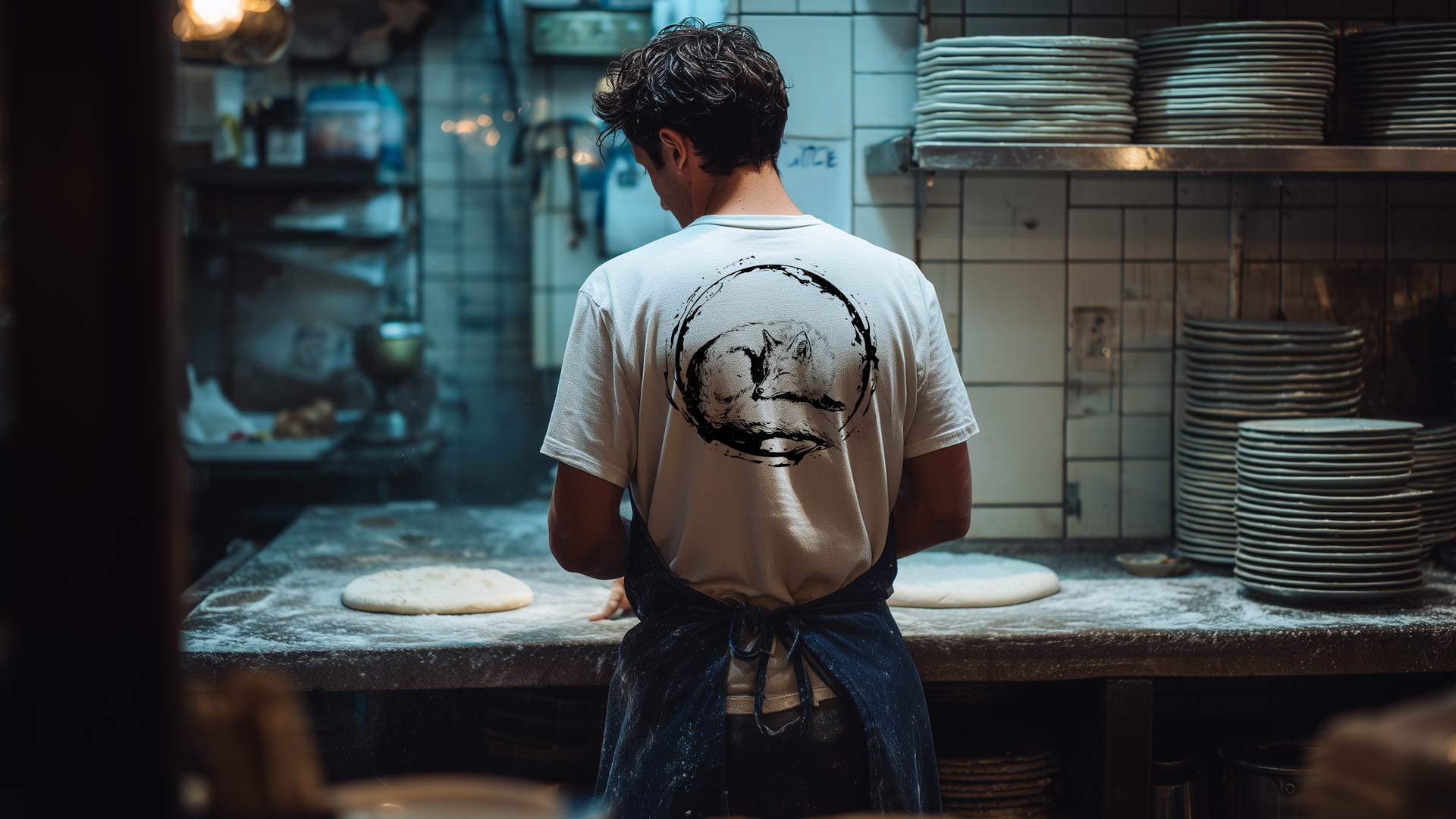
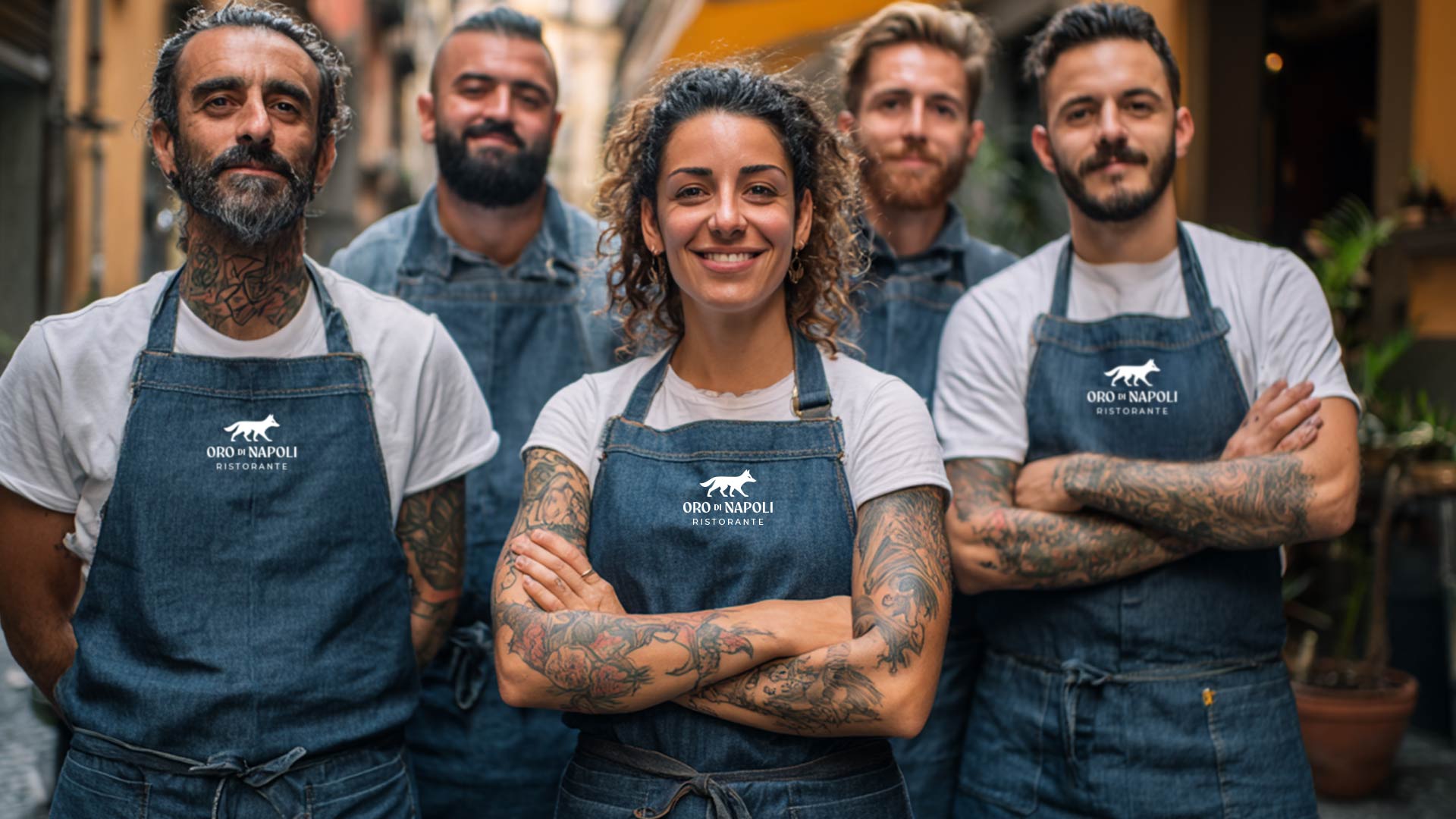
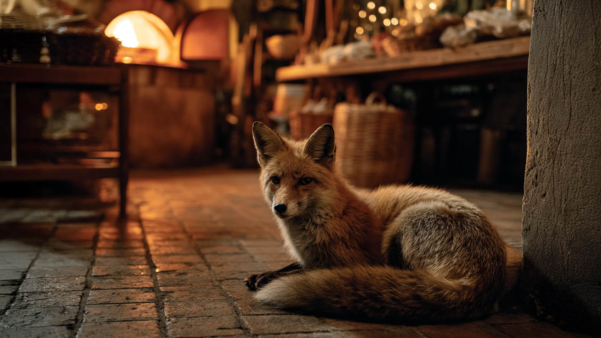
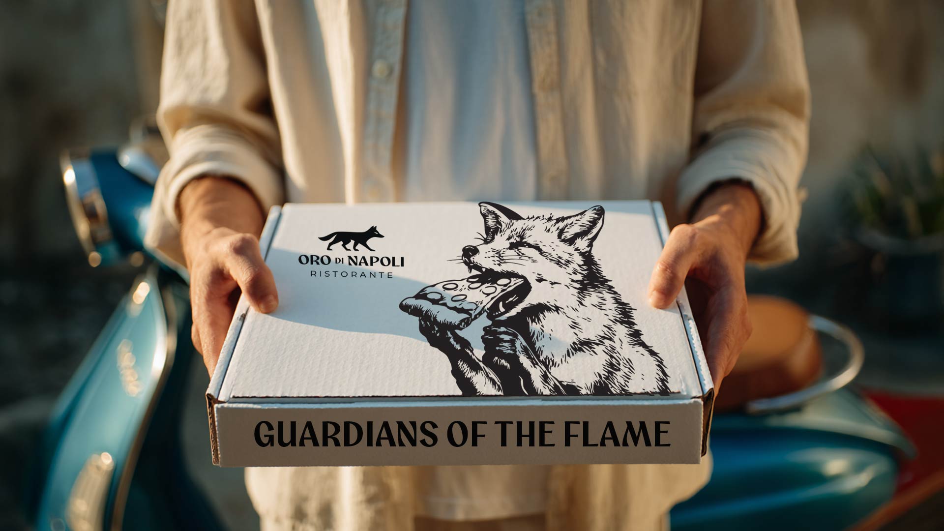
At the center of this sacred space stands its protector: La Volpe d’Oro, The Golden Fox. She is the spirit of the brand, wise and instinctive, elegant yet untamed. Her eyes hold the reflection of the eternal flame, the fire that never dies. She embodies the dual nature of creation — reason and instinct, control and freedom, art and nature intertwined. In mythology, the fox is a symbol of cunning and guardianship, a creature that moves between worlds. In Oro di Napoli, she watches over the fire, ensuring that the sacred balance between passion and precision is never lost.
The flame she guards is no ordinary one. It represents the heartbeat of Naples, the pulse of a culture that finds beauty in imperfection and soul in simplicity. This flame has burned through generations — from the volcanic origins of Mount Vesuvius to the intimate kitchens of the city’s oldest neighborhoods. It is the same fire that shaped the first bricks, baked the first loaves, and gave birth to pizza itself.
Oro di Napoli captures this essence, translating it into a visual and emotional identity that bridges past and present. The tones of the brand — deep terracotta, aged gold, and the subtle glow of embers — evoke warmth, humanity, and time. They are the colors of the earth and fire, of Naples itself. Textures echo volcanic stone, rough clay, and the traces of smoke that linger after the last spark fades. Every material, every hue, every curve of the identity is chosen not for decoration but for meaning.
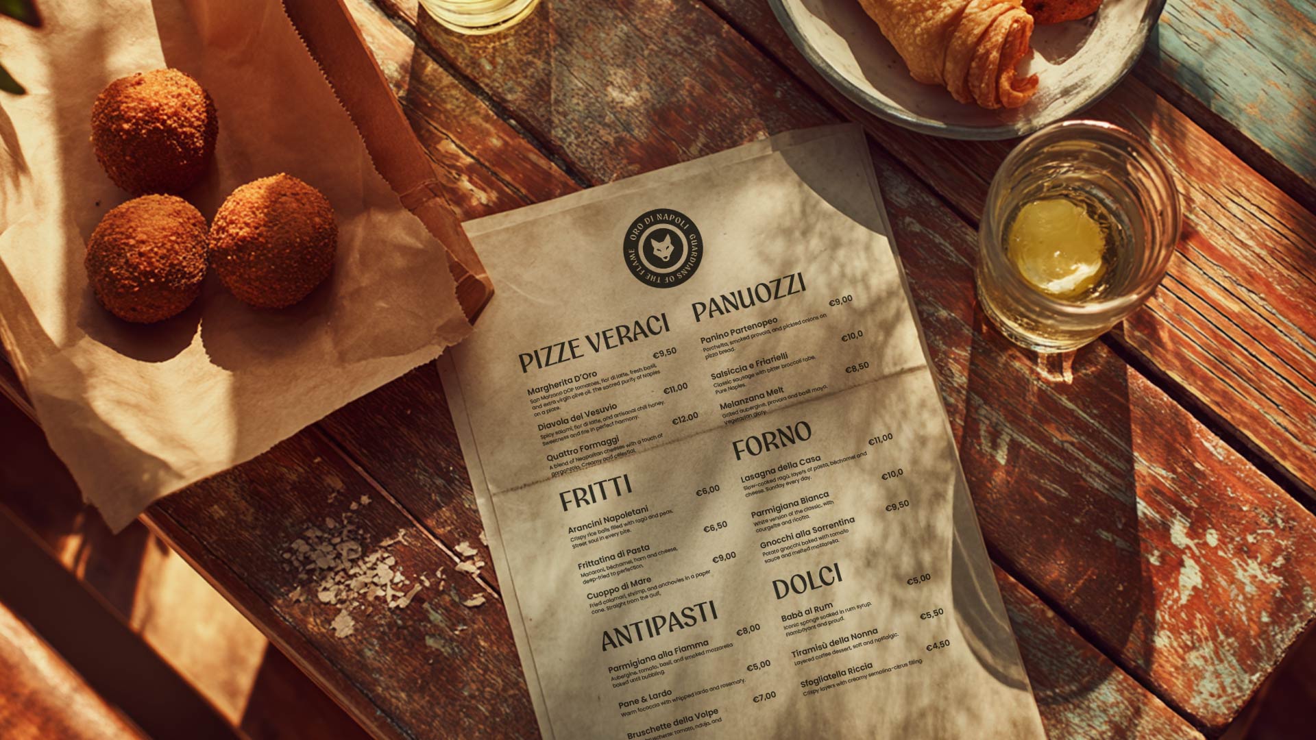
The logo stands as a mark of reverence, crafted to feel timeless yet alive. Its curves flow like heat waves, its form recalling both sacred geometry and the organic rhythm of flames. The typography breathes with human touch — not mechanical, but handcrafted, echoing the imperfect beauty that defines true craftsmanship.
This is not design for its own sake. It is storytelling through symbol. Oro di Napoli’s identity is built on emotion, memory, and ritual. It reminds us that pizza, in its purest form, is not fast food, but slow art. It is the meeting of earth and fire, of hand and spirit. Each pizza born from this flame carries a piece of that devotion — a moment of beauty destined to vanish the instant it is tasted.
Fire, in this narrative, is both protagonist and muse. It is the eternal transformer, the unseen artist shaping texture, flavor, and color. Its unpredictability demands respect. To work with fire is to surrender and to master at once. It teaches humility — for no matter how skilled the hand, the flame always decides. And yet, when balance is achieved, it rewards with transcendence: a crust crisped to perfection, an aroma that speaks of home and history.
The brand’s essence can be read as a quiet philosophy: that creation is not about control, but communion. The designer, like the pizzaiolo, learns to listen — to materials, to color, to the invisible rhythm that ties all elements together. The process becomes meditation, the outcome a testament to harmony between man, nature, and time.
Oro di Napoli also pays homage to Naples itself — a city of contrasts and poetry, where beauty thrives amid chaos, and joy is born from struggle. The city’s soul, much like its pizza, is simple yet infinite. It lives in the laughter echoing from narrow streets, in the scent of wood smoke, in the golden light reflecting off ancient facades. Naples teaches that perfection is not sterile but alive, shaped by imperfection and passion.
Through this lens, Oro di Napoli becomes more than a brand. It becomes a ritual of remembrance — a way of preserving what is sacred in a world of speed and noise. It invites us to slow down, to rediscover wonder in the ordinary, and to recognize the divine spark within human craft.
The guardian, La Volpe d’Oro, reminds us of this lesson. Her gaze is both playful and profound, her presence both earthly and mythic. She embodies intuition — the ability to sense what cannot be measured. In her lies the wisdom of fire: to burn brightly without consuming, to transform without destroying.
In this dance of elements, Oro di Napoli finds its voice. The fire whispers in the glow of the oven, the dough responds, the air fills with scent, and for a brief moment, everything aligns — art, nature, and emotion. The brand captures that fleeting alignment and turns it into an identity that feels eternal.
The beauty of Oro di Napoli lies in this paradox: it celebrates something ephemeral while aspiring to timelessness. Each pizza disappears in minutes, yet the experience it creates endures — a memory imprinted through taste, texture, and warmth. Like art, it exists in the space between matter and meaning.
The visual language of the brand extends this philosophy. The interplay of light and shadow, of matte surfaces and metallic gleam, reflects the dialogue between the sacred and the everyday. Patterns draw from natural forms — smoke trails, molten textures, the gentle ripple of heat. Typography breathes with space and rhythm, inviting contemplation rather than shouting for attention.
Oro di Napoli speaks softly but carries depth. It is not a brand that seeks to impress, but to move. It tells the story of a culture that refuses to forget, of a craft kept alive through care and continuity. Every detail, from palette to symbol, serves the same purpose: to honor the fire that started it all.
Ultimately, Oro di Napoli is a meditation on devotion. It celebrates the act of making — not for fame or efficiency, but for love. It reminds us that true mastery is not about perfection but about presence. The hands that shape the dough are the same hands that carry tradition forward, each movement an offering to the flame.
To experience Oro di Napoli is to witness the poetry of transformation. Fire becomes flavor. Time becomes texture. Simplicity becomes sacred. And for a moment — brief but eternal — craft becomes art, and art becomes life.


CREDIT
- Agency/Creative: David Carranca
- Article Title: David Carranca Brings Oro di Napoli to Life Through the Poetry of Fire
- Organisation/Entity: Freelance
- Project Type: Graphic
- Project Status: Published
- Agency/Creative Country: Portugal
- Agency/Creative City: loulé
- Market Region: Europe
- Project Deliverables: Brand Creation, Brand Design, Brand Identity, Brand Mark, Concept Art, Identity System
- Industry: Food/Beverage
- Keywords: Brand Identity, Visual Identity, Logo Design, Cultural Branding, Luxury Branding, Premium Design, Contemporary Design, Editorial Design, Typography, Symbolic Design, Conceptual Design, Art Direction, Packaging Concept, Italian Design, Mediterranean Aesthetic, Storytelling, Emotional Design, Traditional Heritage, Cultural Identity, Visual Narrative, Design Craftsmanship
-
Credits:
Designer: david carranca


