


Cafeao
A new art-and-design-themed café and conceptual retail venture co-founded by Edison Chen and Sky Gellatly
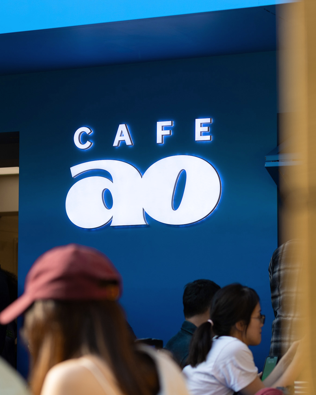
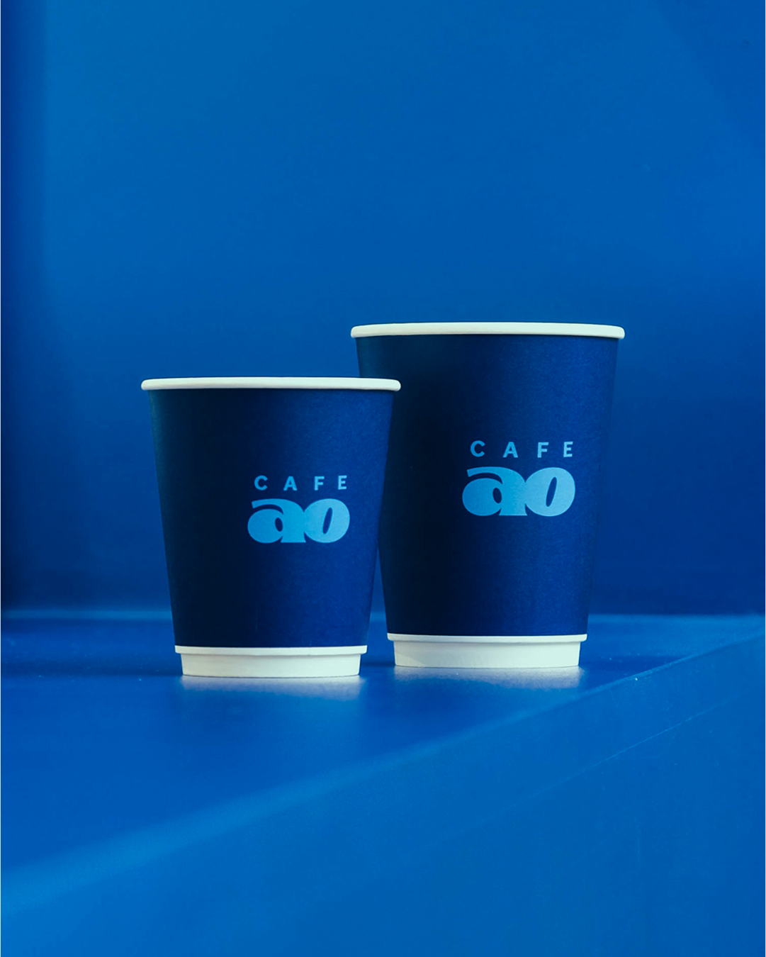
Cafeao merges “café” with the Japanese “ao” (青, blue), embodying founders Edison Chen and Sky Gellatly’s passion for blue and street culture. It symbolizes their shared vision of balance, rest, and harmony. Through exhibitions, artist collaborations, and exclusive product and menu releases, Cafeao reflects their love for art, food, and fashion—creating a space that is both avant-garde and inviting.
Visual Identity
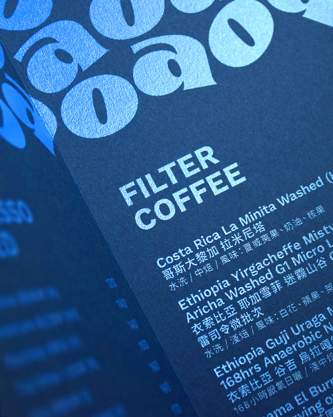
Cafeao is built on the concept of “Blue Sky Thinking”, using bold gradients of blue to set the tone—deep blue evokes mystery and calm, while light blue brings a sense of energy and lightness. The logo combines two elements: the playful, rounded “ao” at its core, inviting and full of personality, and the clean, minimal “Cafe” above it, clearly positioning the space as a coffee-driven creative hub. Designed with golden ratio proportions, the logo strikes a balance between warmth and structure.
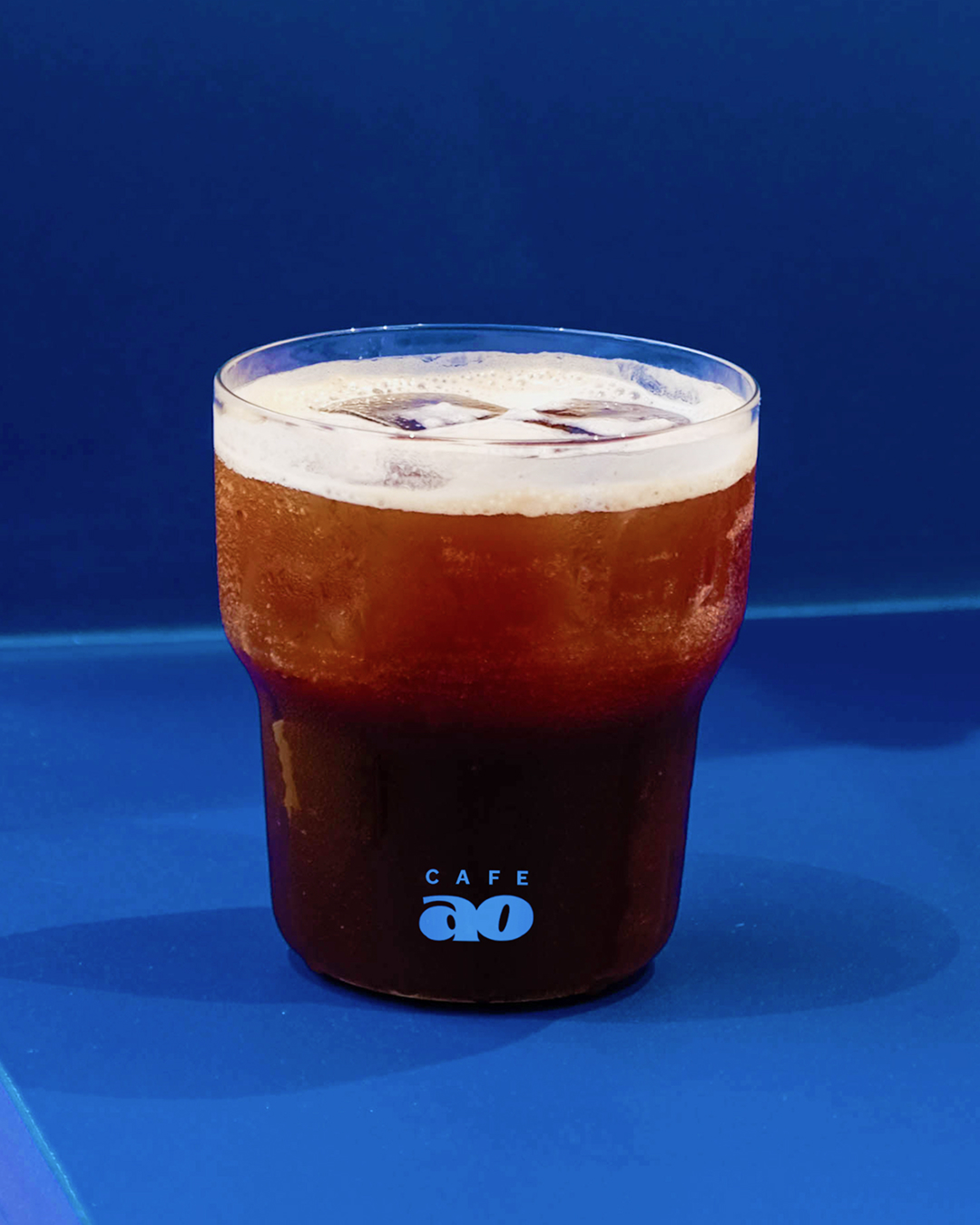
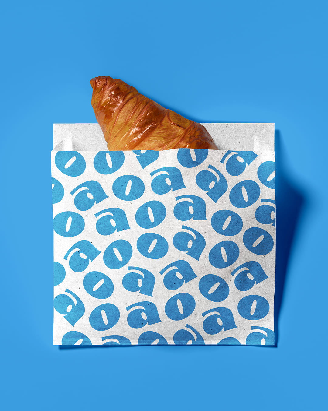
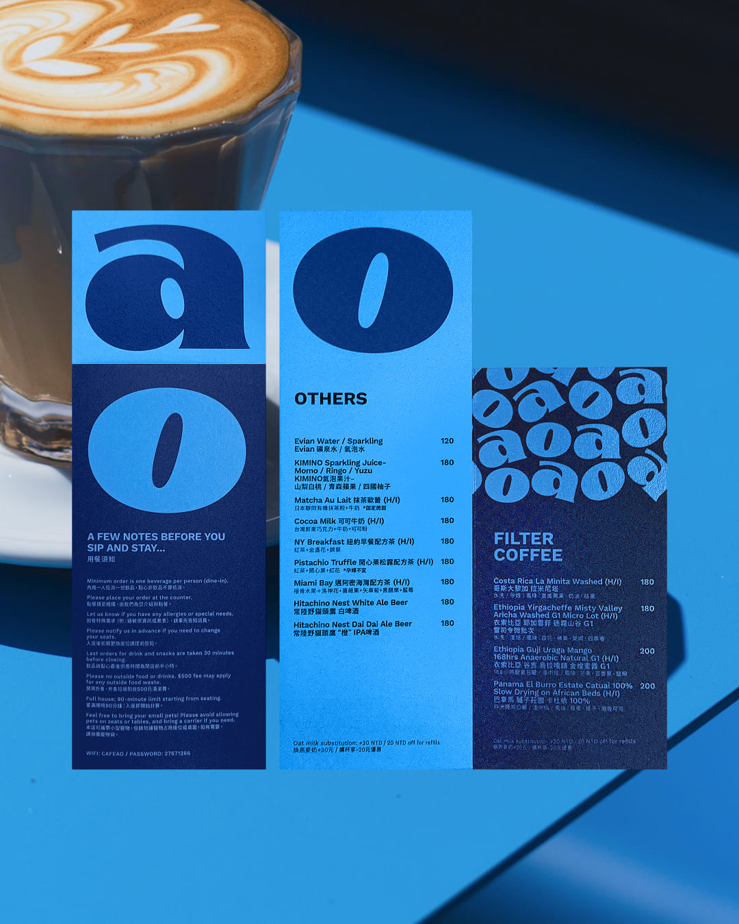
In its extended visual system, repeated use of the blue palette and letterforms creates strong recognition, while the “ao” itself is highly versatile—able to be reimagined across materials and formats. This flexibility makes it more than just a symbol; it becomes a visual language that can evolve through collaborations, installations, packaging, and digital experiences.


CREDIT
- Agency/Creative: Darren Chang
- Article Title: Darren Chang Translates Cafeao’s Blue Sky Vision into a Dynamic Brand Experience
- Organisation/Entity: Freelance
- Project Type: Identity
- Project Status: Published
- Agency/Creative Country: Taiwan
- Agency/Creative City: Taipei
- Market Region: Asia, Global
- Project Deliverables: Art Direction, Brand Design, Brand Identity, Branding, Creative Direction, Graphic Design
- Industry: Food/Beverage
-
Credits:
Visual Identity: Jou Li
Visual Identity: Darren Chang
Motion Graphic: Yiting Hsieh


