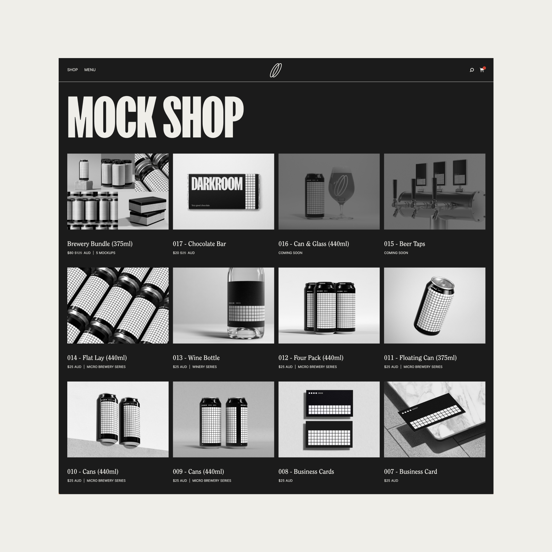
Darkroom develop high quality mockups for graphic designers, studios & start-ups.
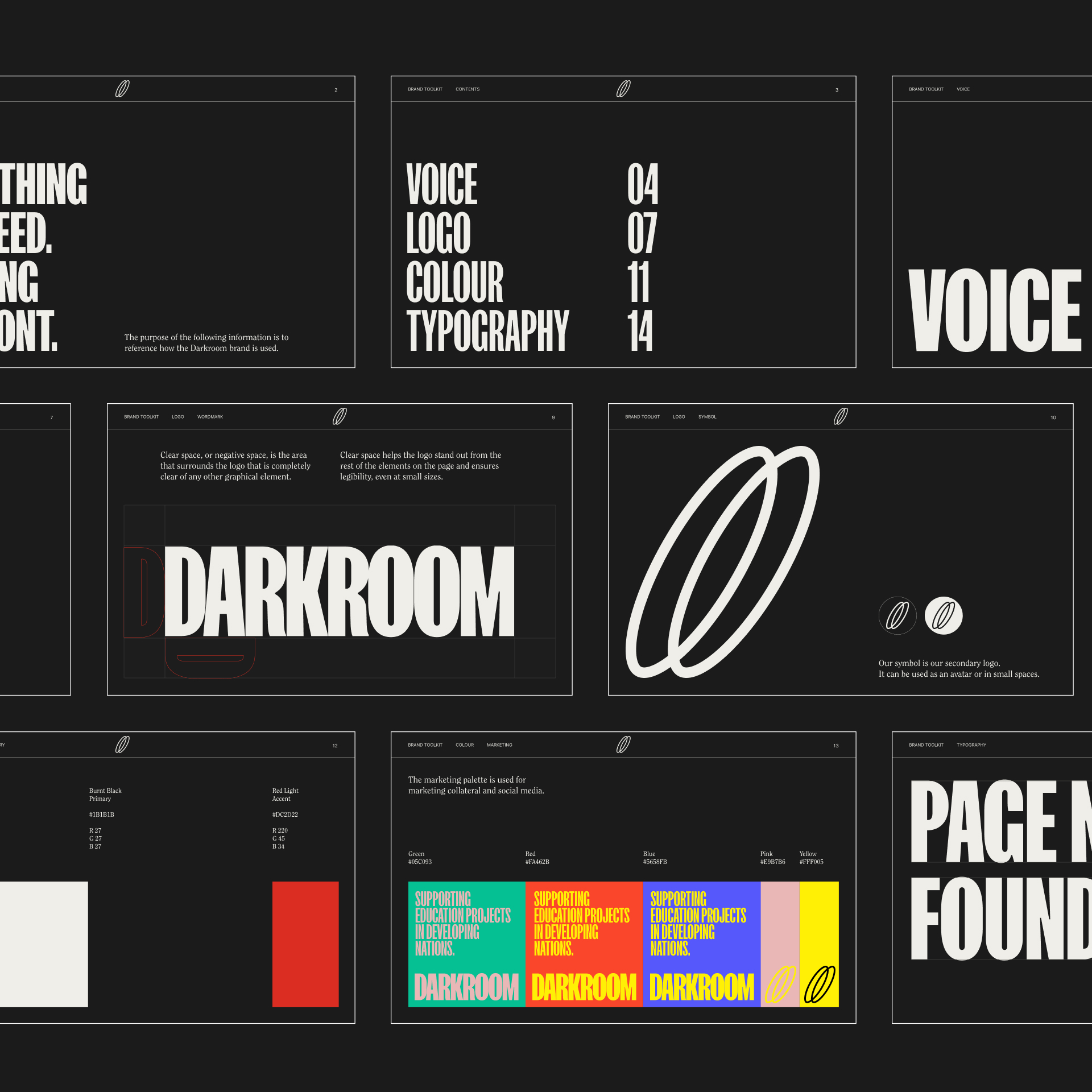
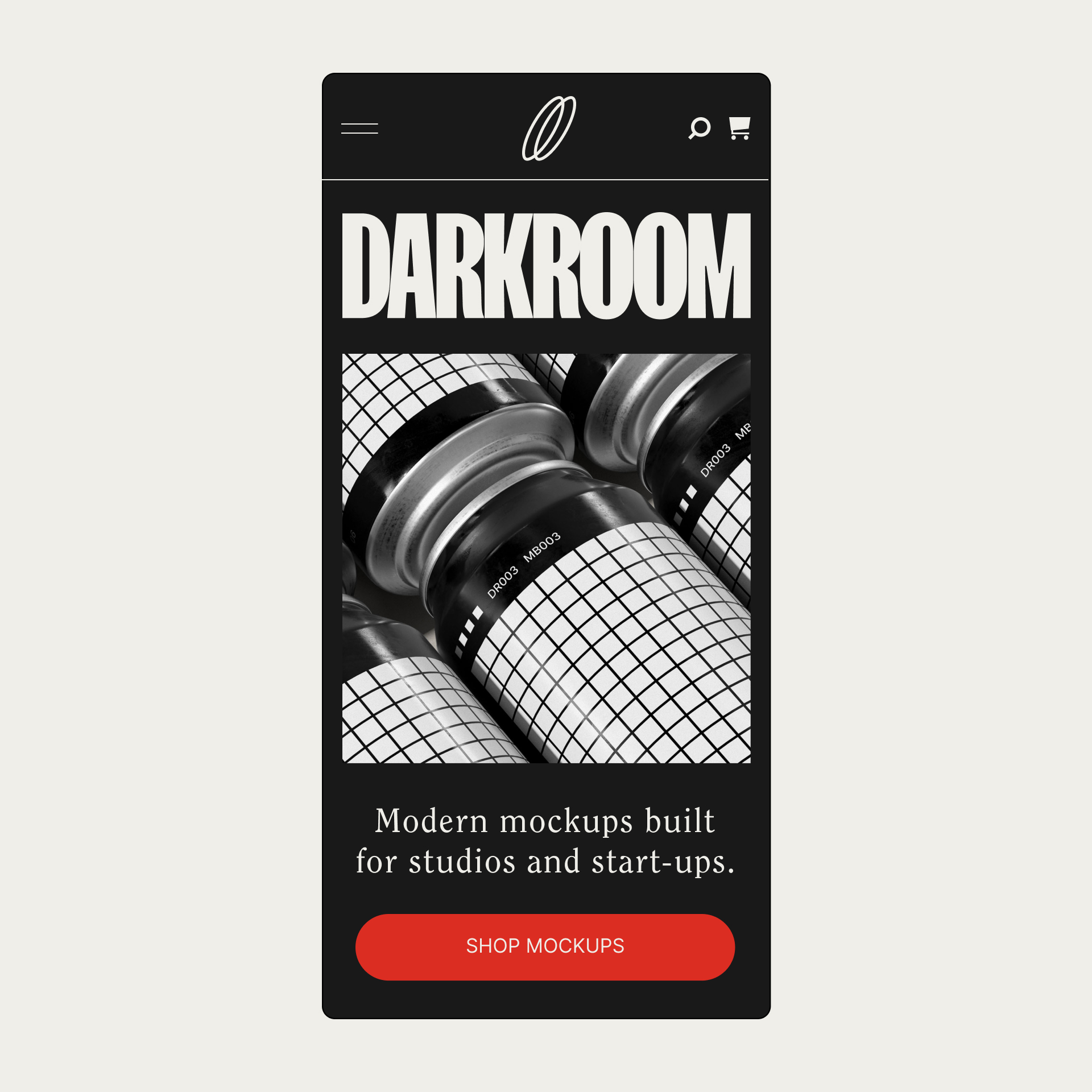
Drawing inspiration from 1970’s film photography, we developed a cinematic, restrained design system.
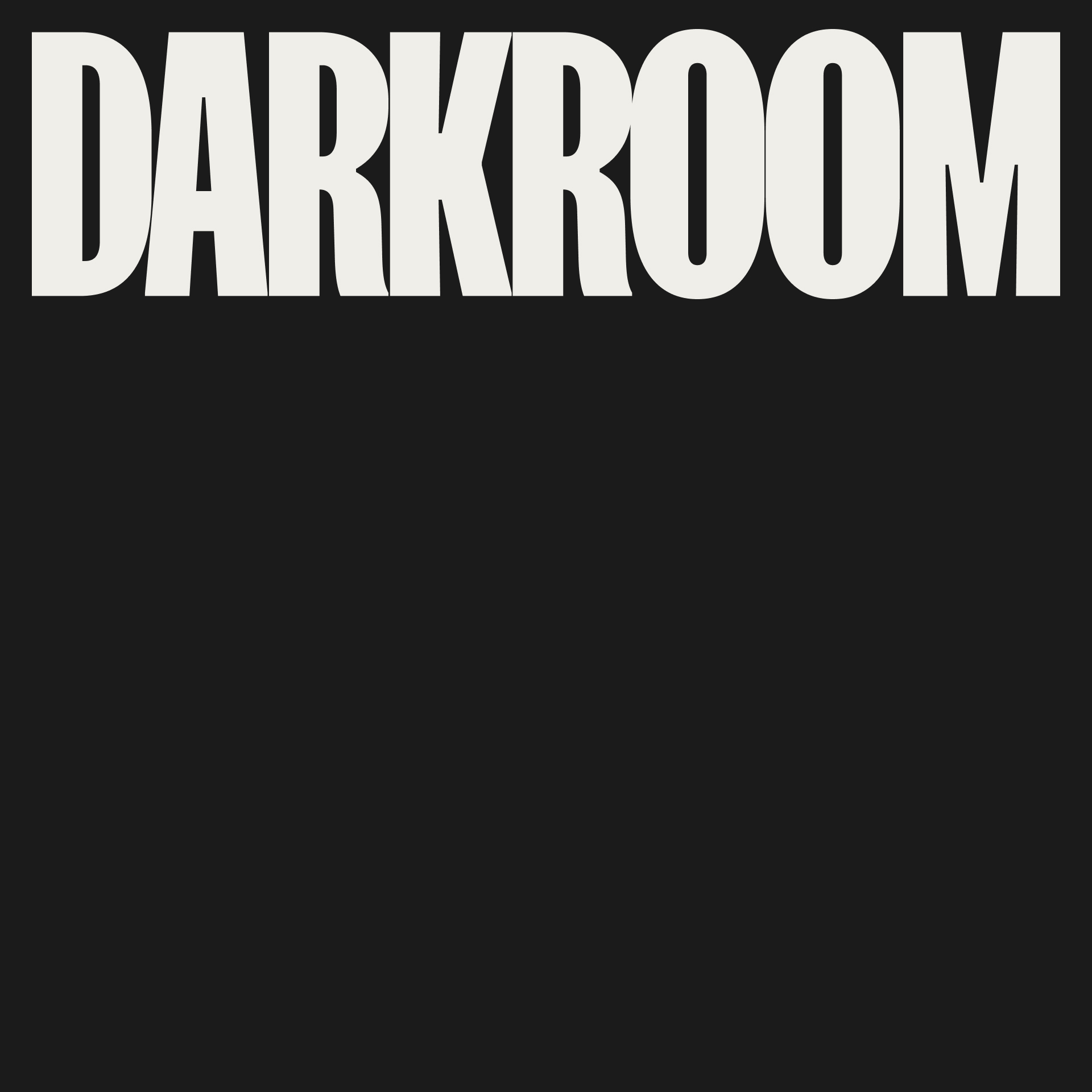
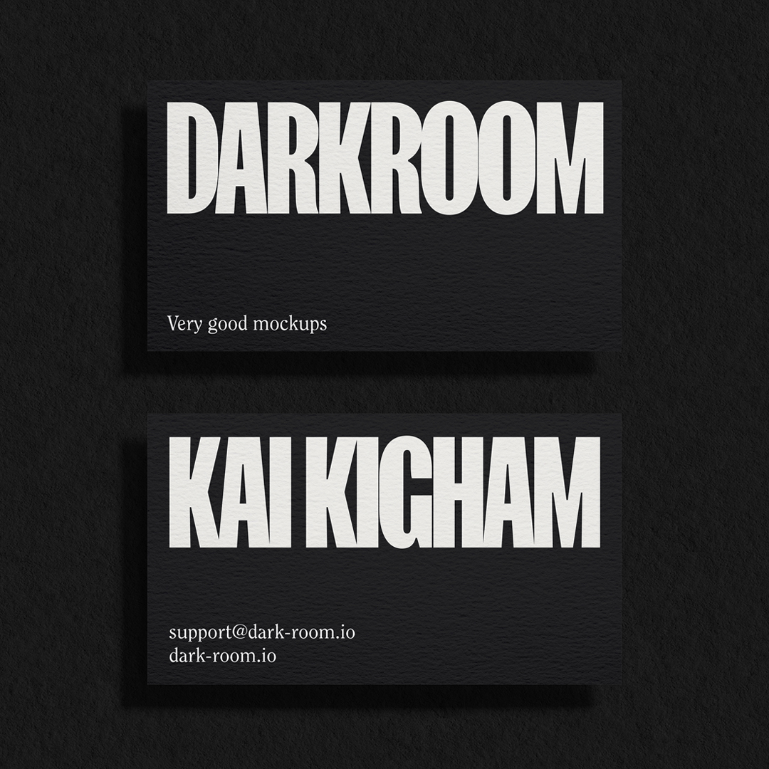
The wordmark, set in FK Screamer with tight tracking, is a bold statement designed to disrupt the mockup landscape. By contrast, the secondary typeface ITC Clearface, is an elegant timepiece of the 70s – helping give the brand a timeless sense of integrity.
The default product texture, a series of uninterrupted white squares, is a nod to analogue contact sheets – further tying the brand to the overarching photography motif. The repetition of the shape alludes to the iterative nature of building mockups out of 3D.


CREDIT
- Agency/Creative: The Child in Me
- Article Title: Darkroom Brand Identity
- Organisation/Entity: Agency
- Project Type: Identity
- Project Status: Published
- Agency/Creative Country: Australia
- Agency/Creative City: Melbourne
- Market Region: Global
- Project Deliverables: Brand Identity, Brand Naming, Web Design
- Industry: Technology
- Keywords: mockups
-
Credits:
Designer: Kody Deretic
3D Artist: Kai Higham
FEEDBACK
Relevance: Solution/idea in relation to brand, product or service
Implementation: Attention, detailing and finishing of final solution
Presentation: Text, visualisation and quality of the presentation


