Darkbright Apparel came to us with a very specific journey in mind. They wanted to create a clothing brand for very specific types of people, and have the company be more than just selling t-shirts. Like a lot of businesses these days, they wanted it to have meaning and do some good for people and planet.
Being raised through the 90’s/early 2000’s and being heavily into the skateboard and rock music scene, they saw and felt the sterotypes associated with being part of those groups. Being looked down on and not readily accepted in society despite being a strong, friendly and loyal community, Darkbright’s desired target audience was to be skaterboarders, rockers, punks and those within ‘tattoo communities’. Although these scenes are more accepted in todays world, the experiences are very much still a part of who they are and so they wanted to live their dream of designing and selling their own clothing brand specifically for those “looked down on” communities.
The ‘doing good for people and planet’ concept was two fold. 1. Most importantly, there are people who do not have access to the lowest, most basic human needs—clean drinking water, food, clothing and shelter—and they wanted to be part of helping improve that. 2. As a by-product of the target audience in mind they wanted to double down on the proof that these “looked down on” communities are kind, loyal, friendly, passionate people who help each other and have the power to make positive change!… and they wanted to give a bit of a ‘F*** You’ to anyone who thinks otherwise.
With the purpose and target audience established we set to work developing a full brand strategy—mission, vision, buyer personas, value proposition, market position, tone and voice, and messaging—before getting into the aesthetics of the brand.
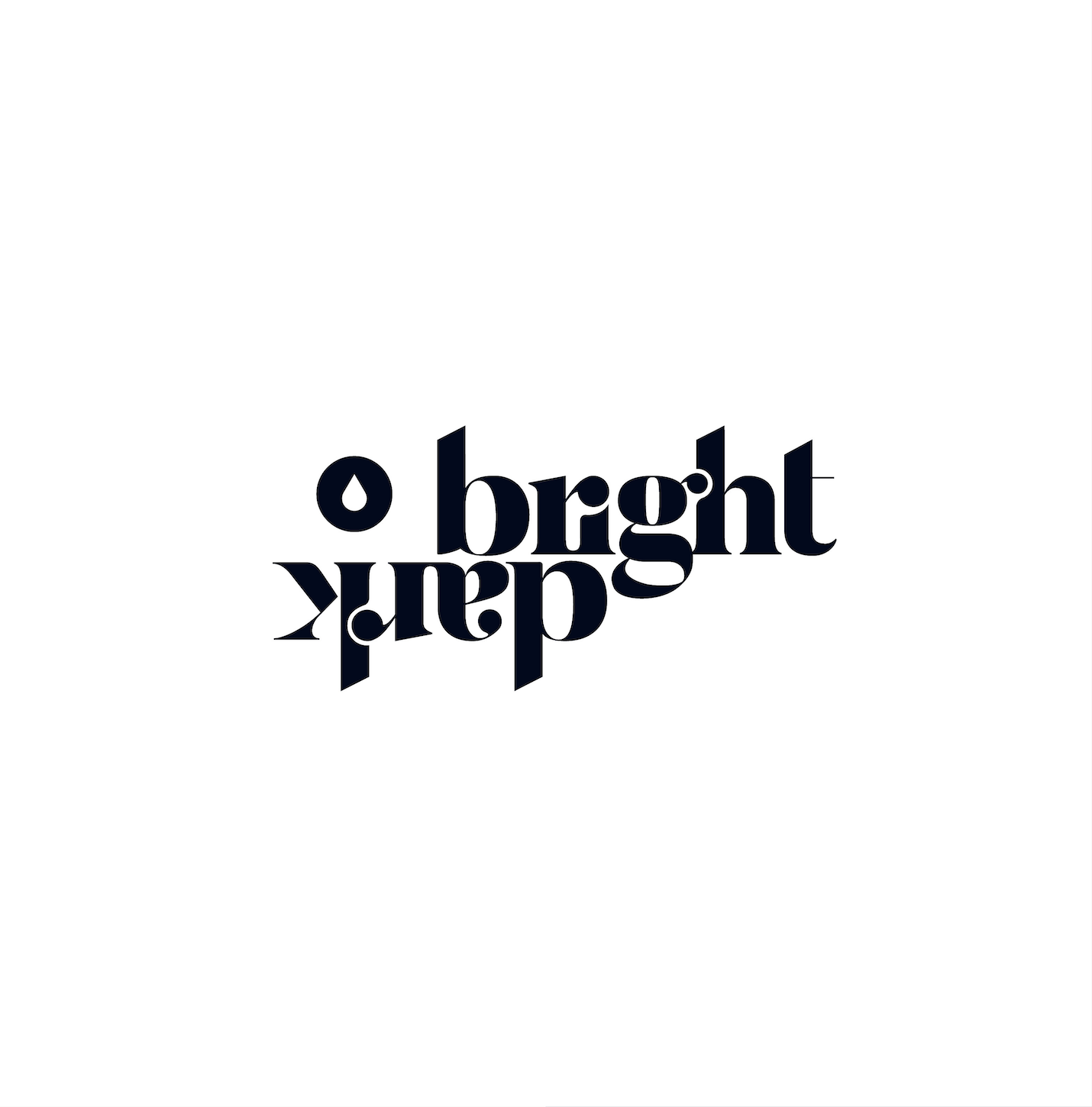
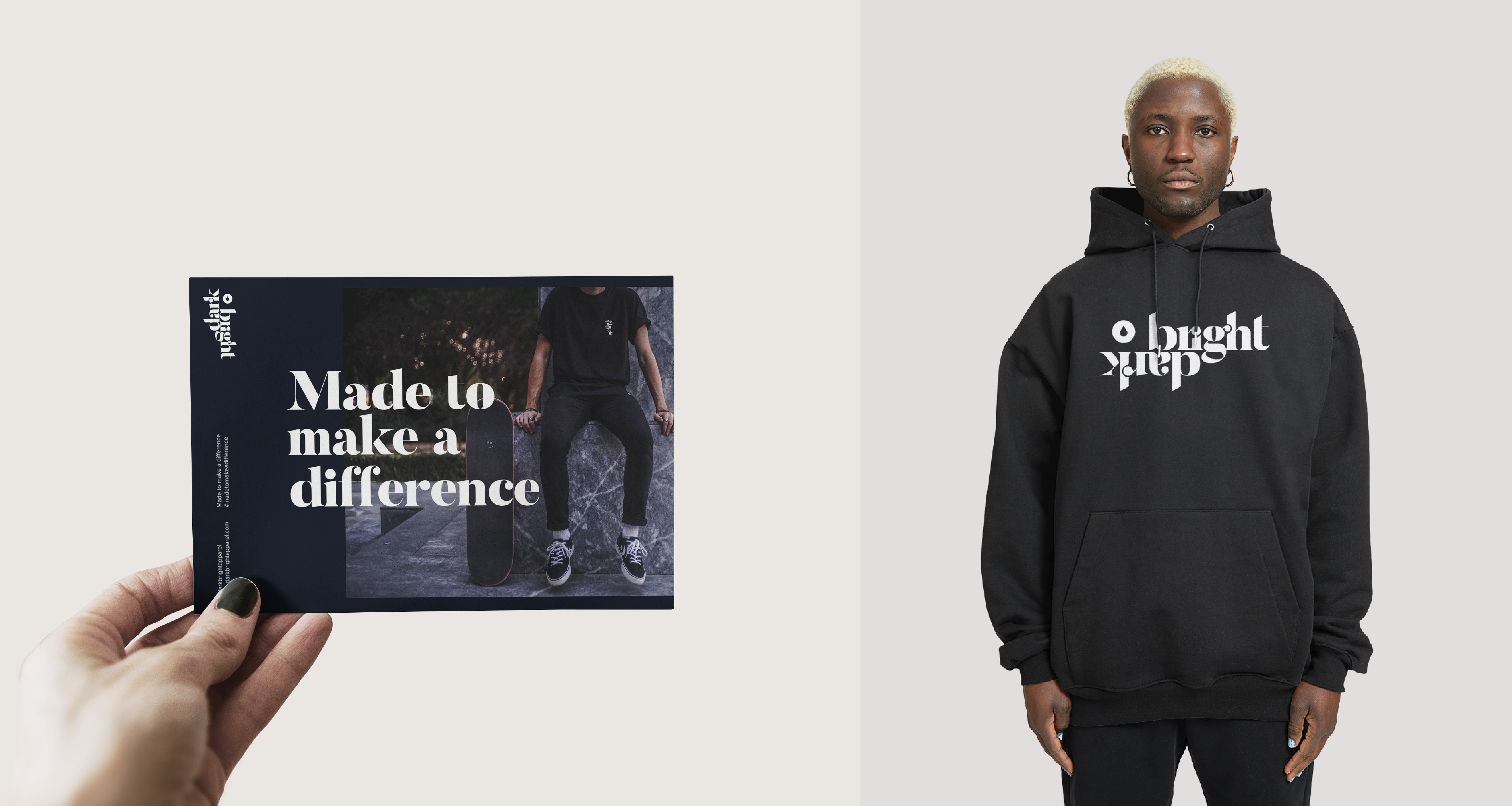
The name Darkbright is based around the entire existance of the business, which is helping people in “darker” times of life feel “brighter” in their lives, their circumstances, and within themselves, and we used that concept to design the logo. We also developed the tagline: ‘Made to make a difference’ which really emphasizes that the business was created with more in mind than just selling t-shirts.
Wanting to be a “cleaner cut” option for skaters and musicians we found a modern serif that has broad strokes contrasted with thin strokes, and interesting shapes to touch upon the aesthetic of something darker or more traditional, but in a deeper, modern, unique way. This was especially brough to the forefront with the break down and positioning of ‘dark’ and ‘bright’. The word ‘dark’ was positioned upside down and backwards underneath the word ‘bright’ to symbolize the rising of brighter hope and brighter spirits within those that they are able to help. The icon itself shows a water droplet, symbolizing that every effort helps no matter how small, water is the nurturing of life, and it also hints towards water being the first initial cause they wanted to help with before it grew and bled into including food, clothing and shelter.
The wordmark was edited and adjusted to create connections and cut-aways unique to itself and provide a separation from the chosen font, but the original font for consistency was used for all headlines throughout the site and the brand, with a modrn sans serif for the main body copy for clear legibility and contrast.
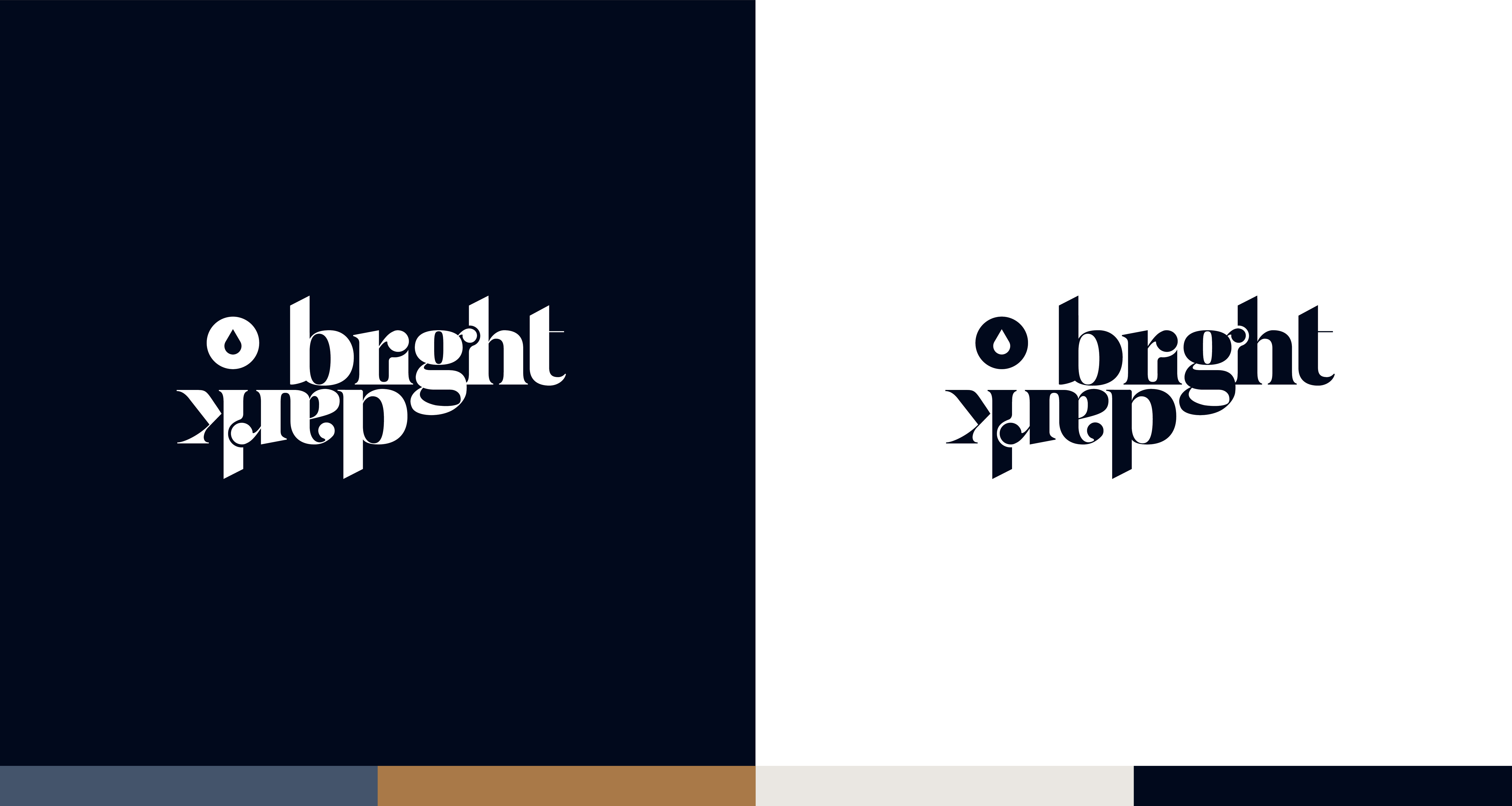
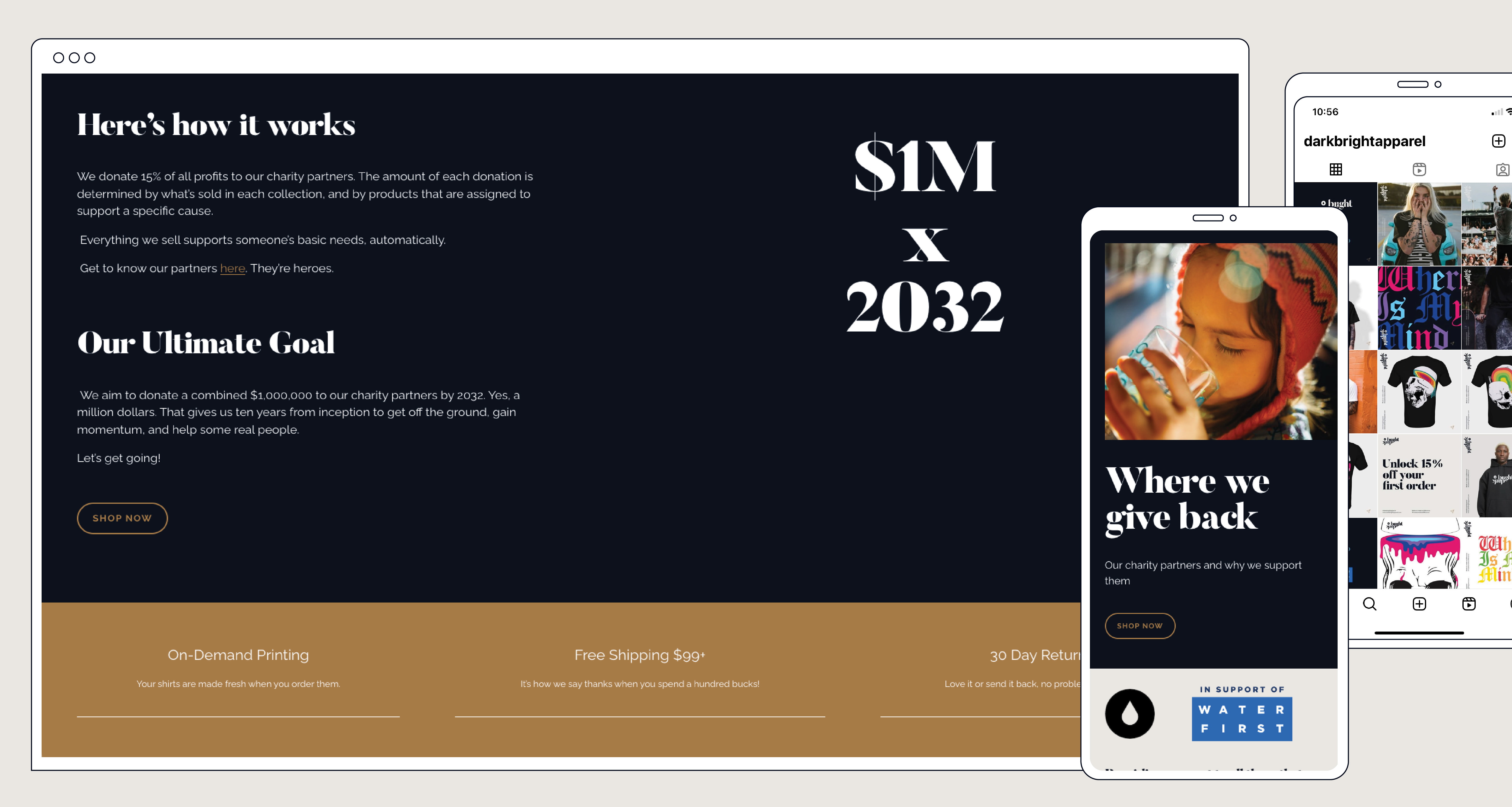
The colour palette had to take into account the aesthetic of a clothing brand without losing the connection to it’s cause, and so we developed a dark navy blue mixed with an off white (dark + bright). Pure white was too stark and abrupt and there needed to be a warmer, softer touch to the brand which is why the off-white/beige colour was developed. Keeping it a simple palette we developed a colour specific for CTA’s and small highlights. This colour is a ‘gum’ colour, which connects itself to a common sole colour in skate shoes.
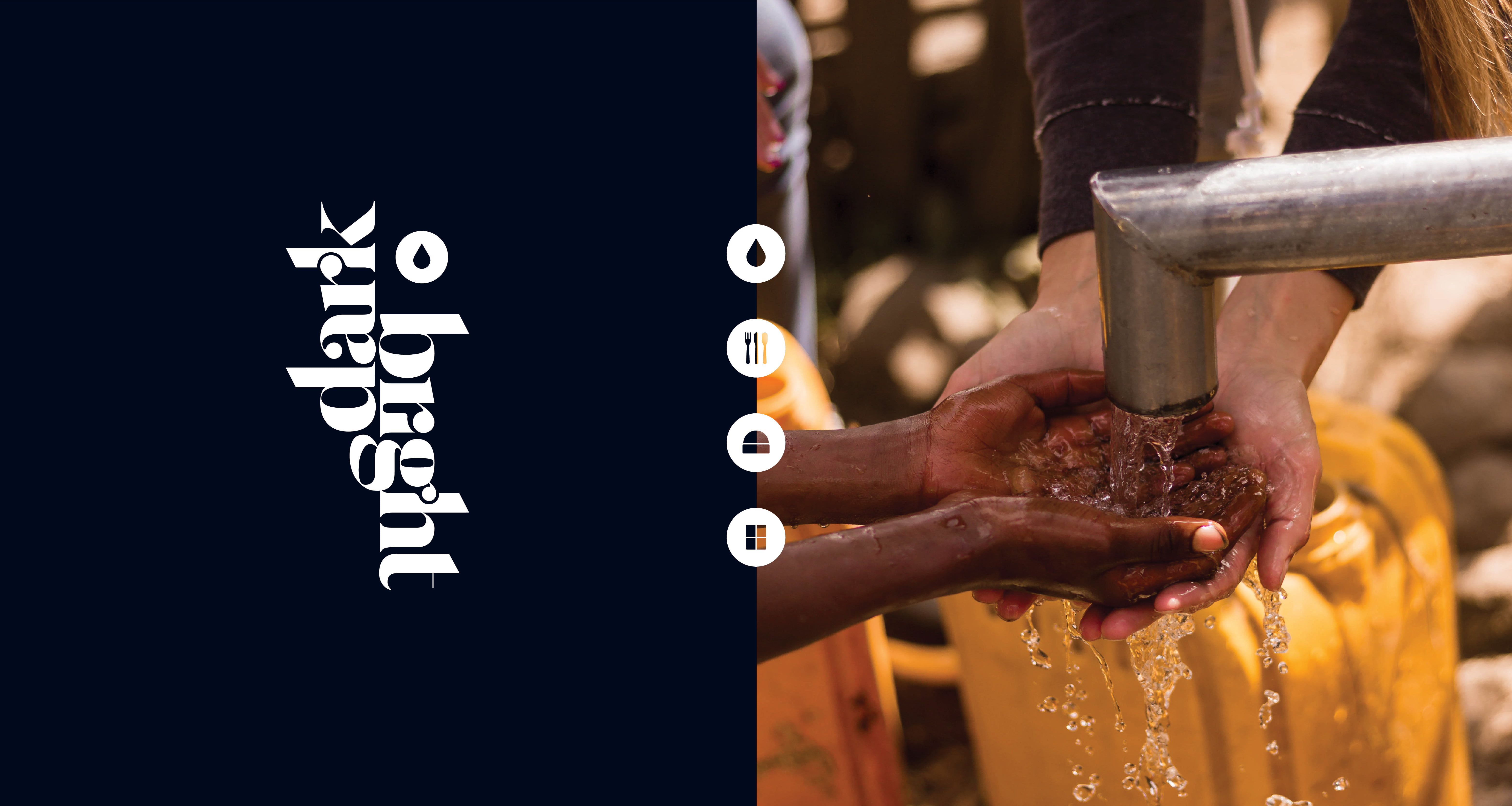
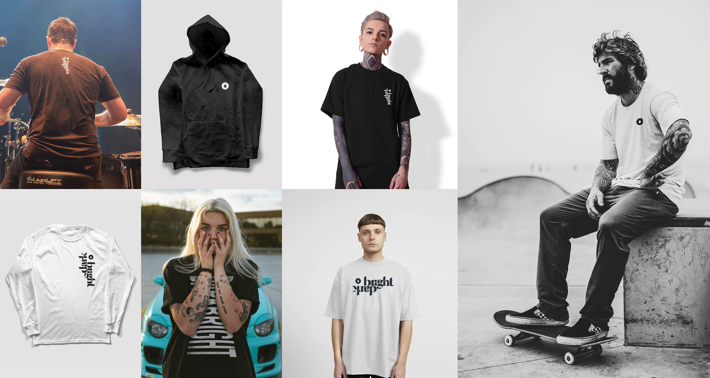
Other custom icons were created to represent water (within the logo), food, clothing and shelter, and the imagery style has three directions that pull together the full story — 1. Products: clean, simple, flat products alone, OR products being worn by straightfaced models. Nothing distracting. 2. Someone wearing the darkbright clothing either playing a music show, skateboarding, or simple holding the right vibe with tattoos to bring a level of reatability to the target audience. 3. Imagery of giving back, the results of giving back, the happiness of people being helped. These three imagery directives present the mood of the brand AND the purpose behind the brand.
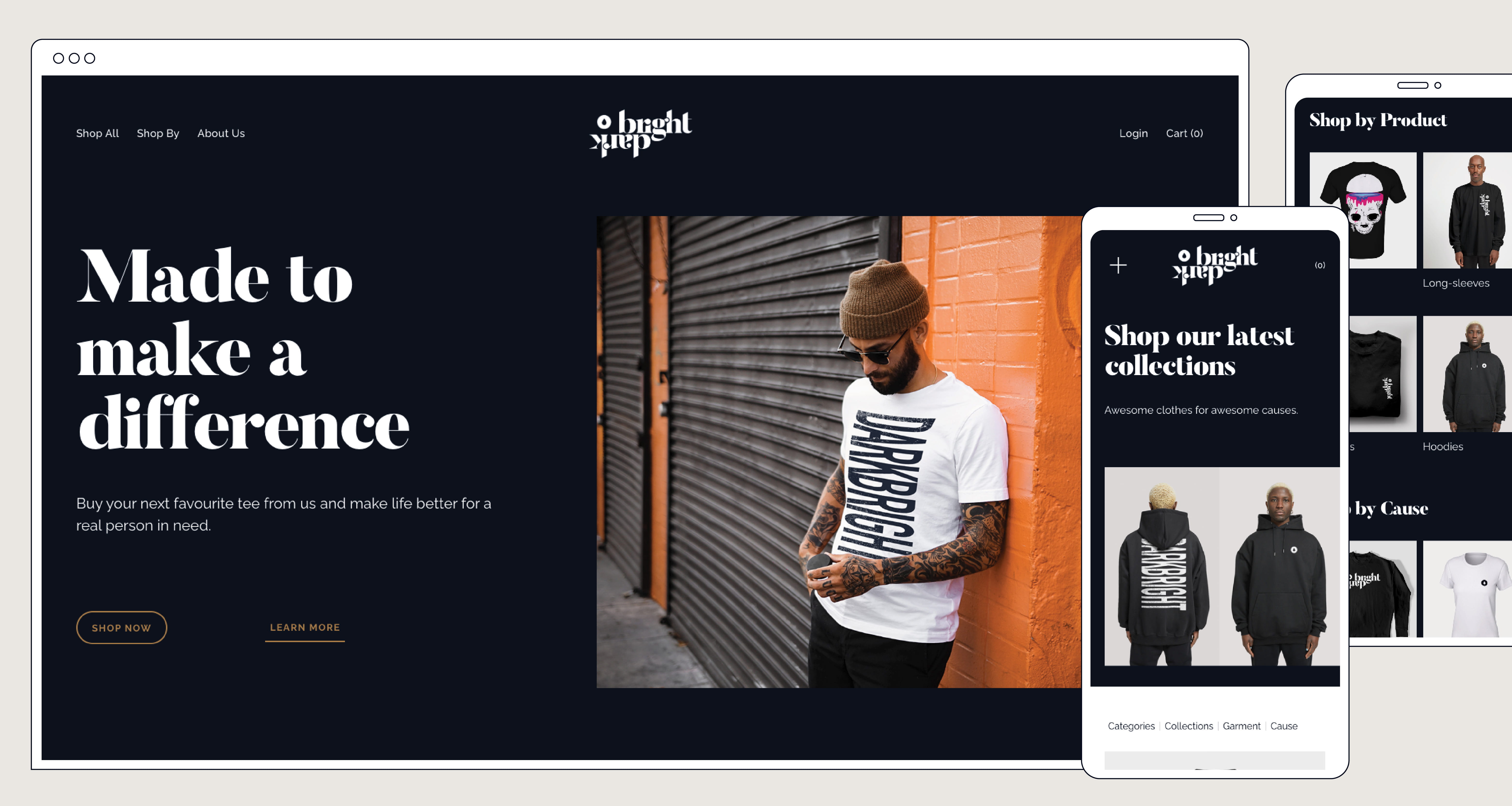
The garment designs themselves and the ability to use the darkbright name outside of the designed logo was purposfully left open. The logo itself should always be present somewhere within a garment design (front, back, sleeve, etc), but the name darkbright can be used to create separate interesting, typographic designs. As long as the design fits the correct vibe and connects with the target audience it is able to be used. The approval process for this lies with the business owners and it is with this guidance that they work with their illustrators to get the right designs out to the world.
Overall the brand is designed to create depth and interest. It connects well with the target audinece and it allows for flexibility and creativity. It was created with layers of purpose and meaning and holds true to the long term goals of the business.
CREDIT
- Agency/Creative: Sunday Roast
- Article Title: Darkbright Apparel Branding
- Organisation/Entity: Agency
- Project Type: Identity
- Project Status: Published
- Agency/Creative Country: Canada
- Agency/Creative City: Kawartha Lakes
- Market Region: North America
- Project Deliverables: Brand Design, Brand Identity, Branding
- Industry: Fashion
- Keywords: WBDS Agency Design Awards 2023/24
- Keywords: Identity, Brand Design Creation
-
Credits:
Design Agency: Sunday Roast


