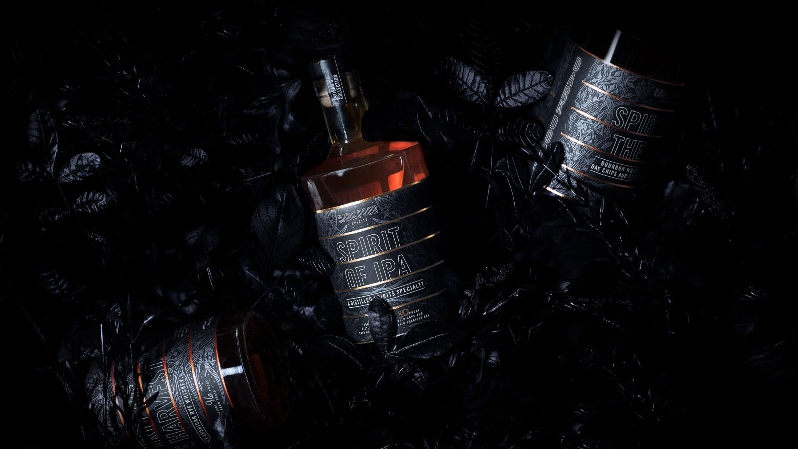
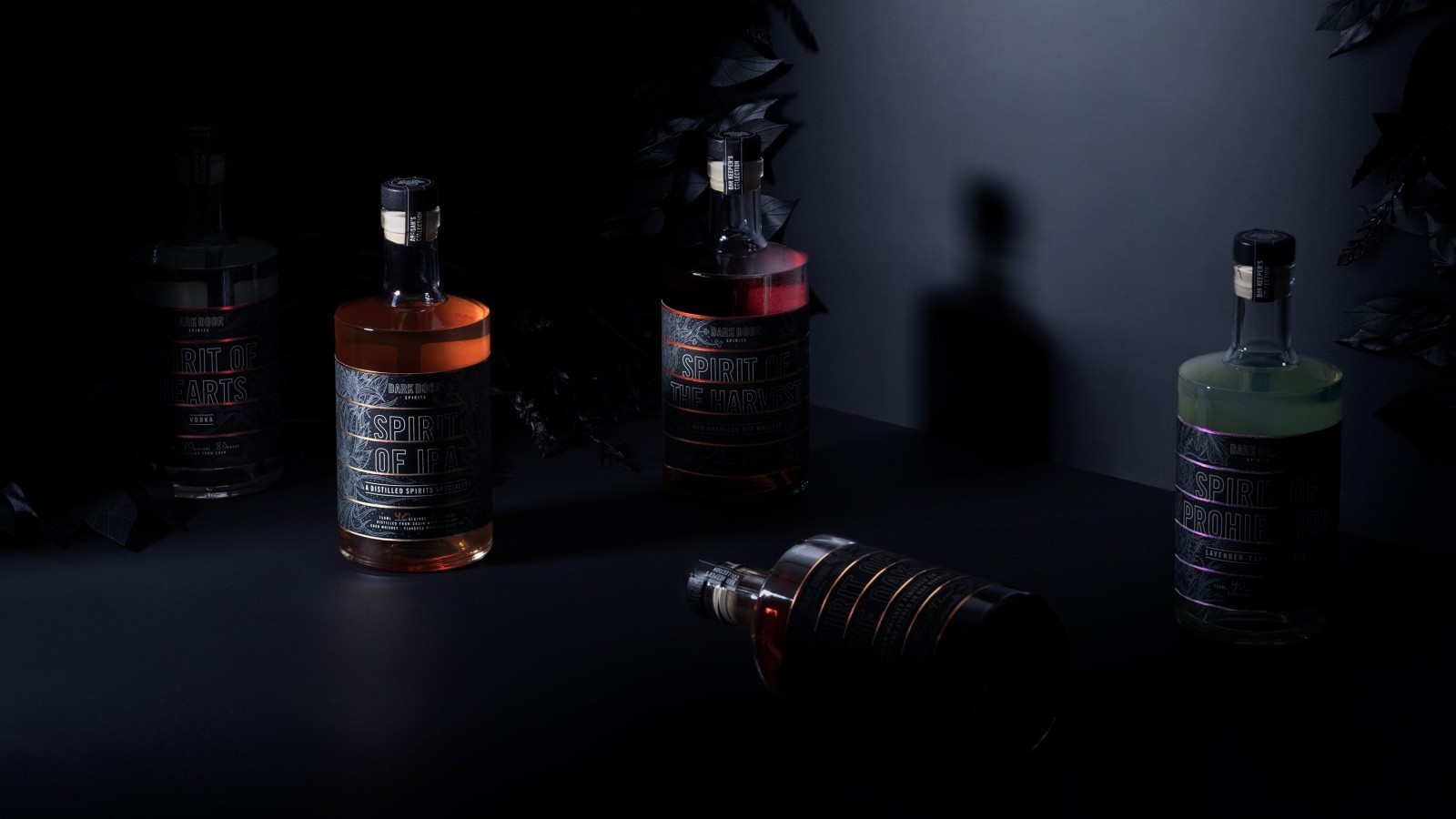
As the spirit world creates within the confines of the status quo, Dark Door Spirits goes the non-traditional route by experimenting with long-forgotten techniques and marrying them with unpredictably inspired ideas. Dark Door’s mission of looking where others won’t led to its cryptic, neon-lit world.
Dark Door needed a logo and identity to represent its brand, along with a packaging system for its core spirits.
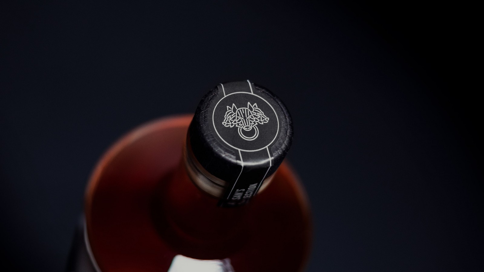
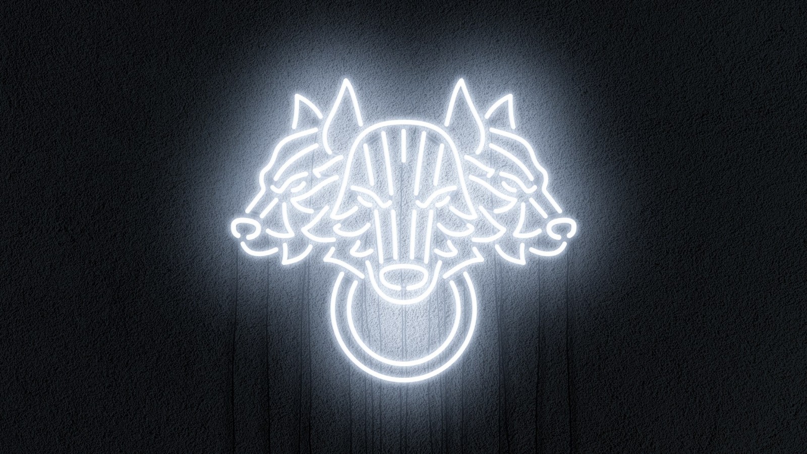
In Greek mythology, Cerberus guards the gates of the underworld to prevent anyone or anything from escaping (a story that will be expanded as the brand grows). Like the Siren, the glowing knocker is meant to lure you in; “Behind this door, it’s anything but ordinary—knock if you dare.”
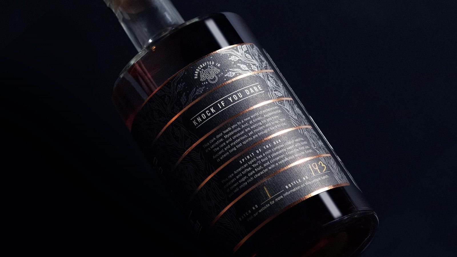
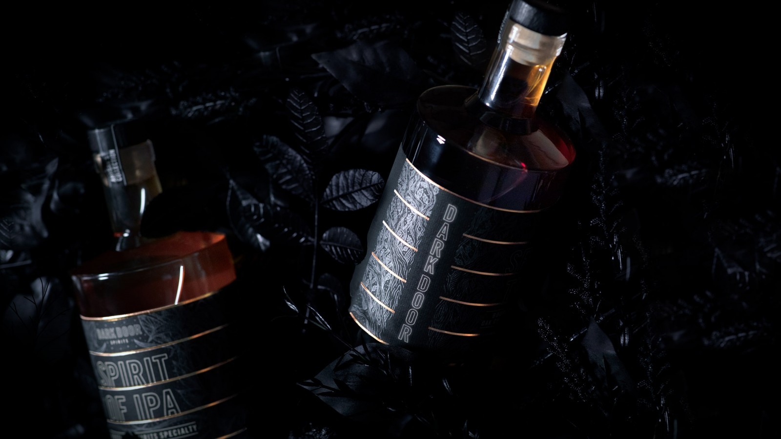
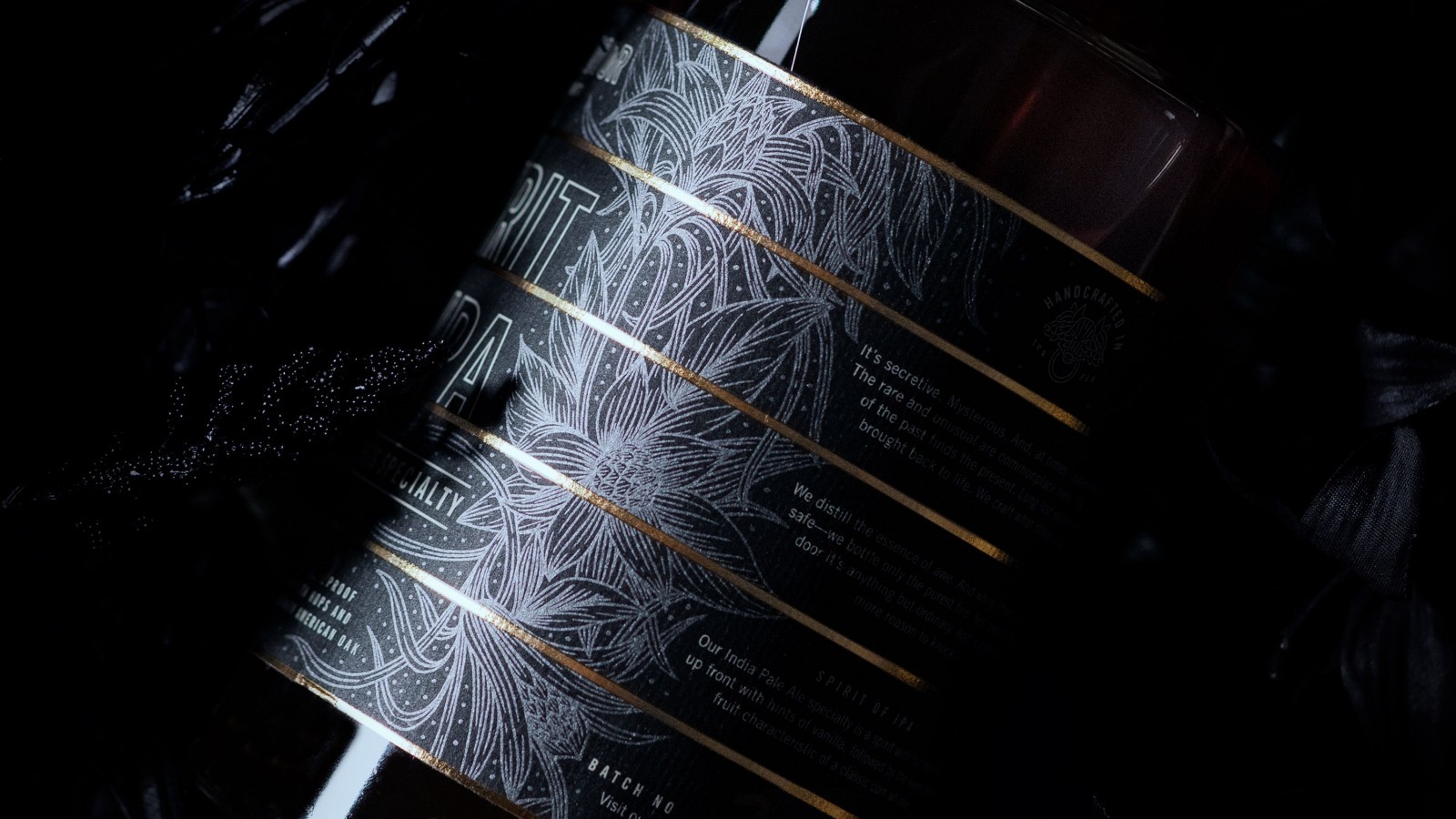
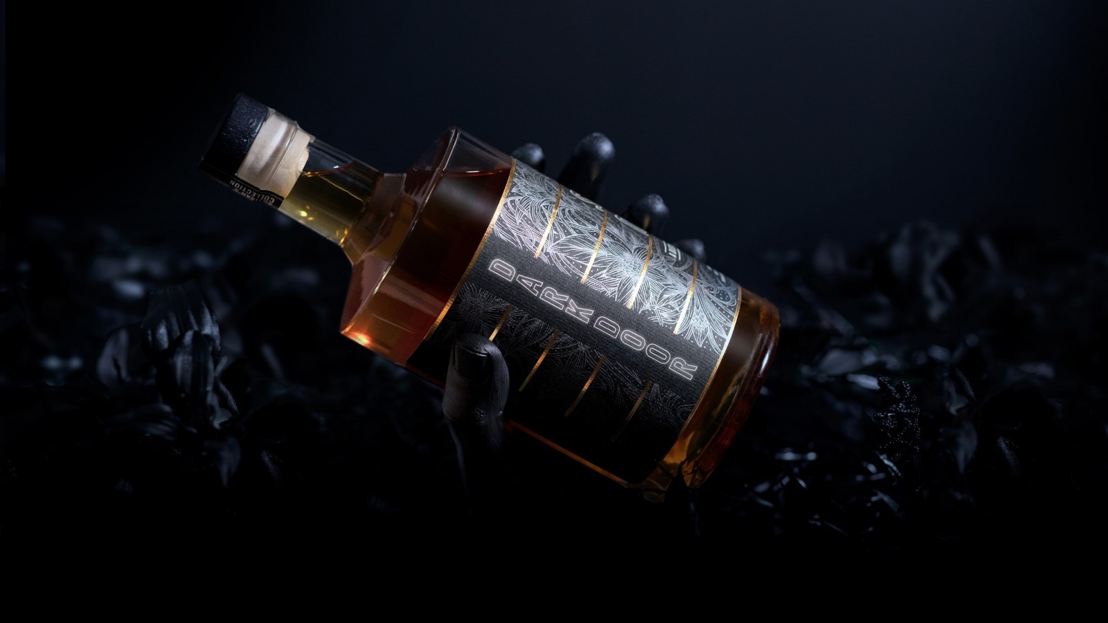
Foil was used to represent the glow of neon in print. On top of just looking cool as hell, foil serves the strategic purpose of creating continuous lines when the bottles are stocked next to each other, helping them stand out among a sea of traditional labels.
The illustrations speak to Dark Door’s experimentation and use of real botanicals. Take a closer look and you’ll see that they’re other-worldly hybrids based on the spirit’s unique ingredients and tasting notes (that’s some real “don’t judge a book by its cover,” subtext there…don’t give this to kids though).
CREDIT
- Agency/Creative: ELNIÑO Studio
- Article Title: Dark Door Spirits Packaging Design by ELNIÑO Studio
- Organisation/Entity: Published Work , Packaging Design Creation
- Project Status: Published
- Keywords: WBDS Creative Design Awards 2020/21


