Concept
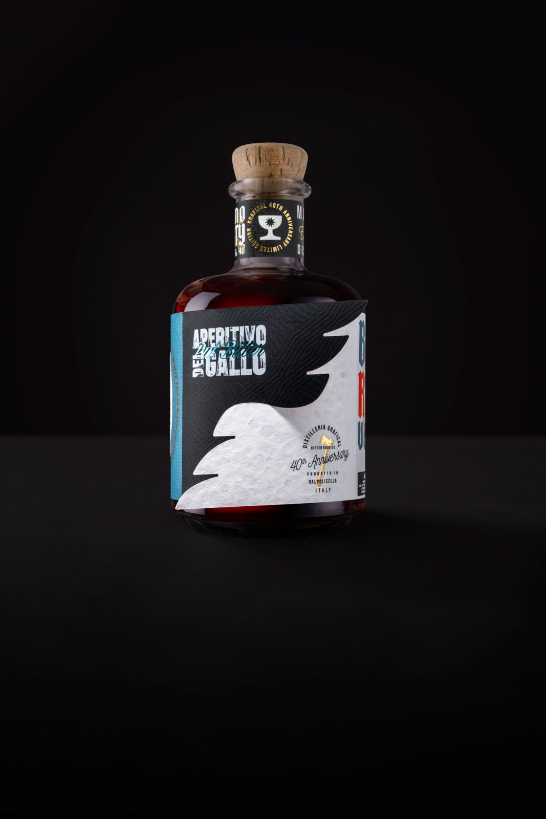
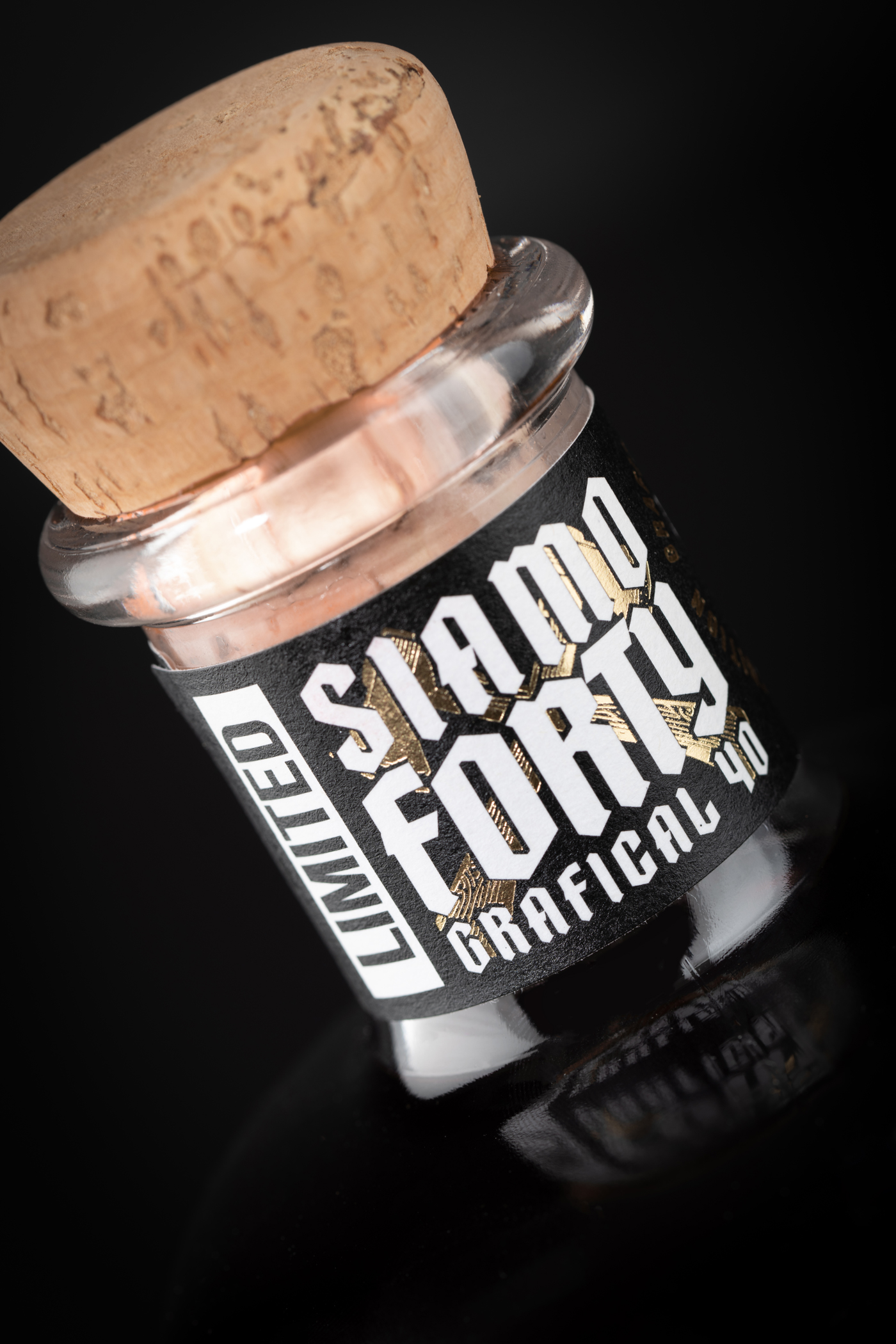
The label for Aperitivo del Gallo Pull Bitter was created to celebrate the 40th anniversary of Grafical, a leading company in the luxury printing and packaging industry based in the heart of Valpolicella, a region renowned for its fine wines. This limited edition is not merely a commemorative product but a symbol of the history, excellence, and creativity that have defined the company over the decades.
The project’s genesis is deeply connected to a pivotal moment in Grafical’s history: the creation of a poster for a concert by the renowned Italian musician Ivan Graziani. This collaboration marked a significant artistic milestone for Elio Lonardi, Grafical’s founder, and represented a turning point for the company, bringing it closer to the worlds of creativity and design. The 40th-anniversary label reflects this legacy, combining visual and conceptual elements that pay homage to music, graphic design, and a passion for high-quality printing.
Graphic Solution
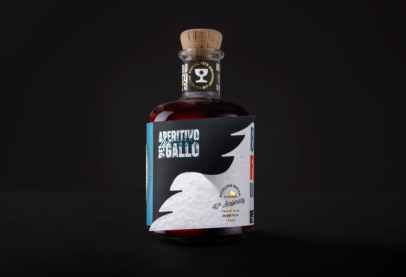
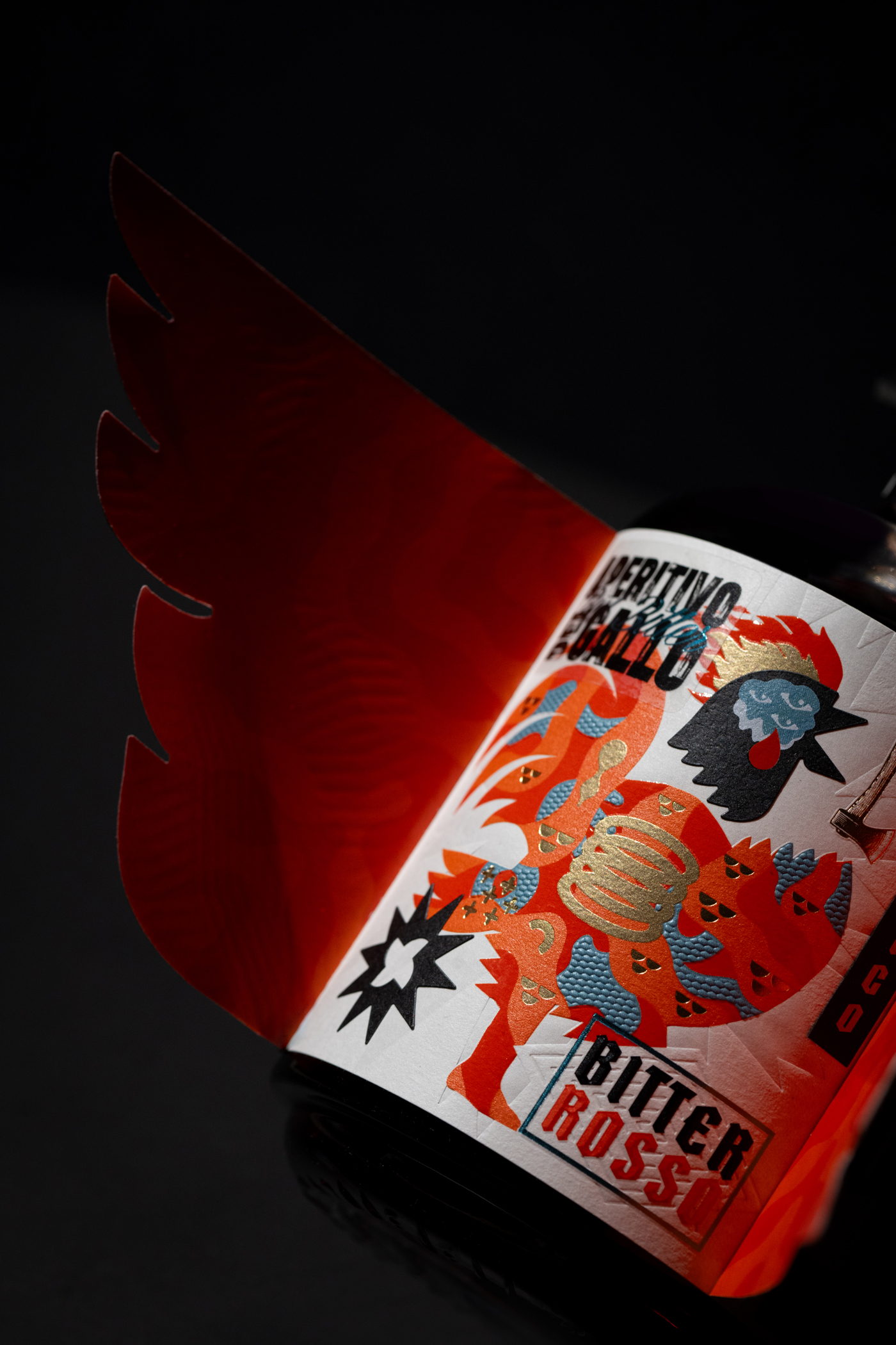
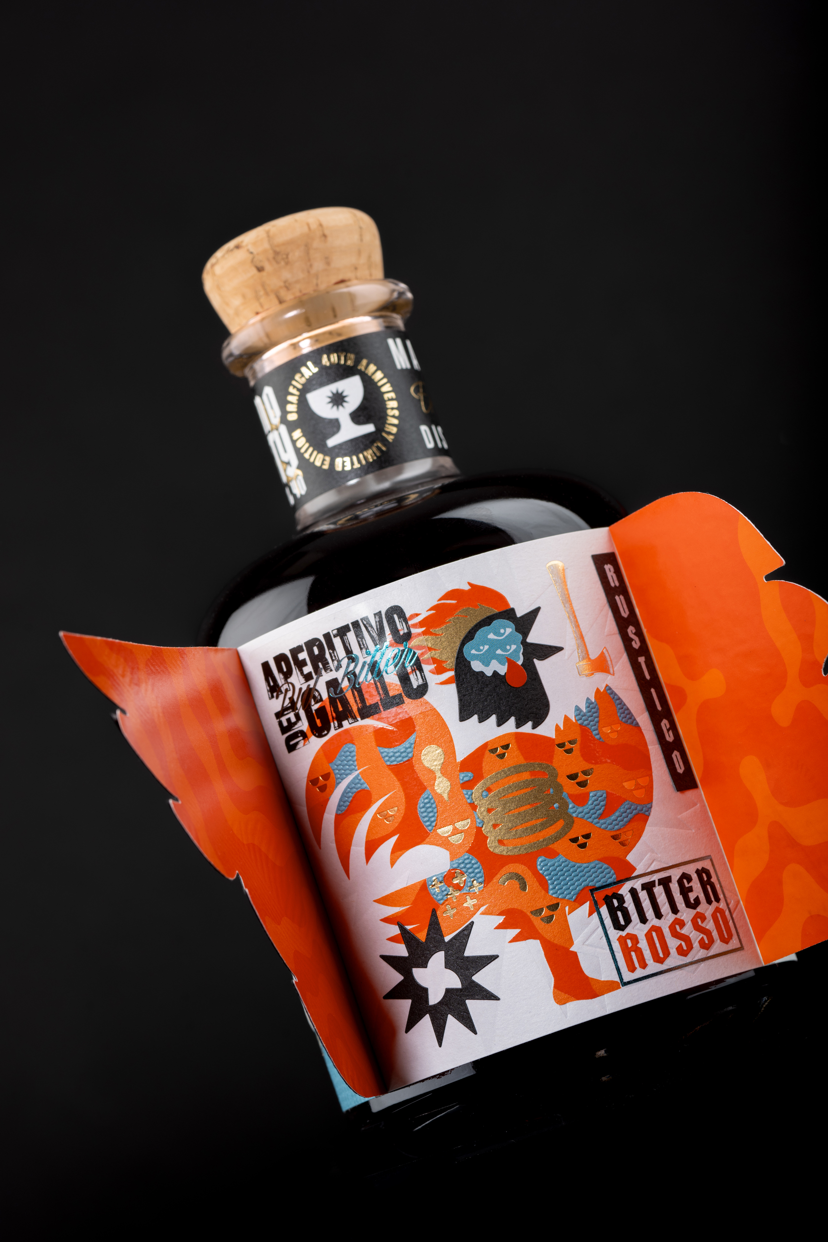
The Aperitivo del Gallo label draws strong inspiration from music, referencing Ivan Graziani’s song Taglia la testa al gallo (Chop Off the Rooster’s Head). The main image—a headless rooster—is a symbol of strength and audacity present across various cultures, reinterpreted here in a minimalist and deconstructed style. The design goes beyond simple illustration, serving as the visual and emotional centerpiece of a product designed to captivate consumers both rationally and subconsciously.
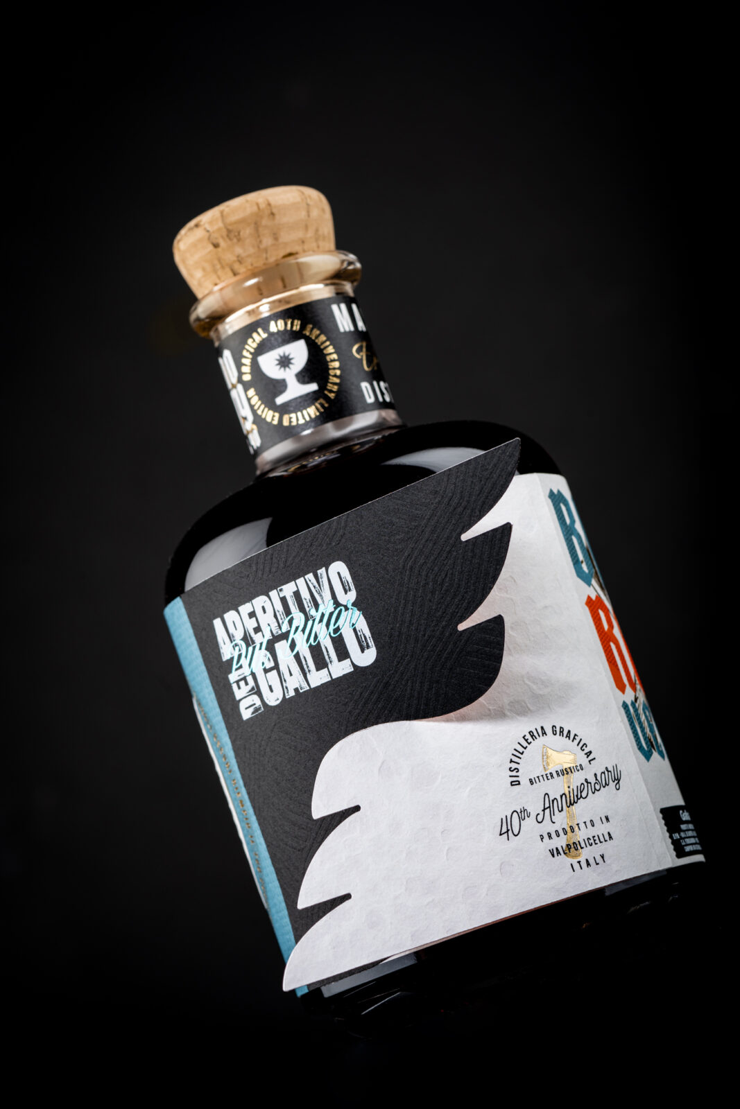
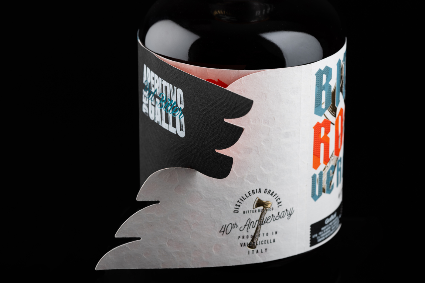
The label was conceived as a three-dimensional, interactive experience, employing layers and folds to enhance the bottle’s circularity. The label is composed of two main layers:
Design
• Outer Layer: Two lateral flaps wrap around the bottle. These sections are designed to grab the consumer’s attention and spark curiosity. The flaps, which can be opened, conceal and reveal the main label, transforming the act of “discovering” the label into a playful experience.
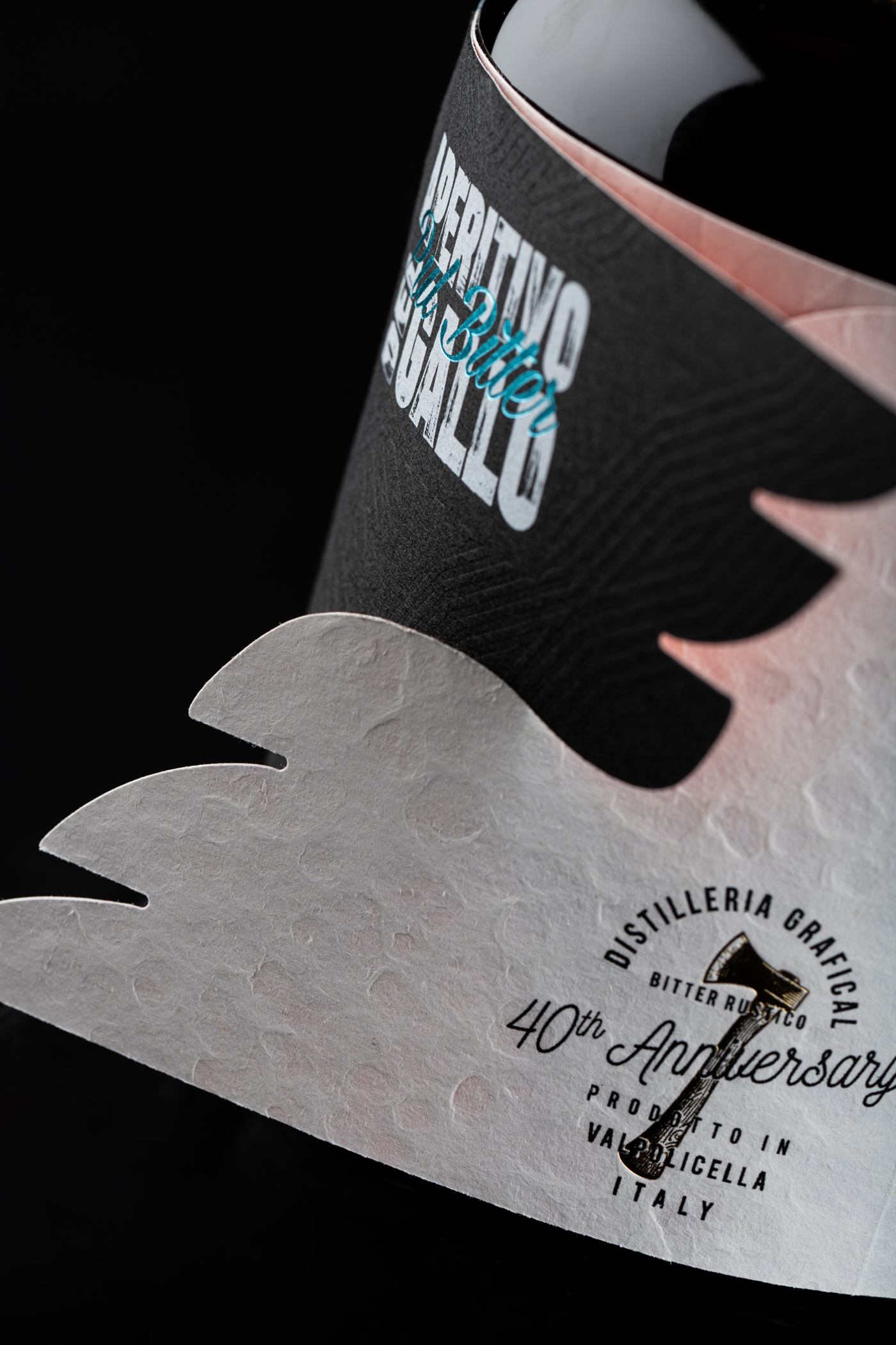
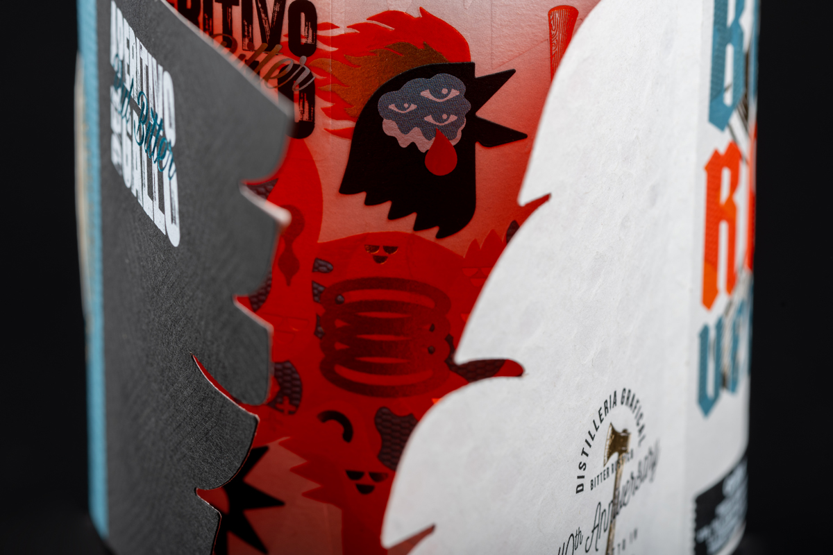
• Inner Layer: The main label is revealed when the flaps are opened. Its design changes depending on how the consumer folds the flaps, offering a dynamic and mutable visual perception.
This deconstruction of the layout ensures that the label is not a static element but rather a true “label in motion,” changing its appearance and inviting consumers to interact with the product.
3. Neuromarketing and Multisensory Engagement
The project integrates neuromarketing techniques to maximize the product’s appeal and brand recall:
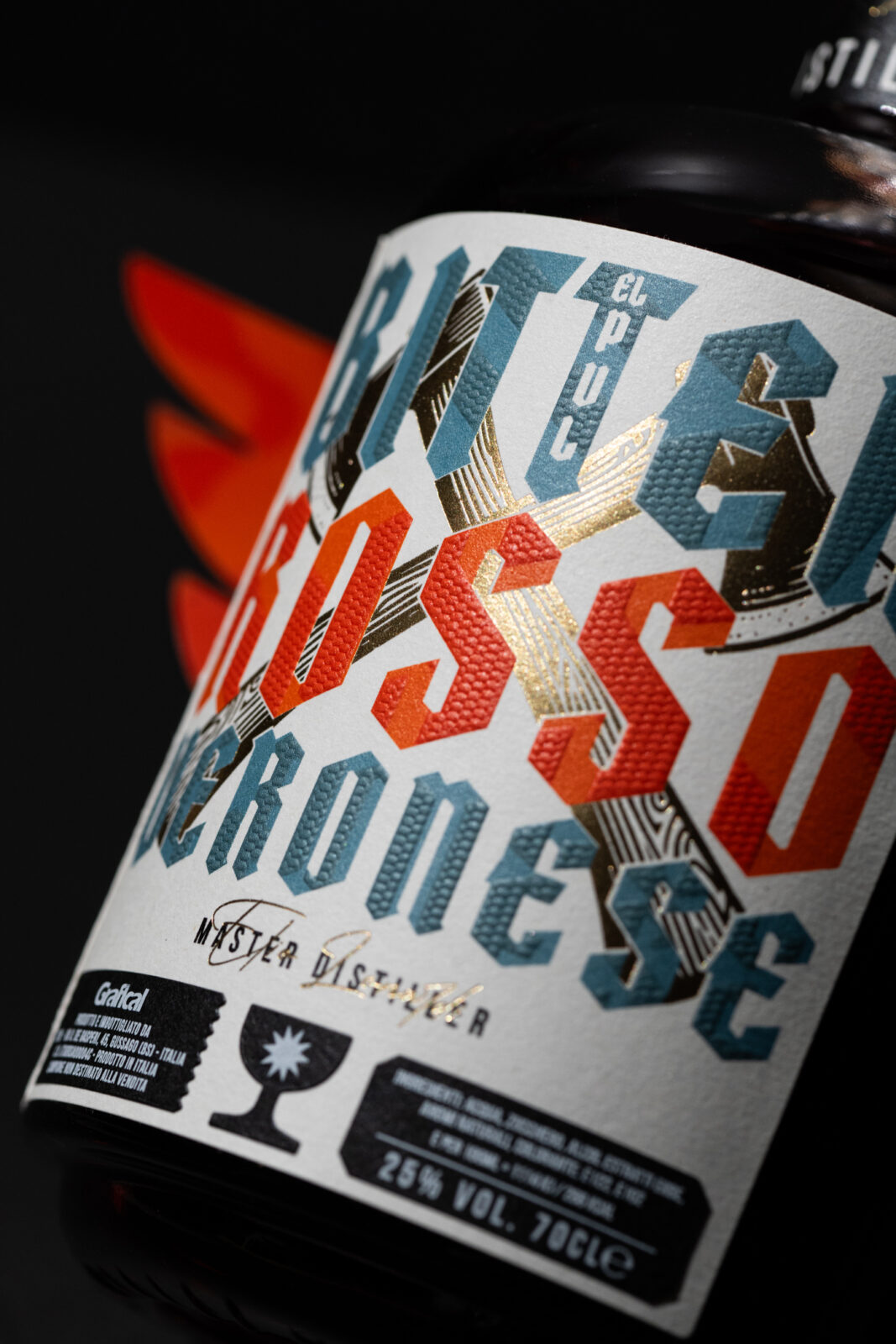
• Visual Contrasts: Strong chromatic and graphic contrasts create an immediate impact, drawing the consumer’s gaze on the shelf.
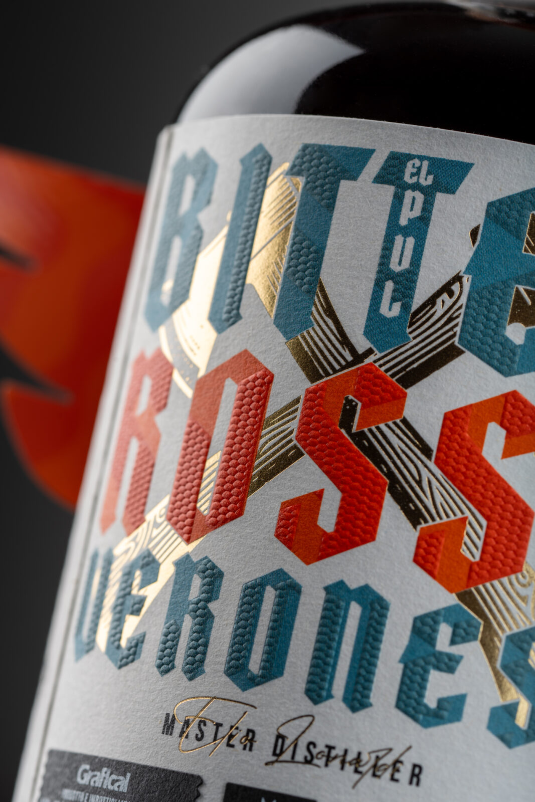
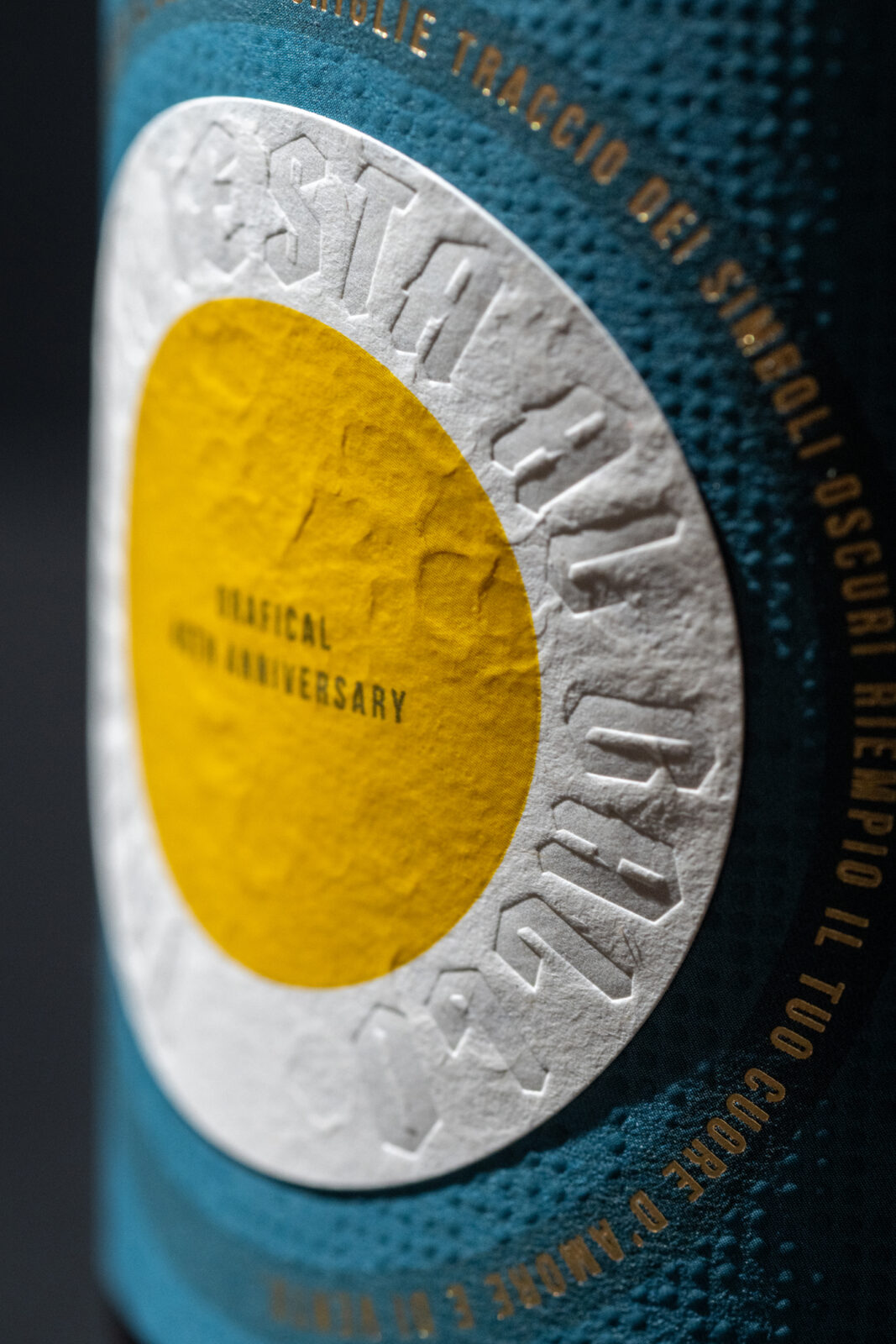
• Tactile Contrasts: The use of different paper layers and materials provides a rich sensory experience. The surfaces range from smooth to rough, encouraging memorable physical interaction.
• Dynamic Interaction: The ability to manipulate the label, fold the flaps, and discover different configurations engages the consumer on a playful and cognitive level, increasing the time spent with the product and fostering emotional attachment to the brand.
4. Circularity
The label is designed to emphasize the circularity of the bottle. The lateral flaps, when folded differently, create visual effects that allow unique configurations. Depending on how they are opened, consumers discover various elements, making each interaction personalized. This dynamic and innovative approach transforms the bottle into an interactive object capable of telling a different story with every manipulation.
Aperitivo del Gallo is not just a label but a sensory, emotional, and playful experience. Through the combination of minimalist design, neuromarketing techniques, and interactivity, the project establishes a deep connection with consumers, leveraging cultural symbolism, deconstructed aesthetics, and multisensory engagement. The bottle transcends its role as a simple container, becoming a medium of creative expression that stimulates curiosity and emotional connection.
CREDIT
- Agency/Creative: Dario Frattaruolo , Anna Lonardi
- Article Title: Dario Frattaruolo Reinvents Label Design for Aperitivo del Gallo’s 40th Anniversary
- Organisation/Entity: Creative
- Project Status: Published
- Agency/Creative Country: Italy
- Agency/Creative City: Viareggio
- Market Region: Italy
- Project Deliverables: Illustration, Label Design, Packaging Design
- Industry: Food/Beverage
- Keywords: WBDS Creative Design Awards 2024/25 Label; luxury; packaging; beverage; bitter; limited edition; anniversary
- Keywords: WBDS Creative Design Awards 2024/25 Label; luxury; packaging; beverage; bitter; limited edition; anniversary
-
Credits:
Quality manager: Anna Lonardi


