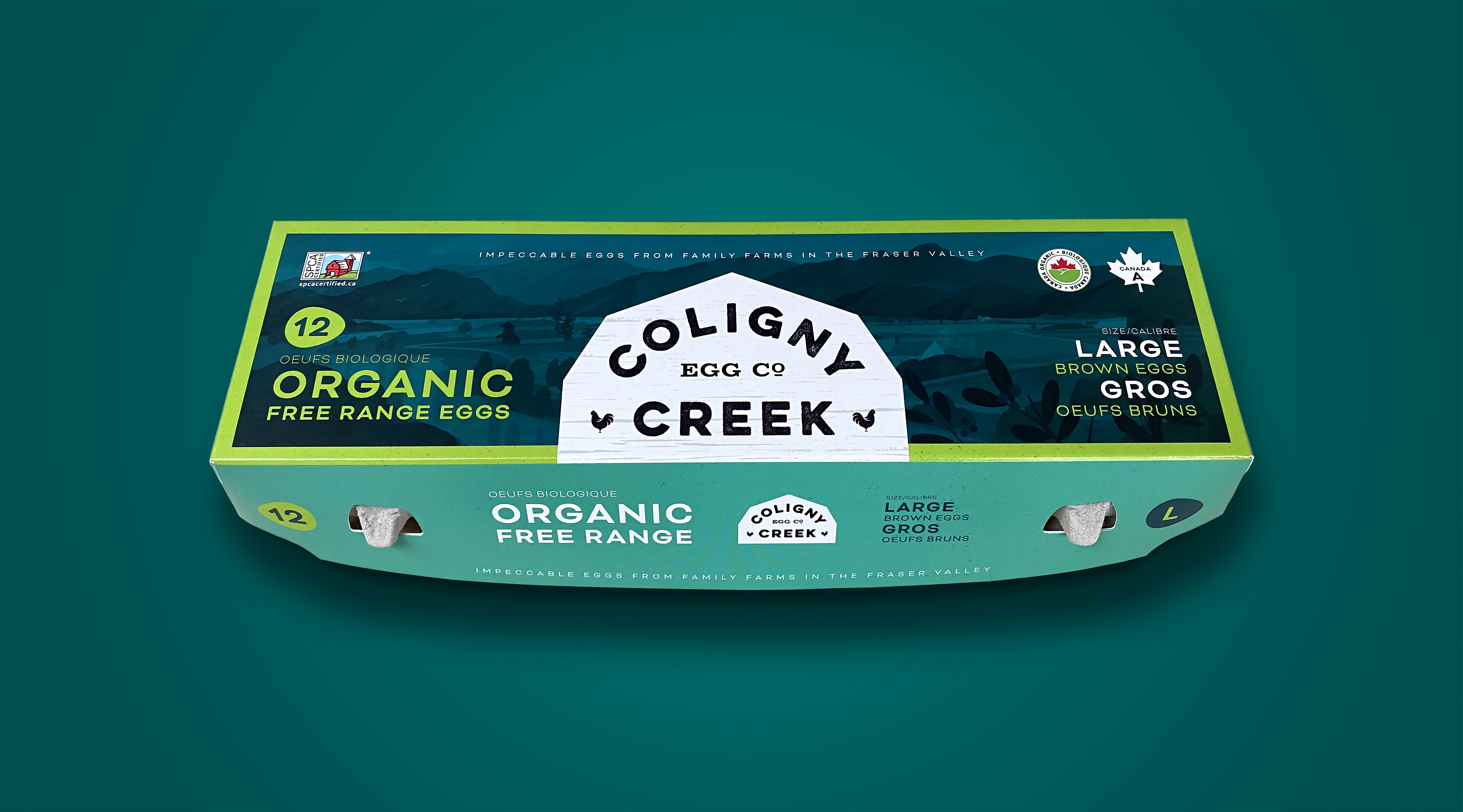
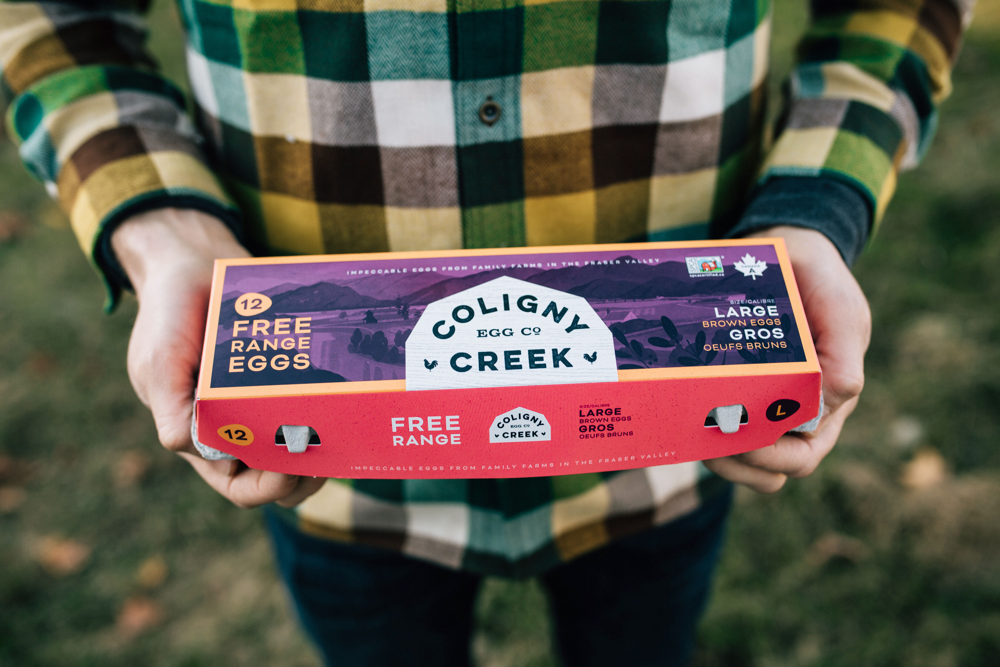
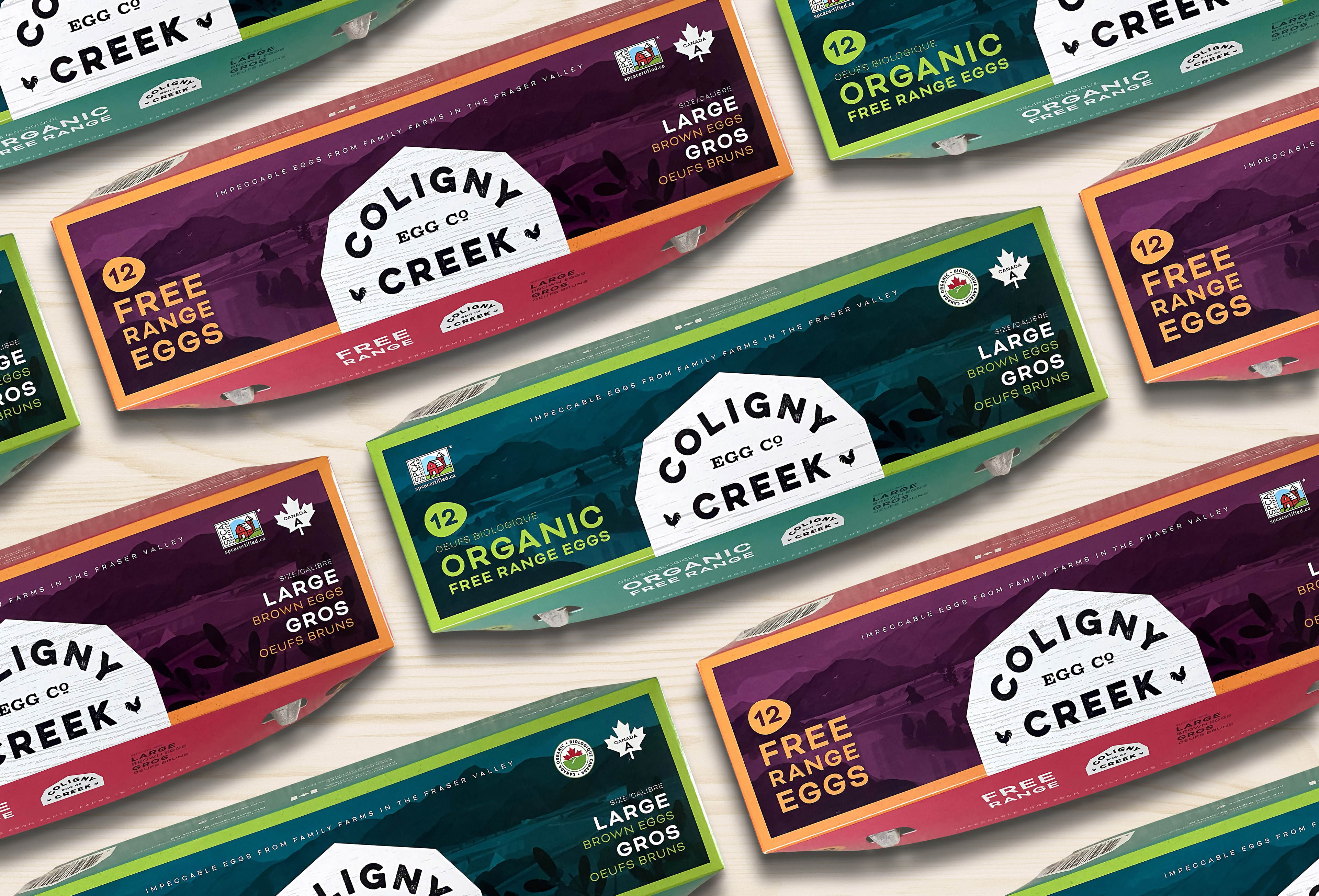
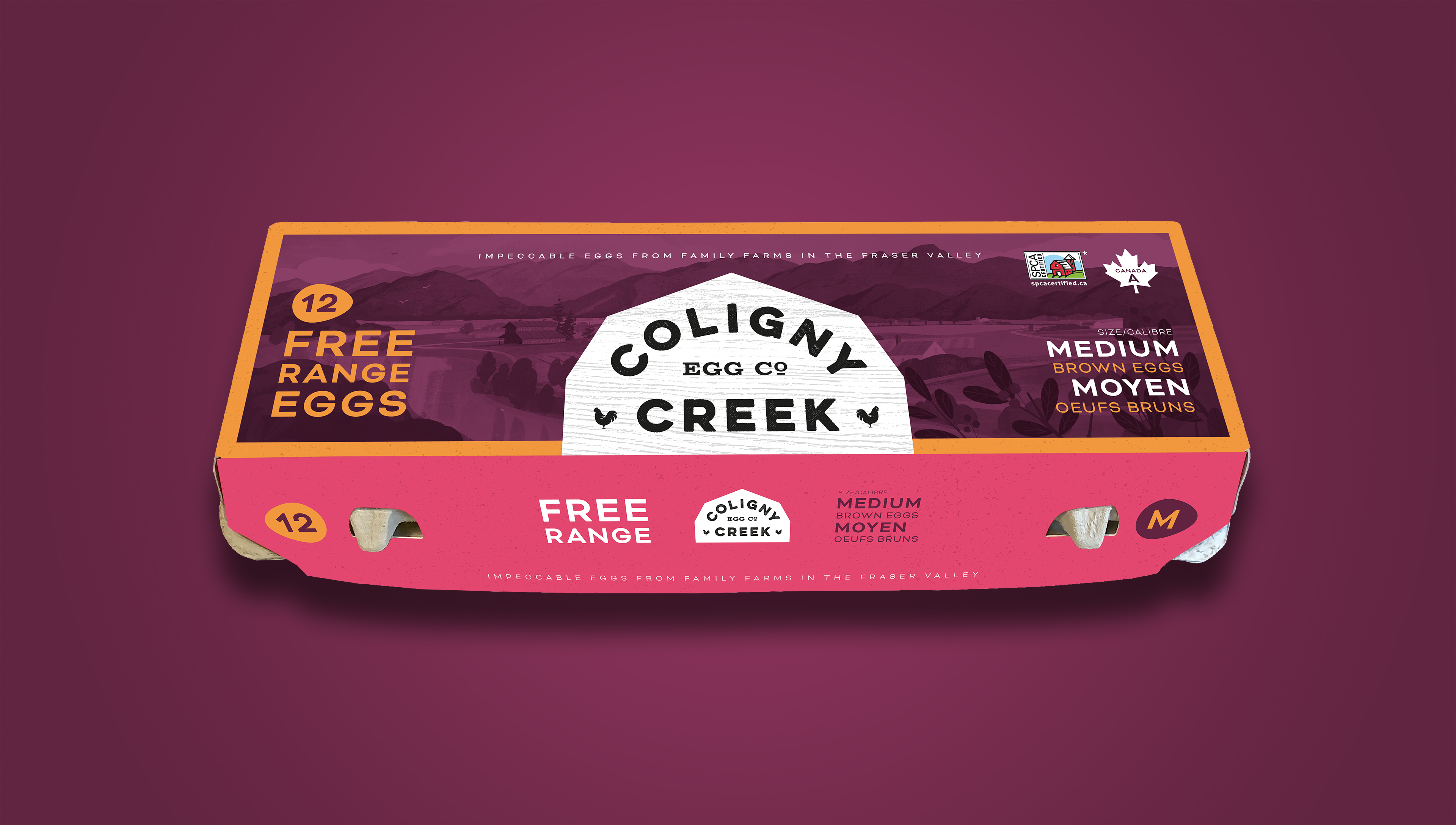
A small family of egg farmers from British Columbia’s Fraser Valley looked to me to create a new brand for their free range and organic product, following a restructuring of their business.
I provided category research, along with brand positioning, which informed work on tone of voice and creation of a name for the new brand. On recommendation, the client utilized an under-used full-colour egg carton format, for maximum impact on-shelf.
The illustration (by Jamey Christoph) depicts the region of British Columbia where the farm is located, featuring the family’s distinctive red-roofed barn. The identity riffs on the classic roofline of barns to provide a memorable and recognizable shape for the logo. Additional applications of the brand identity system included a website, truck graphics, business cards and photography art direction.


CREDIT
- Agency/Creative: Dan O'Leary Design
- Article Title: Dan O’Leary Design Branding and Packaging Design for Coligny Creek Egg Co.
- Organisation/Entity: Freelance, Published Commercial Design
- Project Type: Packaging
- Agency/Creative Country: Canada
- Market Region: North America
- Project Deliverables: Brand Creation, Brand Identity, Brand Naming, Brand Strategy, Branding, Graphic Design, Identity System, Packaging Design, Photography, Rebranding, Tone of Voice
- Format: Case, Tray
- Substrate: Pulp Carton, Pulp Moulded Fibre


