


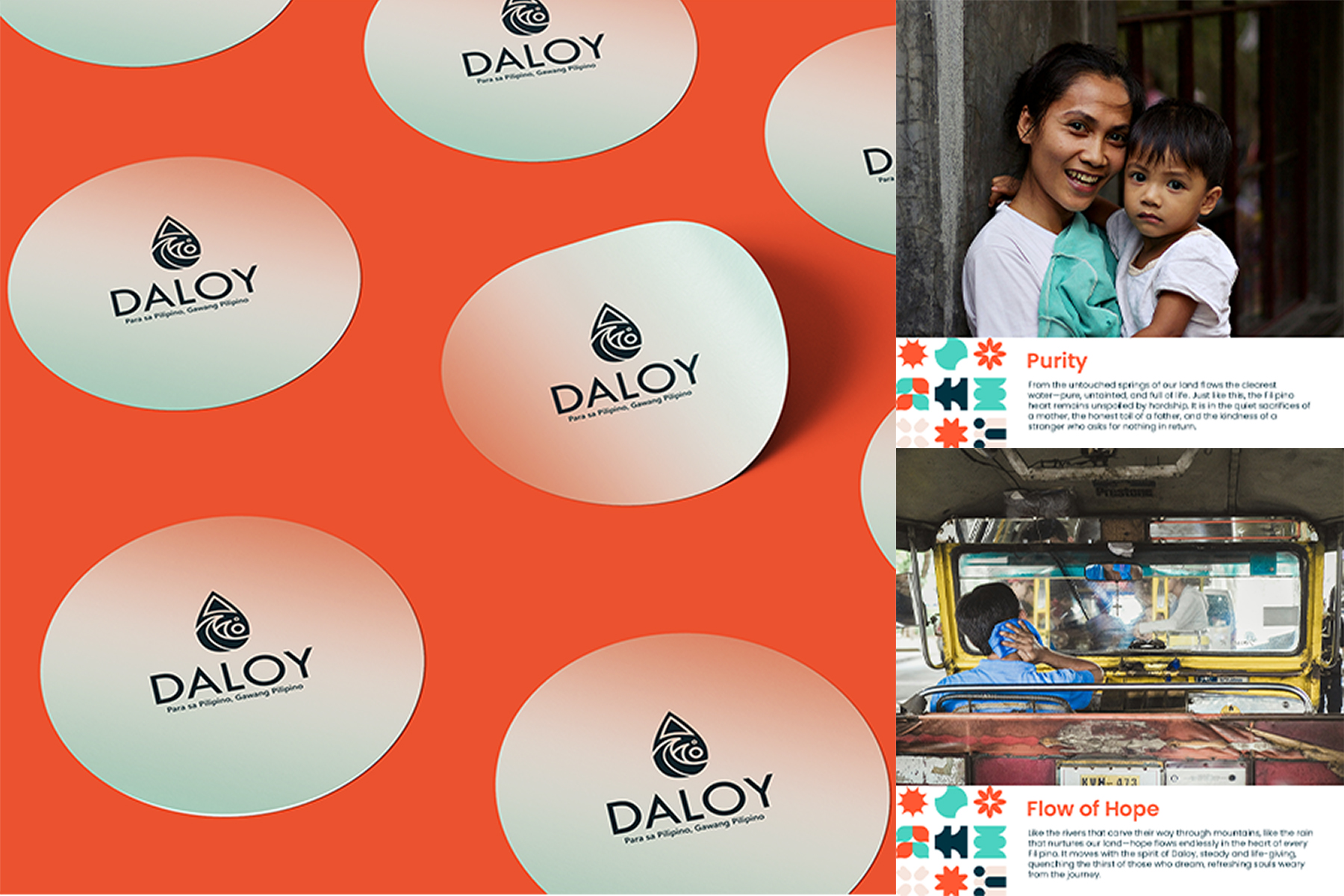
Daloy Purified Drinking Water is embracing a refreshed brand identity that deeply resonates with the Filipino spirit daloy ng buhay, daloy ng malasakit. More than just a product, water is essential to everyday life, nourishing families, strengthening communities, and sustaining traditions. With this rebranding, Daloy aims to reflect the purity and trust it provides to every Filipino household while honoring the cultural significance of water as a symbol of life and resilience.
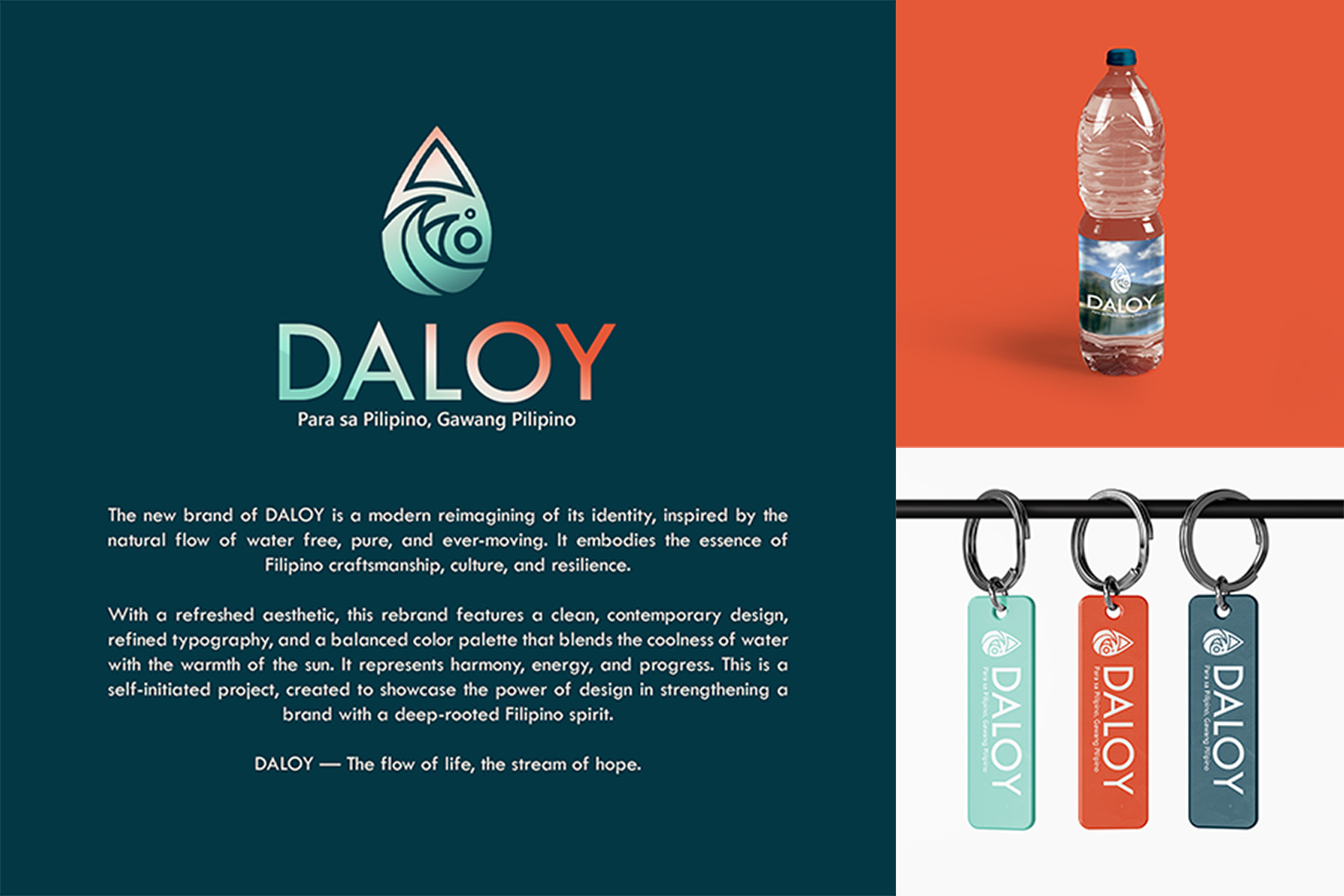
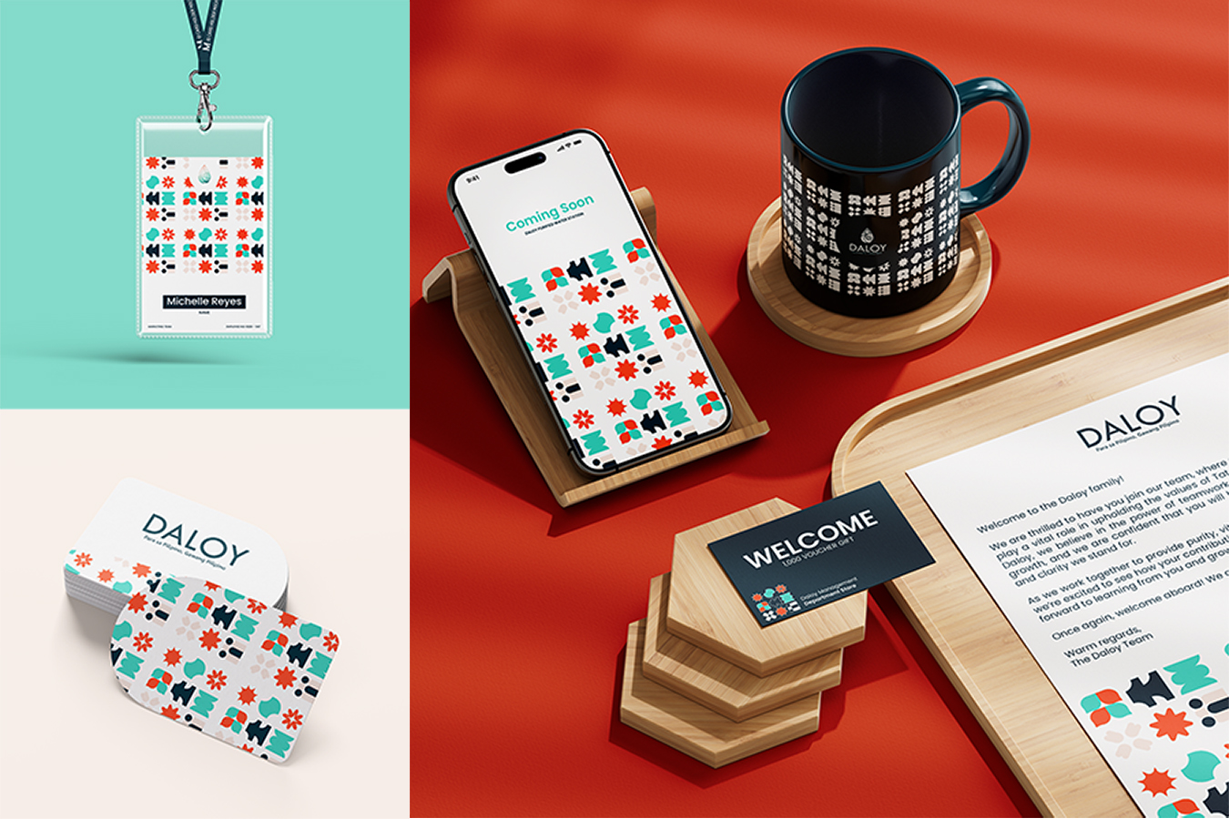
The new logo embodies the natural flow of water, representing the continuous movement of progress, unity, and sustainability. It embraces a modern yet familiar aesthetic that ensures versatility across digital and physical platforms, making Daloy a recognizable and trusted brand for generations to come. Inspired by the simplicity and clarity of water itself, the refreshed design maintains a clean and minimal approach while reinforcing Daloy’s commitment to providing safe, high-quality hydration.
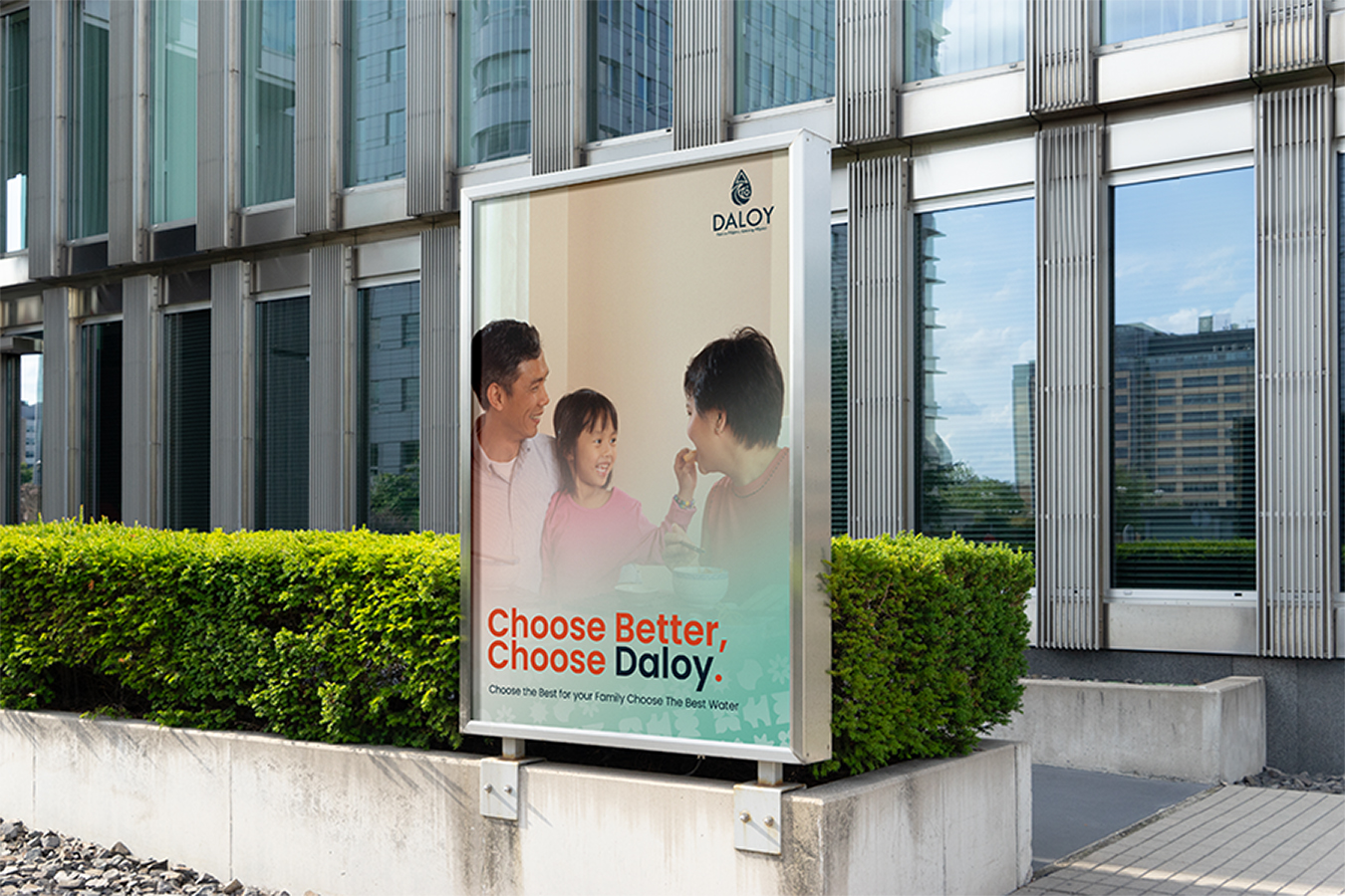
Beyond aesthetics, this rebranding is about strengthening Daloy’s connection with Filipino families from the morning glass of water to shared meals and celebrations, Daloy flows through life’s everyday moments. It is a reflection of the company’s dedication to community, health, and a sustainable future. Through this transformation, Daloy remains committed to delivering not just purified water but a brand that embodies trust, care, and the essence of being truly Filipino.
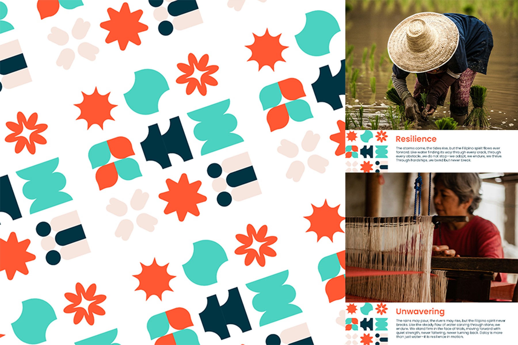
The design philosophy behind Daloy’s new logo incorporates elements that speak to Filipino heritage and nature, ensuring that it remains both modern and culturally rooted. The fluidity in its design represents adaptability and progress, values that resonate with Filipinos’ hardworking and family-oriented nature. The choice of typography and iconography reflects a balance between tradition and innovation, symbolizing a brand that evolves with time while staying true to its core values.
This rebranding also marks Daloy’s commitment to sustainability and eco-consciousness, ensuring that its practices align with environmental responsibility. As clean water remains a fundamental necessity, Daloy’s new identity serves as a reminder of its mission to provide safe, high-quality drinking water while advocating for a cleaner, healthier planet.
Through this revitalized brand identity, Daloy Purified Drinking Water reaffirms its position as a household name, reinforcing its role in every Filipino’s daily life. Whether shared in moments of celebration, nourishment, or simple refreshment, Daloy continues to be a brand that flows with trust, care, and a deep connection to the people it serves.

CREDIT
- Agency/Creative: Xi Yu Wayne
- Article Title: Daloy Purified Drinking Water: A Filipino-Inspired Logo Rebranding for a Timeless Flow by Xi Yu Wayne
- Organisation/Entity: Freelance
- Project Type: Identity
- Project Status: Published
- Agency/Creative Country: Philippines
- Agency/Creative City: Quezon City
- Market Region: Asia
- Project Deliverables: Brand Identity, Brand Naming
- Industry: Food/Beverage
- Keywords: #Branding #WaterCompany #BrandIdentity
-
Credits:
Brand Designer: Xi Yu Wayne


