


Having built a successful brand portfolio in convenience cheese, Dairyworks is moving into other dairy-based categories with their everyday mainstream ‘Make life Easier’ brand platform and product offerings.
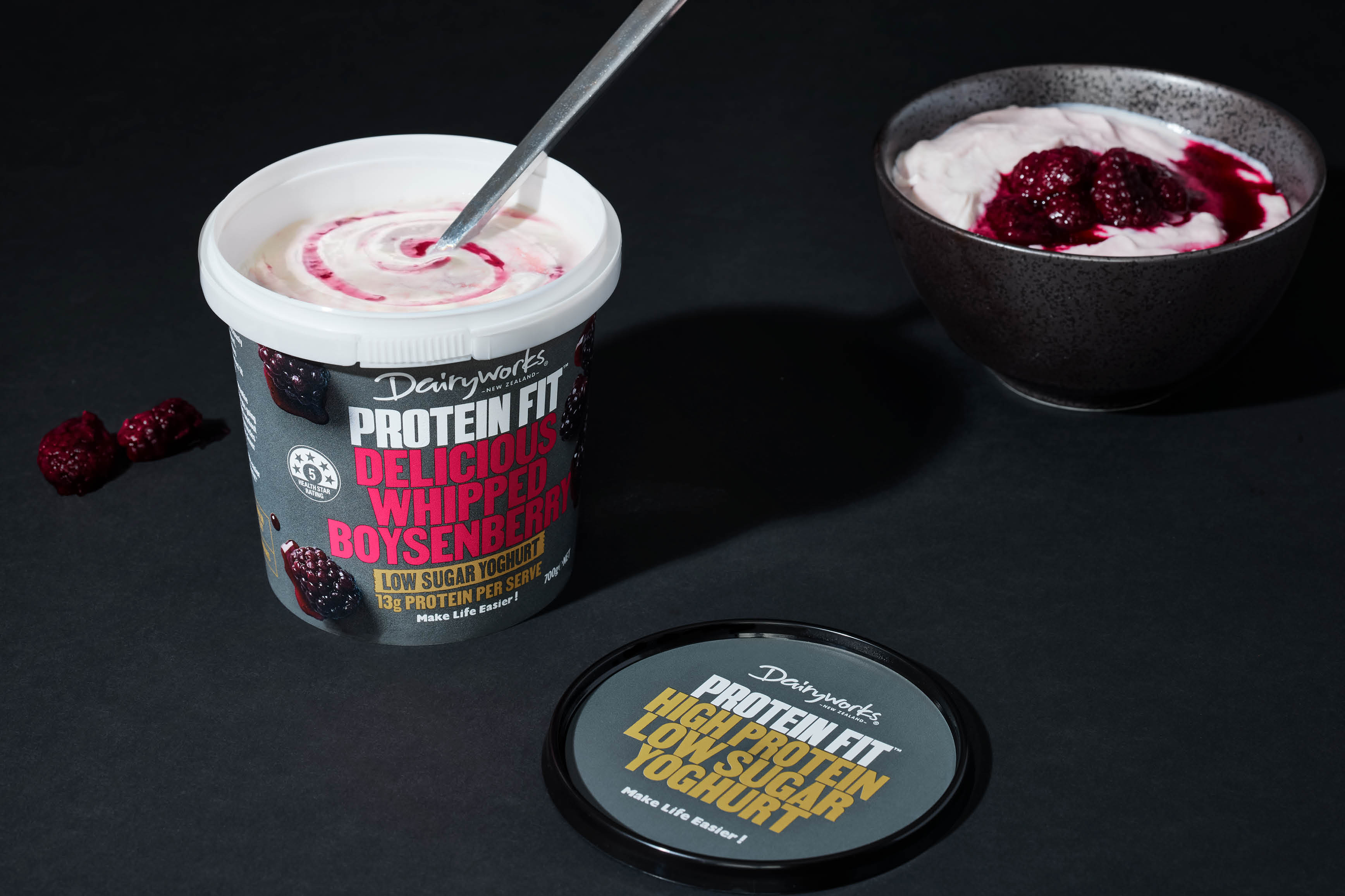
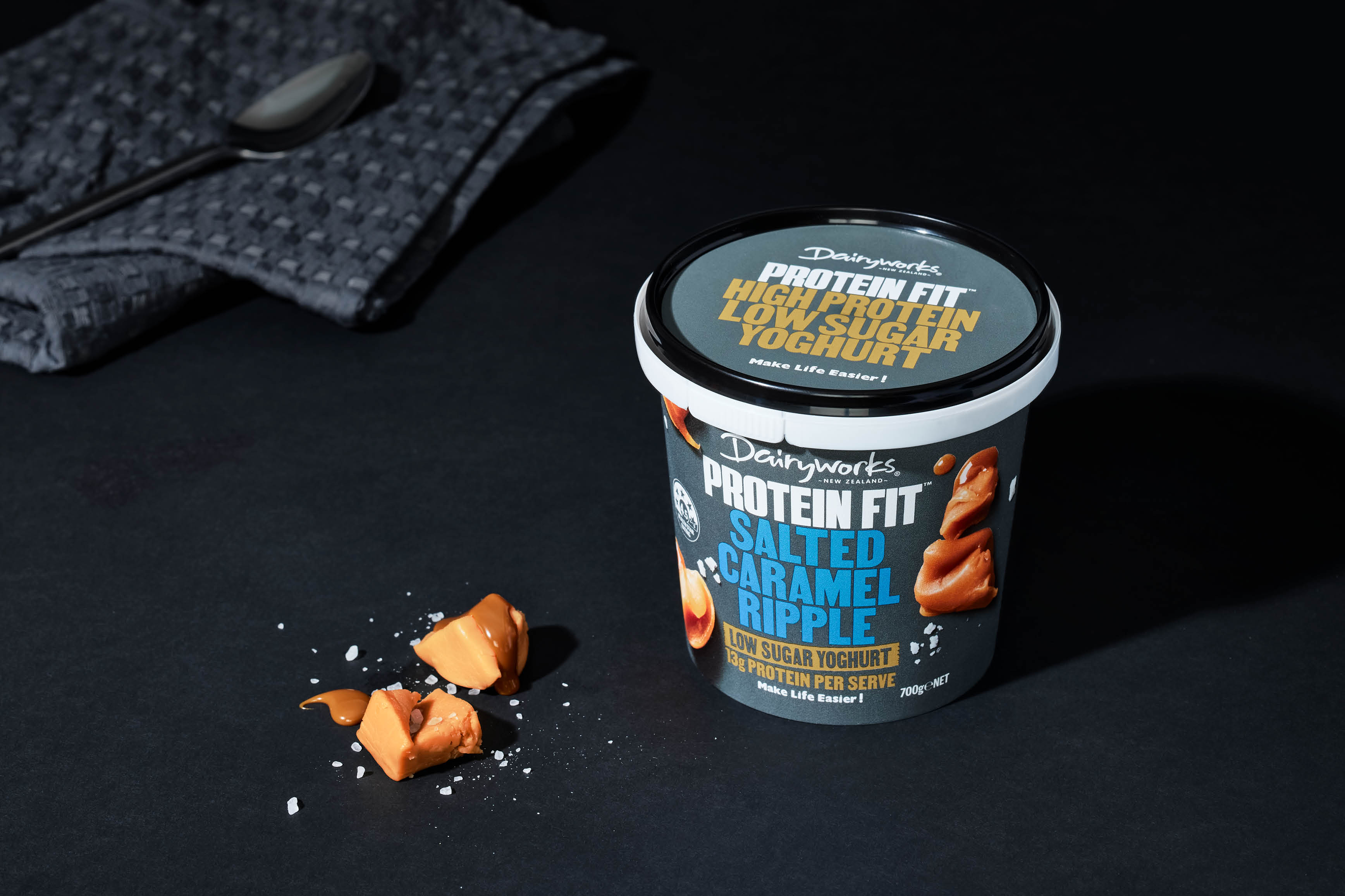
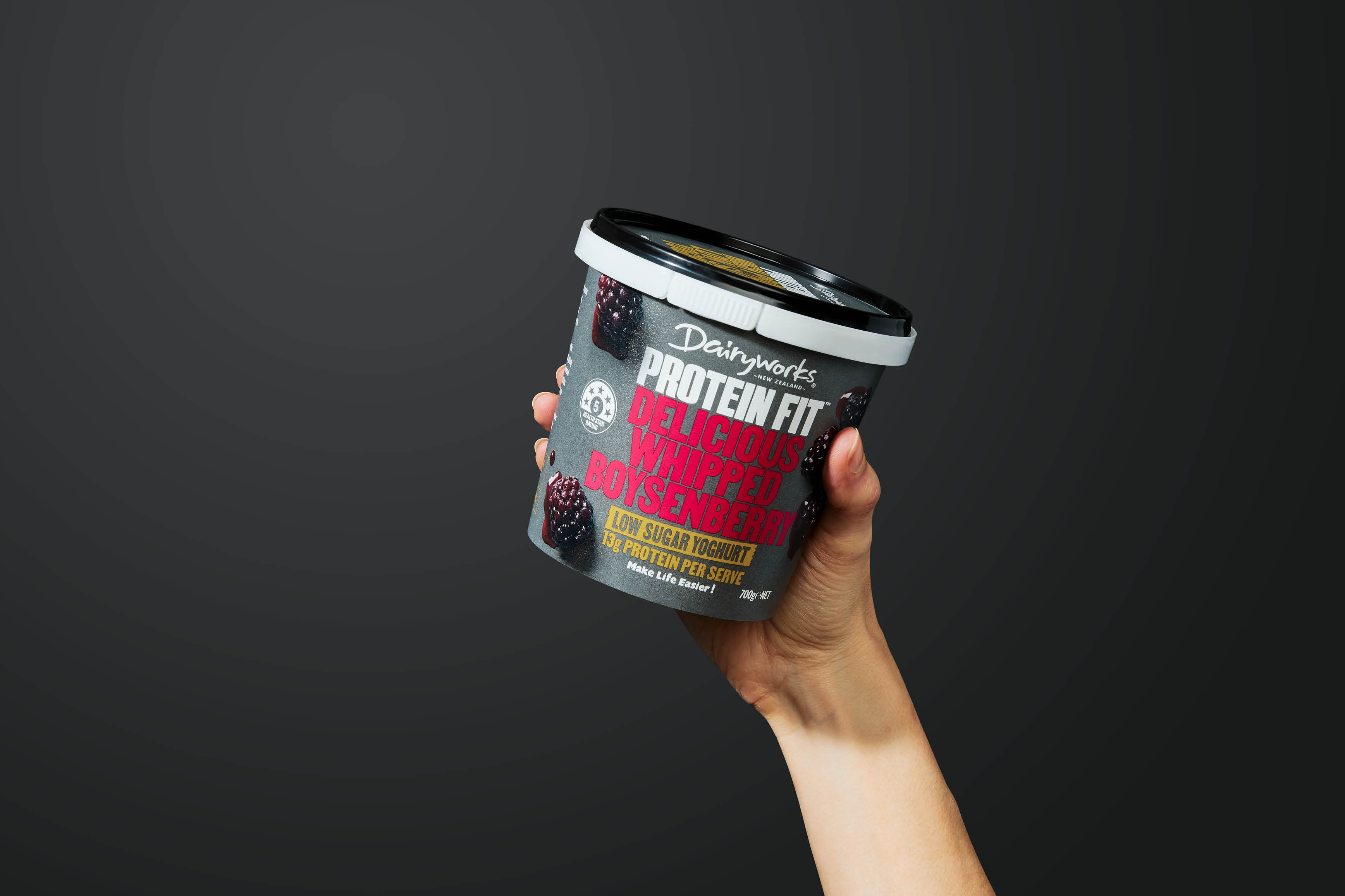
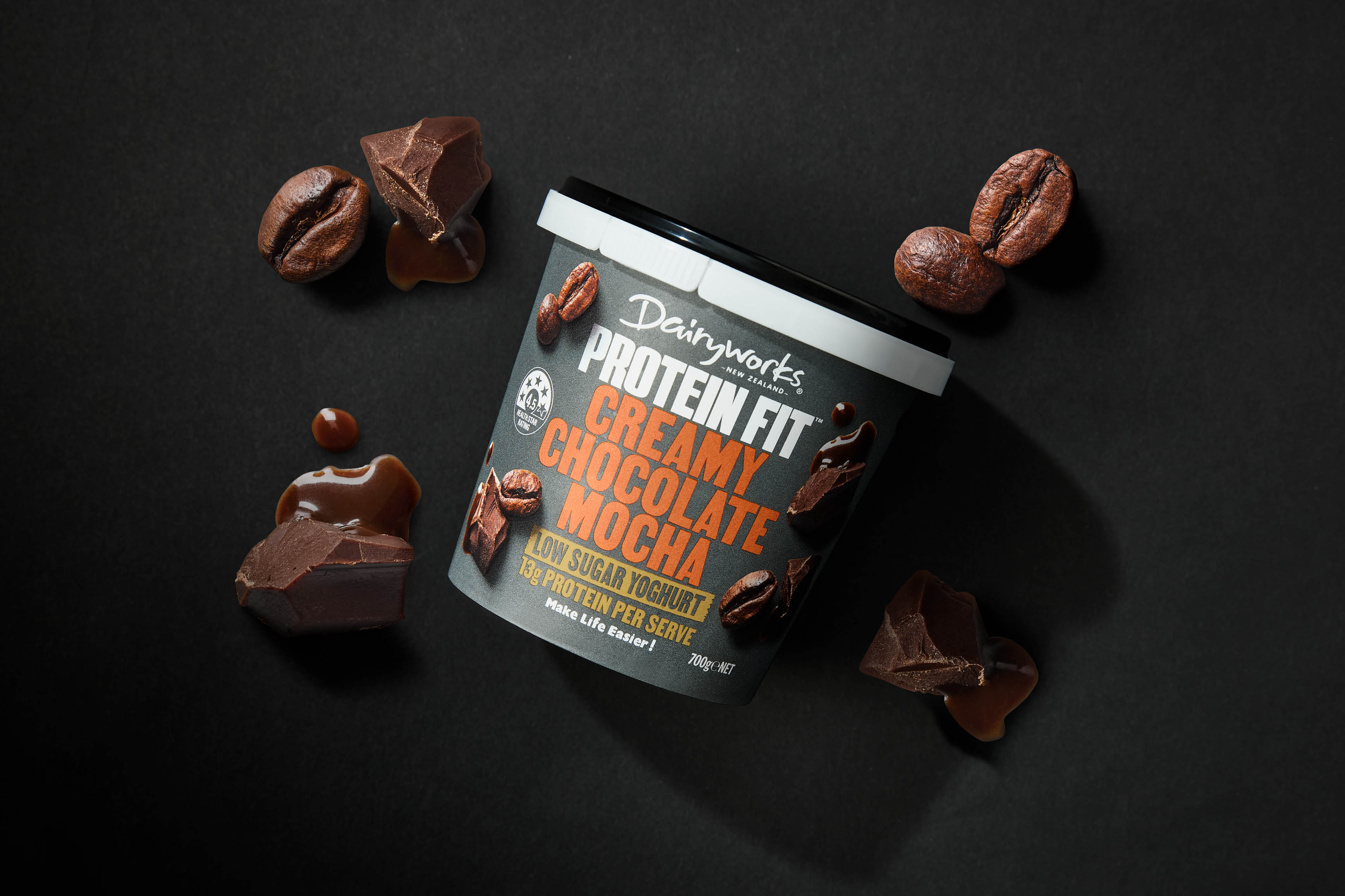
The yoghurt category is a busy environment, with various corporate and artisan brands that offer similar styles, and flavours and cater to numerous occasions. The Protein-based yoghurt proposition is a relatively recent addition to this. Still, it has quickly created a popular new sub-category aimed at the healthy lifestyle consumer looking for a breakfast replacement, smoothie additive or midday snack. But the incumbent brands have relied upon commonly used (and dull!) flavour recipes. This was the opportunity for Dairyworks to create an exciting and new range of Protein-rich yoghurts that not only delivered on protein content but also had flavours that consumers would crave.
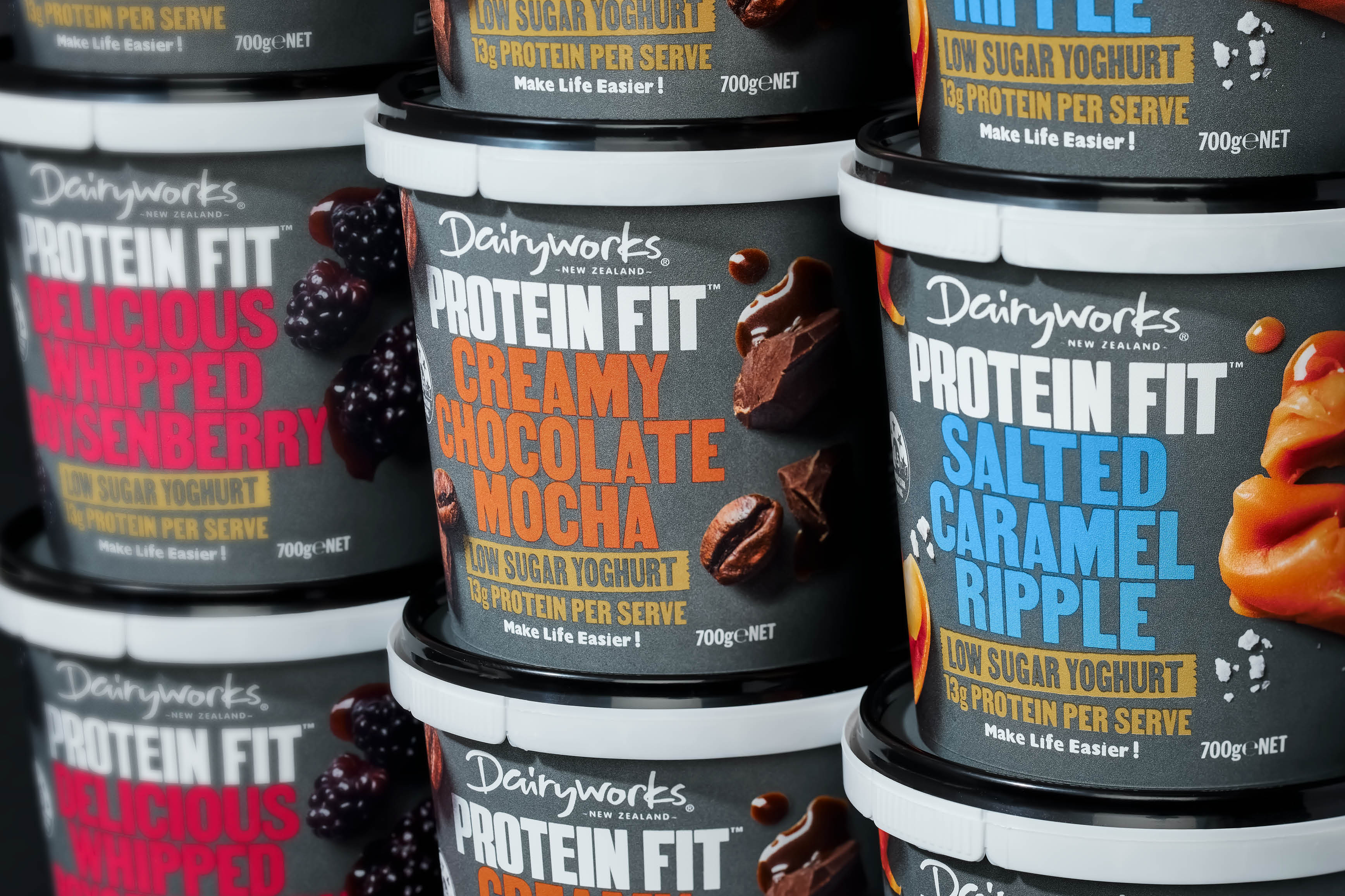
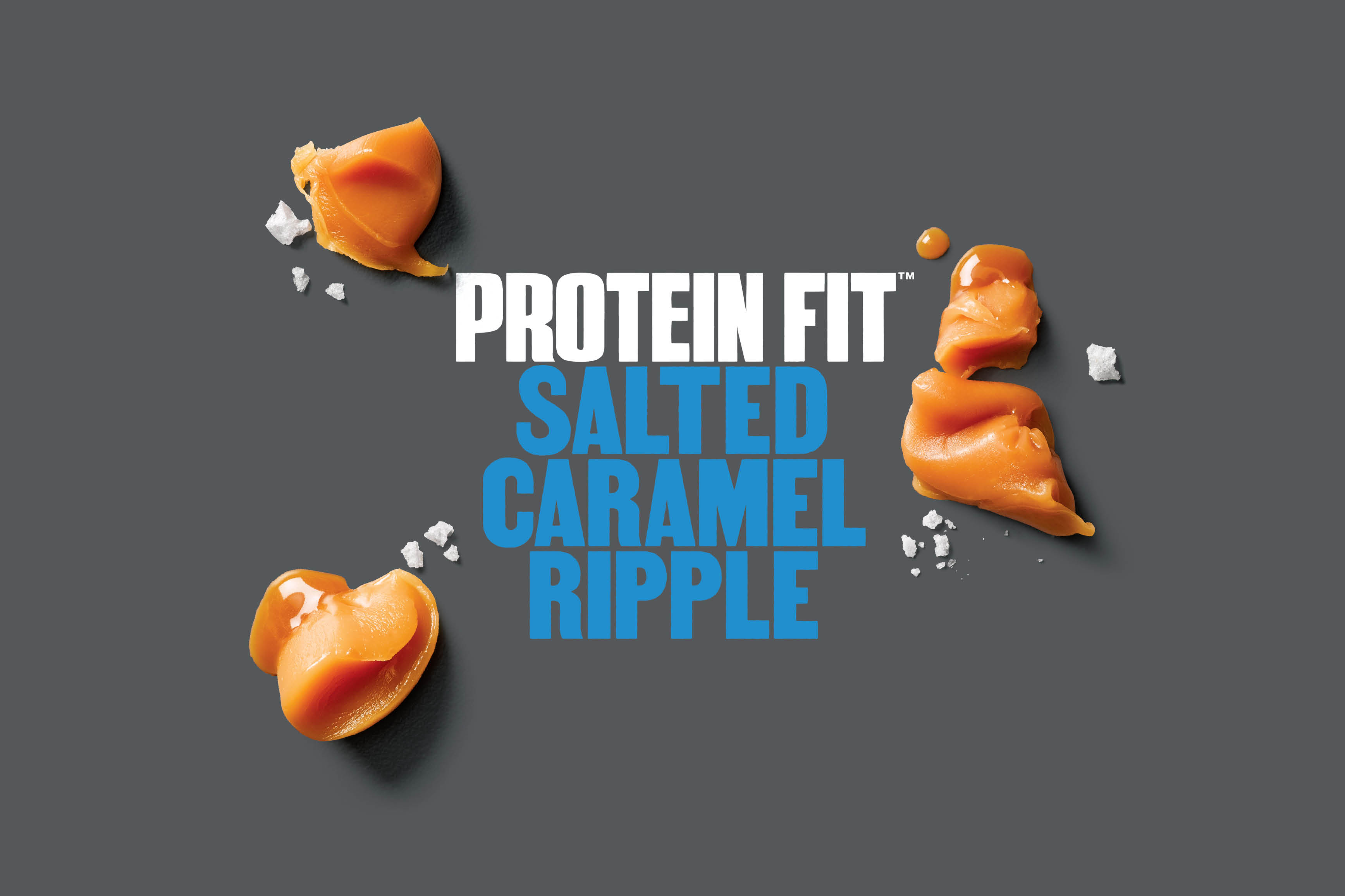
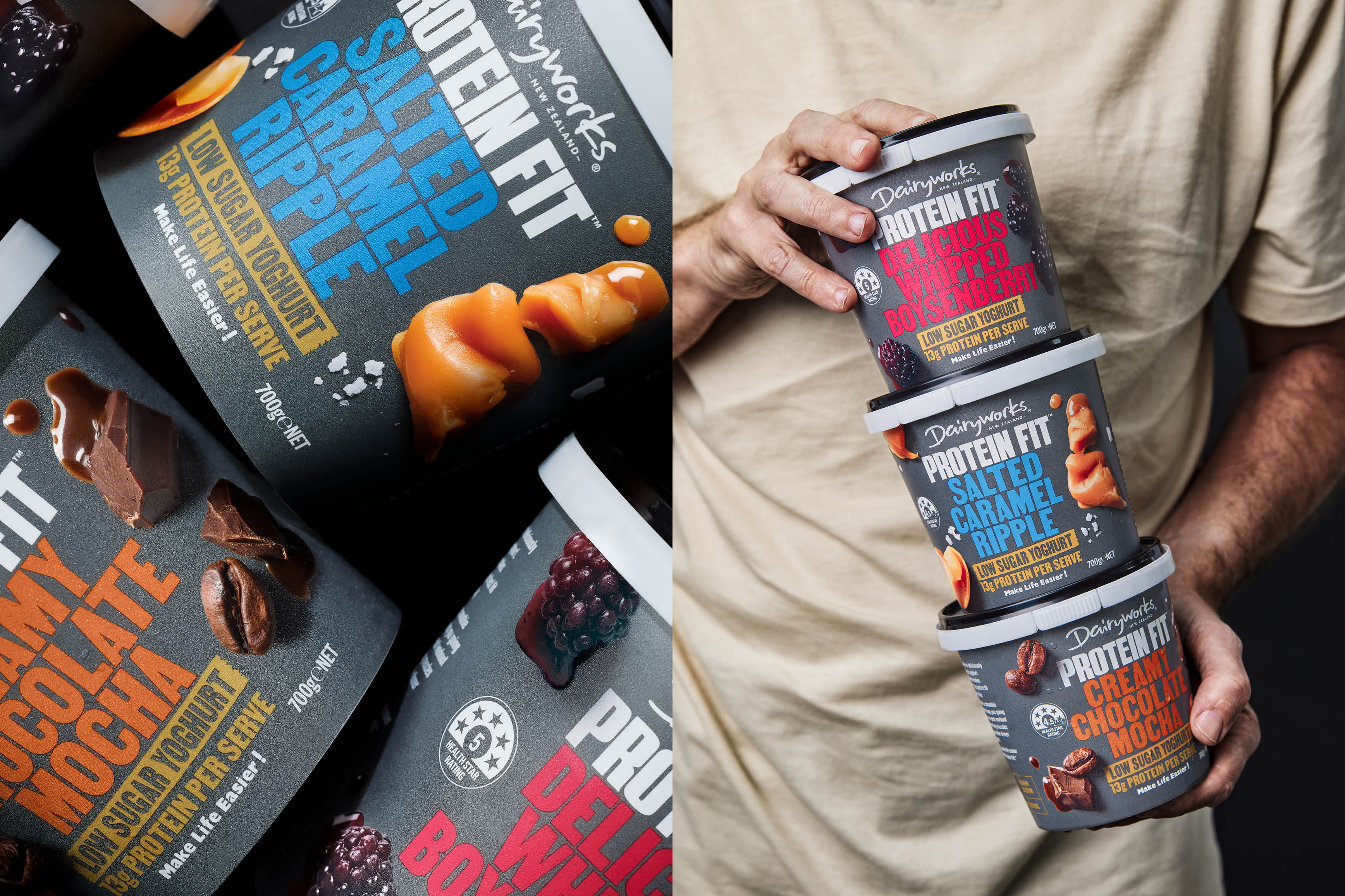
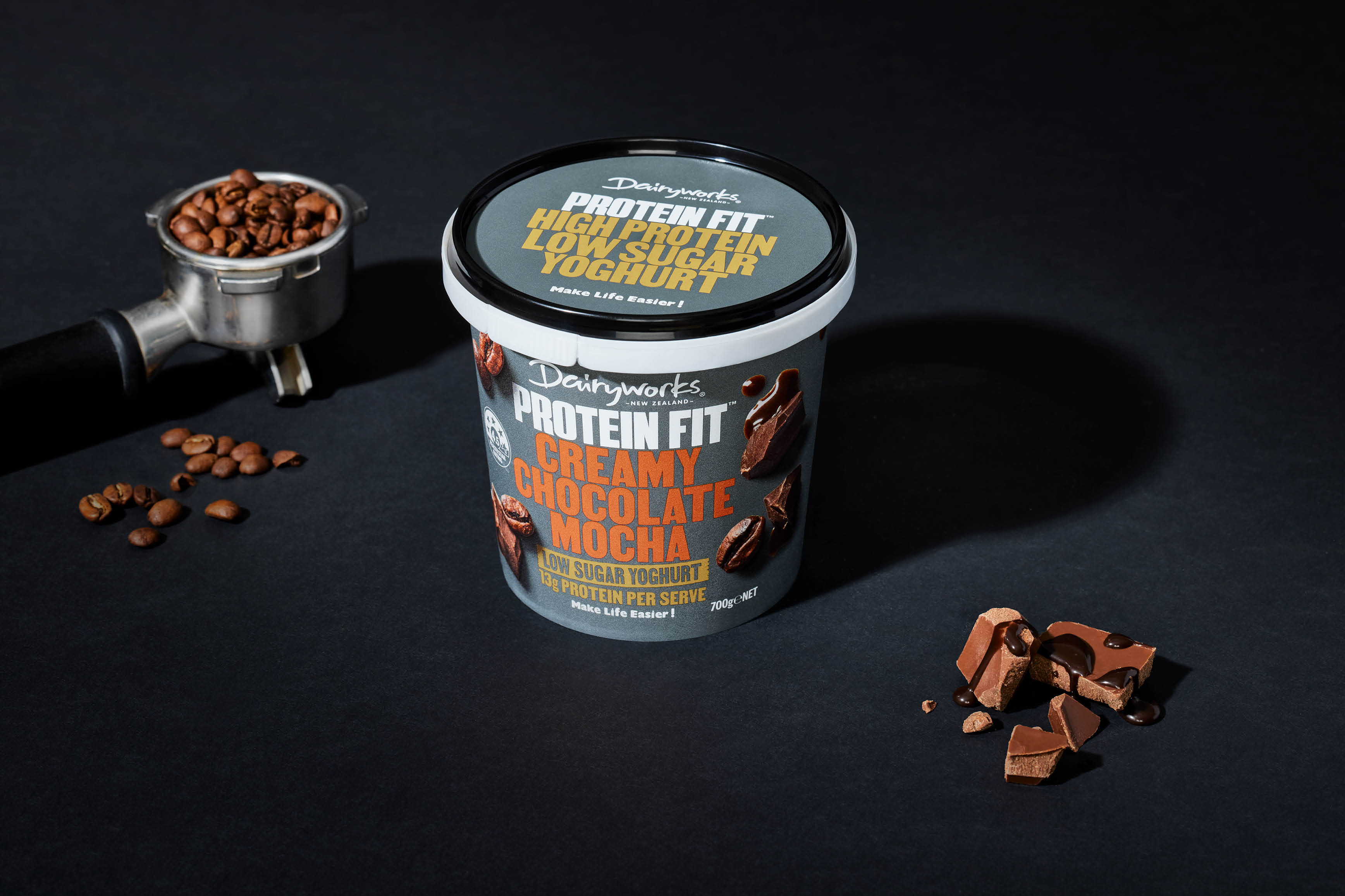
This was also an opportunity to disrupt, what has quickly been adopted as, the category norm colour coding – black. This has led to a level of ‘sameness’ that makes it difficult for consumers to distinguish between brands. Instead, we used a dark grey brand block to create a compelling alternative (and unisex) for the protein consumer. Typography inspired by street posters is big, simple, bold and uncompromising – communicating bold flavours that verge on indulgence rather than meh! This is complemented by oversized macro photography of key flavour ingredients showcasing the rich colours, textures and luscious shapes. This range packs a protein punch with more of the flavour consumers desire.
CREDIT
- Agency/Creative: Onfire Design
- Article Title: Dairyworks Protein Fit by Onfire Design
- Organisation/Entity: Agency
- Project Type: Packaging
- Project Status: Published
- Agency/Creative Country: New Zealand
- Agency/Creative City: Auckland
- Market Region: Oceania
- Project Deliverables: Art Direction, Brand Creation, Brand Tone of Voice, Packaging Design, Photography
- Format: Pot
- Substrate: Plastic
- Industry: Food/Beverage
- Keywords: Packaging, food, yoghurt, photography, typography
-
Credits:
Creative Direction: Matt Grantham
Design: Michael Nicholls
Design: Jamie Turnbull


