


Ermolaev Bureau – The Family Farm of Cheburashkini Brothers
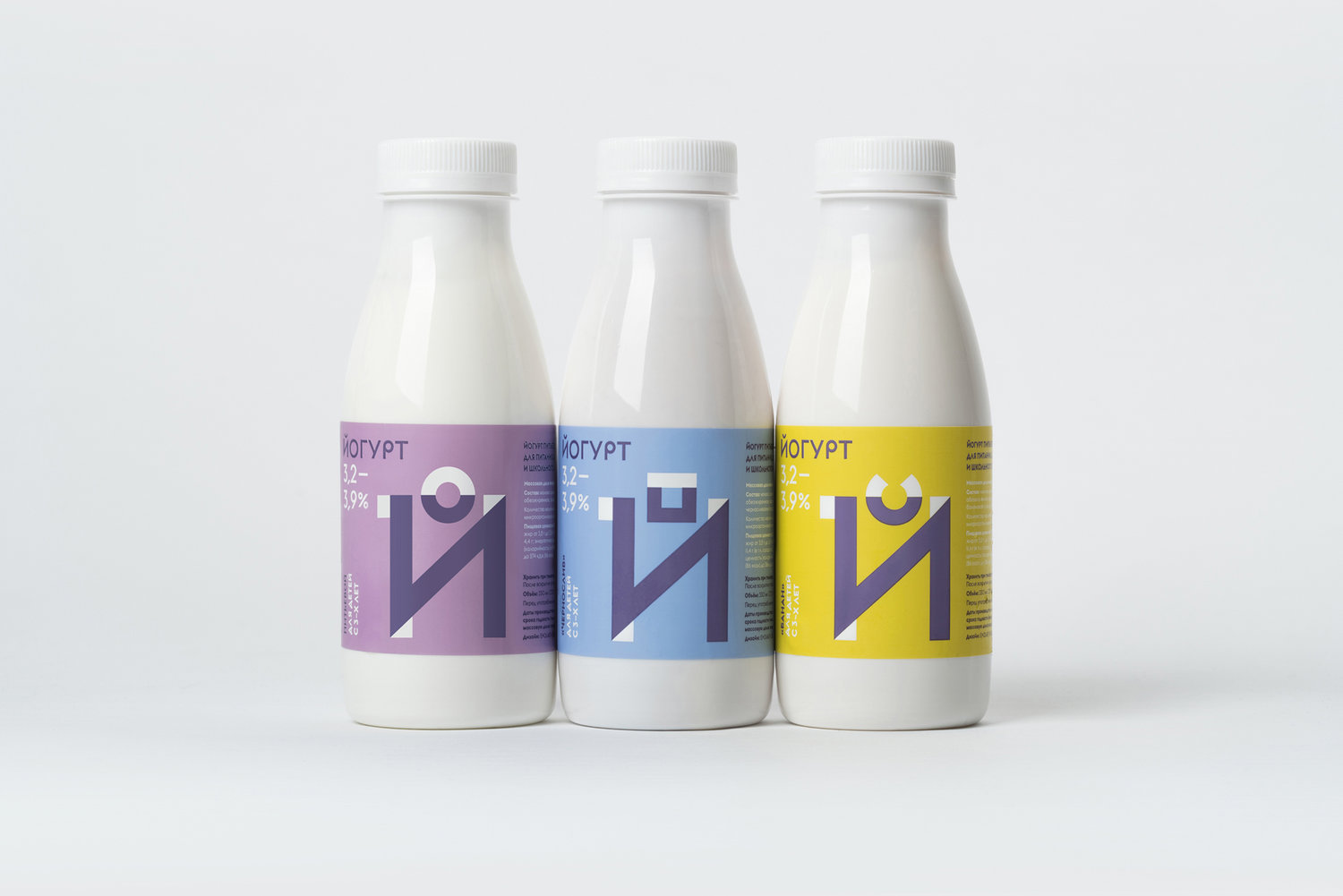
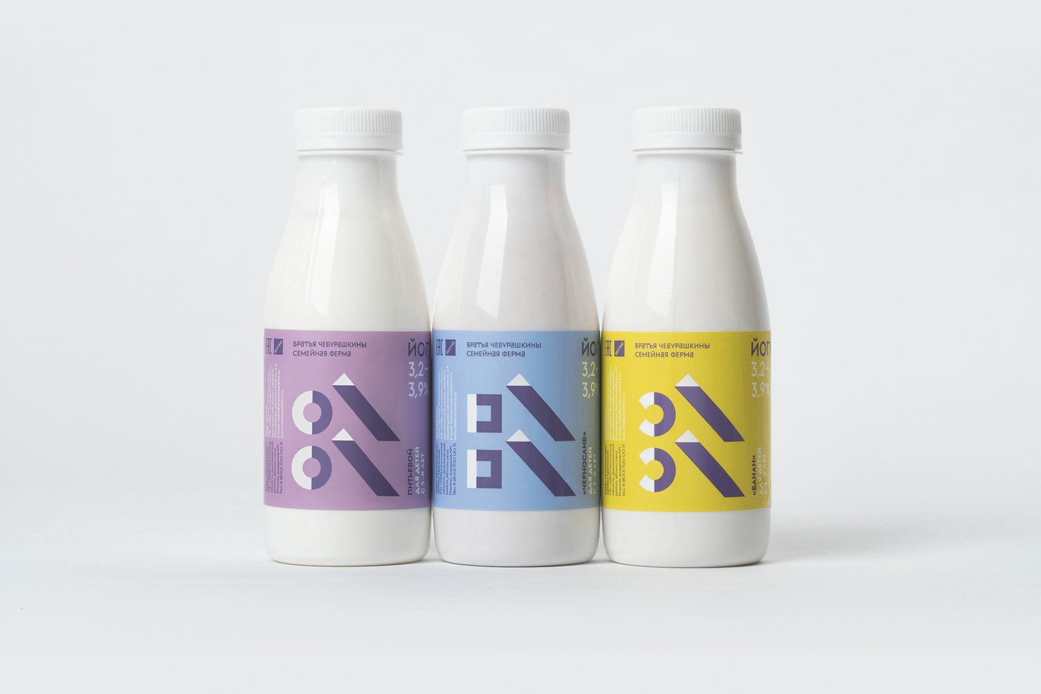
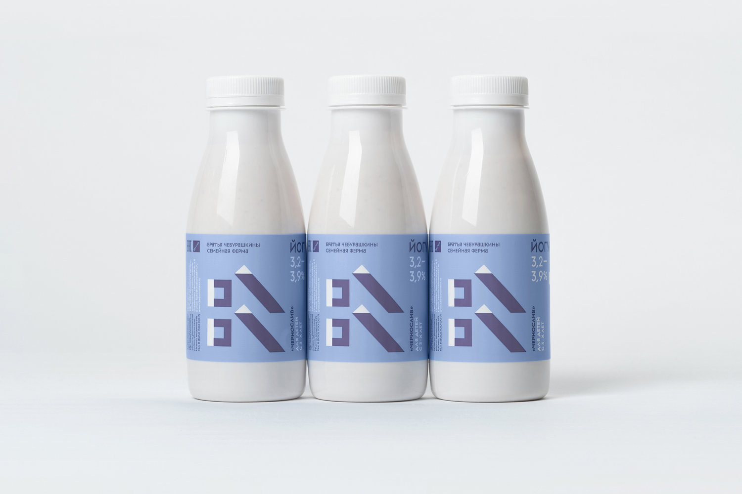
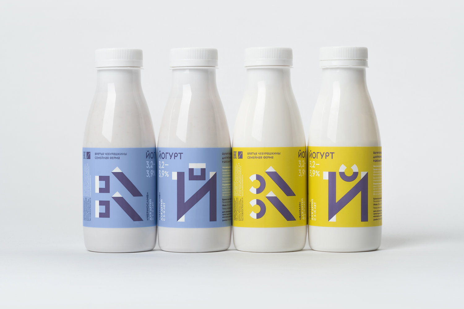
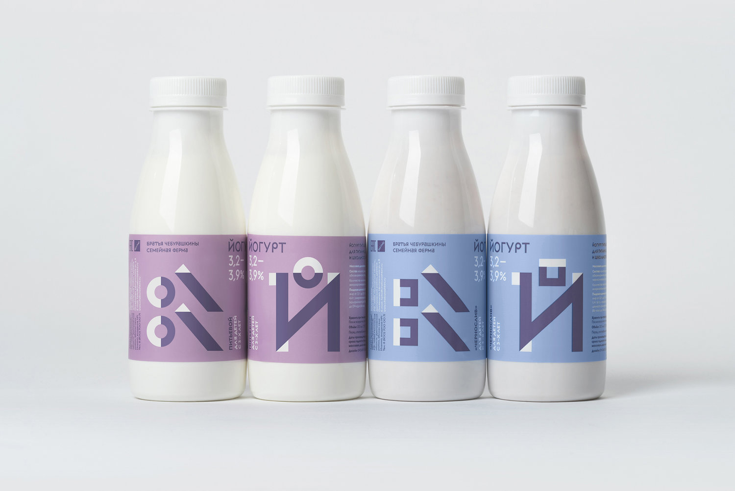
This is a yogurt range for kids from 3 years old. Kids study and discover the world through simple forms, they better comprehend abstract, simple, geometric and pure shapes and colors. The idea is that the word ‘yogurt’ in cyrillic starts with the Й letter, this is one of a few letters in cyrillic alphabet, which has a diacritic symbol pointing out this is not the И letter, but the Й. This diacritic symbol we use as a basis to show different tastes of yogurt: cherry, prune, pear, peach and others. The shape and color abstractly remind of this berries. If you place yogurts next to each other, graphics join each other and make new graphic shape, new picture. Thus with the help of this tasty yogurt kids start to develop their abstract thinking.Kids at this age don’t buy products themselves, mostly their young moms do that for them. And moms already know about the Cheburashkini brand and the fact that its products are natural. They buy Cheburashkini products to their kids because they know they are high-quality and berries in them are natural. Our target audience consists primarily of intelligent consumers who value the quality of a product as well as its design. This company uses only natural ingredients – just flat yogurt plus genuine jam.We also count on the fact that this product will be popular not only among all the kids, but also will be attractive for adults.Visual solution for kids, based on abstract visual codes does not exist on the shelves of Russian stores. There are cartoon-animated characters of famous heroes instead. This allowed us to stand out on the shelf with the help of totally different visual language. Plus the bright color and telling about the taste is well perceived by the little kids.Buying this product to her kid mom will be telling him that this or that graphic shape is a shape of a berry, but in a different expression. We made simple educational animated movie for the promotion of a new product for kids, which in a simple and intelligible way tells them where the yogurt comes from. Also on the basis of this cartoon we built up augmented reality that works inside the educational book. With the help of smartphone (point the camera at graphics) static graphics come to life and start to move. It helps parents to tell children about all the processes (every stage) of yogurt manufacturing, starting with the cow and farm and finishing with the shelves of stores. There is a special sign on the pack showing that you can download the app and watch the cartoon film.
CREDIT
- Agency/Creative: Ermolaev Bureau
- Article Title: Dairy Packaging For Kids (The Family Farm of Cheburashkini Brothers)
- Organisation/Entity: Agency, Published Commercial Design
- Project Type: Packaging
- Agency/Creative Country: Russia
- Market Region: Europe
- Format: Bottle
- Substrate: Plastic


