


“Daily meal” is a cafe offering comfortable and healthy food, and a savior for those who don’t like to cook and value their time. The main target audience is managers in companies who sit in offices, work a lot and don’t have time for snacks. They want to have a snack, but not a harmful burger, but something more beneficial.
The idea behind “Daily meal” is to provide busy people with healthy and visually appealing food, and to help them stay healthy.
Introduction: It’s great to start every project with a detailed analysis of the target audience, research, and in-depth interviews to better understand people’s needs and pain points. In this case, the project budget was limited, so we relied on the information that the brand owner knew and used it as a foundation.
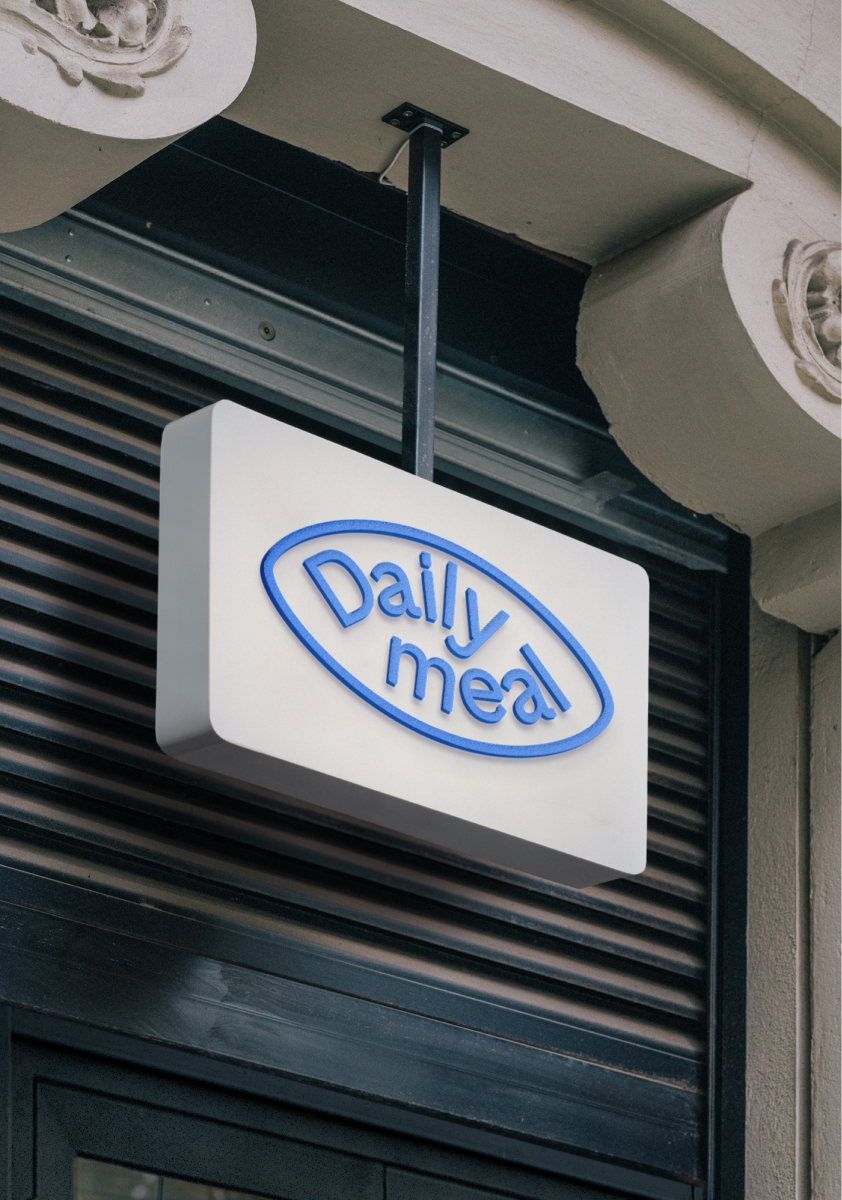
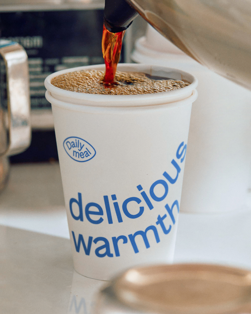
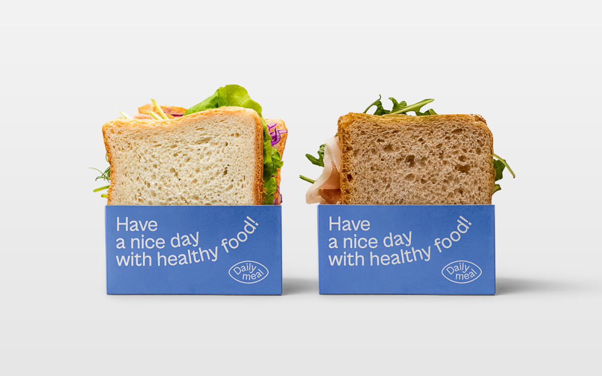
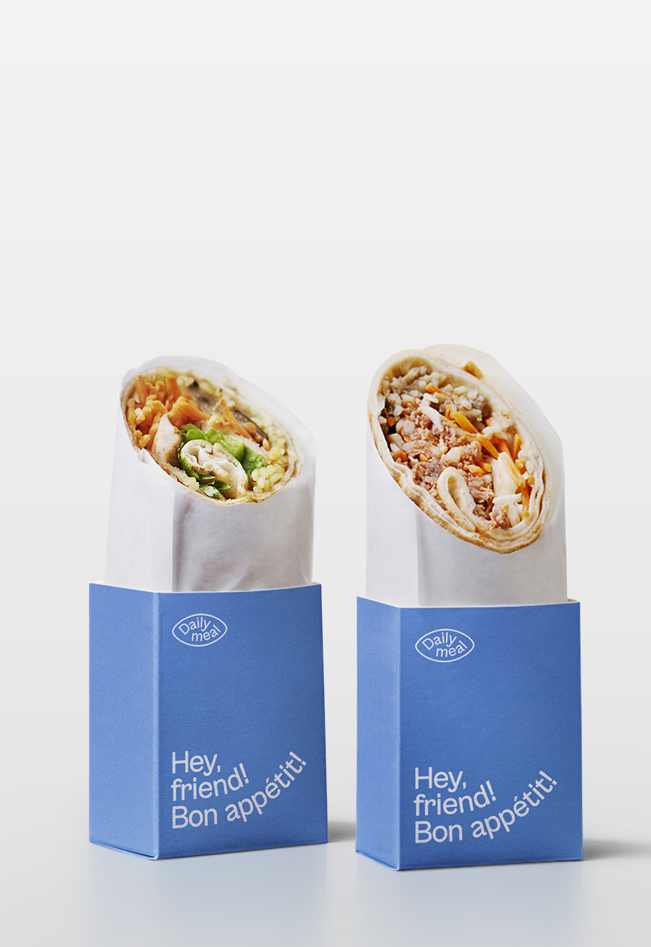
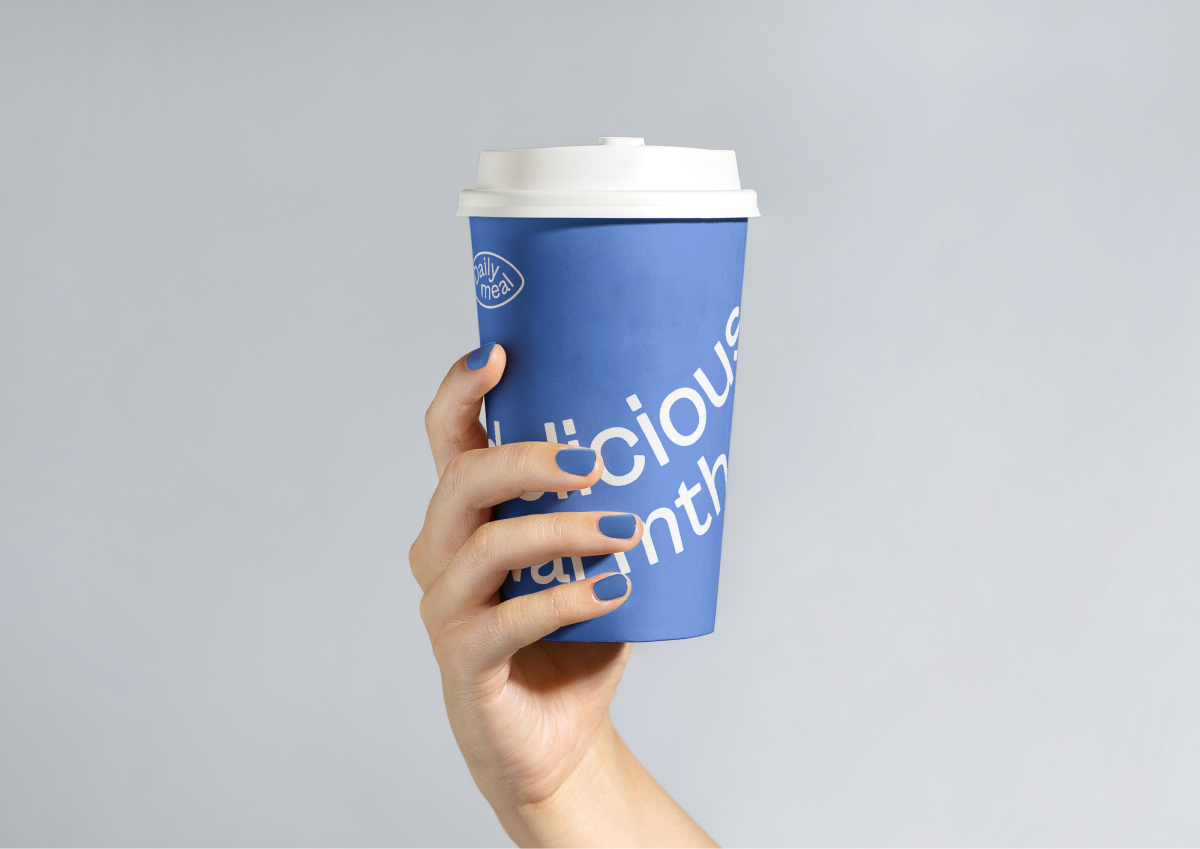
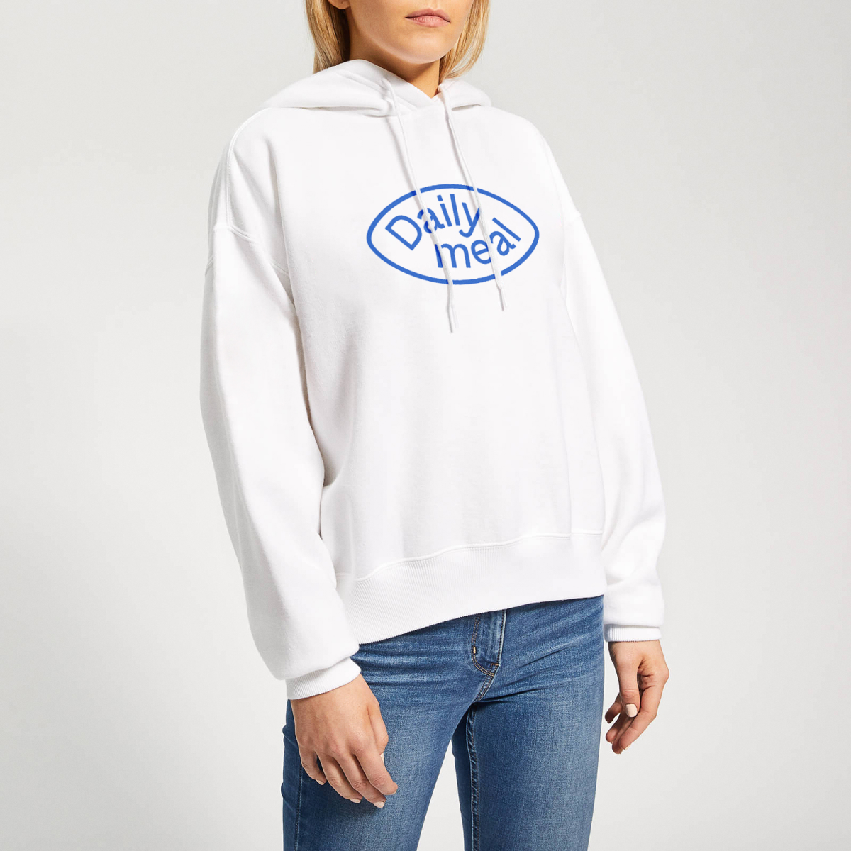
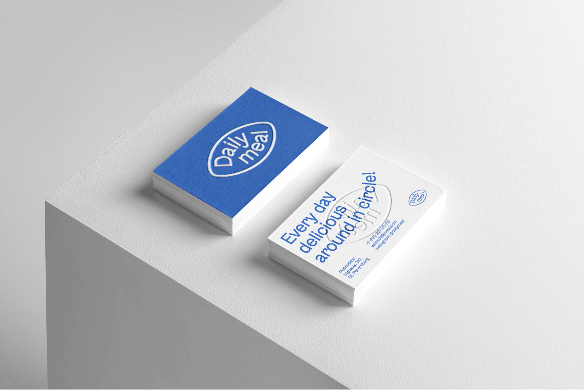
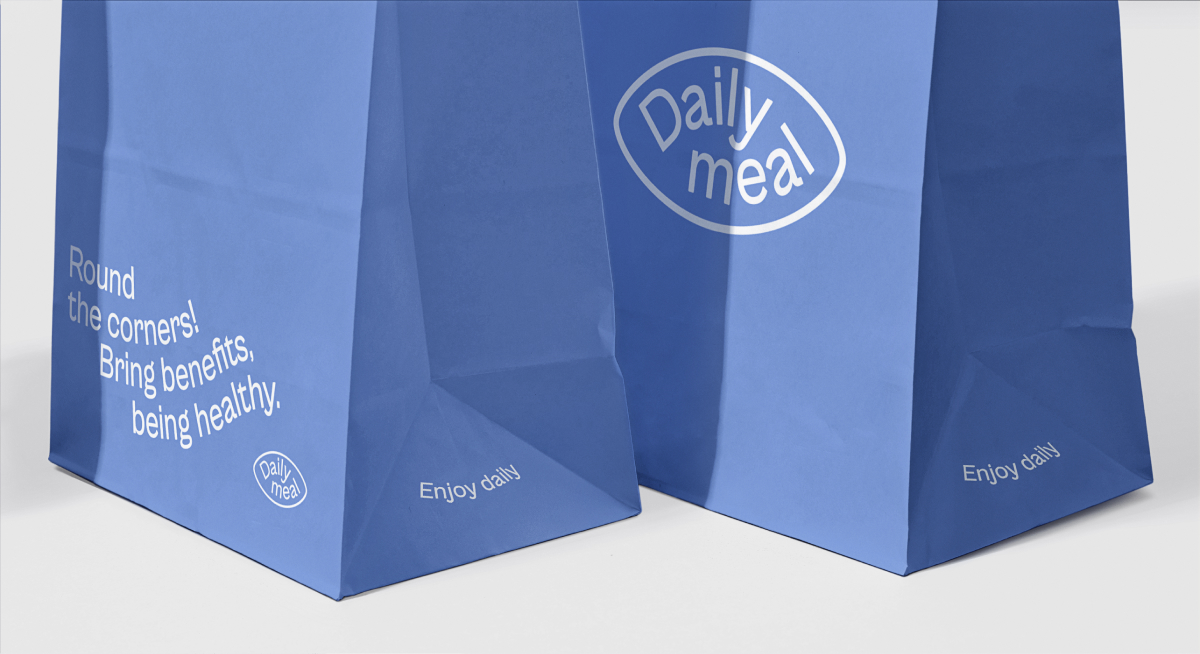
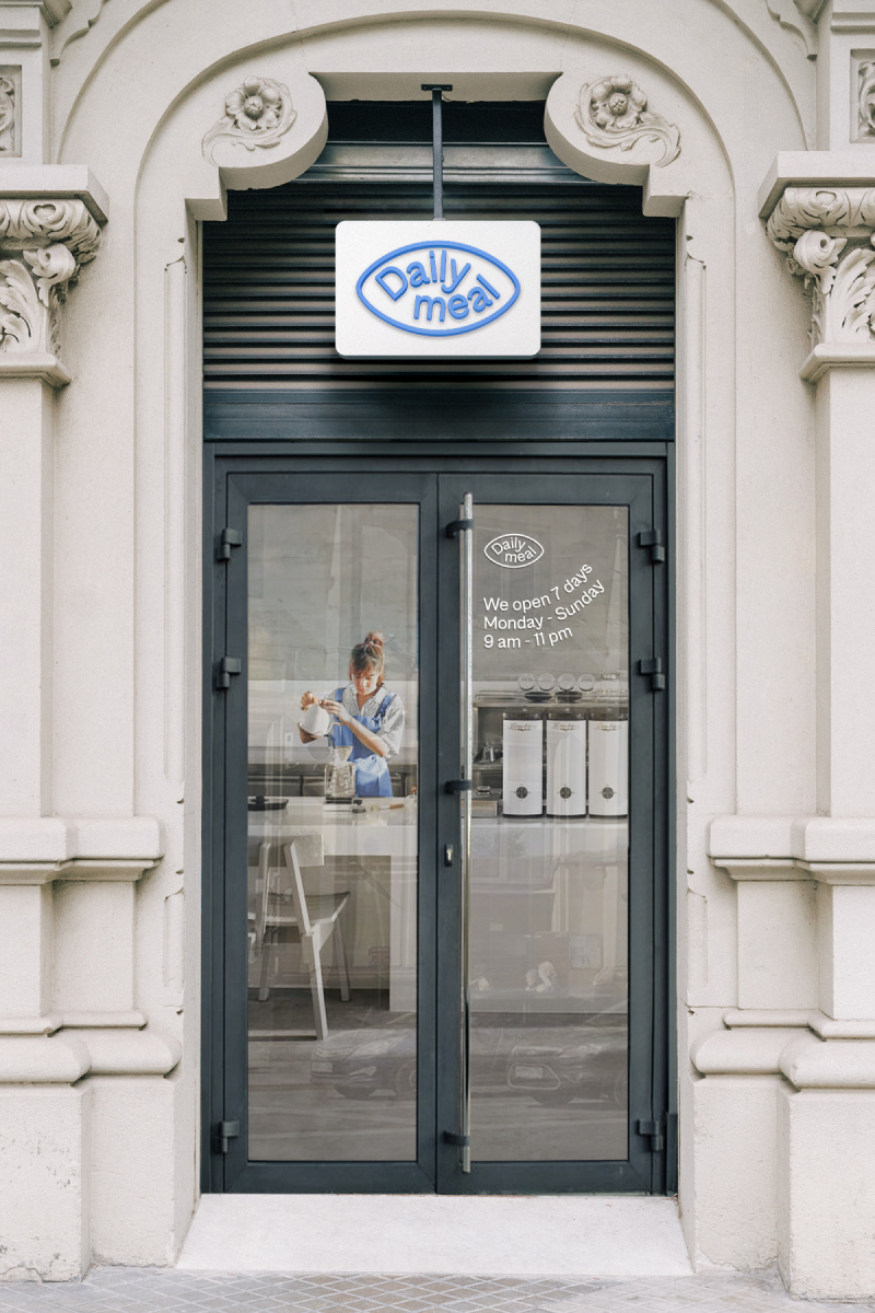
Process: During the work process, an idea emerged that people often work like a squirrel in a wheel and get exhausted. They want to make their lives better so that they can move more freely and casually, live in the moment, and enjoy their time. That’s why we came up with the slogan “Tasty every day in a circle.” And it’s true when they eat at “Daily meal”. I conveyed the main metaphor through a typographic play with rounded shapes in text lines. This technique is reflected on all mediums, such as paper cups, packaging and merch. The metaphor is also visible in the “Daily meal” logo.
Colour: Everyone wants to relax and unwind, and that’s what every company employee wants. That’s why we chose the blue color as the main color, which is perceived as calm and safe. For many people, it’s important to regain their strength during difficult times and be in harmony with themselves – and these are the properties of the blue color. In the identity, this color also distinguishes “Daily meal” from competitors among establishments and delivery services with healthy food.
Result: I have created a foundation for scaling and developing a cozy establishment that aims to become a part of people’s lifestyle and reflects the main ideas through typography and minimalist design.
I have developed
Logo and visual identity
Social media communication guidelines
Packaging and souvenir design
Reflected: I have conveyed the essence of the brand through the visual identity, which is reflected on all brand media.
What’s next?: The visual identity can be used for scaling the cafe, as well as for future franchise creation and development.

CREDIT
- Agency/Creative: Ilya Goloborodov
- Article Title: Daily Meal Brand Identity of a Cafe
- Organisation/Entity: Freelance
- Project Type: Identity
- Project Status: Published
- Agency/Creative Country: Georgia
- Agency/Creative City: Tbilisi
- Market Region: Europe
- Project Deliverables: 2D Design, Beauty Photography, Brand Design, Brand Identity, Branding, Design, Food Photography, Label Design, Logo Design, Packaging Design, Photography
- Industry: Retail
- Keywords: Daily Meal, Brand Identity, Cafe, Logo, Typography, Colors, Menu, Patterns, Brand Elements, Visual Identity, Packaging Design, Interior Design, Signage, Promotional Materials, Website Design, Social Media, Ambiance, Branding, Concept, Identity System, Stationery, Uniform Design, Coasters, Takeaway Cups, Food Photography, Wall Graphics, Illustrations, Social Media Templates, Outdoor Advertising, Loyalty Cards, Website Layout, Brand Guidelines, Menu Boards, Promotional Campaign, Custom Fonts, Visual Hierarchy, Minimalist Design.
-
Credits:
Brand Designer: Ilya Goloborodov
Client: Daily meal
Visual Identity / Communication: Ilya Desiz


