In the discipline of Ju Jitsu, strength is more than just a physical skill; it’s a connection between mind, body, and spirit.
Our challenge was to capture this essence in a visual identity that reflects the philosophy and energy of this sport, aiming to give a solid visual identity to the Daikidojo gym.
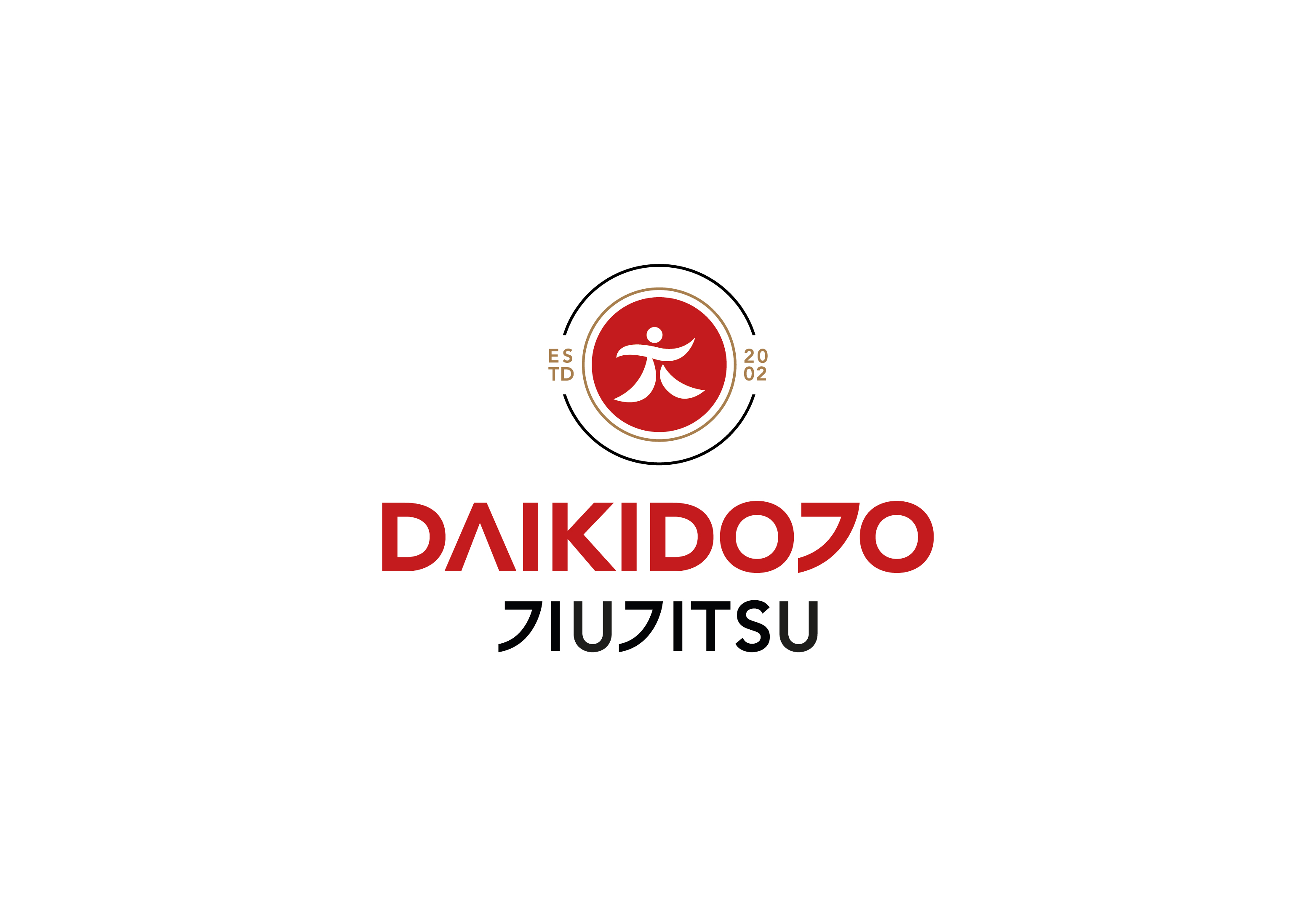
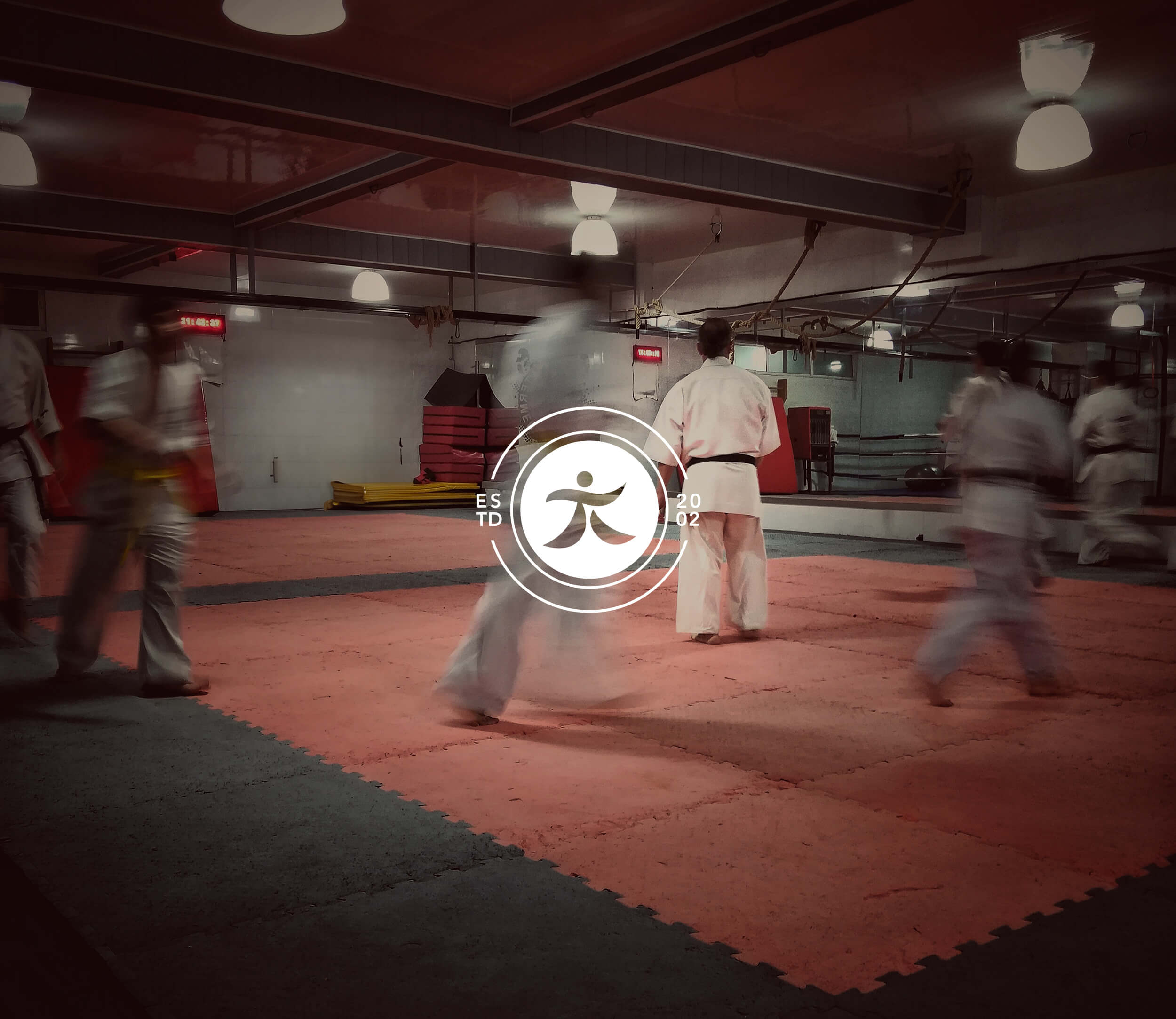
We developed a visual identity that harmonizes the tradition of Ju Jitsu with a contemporary sensibility, with the goal of finding a balance between power, flexibility, and tradition. We began by reinterpreting the ideogram in the old logo, transforming it into a dynamic representation of a martial artist in action.
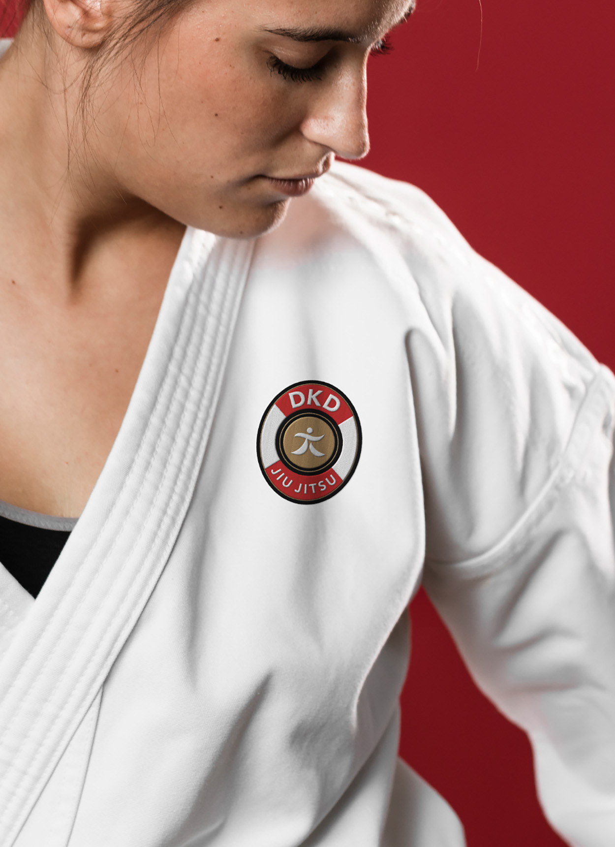
This figure was embedded within a circle, creating a customized logo where the traditional letter “J” was replaced with a design inspired by Japanese ideograms. At the request of the owners, we created a second version of the logo suitable for use as a badge. This badge not only echoes the main logo but was designed to be easily embroidered and applied to kimonos and various merchandise.
To further enrich the entire visual identity, we introduced gold as a four-color process, alongside the existing red and black, which were already present in the previous logo. This color choice adds a touch of prestige to the entire visual identity.
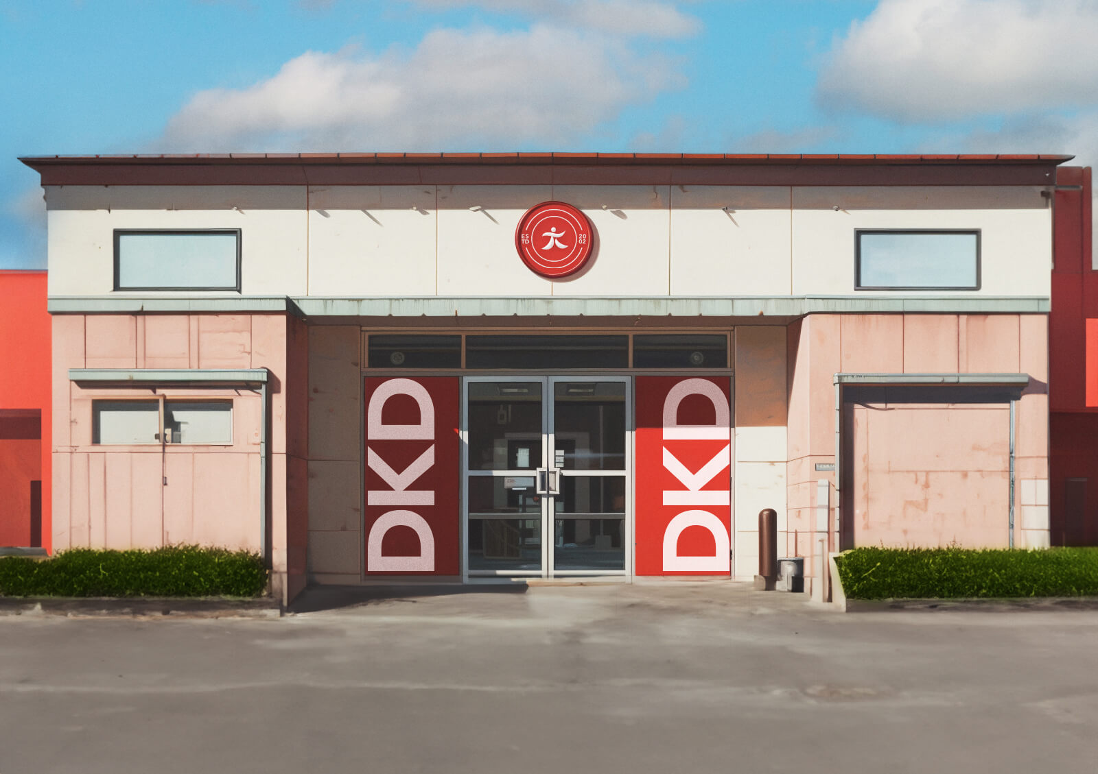
This branding project greatly increased the client’s visibility in the national Ju Jitsu championships, contributing significantly to his awareness and greatly increasing the number of enrollments in his school.
Project designer for Studio K95.





CREDIT
- Agency/Creative: Danilo De Marco
- Article Title: Daikidojo Brand Identity
- Organisation/Entity: Agency
- Project Type: Identity
- Project Status: Published
- Agency/Creative Country: Italy
- Agency/Creative City: Catania
- Market Region: Europe
- Project Deliverables: Brand Design, Brand Guidelines, Brand Identity, Branding, Logo Design
- Industry: Education
- Keywords: ju Jitsu, sport, logo, branding, karate, karate school
-
Credits:
Project Manager: STUDIO K95


