Cycle.me – Nutrient Timing Food
In the era of “The 100-Year Life,” Health is becoming a key societal issue. However, too many health food options can confuse people.
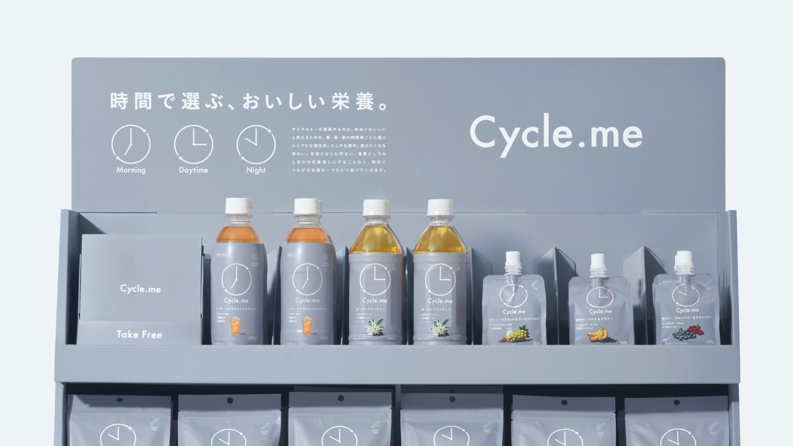
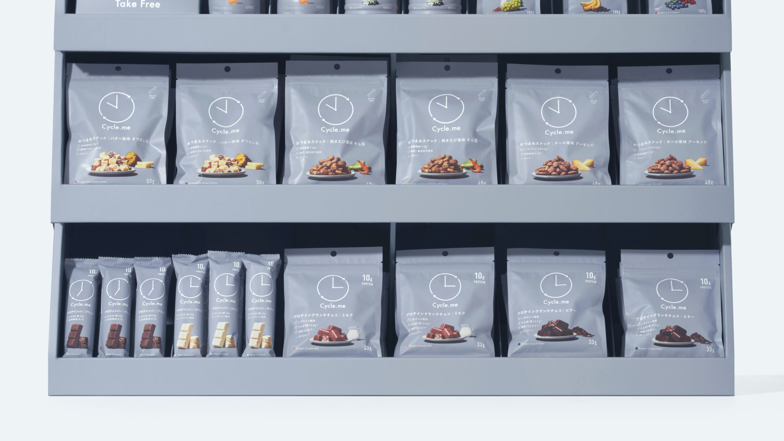
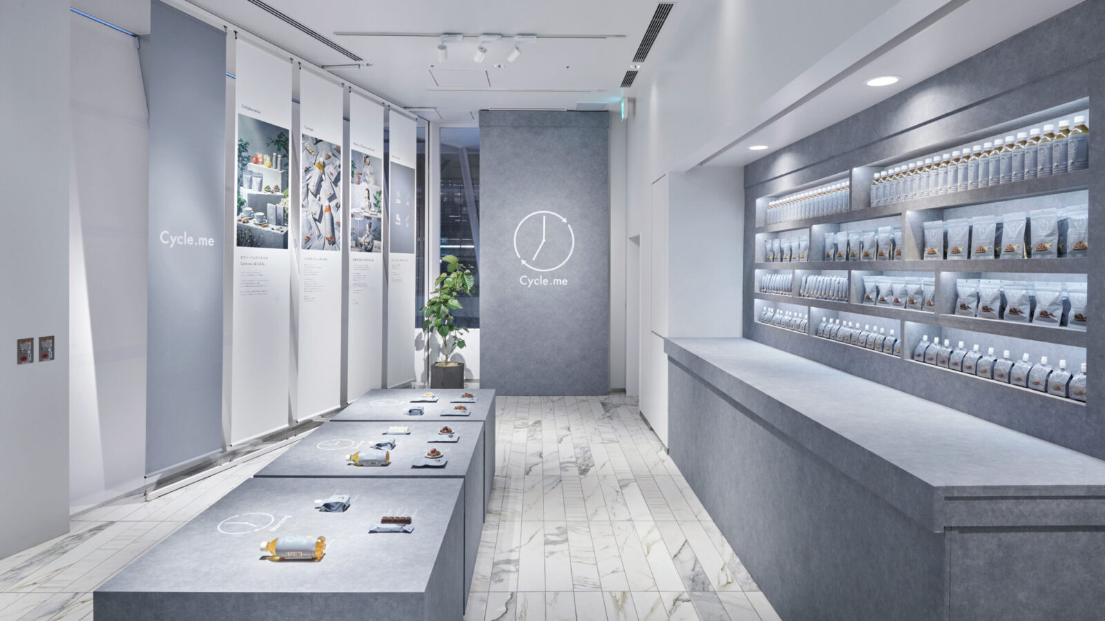
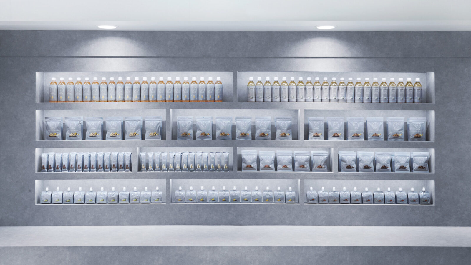
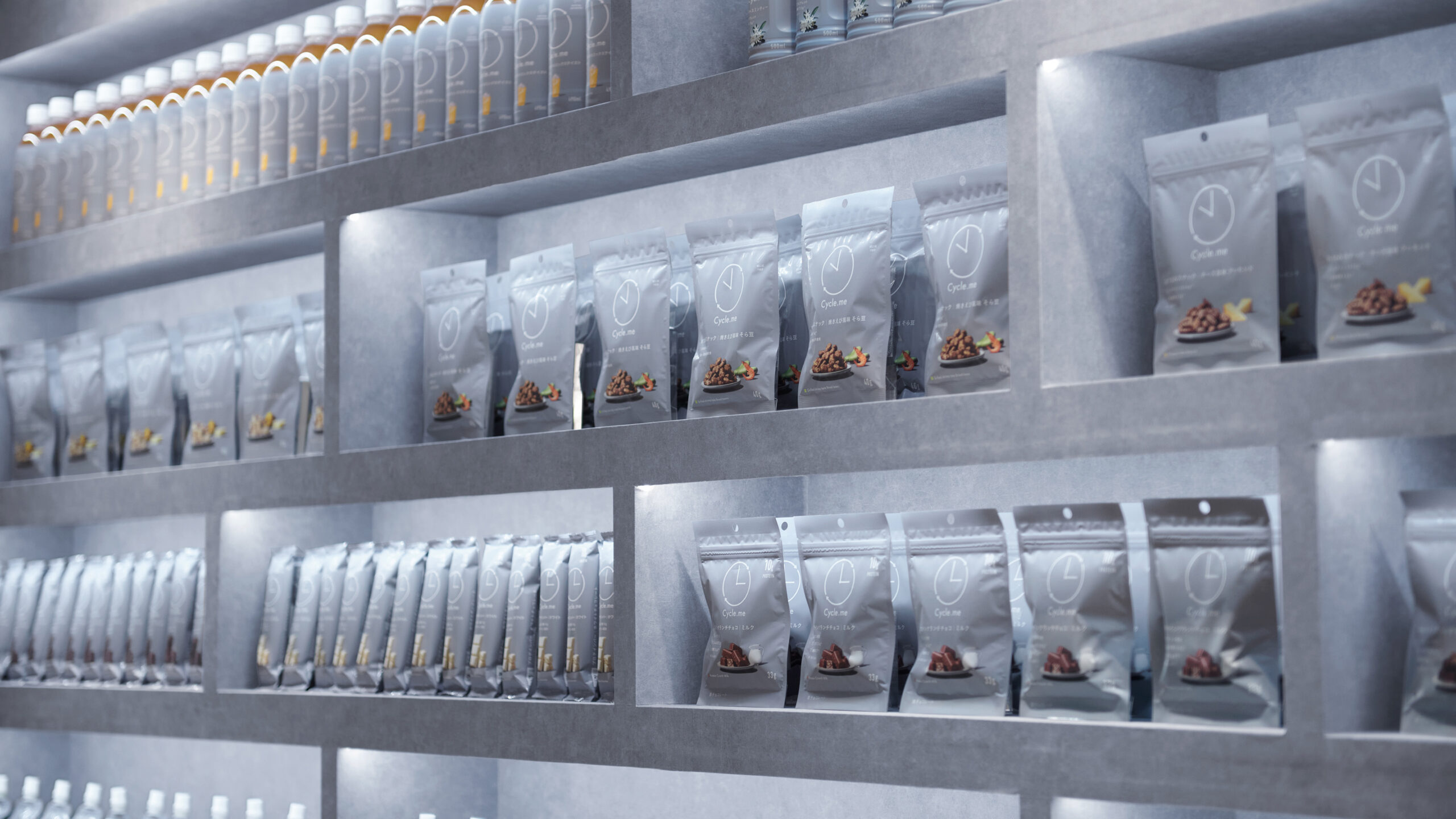
So, the Japanese start-up “dot.me” has partnered with Seven-Eleven Japan to launch an innovative health food brand “Cycle.me.” The brand is based on “Chrono-nutrition,” which focuses on “when to eat,” Knowing the right timing makes the choice much simpler. Research on the body’s internal clock shows that the impact of nutrients varies depending on the timing of meals. Morning, daytime, night. For each time period, We developed products containing recommended nutrients, such as protein bars, beverages, chocolate crunches, jellies, snacks, and instant noodles. There are a wide variety of products to meet diverse lifestyles. Many Seven-Eleven stores in Japan operate 24 hours, enabling people to buy products anytime. This aligns effectively with Chrono-nutrition.
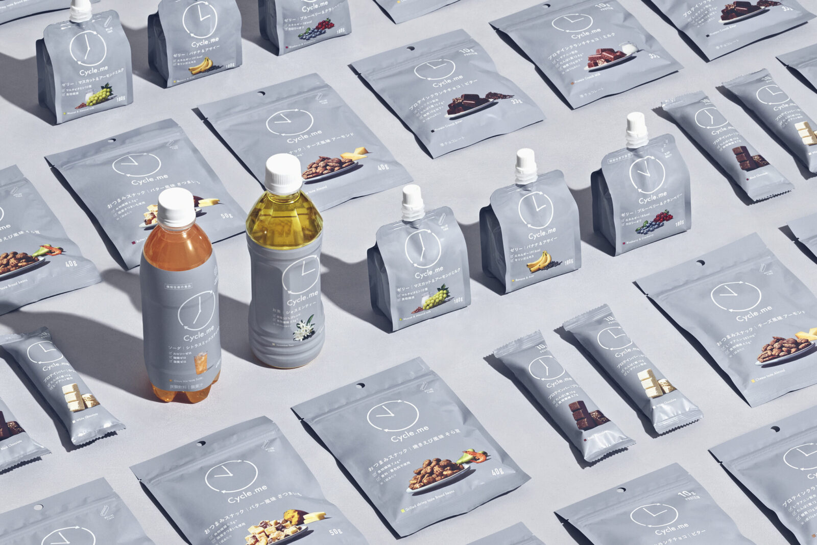
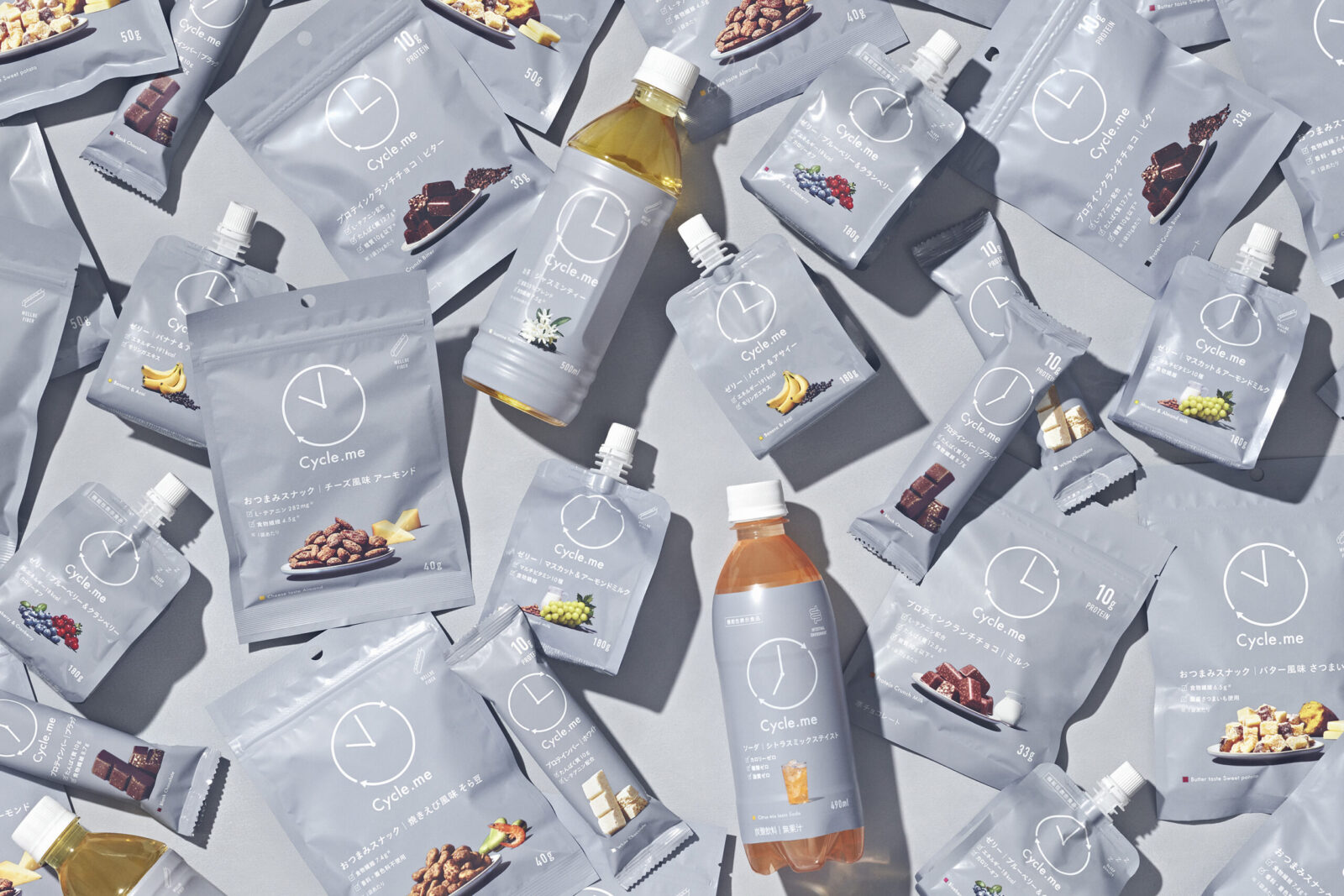
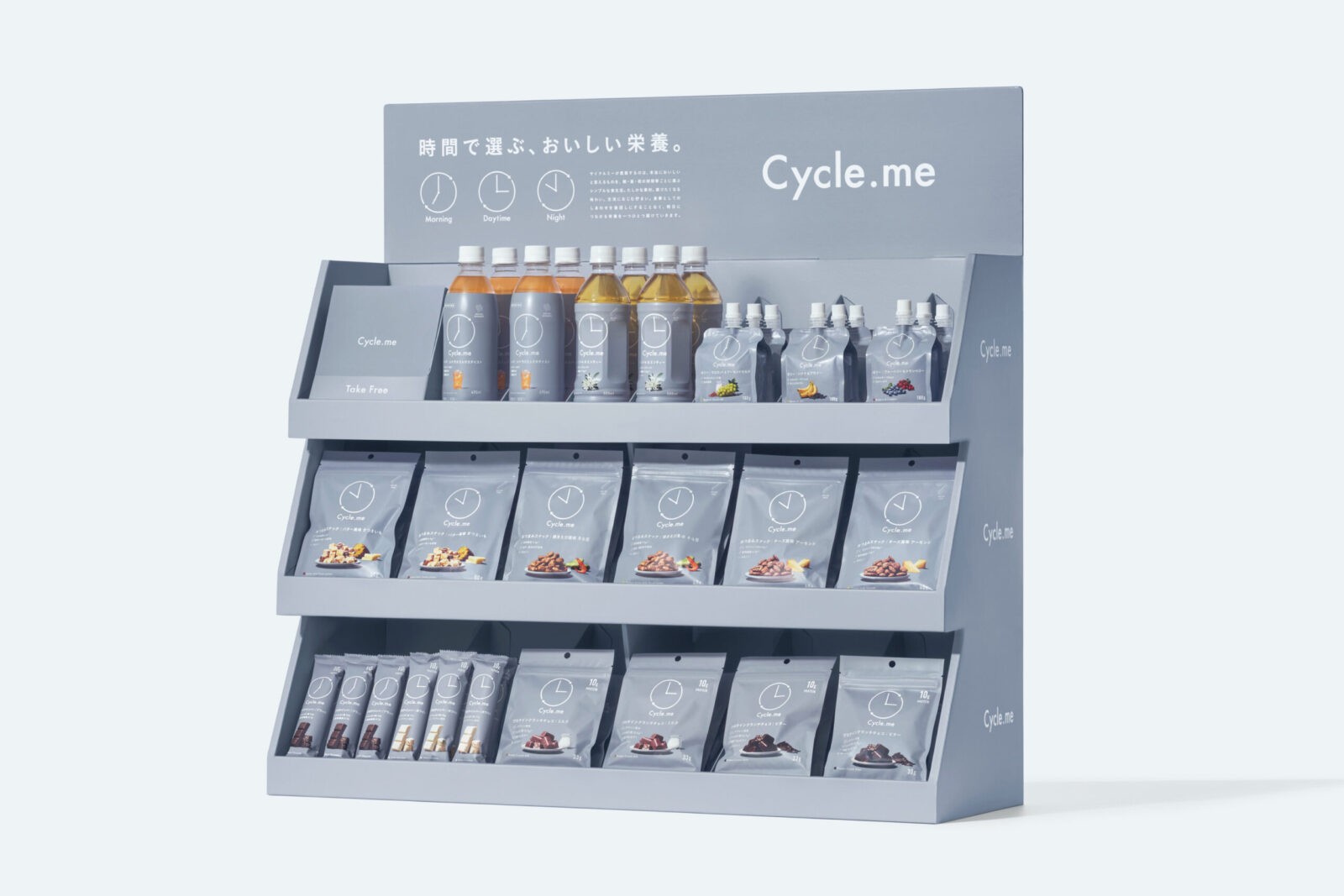
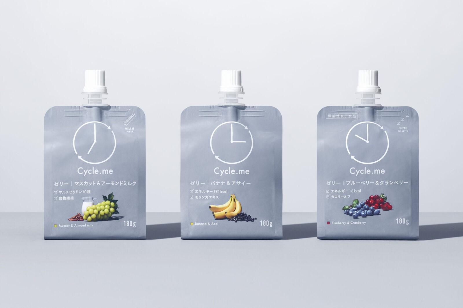
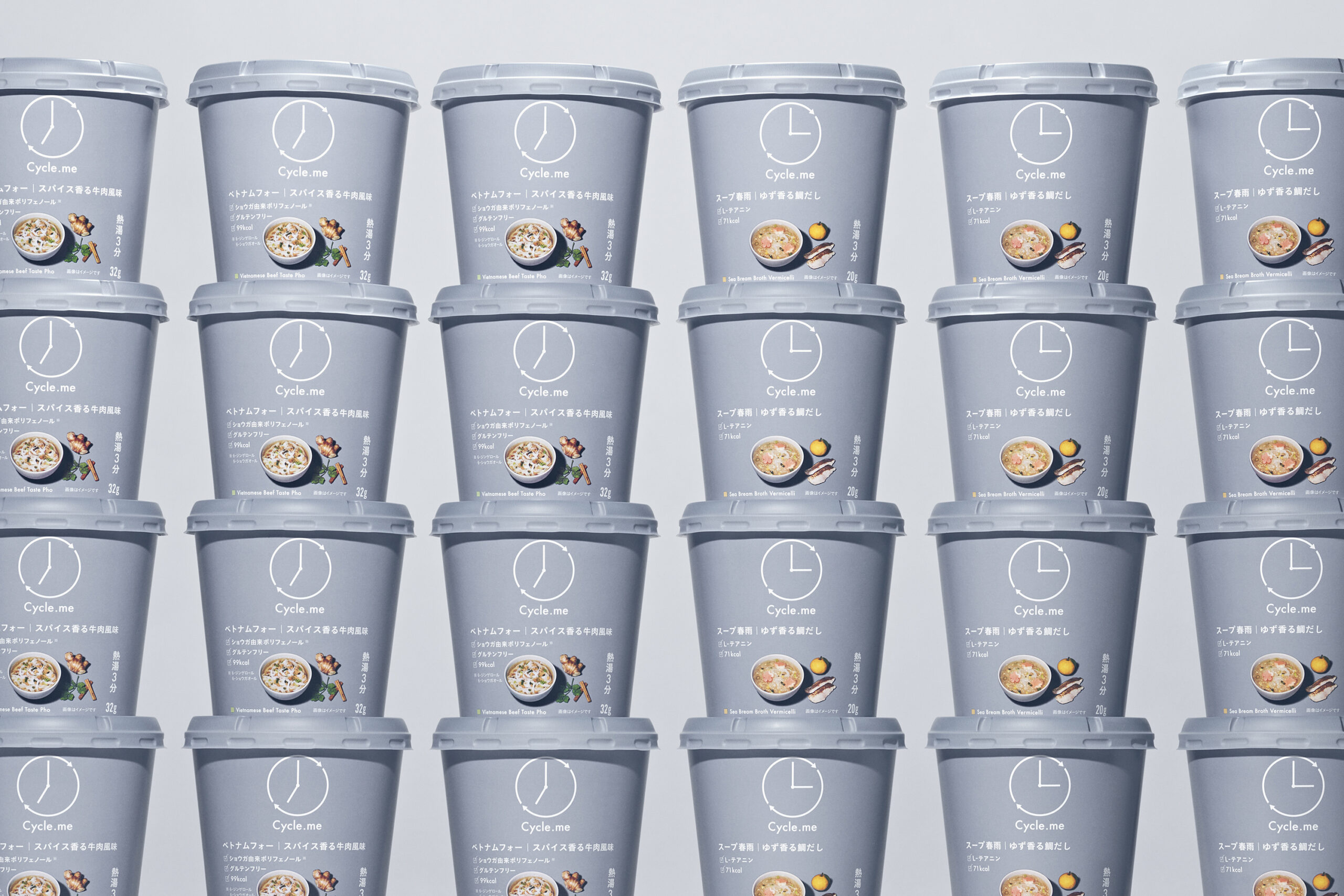
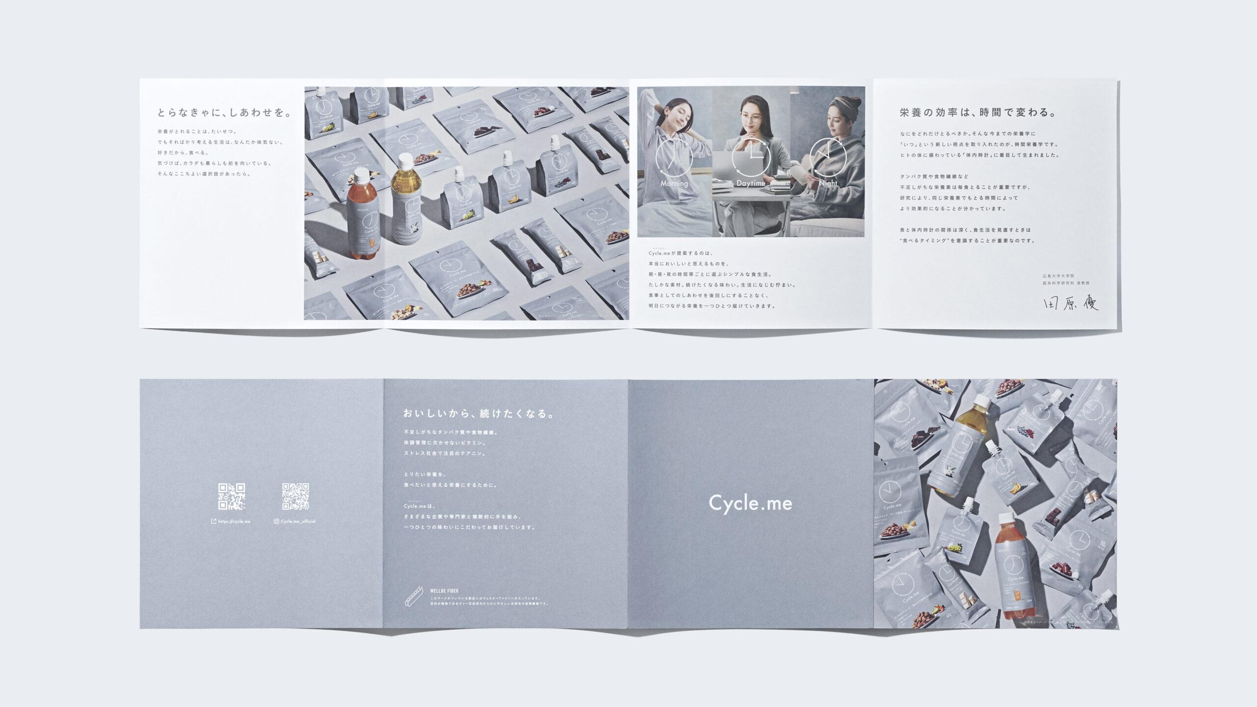
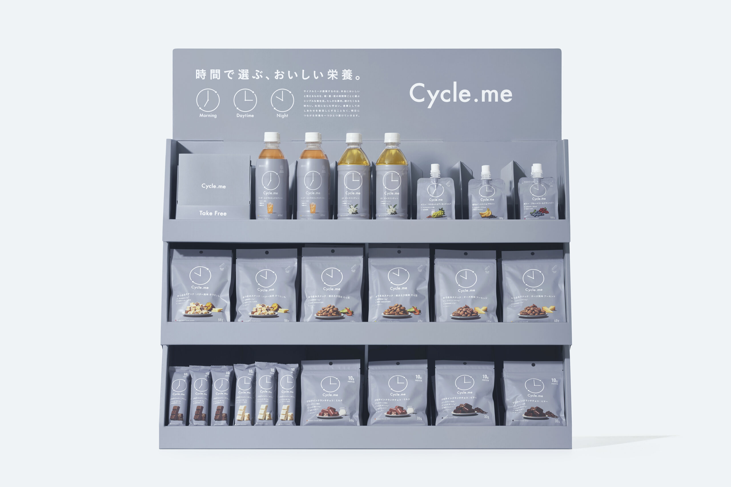
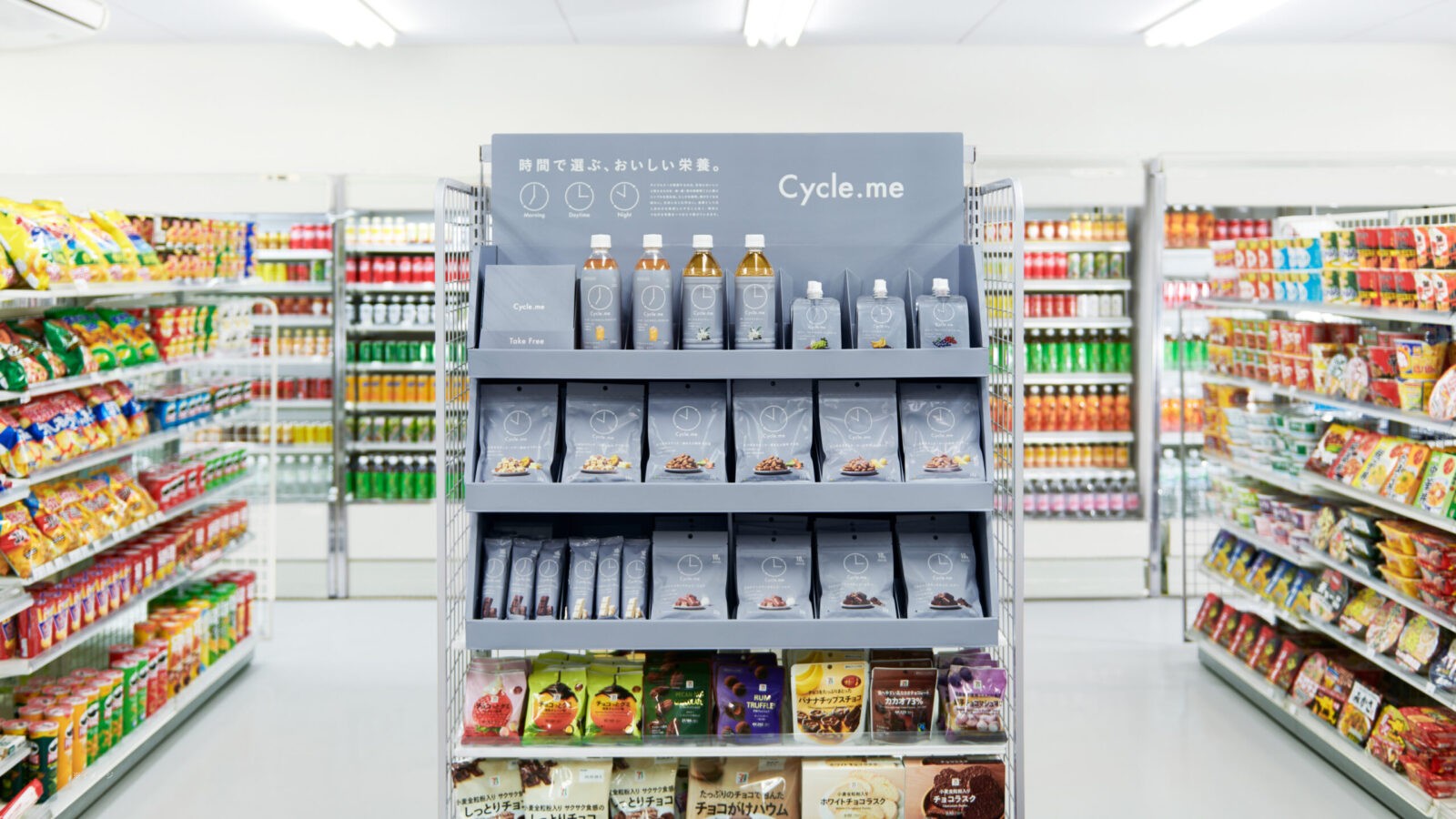
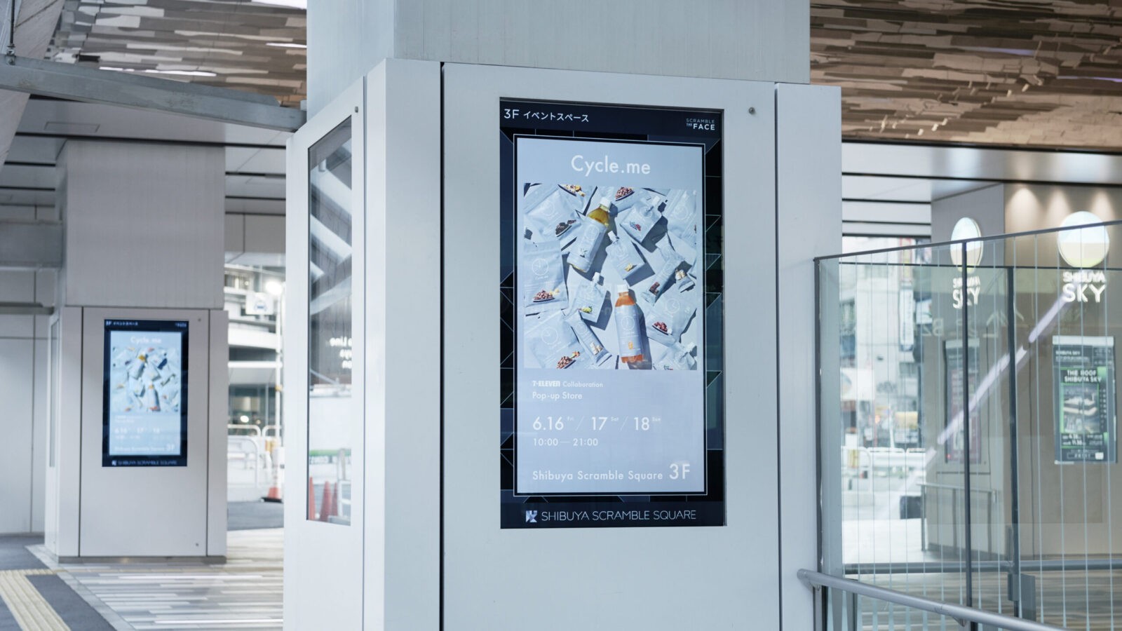
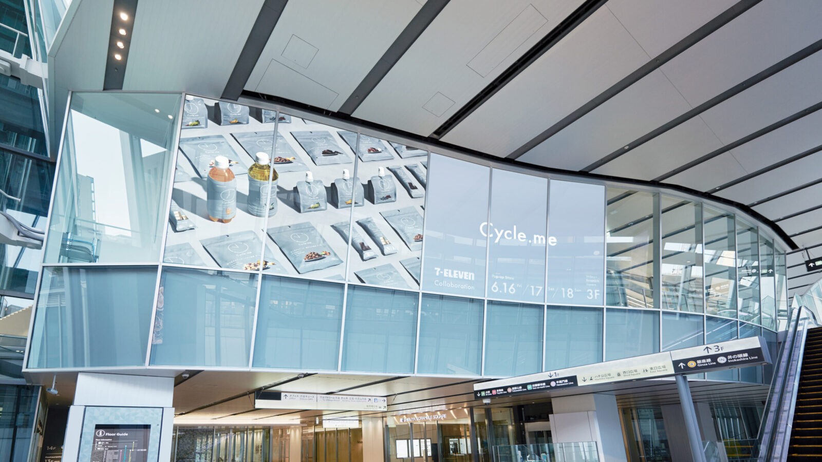
The package design indicates the ideal timing to eat by a clock symbol mark. It is simple and functional, offering only the essential information about the ingredients. We created brochures and displays to help understand Chrono-nutrition. At the store, they introduce a new approach of selecting healthy foods. Traditionally, packaging must be vibrant to stand out. we thought the opposite – that the brand color’s gray pops out in a colorful space. We presented the concept of Chrono-nutrition through a digital platform and to gain media exposure, organized pop-up stores.
Convenience stores are the most familiar touchpoint for the Japanese. Cycle.me has spread to more than 21,000 Seven-Eleven stores all over Japan. Japan tops the world in store count, with 20 million visitors daily. About 1 in 6 people shop there every day. It generated a lot of buzz and received extensive coverage on TV. Through open innovation, more companies are joining us. Cycle.me created a simpler way to choose healthy foods and instilled healthy eating habits that can be maintained effortlessly.
CREDIT
- Agency/Creative: Hakuhodo Design , Hakuhodo Inc. , Spice Inc. , White , dot.me
- Article Title: Cycle.me’s Minimalist Packaging Gains Buzz Across Seven-Eleven Stores in Japan
- Organisation/Entity: Agency
- Project Status: Published
- Agency/Creative Country: Japan
- Agency/Creative City: Tokyo
- Market Region: Japan
- Keywords: WBDS Agency Design Awards 2024/25
- Keywords: WBDS Agency Design Awards 2024/25
-
Credits:
Chief Marketing Officer: Yamato Watanabe
Creative Director: Takayuki Ichida
Art Director: Takayuki Ichida
Copywriter: Hinako Okubo
Copywriter: Seri Morikawa
Designer: Riko Sato
Designer: Sakura Oshima
Designer: Kai Higuchi
Designer: Takeshi Kajiyama
Designer: Mei Kobara
Designer: Natsuki Akasaka
Designer: Ayano Yanagisawa
Designer: Mayumi Matsushita
PR Planner: Rie Ishikawa
PR Planner: Miku Iemura
Strategic Planner: Ryuji Isaku
Photographer: Ryo Yasumoto
Retoucher: Takumu Koshiba
Retoucher: Shin Nakanishi
Producer: Kakunosuke Mizusawa
Producer: Megumi Yoshida
Event Producer: Kaoru Nishino
Prop stylist: Yoko Watanabe
Art: Ken Yamada
Account Director: Tomoya Tamada
Account Manager: Kazuhiko Inoue
Account Manager: Chikara Kasezawa


