


The Labelmaker – Oriachovitza Wine Label
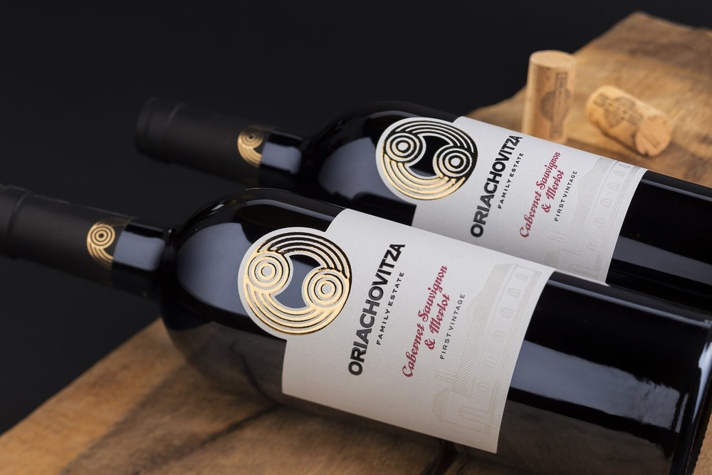
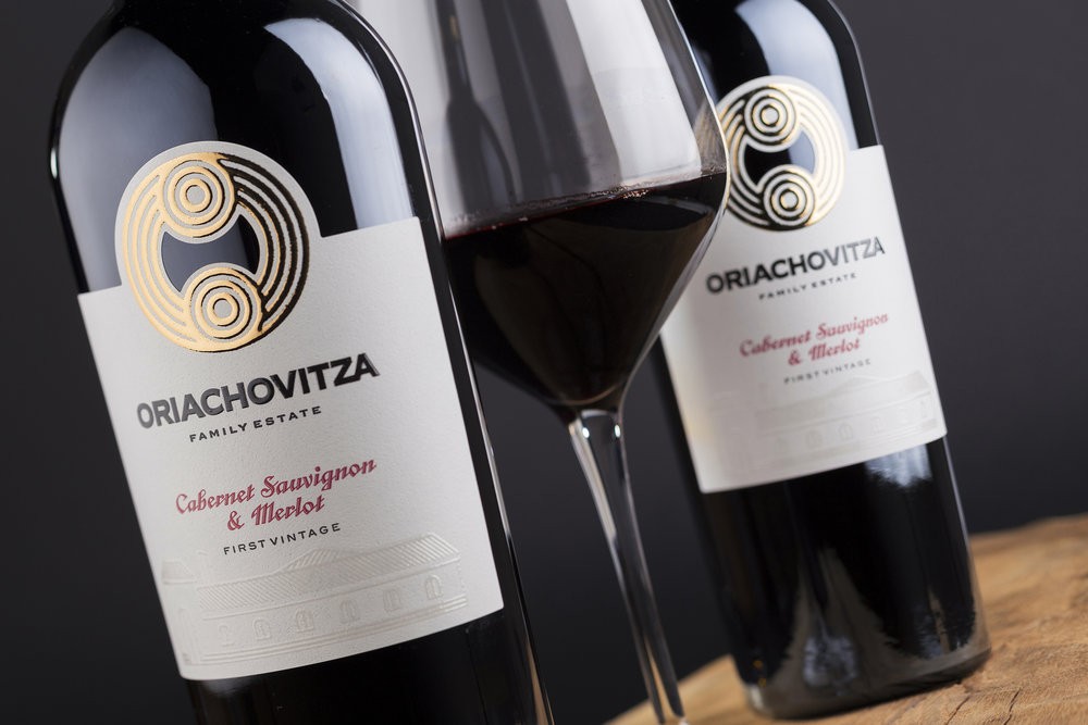
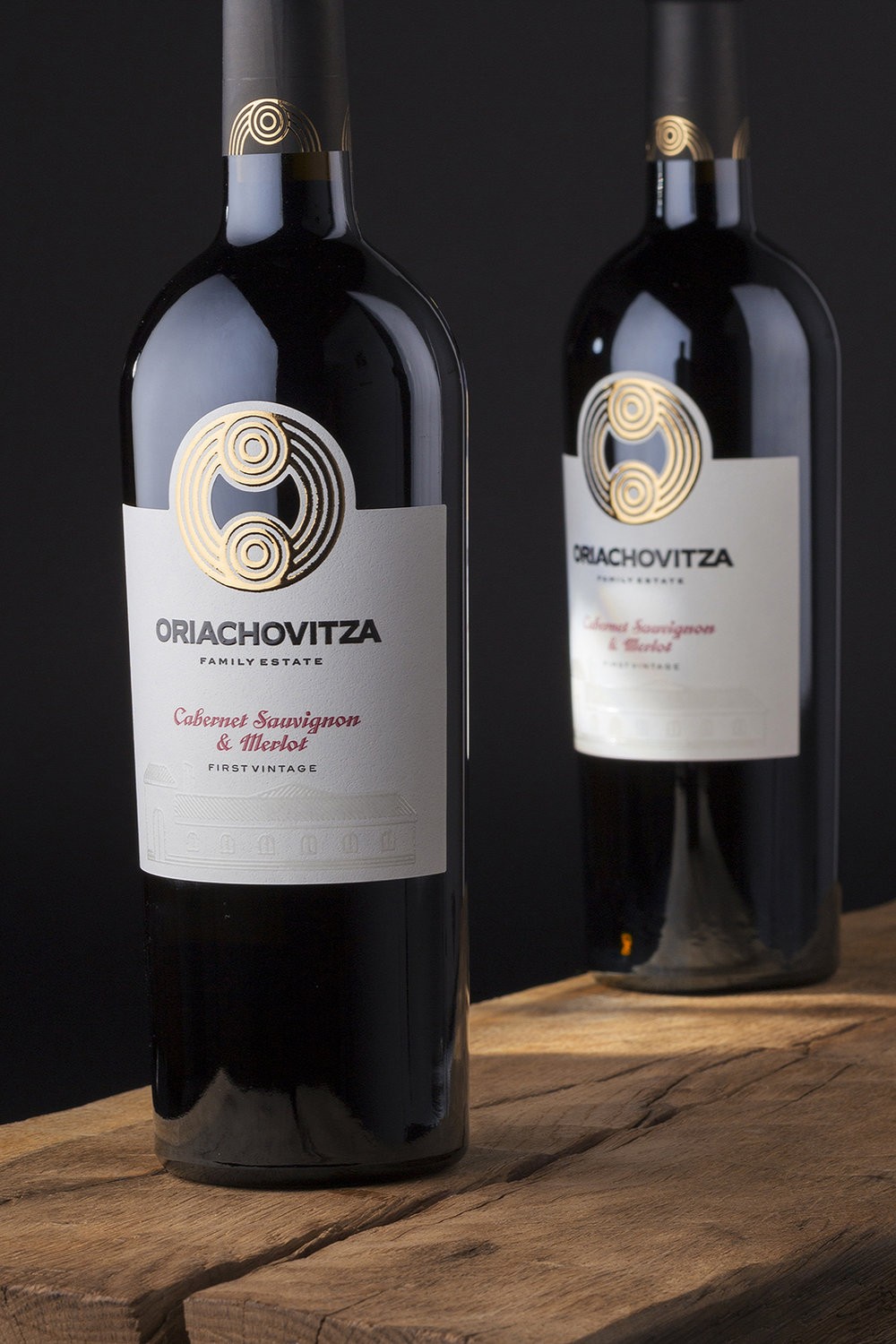
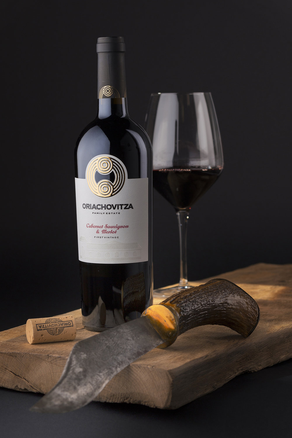
“Custom winery logo design is something I do from the very first moment I started doing wine labels in 1998. In fact I changed the logos or did new ones for almost every winery I worked with through the years. This story repeated with Oriachovitza winery and I am very happy and proud with the result and also because of the fact that their custom winery logo was a focus point of their new label design I was commissioned to create.Oriachovitza is a family winery run by father and son. The strong family relation was quite evident even from the first moment we started discussions on the project. This is very powerful source of inspiration and I decided to use it as a foundation of their custom winery logo design. After a few days brainstorming going back and forth between different options I finally decided to use two small circles as symbols of father and son and a third larger one to unite them in family. The result was quite promising and it was really big fun to finish up the logo.The first time I used it was on my Gaetan wine label but it was used there just to ‘sign’ the whole picture. Here in Oriachovitza wine label the logo played the main part in my creative process. Positioned at the top of the label I used for the very first time in my practice the brand new Silk Foil technology with gold foil to stamp the logo. It looked really incredible shining with all of its beauty and character. As a special touch-up I preserved the opening at the center of the logo so you could touch the bottle directly. The bottom part of the label was kept for the Oriachovitza title and a mono-linear vector illustration of the winery printed with transparent varnish. The whole label received classical but at the same time unusual shape. Oriachovitza custom winery logo design took the best place in the whole wine packaging making it very recognizable and easy-to-remember among others on the shelves.I used classical conic bottle Ancienne by Saverglass and black matt for the capsule on the top. My paper choice fell this time on very smooth and delicate paper – the Constellation Snow Country by Arconvert.We have only one wine so far in the Oriachovitza range but soon I will have to add a few more reds, whites and a promising rose – stay tuned!Credits:Client: Oriachovitza wineryDesign: the LabelmakerBottle: SaverglassPaper: Arconvert / ManterPhoto: Jordan Jelev”
CREDIT
- Agency/Creative: the Labelmaker
- Article Title: Custom Identity Design for Father and Son Winery
- Project Type: Packaging
- Agency/Creative Country: Bulgaria
- Market Region: Europe
- Format: Bottle
- Substrate: Glass


