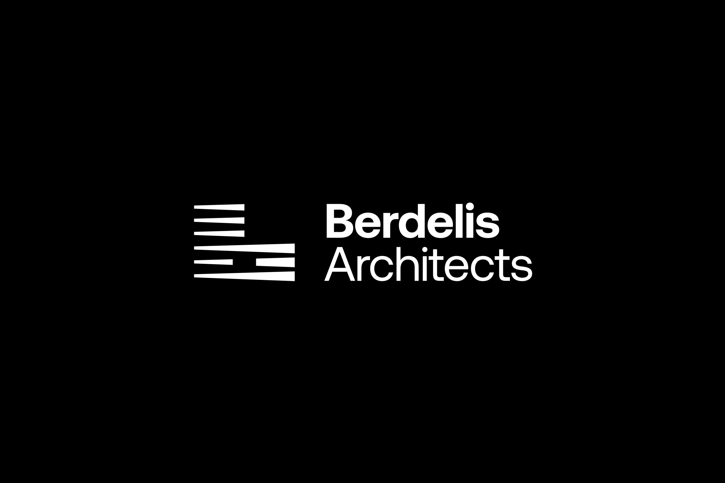
Strategy: We decided to use the perspective and the dynamic of the cityscape in order to create an innovative geometric monogram. To do so we involved a thoughtful combination of design elements, following a specific series of steps, namely: study of certain cityscapes and detection of specific landmarks, identification of key geometric shapes, incorporation of perspective, selection of monogram style, maintenance of balance and symmetry, selection of the appropriate typography, consideration of context, adaption of chosen formats.
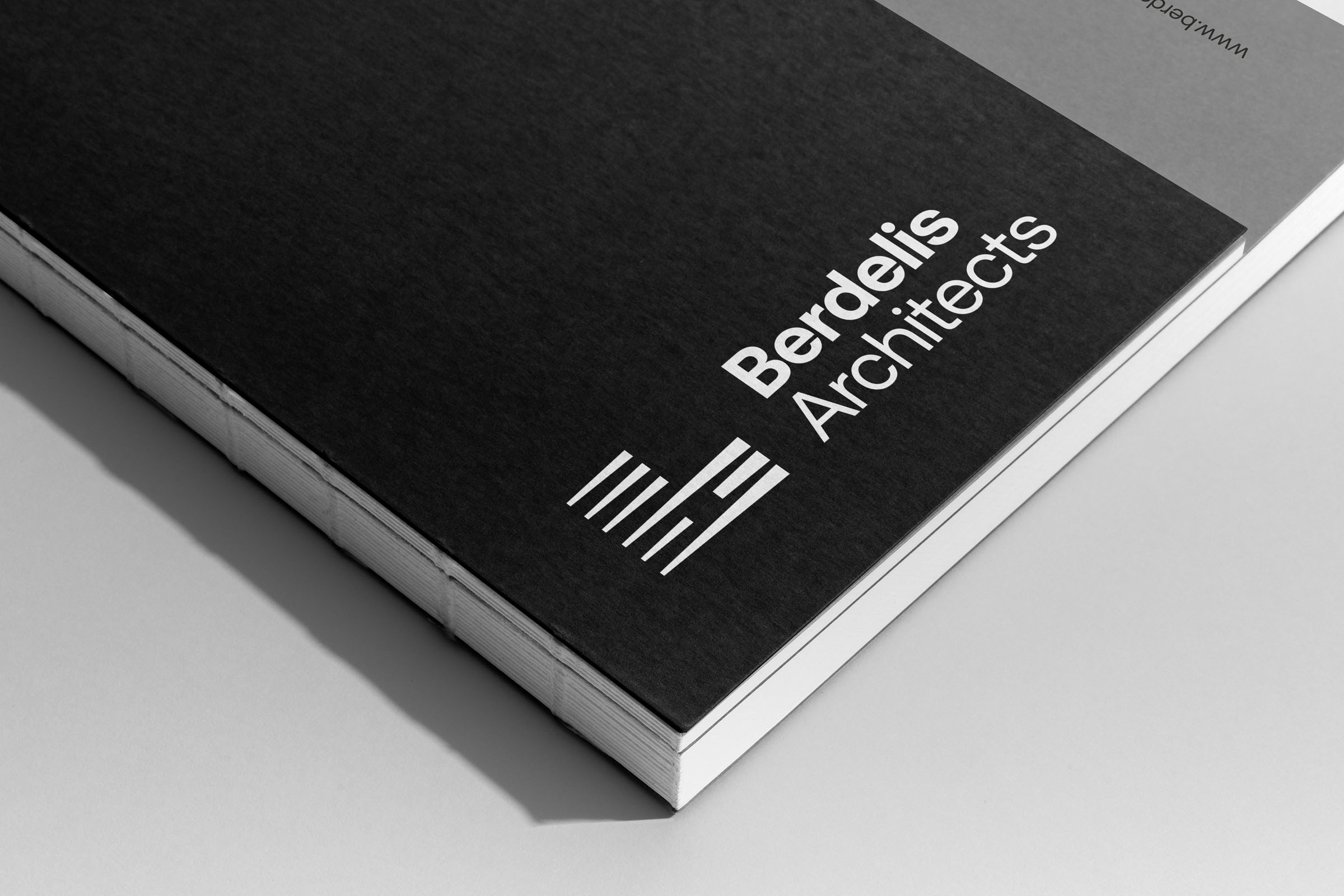
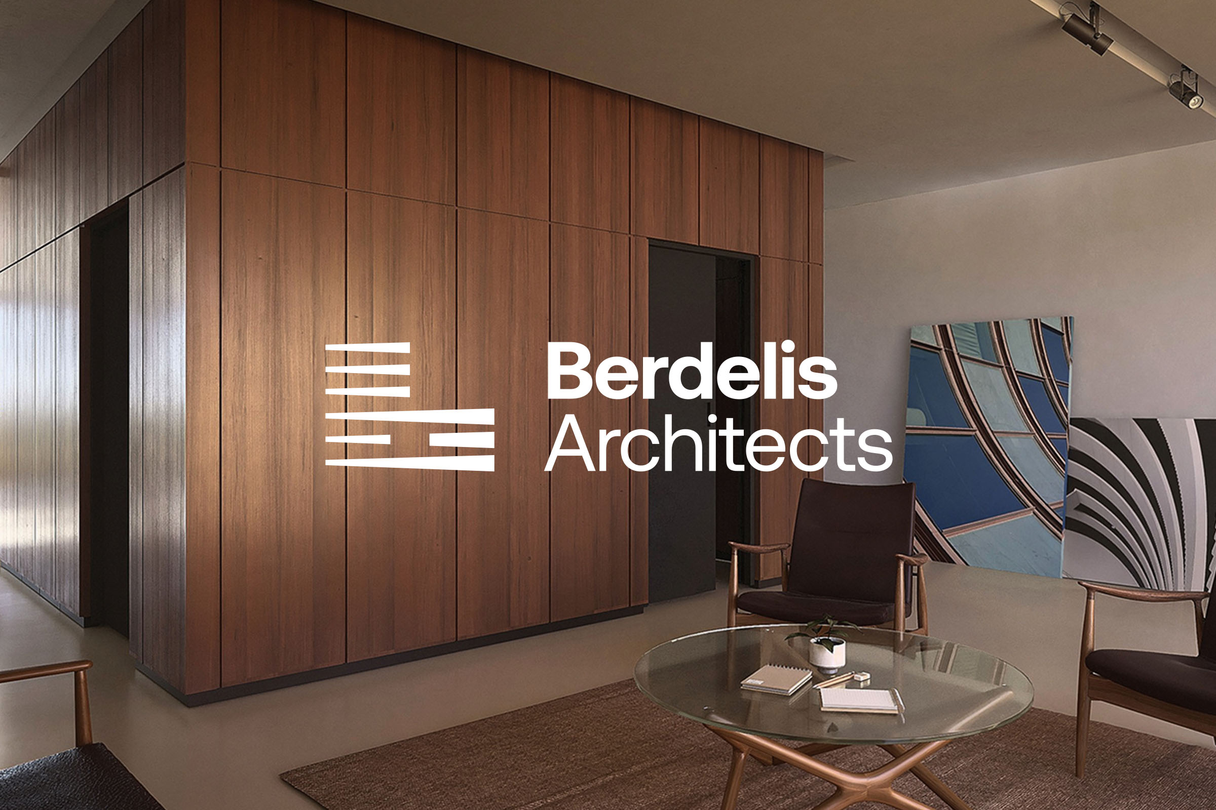
Logotype: In order to design the logotype we first aimed to capture the essence of the architect’s work, as well as the style and the philosophy of the brand. We achieved to do so by deep research and identification of the most appropriate/relative architectural inspirations, which then formed the guidelines of styles and motifs. Aligned with these guidelines we paid emphasis to the structure and the symmetry of the logotype, while we used simple geometric forms to convey precision and balance. During this process we decided to incorporate the Initial of the brand name into the symbol and to integrate this very element into the overall design. Furthermore, we incorporated simplicity as to visually communicate sophistication in design. Hence, the initial brand name letter ‘’B’’ is attributed within a minimal form, which communicates the uneasy architectural spirit, which – simultaneously – pays respect to the demand for balance. Finally, we supported the symbol with a straightforward typeface in dissimilar weights, reinforcing the distinction between the brand name and its services.
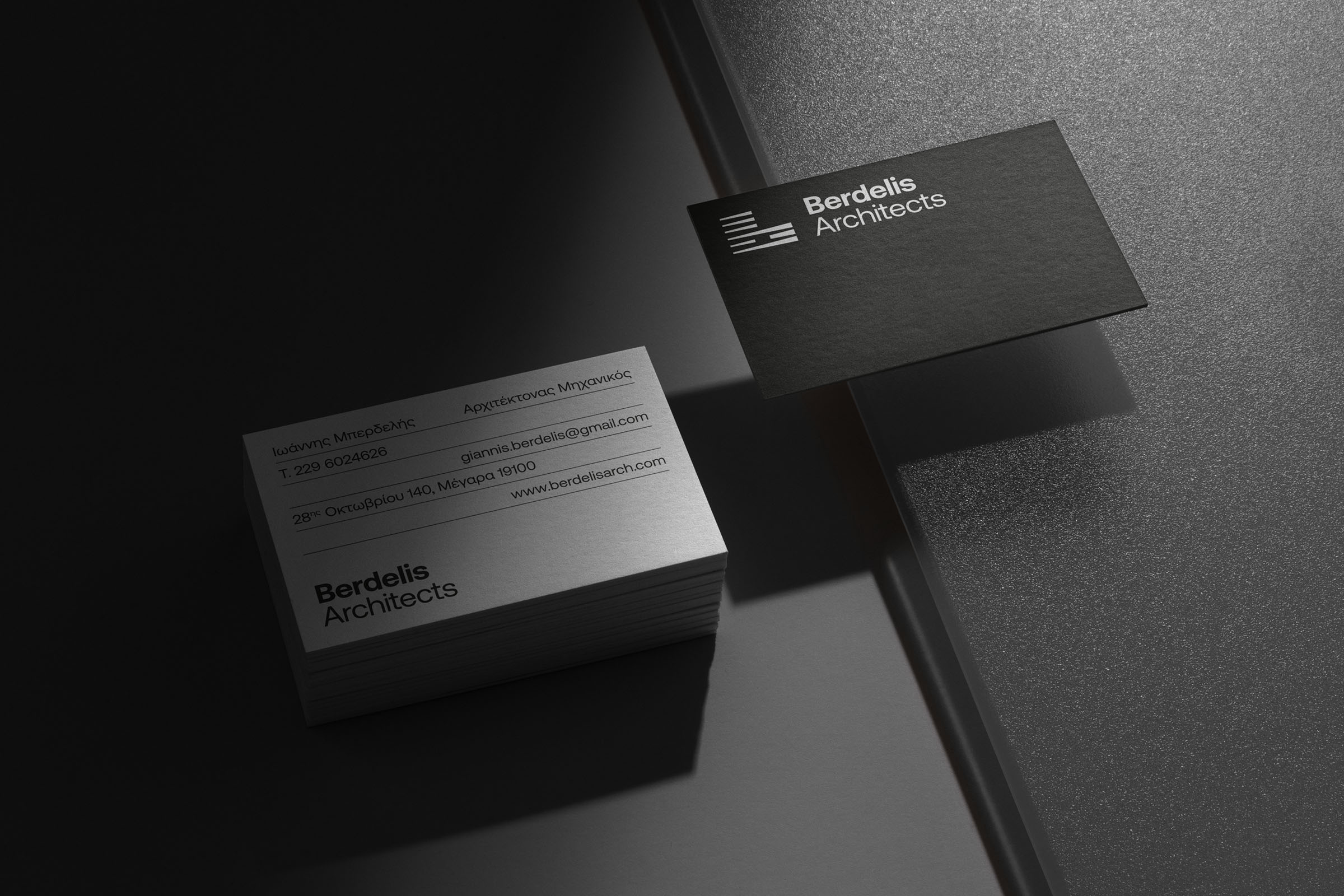
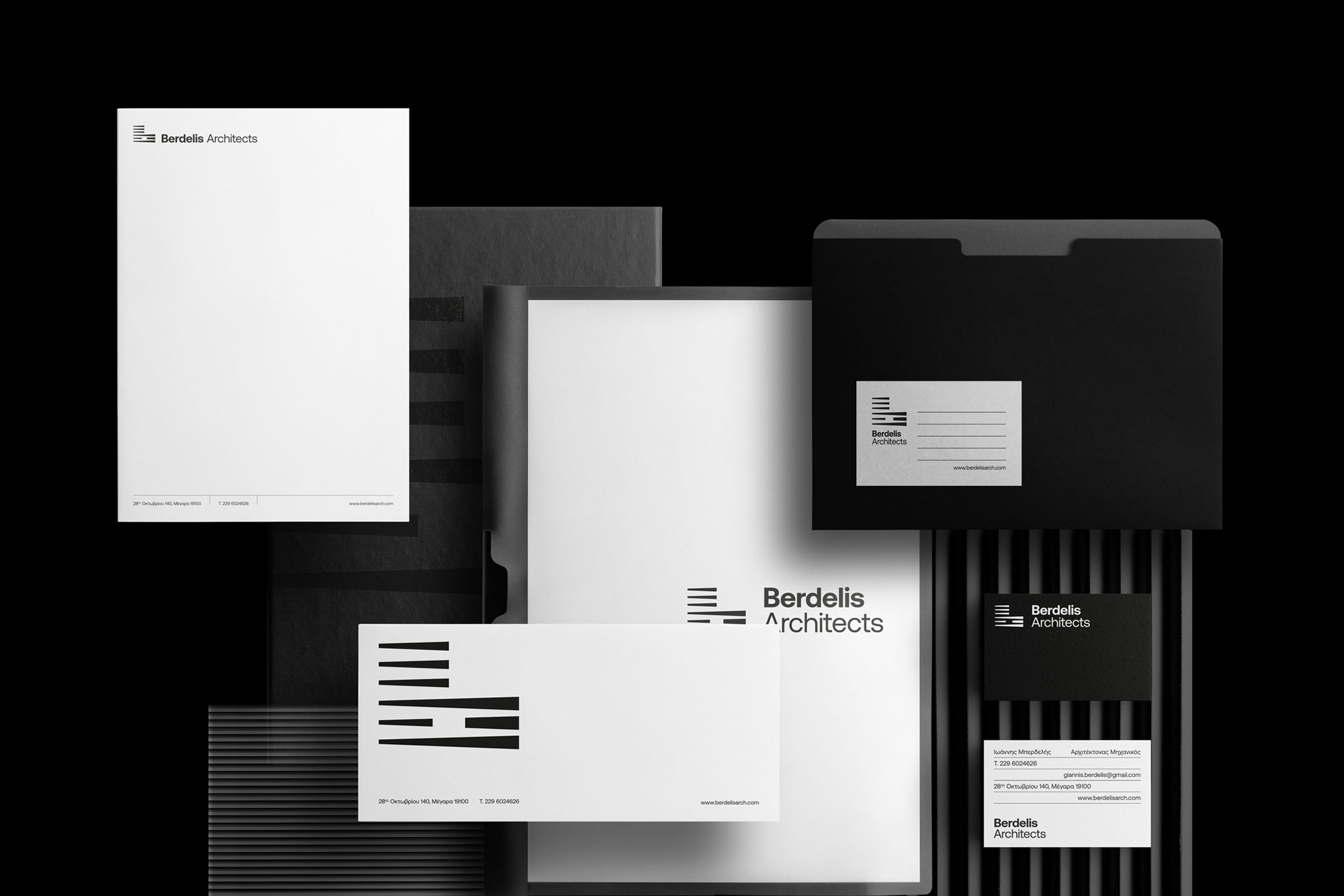
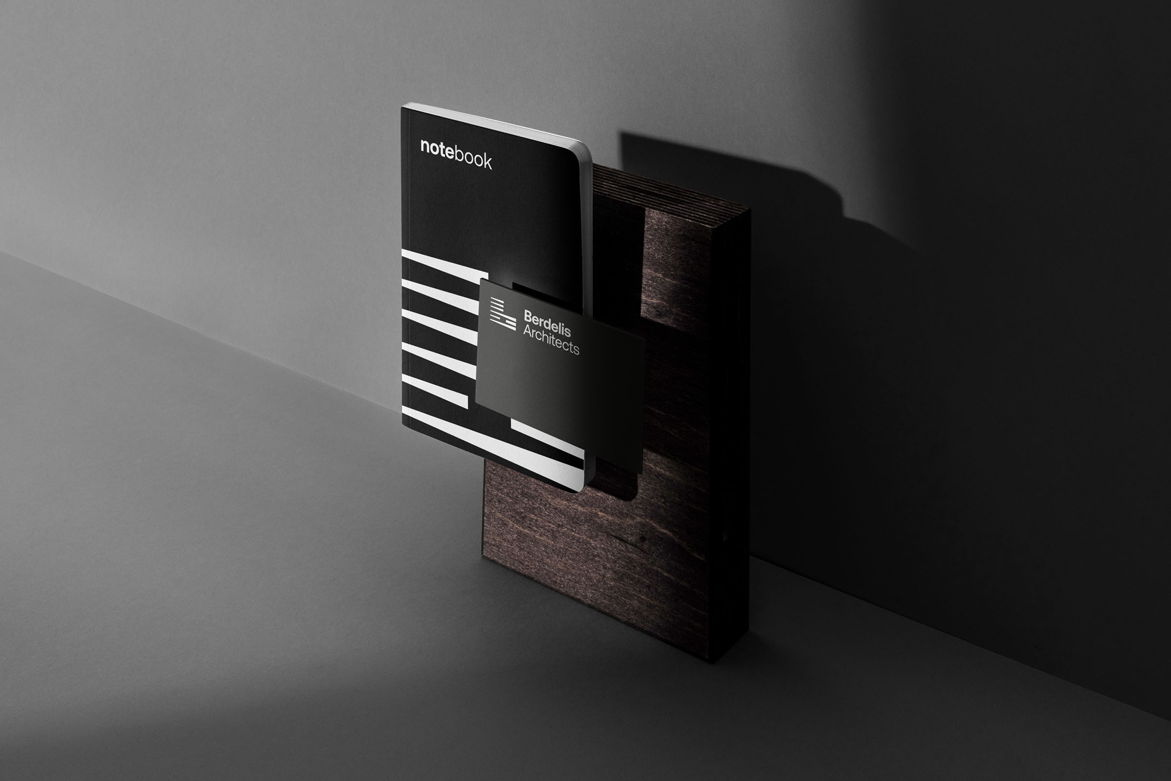
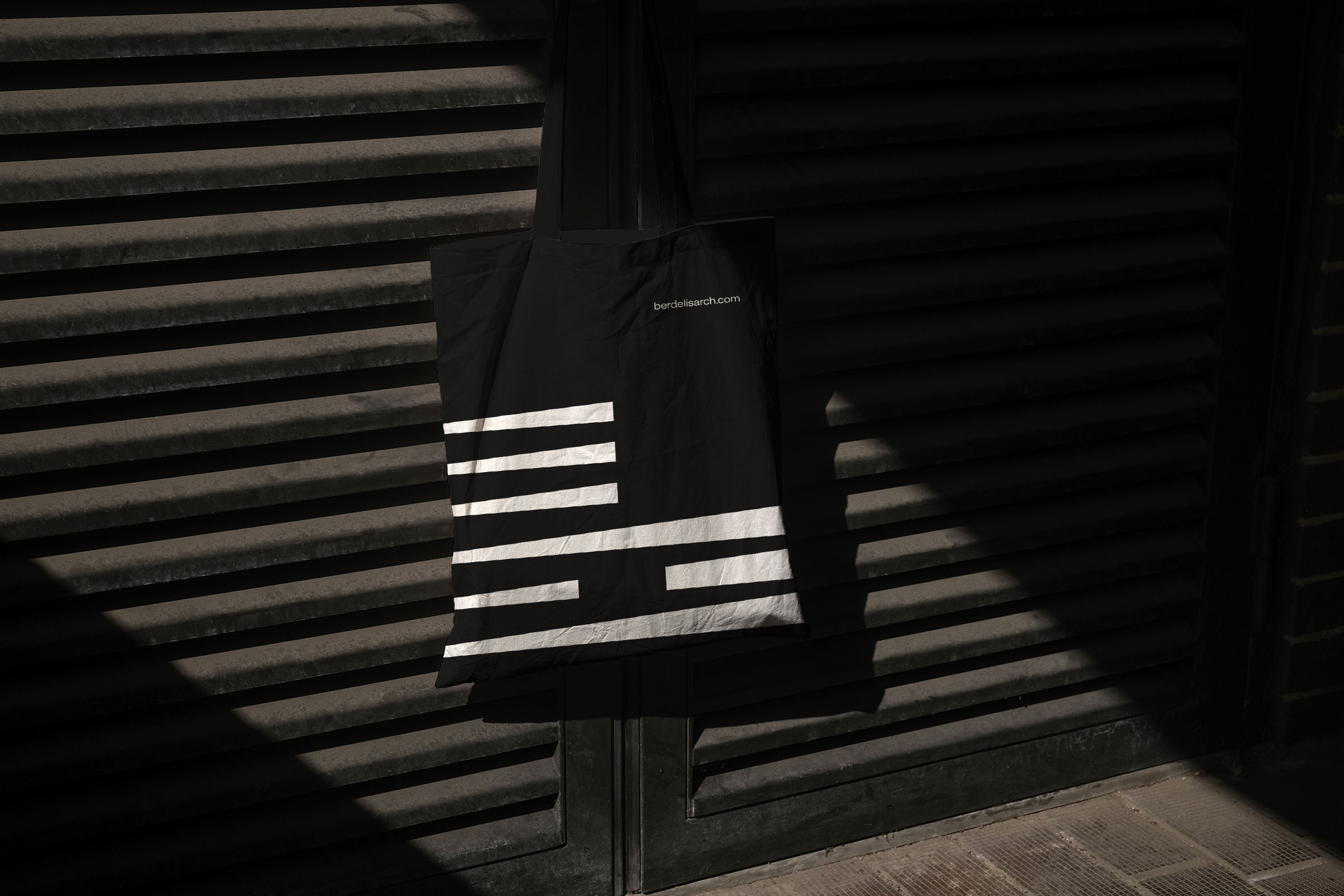
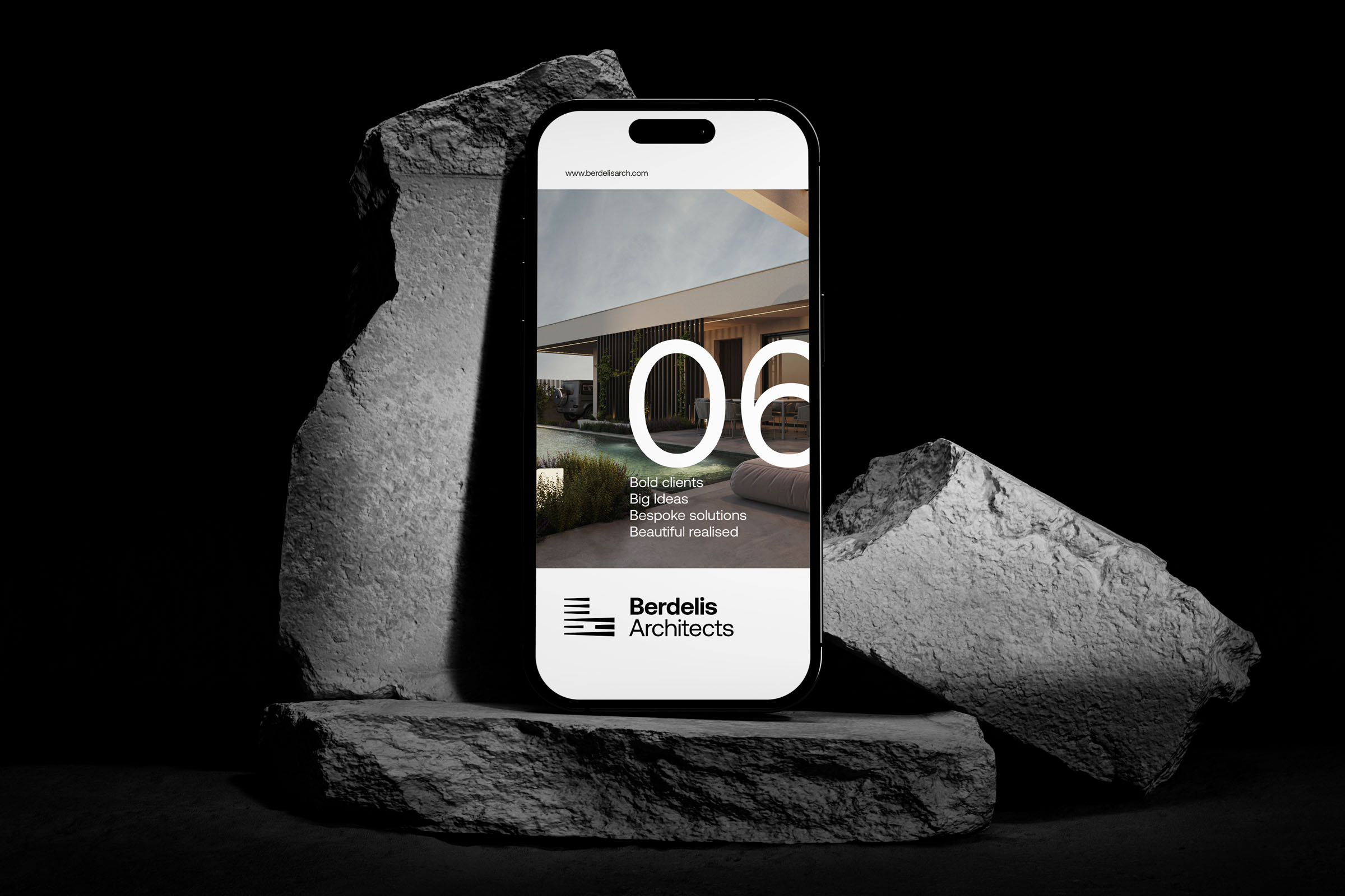
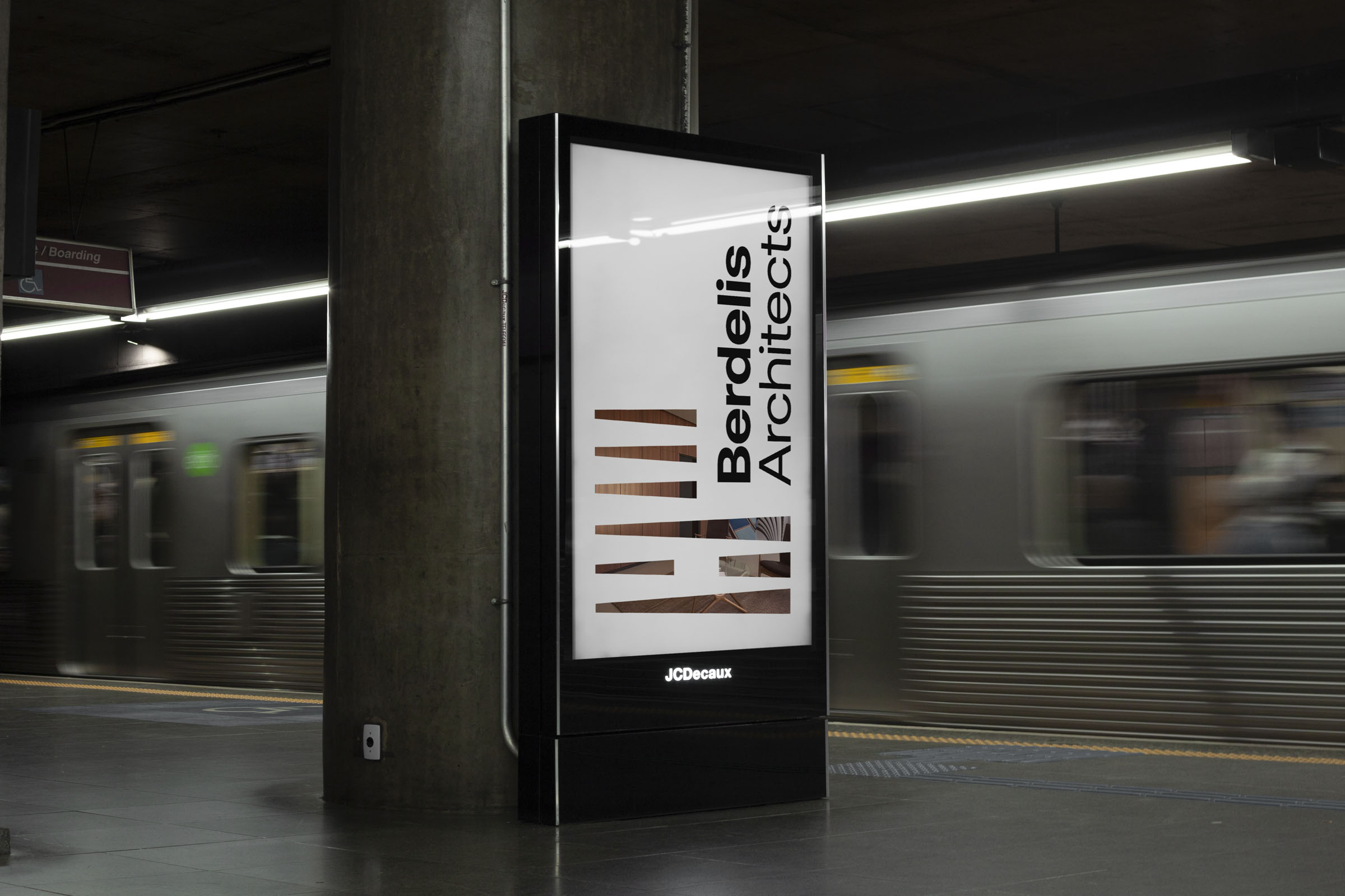
Corporate identity: We broadened brands’ visual communication with a simple, though dynamic identity, based on the modern black-and-white motive of the logotype, using the symbol and the brand name in a way that transforms the established balance, creating a feeling of security and prestige. Within this framework, we developed a series of corporate ID solutions, designing business cards, envelopes, letterheads, tote bags and signs, with the symbol of the brand appeared either large and solid or transparent, allowing a background chosen image to replace its internal, with the intention to communicate its adaptability and the capability to evolve and transform itself. Specifically regarding the letterheads, the brand name was not attributed in two lines, distinguished by dissimilar weights (heavy and light), but rather in a single line, servicing practical issues and proving – once more – the overall adaptability of the design.
CREDIT
- Agency/Creative: Cursor Design Studio
- Article Title: Cursor Design Studio Create Logotype and Corporate Identity Design for Berdelis Architects in Athens, Greece
- Organisation/Entity: Agency
- Project Type: Identity
- Project Status: Published
- Agency/Creative Country: Greece
- Agency/Creative City: Larissa
- Market Region: Europe
- Project Deliverables: Brand Identity, Graphic Design, Logo Design
- Industry: Construction
- Keywords: Logo,CursorDesign, CursorDesignStudio, Logodesign, Logotype, Monogram, Architects, Architecture, Identitydesign, Brandidentity, Branding, GraphicDesign, Minimal, Vidual identity
-
Credits:
Art Director: Apostolos Tsiovsaras


