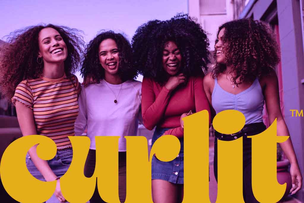
“Inspiring every curly head one curl, one wave at a time”
Curlit is an Egyptian local brand, an all-natural and vegan brand for hair products, specifically curly and wavy hair. Curlit’s main objective is to bring a solution every curly head is looking for; high-quality products for every hair type and every hair condition that will leave you with the hair you were always meant to have.
Curlit believes that natural curls deserve natural solutions which is why Curlit’s ingredients are 100% verified to be cruelty-free, and free from pesticides and heavy metals. All products are thoughtfully put together to address particular hair health needs. Each of the components and ingredients is carefully measured to ensure your hair gets a healthy boost. The ingredients have been carefully put together to create the perfect blend and balance of each ingredient to make sure that each hair type is fed the right amount of nutrients needed.
Curlit is a brand of empowerment, it encourages women and men to embrace their uniqueness and natural beauty. Today’s unattainable and unreal perceptions of beauty can damage one’s self-esteem leading to forgetting that natural beauty lies within. Curlit celebrates differences and embraces them. Feeling confident in your own skin, and hair makes anything possible. Confidence will encourage you to make life-changing decisions, stand up for what you truly believe in and take risks that allow you to live the lives you want to live.
Hair Care is not only for women, men should also be able to take care of their hair and have healthy-looking curls. The hair care routine for men is the same as it is for women, with a few variations. With regular hair care, your hairstyle will last longer and look as good as it is meant to.
Curlit and Branding Bar:
Curlit and Branding Bar partnered up to build the brand from the ground up with Branding Bar’s expertise in the design and branding field. A brand identity, brand strategy, Website UX and UI design and website development were created for Curlit.
The main purpose of this partnership was to build a brand that will stand out in the market and create a community of curly heads that empower and encourage each other to embrace their differences. Branding Bar was able to deliver a brand that gives an empowering and youthful look and feel as well as a unique look and design that looks like no other in the market. This was done through intensive research of the market and research on the psychology of color to make the brand stand out on the shelves at the stores.
Brand Strategy:
To ensure Curlit would be correctly positioned in the market, Branding Bar developed a unique brand strategy that covered all aspects in terms of positioning, transparency and target audience. Branding Bar and Curlit worked closely together in order to build a strong and powerful brand. The input of both parties was crucial in the development of the brand strategy because the vision of the brand owner is just as important as the agency’s input and expertise. The brand strategy was created after several rounds of creative sessions where we go through in-depth market research in order to come up with a strong competitive edge that would make Curlit stand out in the market. We built the brand to acquire traits such as confidence, strength, boldness, friendliness, simplicity, transparency, and authenticity. The tone of voice created reflects that Curlit prefers rebellious over conservative, subtle over the noisy. We don’t take ourselves too seriously. Whether people know what product they need from us or just don’t know, every word we say empowers and encourages. We impart our expertise with clarity, empathy, and wit. The brand’s promise is
Quality: We promise to keep our formula simple and straightforward, natural ingredients 100% verified to be free from pesticides and heavy metal, nourishing for your hair and soul.
Empowerment: We promise to always push you to be your absolute self, to em- brace your beauty in your own, unique way.
Diversity: At curlit, we encourage you to proudly be different, bold and to stand out within a crowd. We love and accept each and every one of you just the way you beautifully are.
Environmental Protection: We promise to be just as kind to the planet as we are to your hair
Logo:
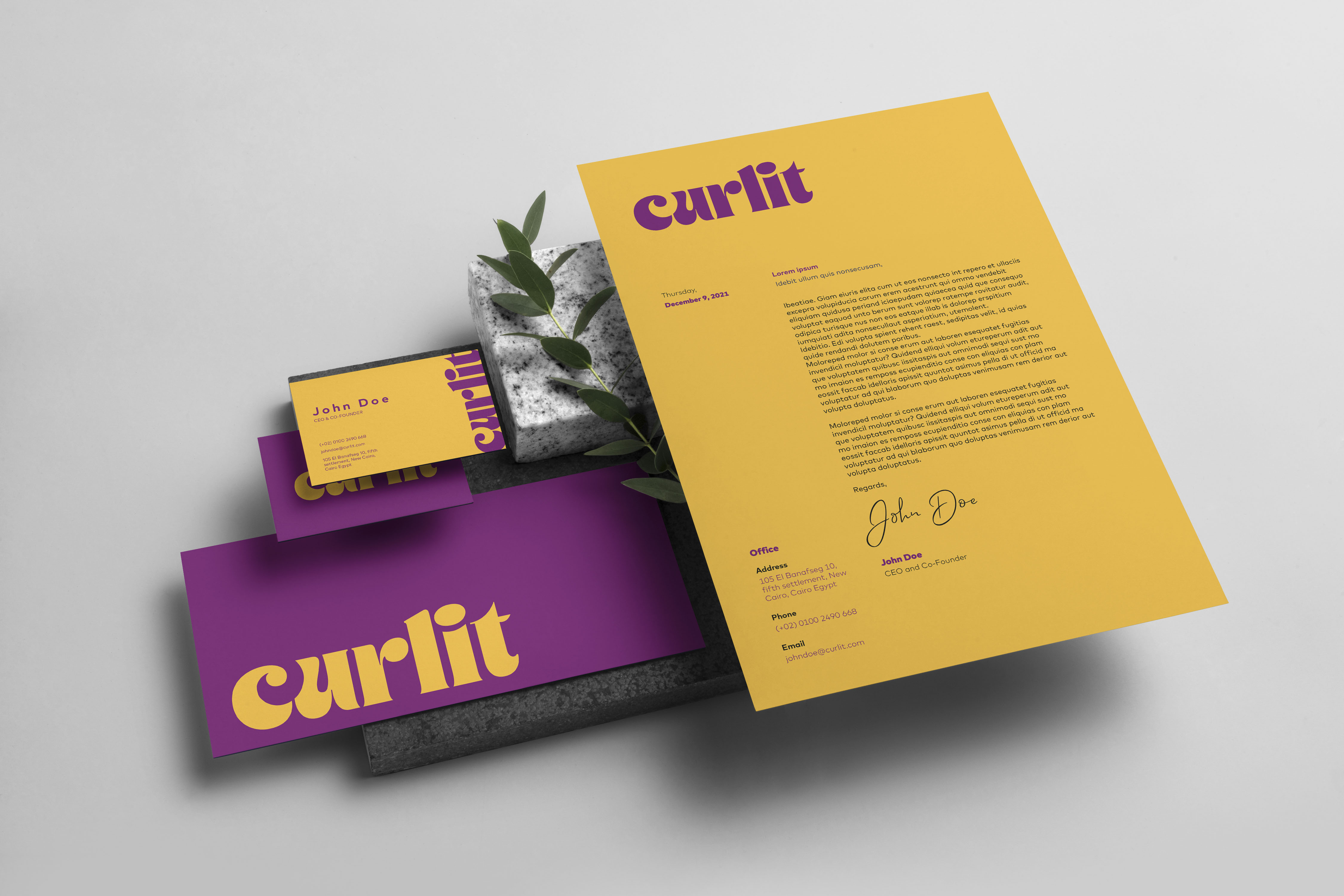
The challenge was to create a logo that is so strong and powerful by itself, yet does not acquire too many details since it is going to be used mostly on packaging of the products that already have other important details. We wanted to maintain a good balance between a bold and friendly looking logo. The logotype approach chosen for Curlit was something convenient for the brand’s long-term development that would not restrict any future product lines. The font is bold to communicate power, strength and uniqueness. The logotype includes a curly hair strand embedded in the letters “CU” as a subtle twist in the logo to make it more memorable, distinctive, and more catchy to the audience. The logo displays a bold, confident, and strong character just like the brand. The logo is designed to be a statement pieces without the need for other elements to help it stand out.
Color palette:
The brand’s color palettes were chosen carefully considering the core values and the messages that want to be communicated to the audience. The colors chosen for Curlit are bright, vibrant, and trendy colors, to reflect how dynamic and youthful the brand is. The purple conveys wisdom, luxury, and creativity. The yellow is an exciting, modern, youthful, and attention grabber. The pink adds a feminine and generous feel to the brand. Lastly, the blue gives the feeling of trustworthiness, transparency, and openness.
Packaging design:
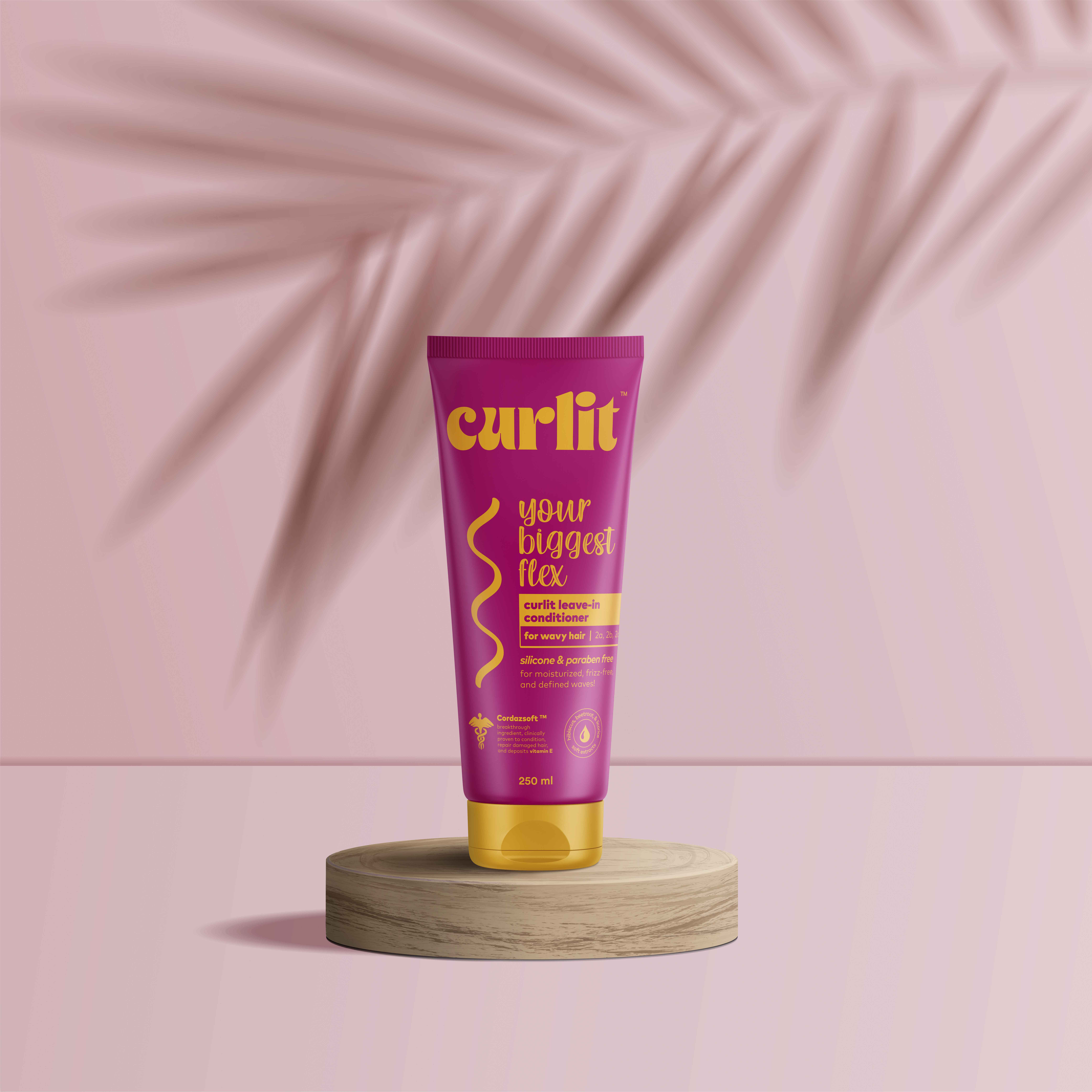
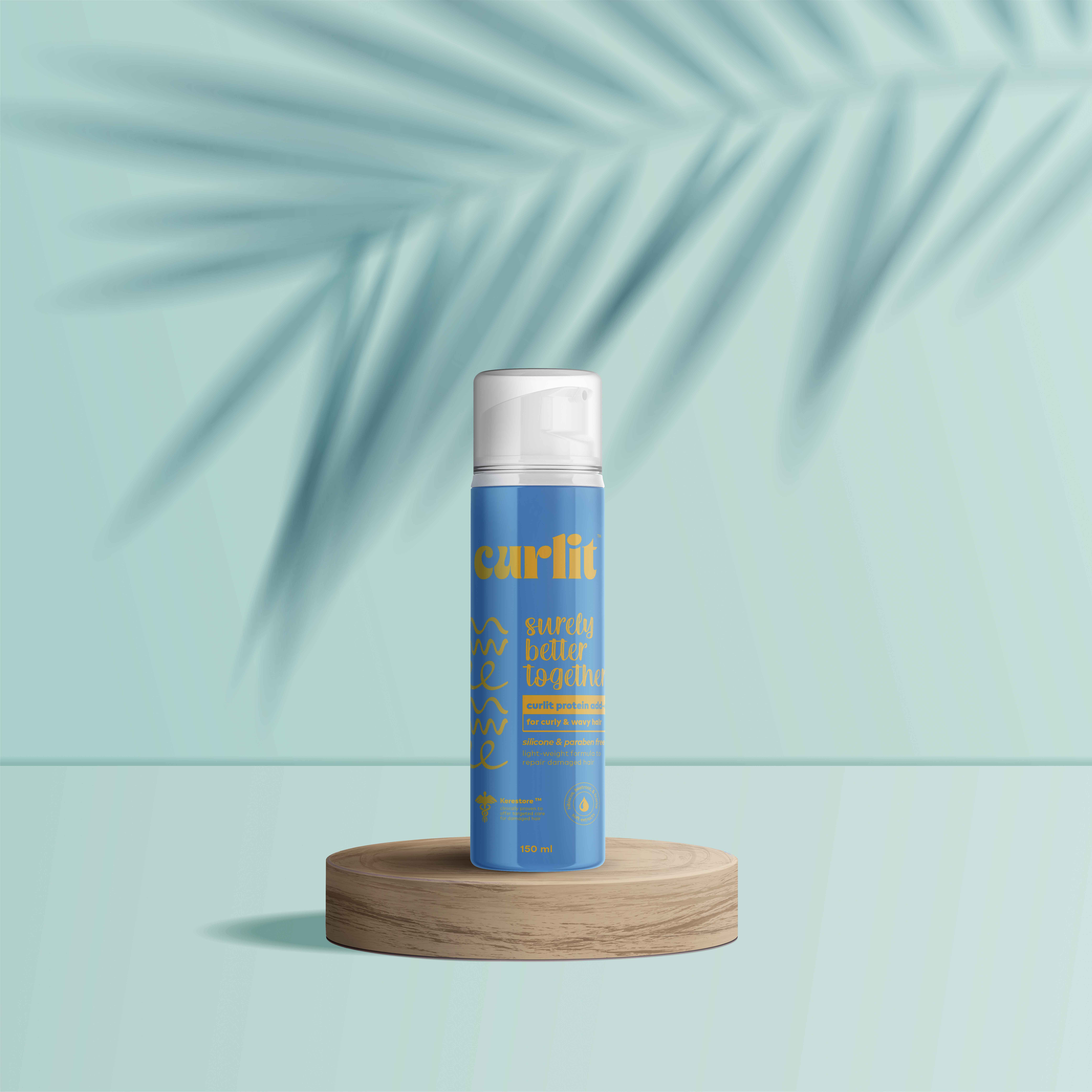
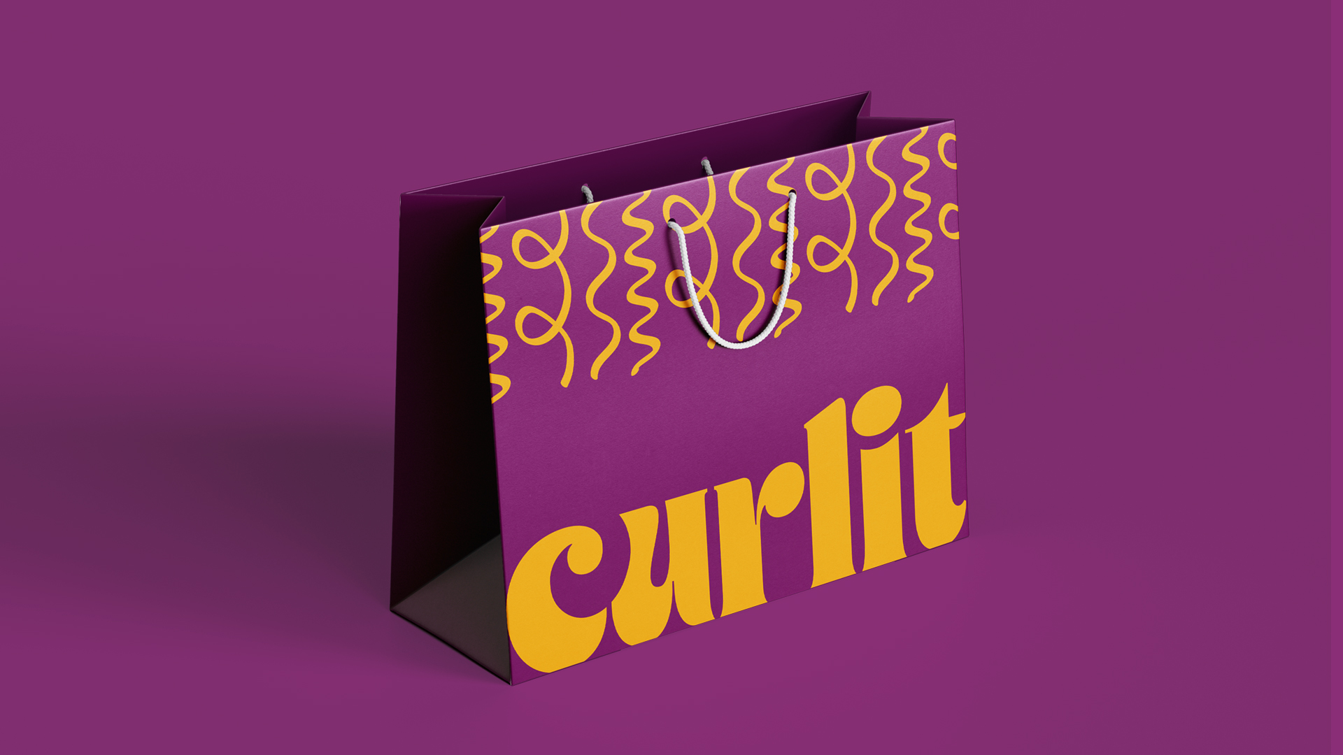
The packaging design conveys the desired vibe which is bold, trendy, confident, and distinctive. It does not look like any of the products sold in the markets. The packaging displays the necessary information using the proper hierarchy. It has just enough negative space to make you focus on the crucial data. It was designed to stand out on the shelf. Each product line is color coded. For instance, any product designed for curly hair will be purple in color whether it is a shampoo, conditioner, or leave-in conditioner. That way it is easier for the consumer to pick up his/her desired product without having to spend so much time reading through the product details to know whether it is for curly or wavy hair. The challenge was how to maintain this concept without confusing the customer on which product is which. Now that they all acquire the color purple how would the customer recognize whether the product is a shampoo or a conditioner for example. The solution that we came up with was to design distinctive packaging for each product. The shape of the bottle will be the guide to our potential customers, so if it is a serum it would be in a slim bottle with a pump. The packaging has vibrant colors that displays Curlit’s brand persona which is carefree, youthful, energetic, confident, and bold. We came up with names for each product so that later on customers would refer to the products with their designated names. For instance, we called the leave-in conditioner “your biggest flex”. We chose names that reflect the brand. The names are characterized by their bold and casual style so that they grab the attention of our target audience. An illustration of the hair strand is used to further emphasize on which hair texture the product is designed for.
Website UX and UI Design
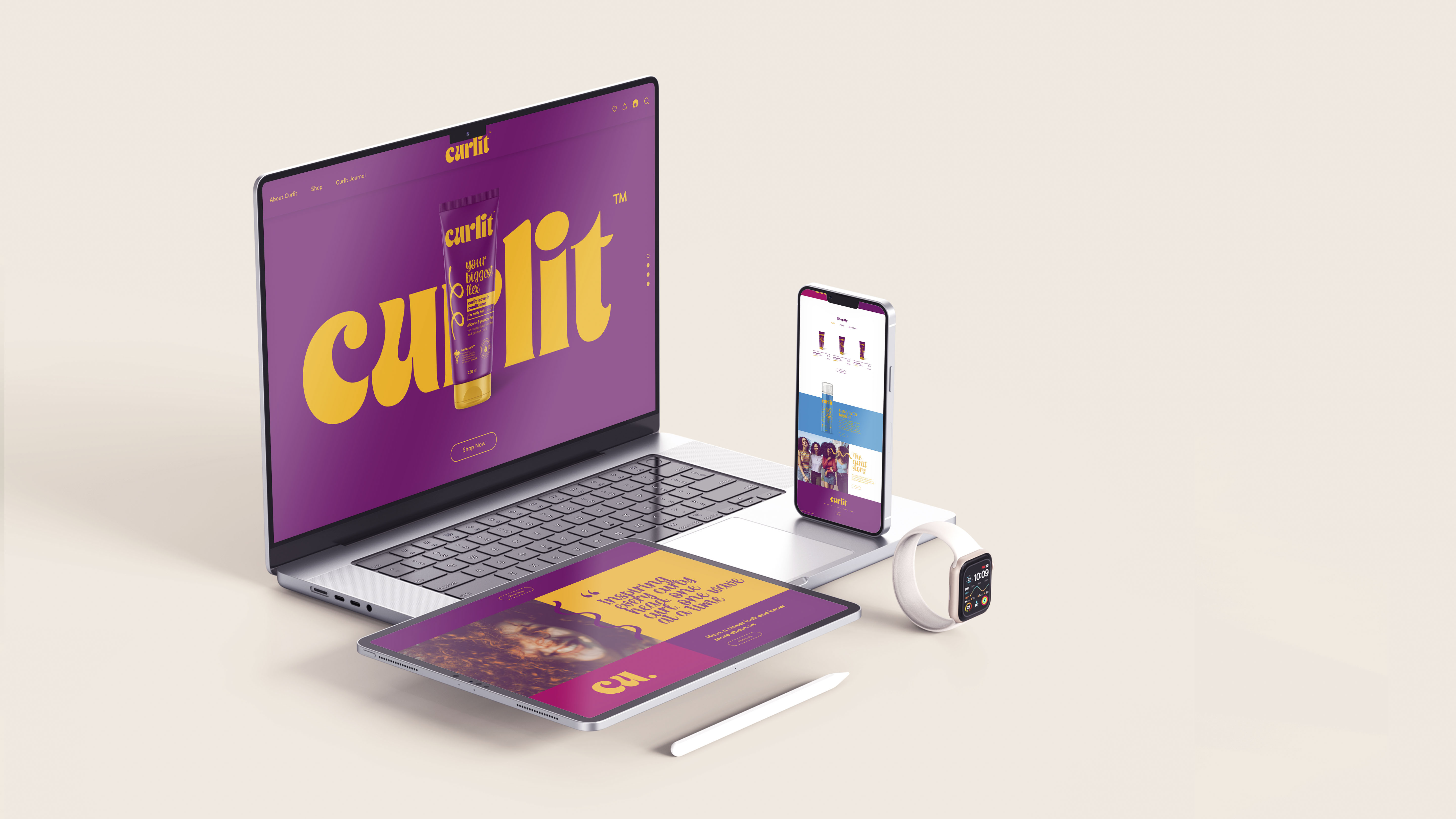
The website was designed to reflect a harmonious look and feel with the brand’s identity design. It is characterized by its colorful interface using the brand’s bold and vibrant colors. The user experience of the website is easy to navigate through. The website is designed as an e-commerce website to sell the brand’s products and inform people about the brand’s core values and gives a slight brief on how it all started. In order to create a friendly and transparent atmosphere for anyone who visits the website, we chose a special style of diction that would convey a welcoming mood to the website visitors. We also added a blog section in order to educate our target audience on how they should treat their textured hair as well as how to use Curlit’s products in the best way possible. The user interface maintains the brand’s look and feel by using the brand’s color palette and the brand elements. The website is mainly focused on the products because the main reason behind the establishment of the website is to sell the products. We made sure the checkout is easy and that customers could buy the products without registering an account. The reason why is to make sure that customers do not feel lazy to create their own account instead they can easily buy the products and avoid the hassle of creating an account. However, the registration process is designed to be minimal without asking for too much information in order to keep the customer on the website and create loyal customers.
CREDIT
- Agency/Creative: Branding Bar
- Article Title: Curlit Brand Strategy and Identity Design
- Organisation/Entity: Agency
- Project Type: Identity
- Project Status: Non Published
- Agency/Creative Country: Egypt
- Agency/Creative City: Cairo
- Market Region: Africa
- Project Deliverables: Art Direction, Brand Design, Brand Guidelines, Brand Identity, Brand Tone of Voice, Identity System, Packaging Design, Web Design
- Industry: Health Care, Pharmaceutical
- Keywords: WBDS Agency Design Awards 2022/23
- Keywords: Brand Identity Design, Packaging Design, Web Design, Branding
-
Credits:
Senior Brand Designer: Sera Samir Riad


