Cunhapê comes from a Spanish word “cuñapé” which refers to cheese bread but of Bolivian origin. Cunhapê is a whole crunchy cheese bread. The challenge for the project was to create an identity that was modern, timeless and at the same time cheerful and that showed refinement. And the brand would reflect on the packaging communication.
The solution was to innovate in typography and explore the most striking colors for a project that has to be cheerful and outgoing. The well-crafted typography conveys the tone of elegance and competence that the client sought, but without being serious or traditional. It is the mixture of the modern with the elegance.
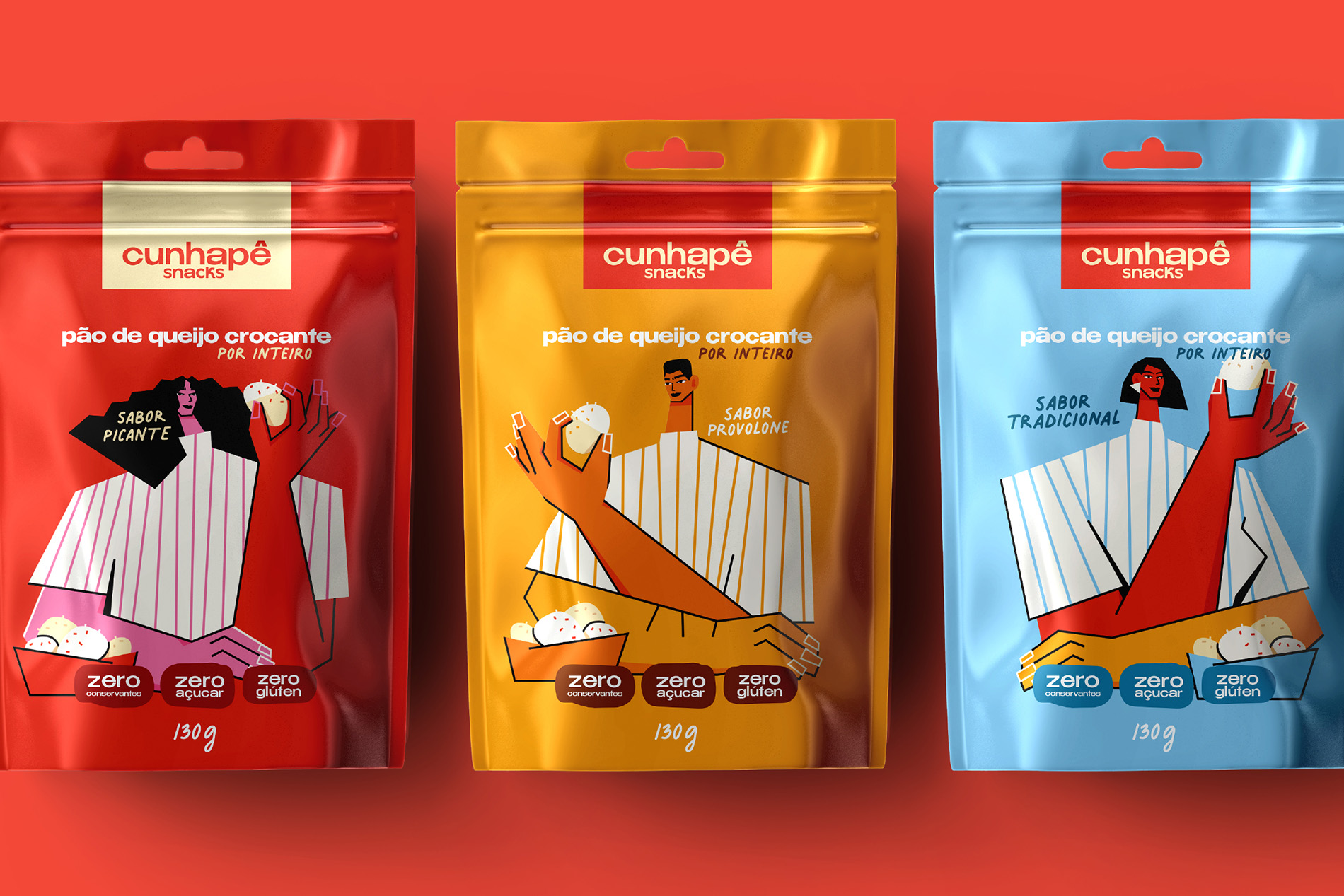
I worked with a modern typography, striking and with a strong personality. This type combined with warm colors, brought elegance, but also joy and high spirits to Cunhapê.
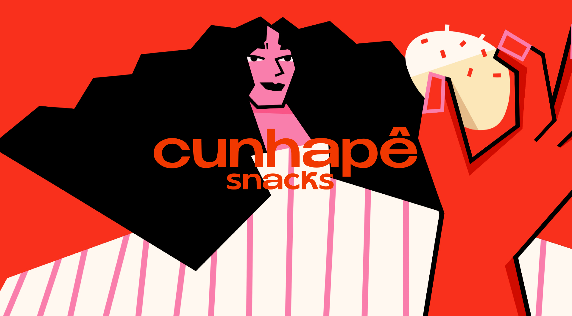
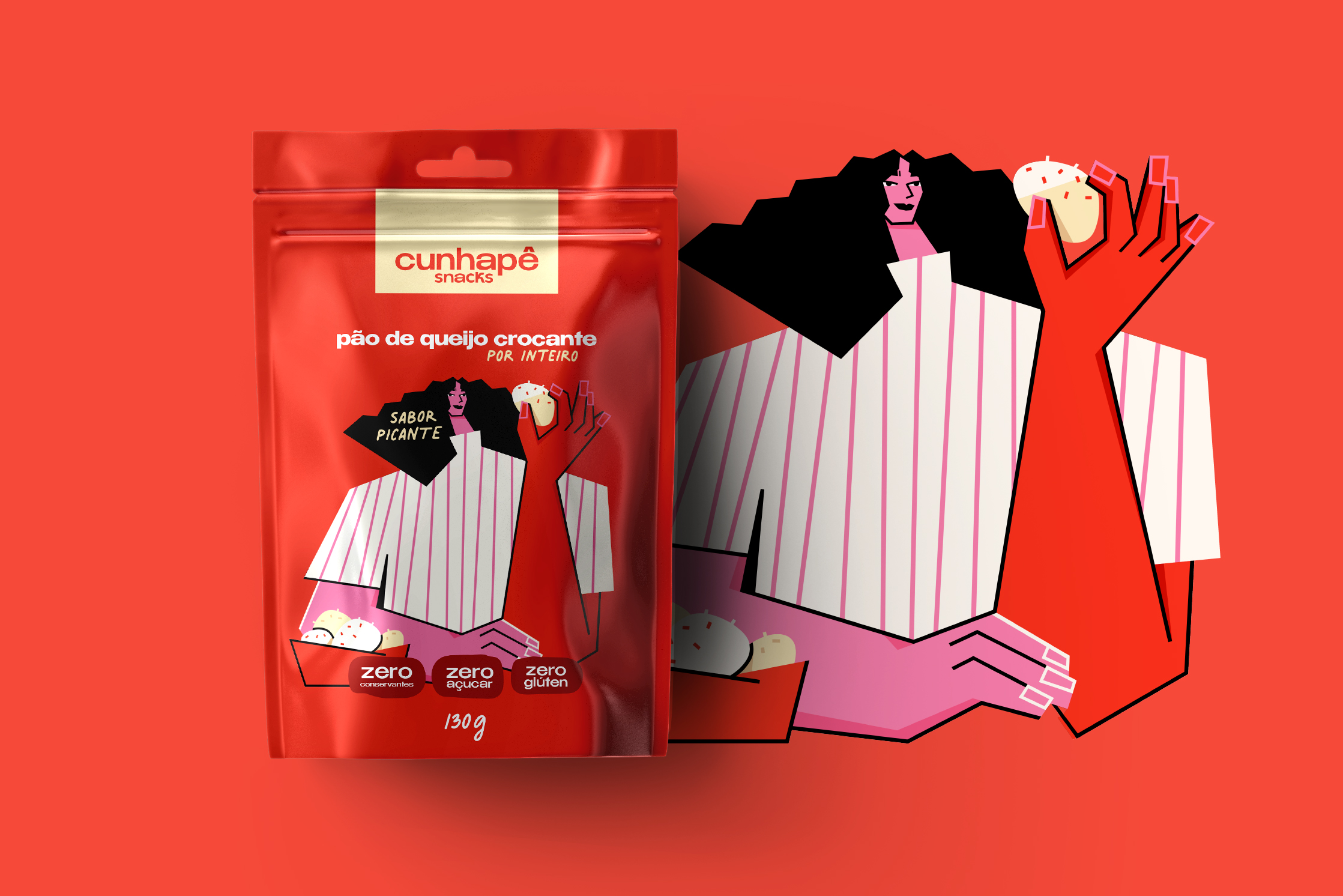
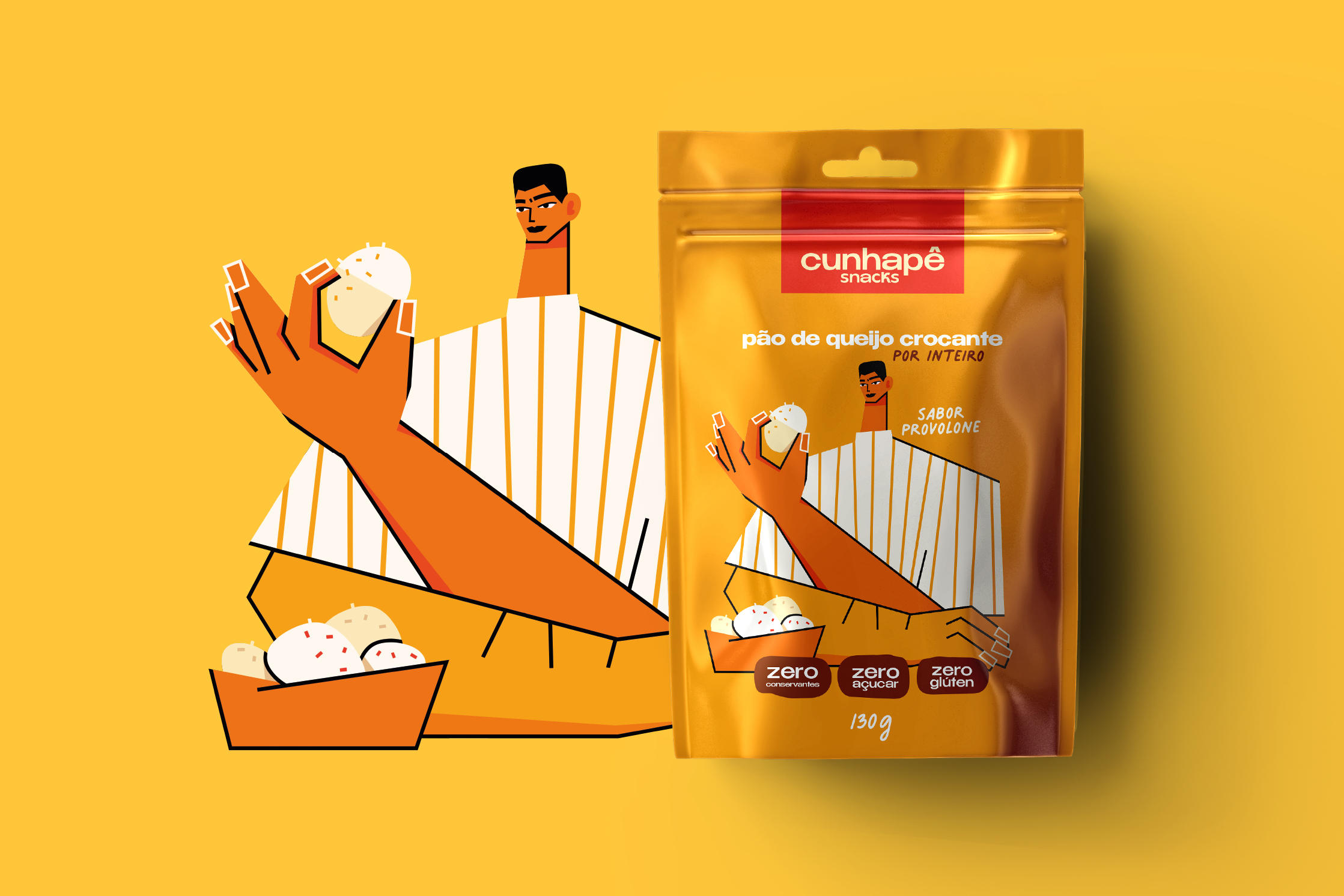
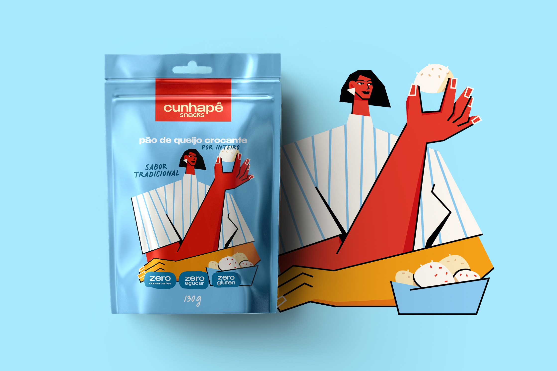
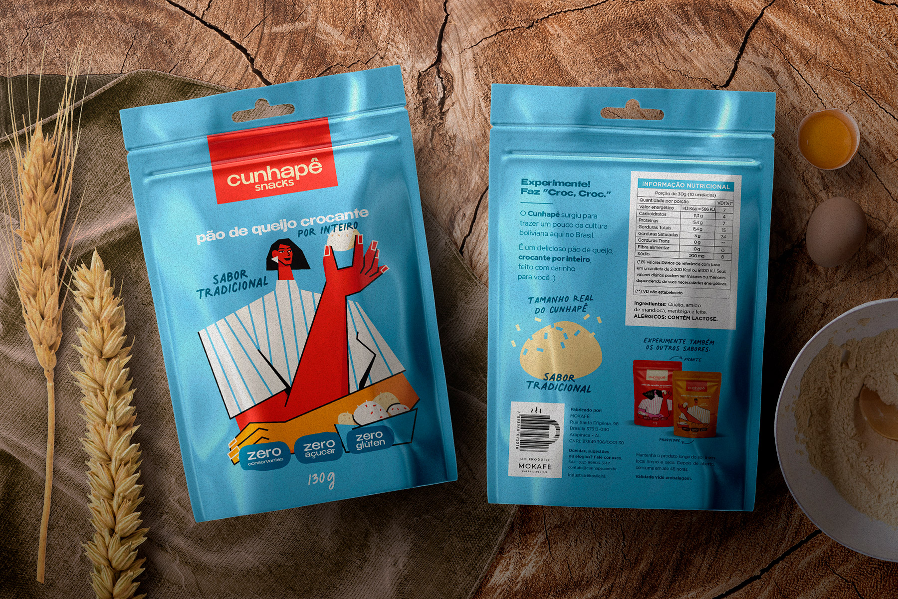
For the project I called an illustrator to represent the youthful tone that we wanted for the product lines. The language used in all communication is very relaxed. The “Try it! Croc, croc” clain brings the product closer to the consumer.
The croc, croc is an onomatopoeia, a figure of speech that represents the crunching biting movement.
The material was produced in Stand-up Pouch Metallized. With this, the aspect of aluminum lamination was very evident, reinforcing the premium characteristic of the product. Cunhapê is a recipe for Bolivians. Michelle, owner of the Cunhapê company, came to Brazil to show the cuisine of her Bolivian origin.
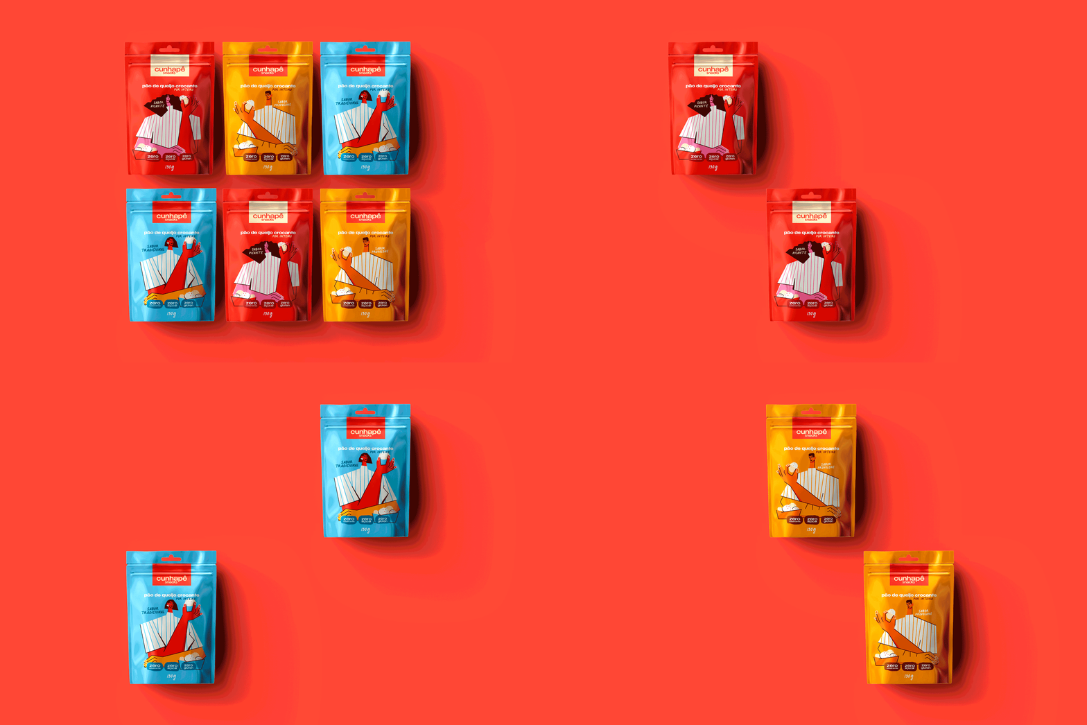
On the back of the packaging we brought a joke with the original size of Cunhapê, so that consumers know what they are buying. In addition, the consumer also finds the rest of the product line: provolone flavor, spicy flavor and traditional flavor.
The Stand-up pouch has a zipper for closing. Thus, the consumer can maintain the crispiness for much longer, maintaining the freshness and flavor of the Cunhapês.
It was a project made with great care, so that consumers can buy and eat during working hours, in the hustle and bustle of day-to-day.
CREDIT
- Agency/Creative: PSNDesign
- Article Title: Cunhapê Brand Identity and Packaging Design Created by PSNDesign
- Organisation/Entity: Freelance, Published Commercial Design
- Project Type: Packaging
- Agency/Creative Country: Brazil
- Market Region: South America
- Project Deliverables: Brand Advertising, Brand Guidelines, Brand Identity, Graphic Design, Identity System, Packaging Design, Product Naming
- Format: Pouch
- Substrate: Plastic


