


Culley’s started off selling home-grown, home-made sauces in farmer’s markets back in 2010, and has since then achieved phenomenal success with a range of products in supermarkets, restaurants, and speciality food stores throughout New Zealand and overseas. What began as a small, local endeavour quickly expanded as their unique and flavourful sauces captured the hearts and taste buds of many. The initial success provided a strong foundation for growth, leading to a broader audience and increased demand.
However, this rapid growth brought with it significant challenges. While the expansion was great for the business, it also meant that there wasn’t enough time to take stock and develop a strategic vision and brand strategy for the company and its diverse product range. The need for a cohesive brand identity became evident as they aimed to maintain their authenticity while appealing to a broader market.
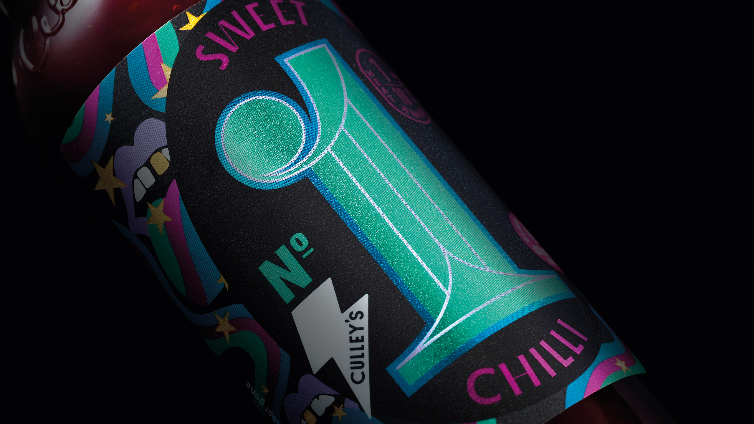
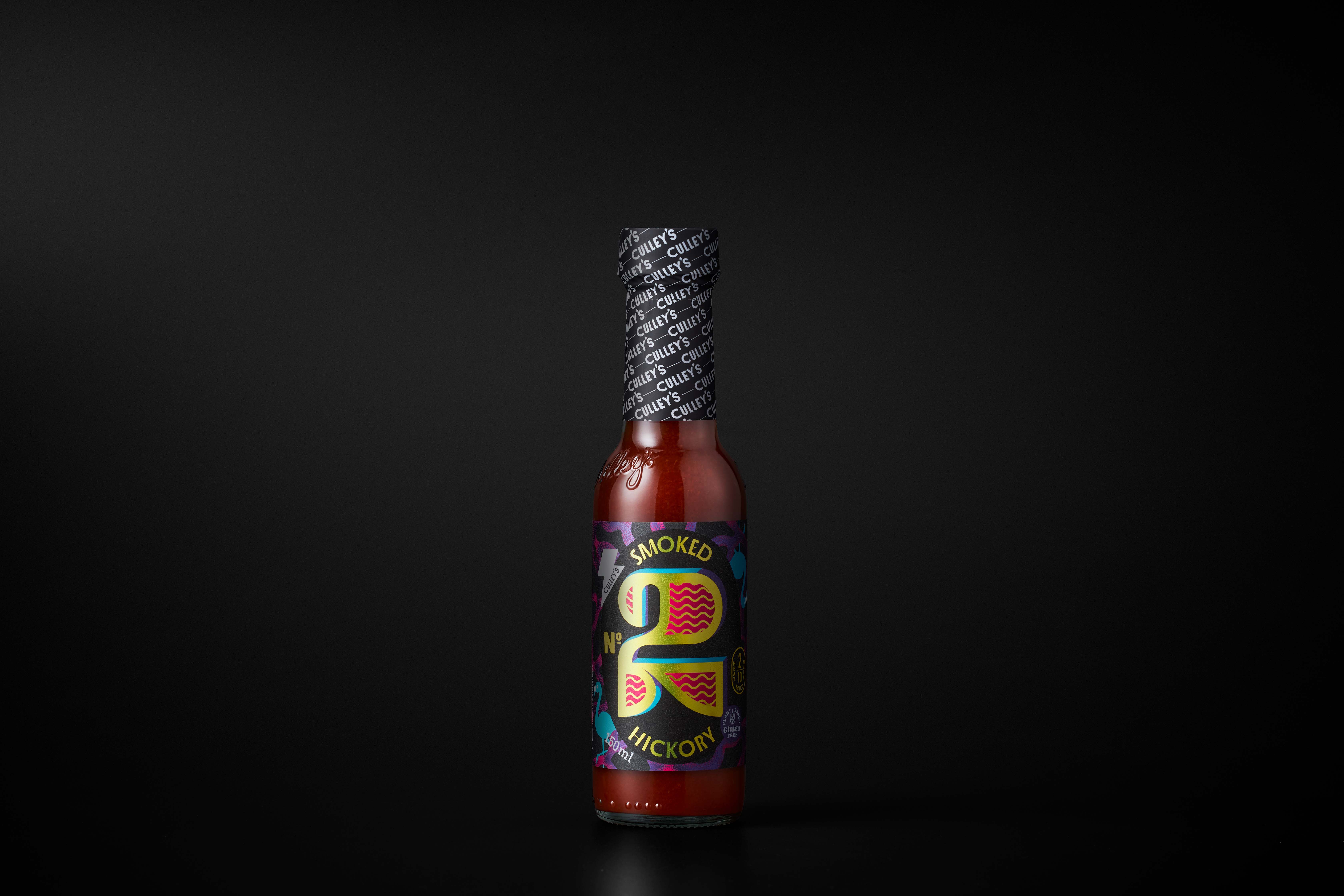
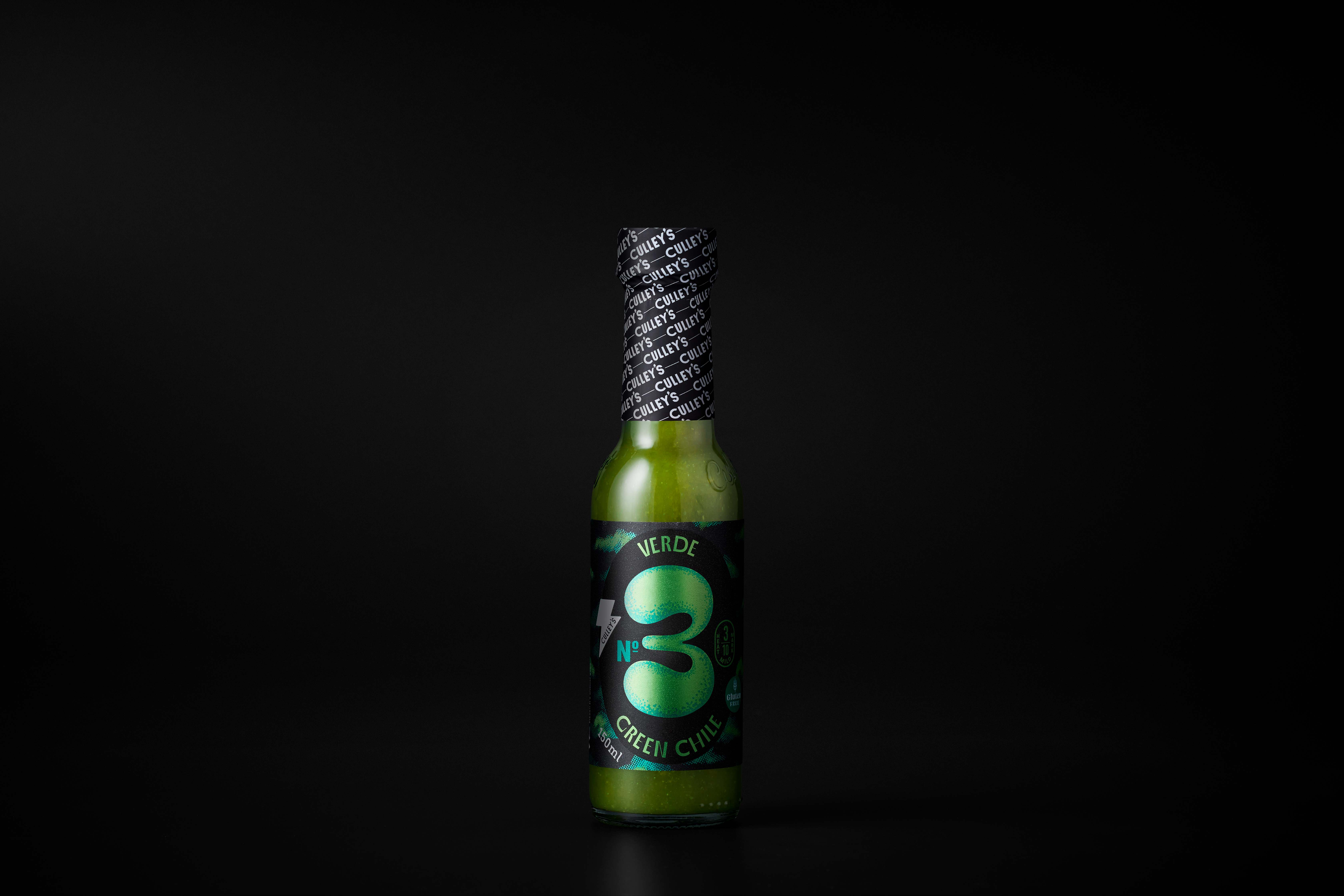
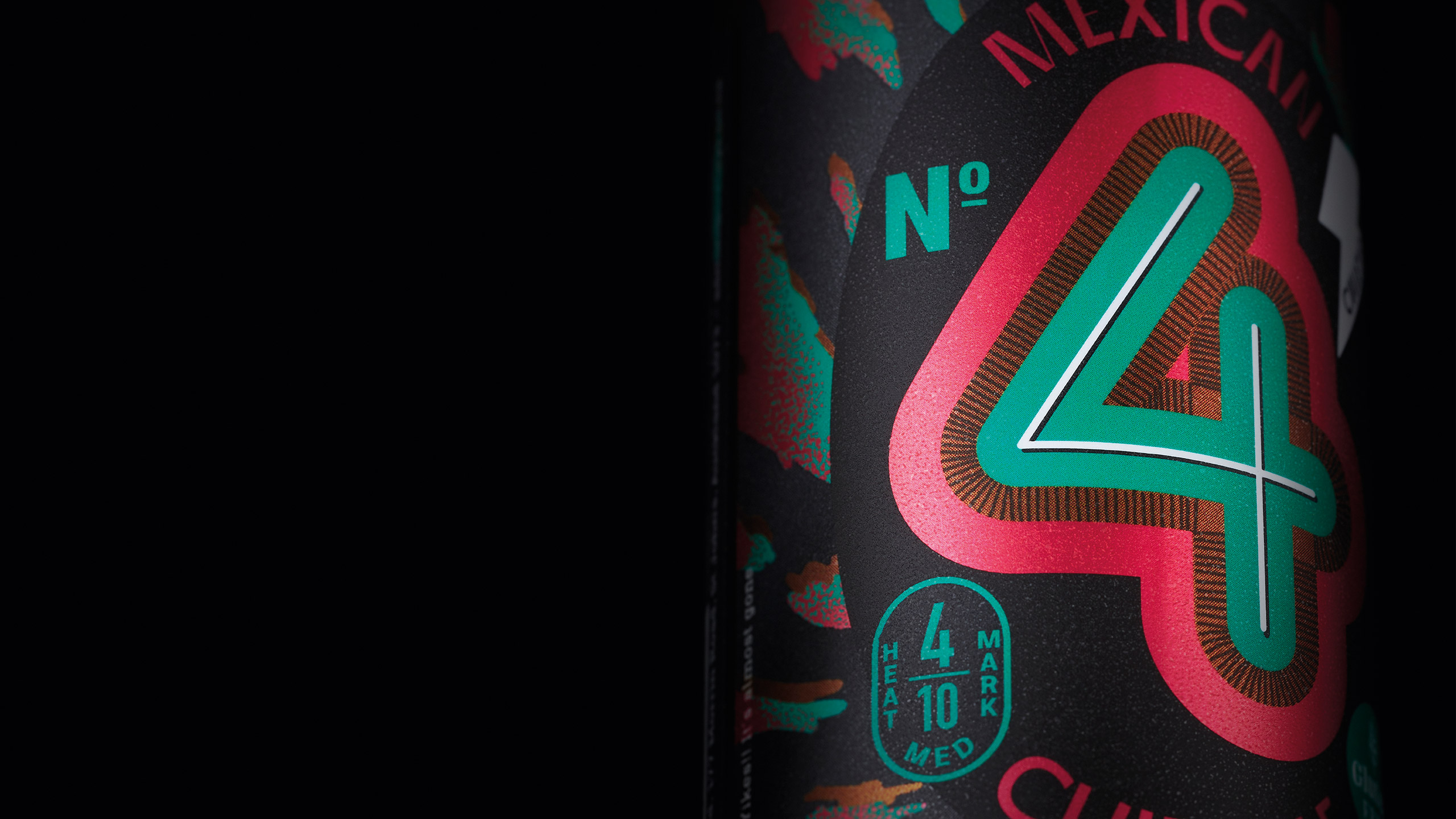
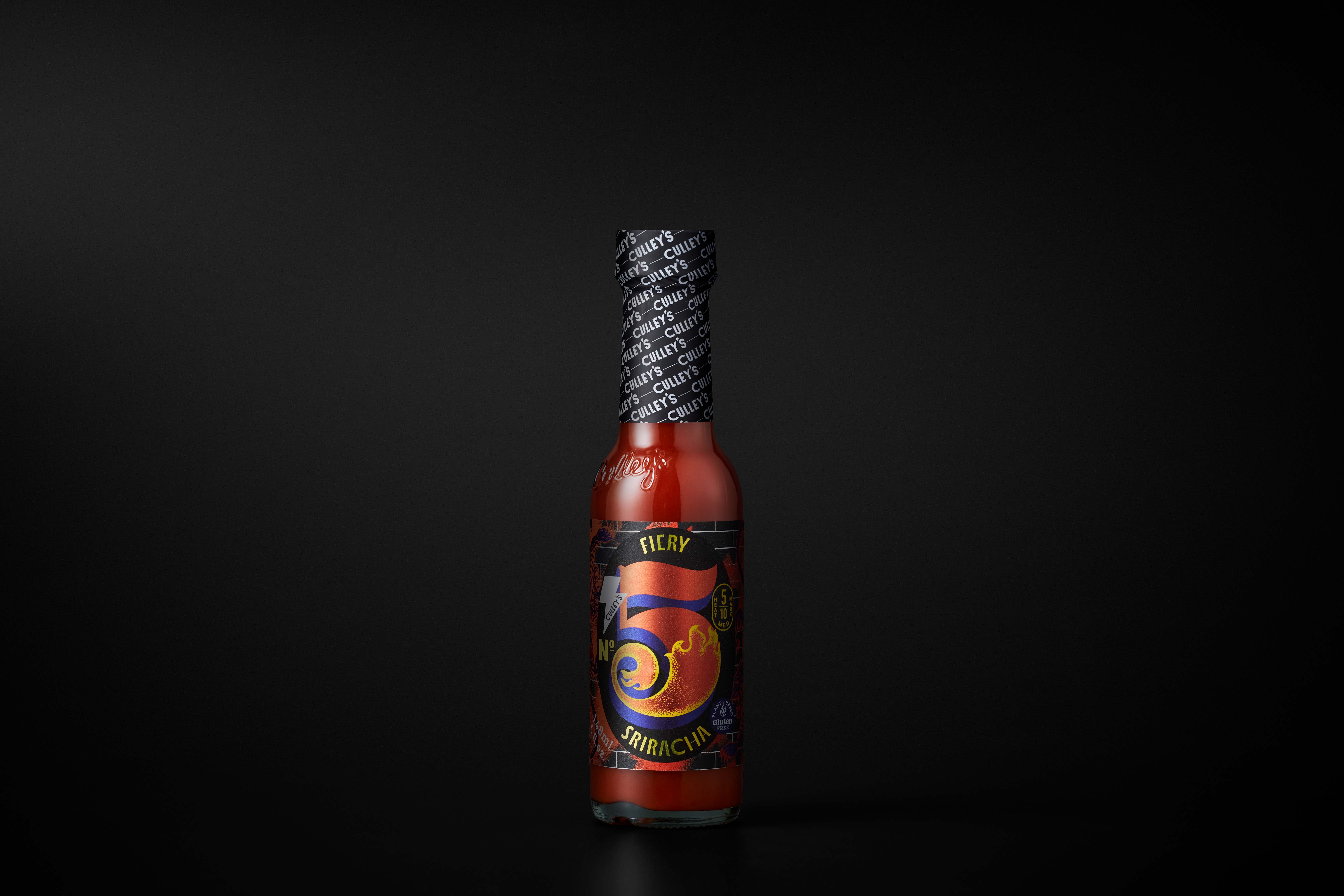
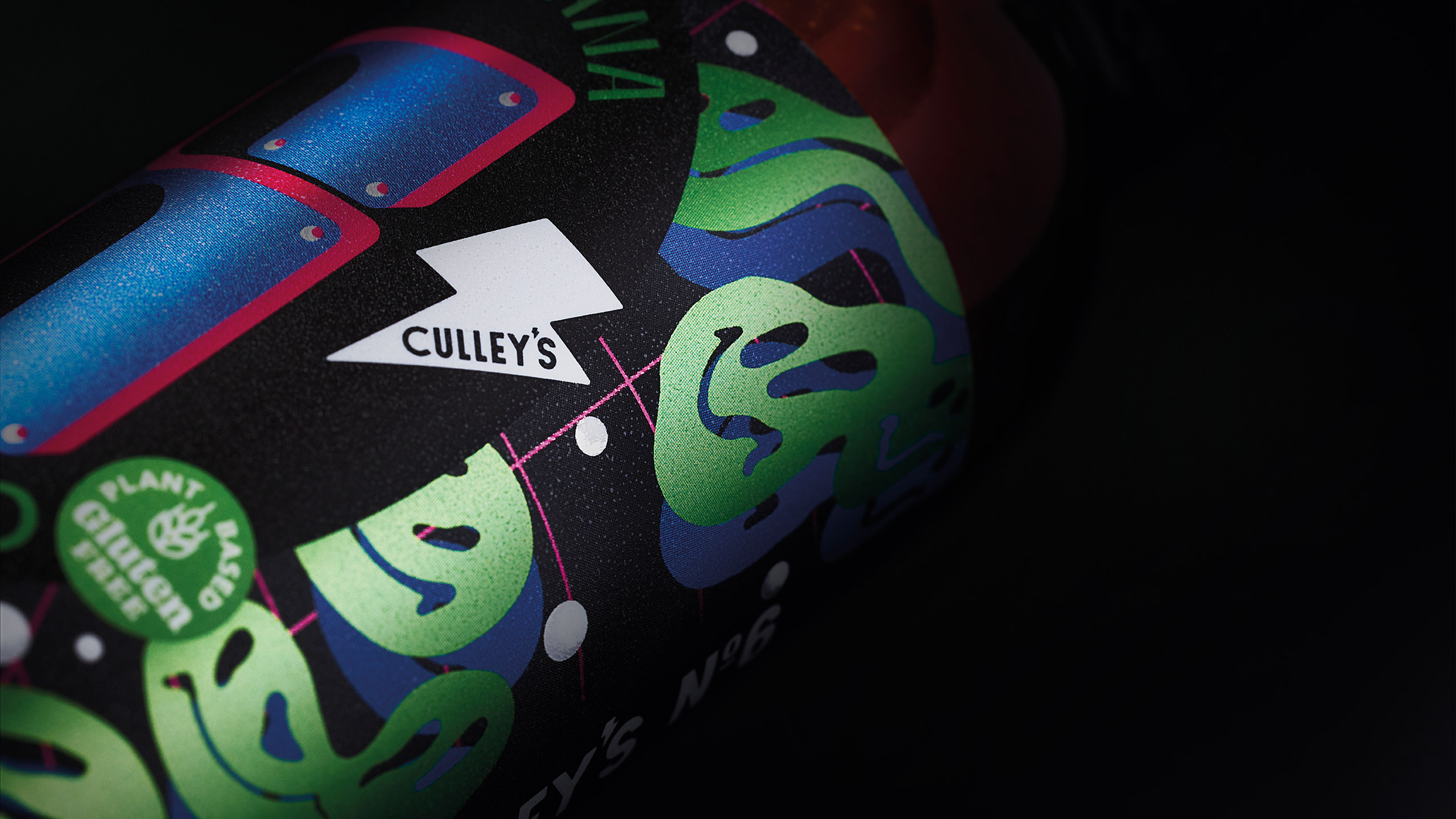
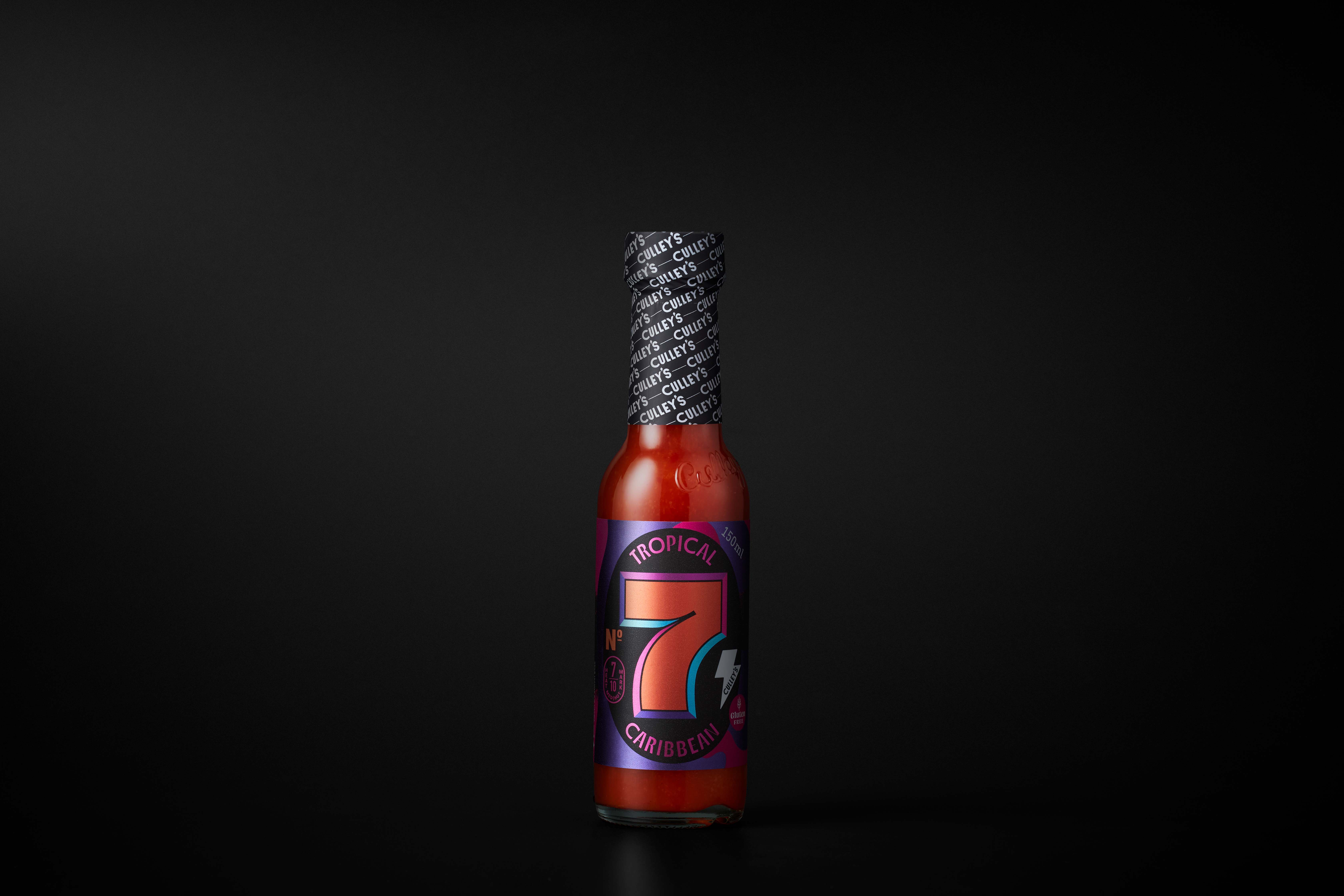
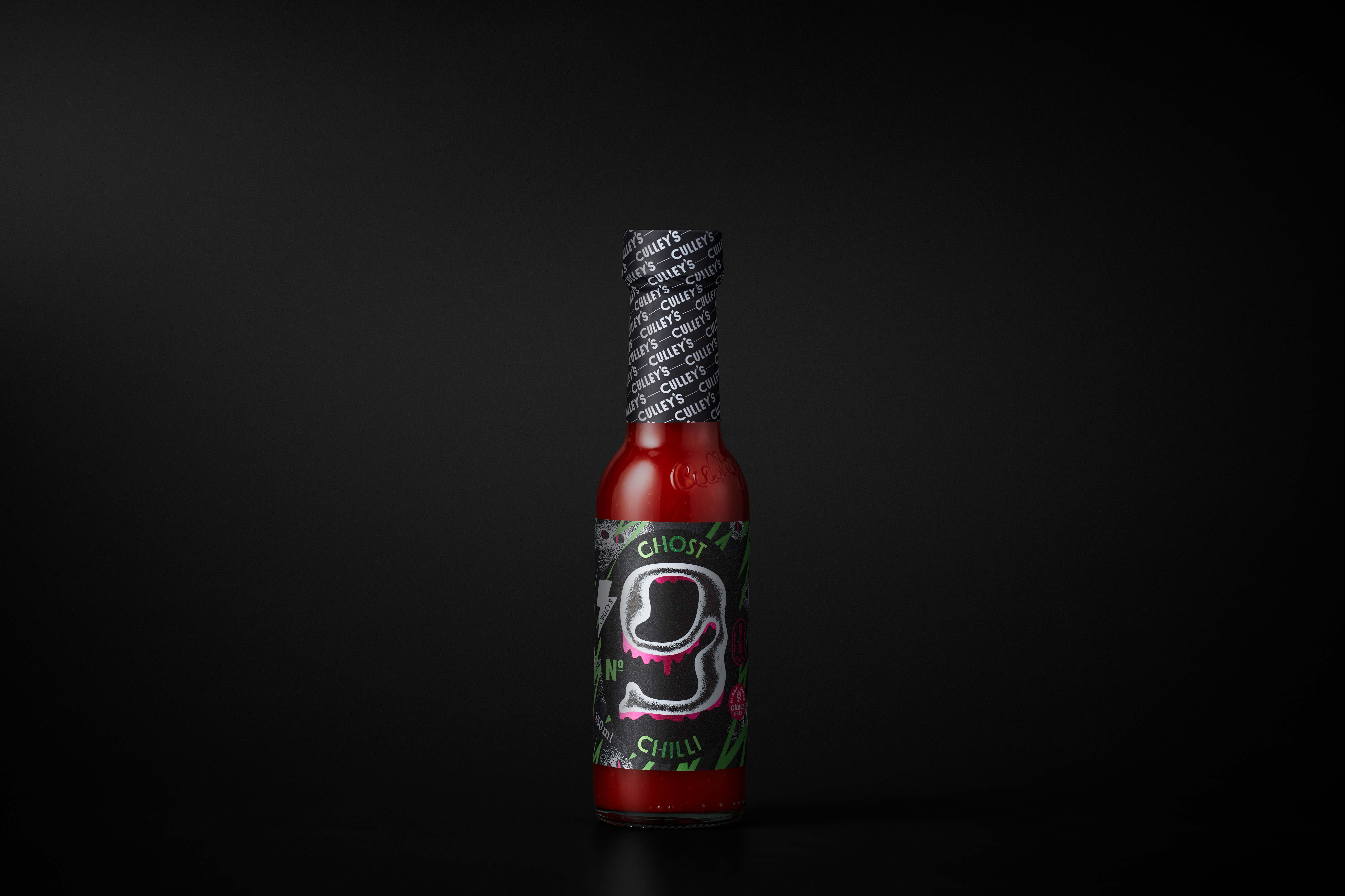
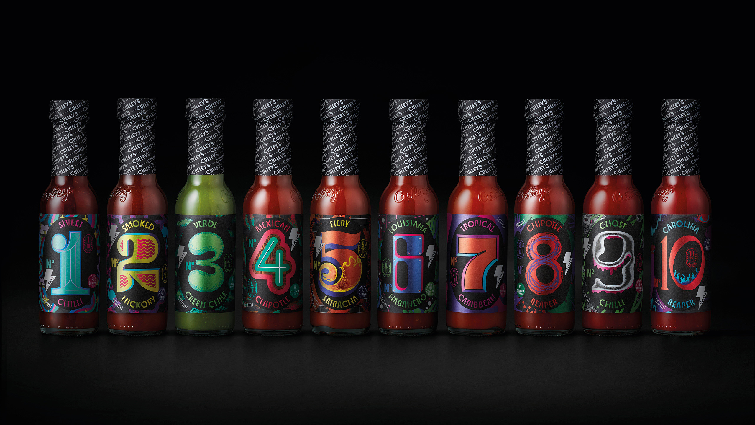
In response to this challenge, we embarked on a journey to refine and articulate the brand essence for their core chilli sauce range. We centred the essence around three key elements: ‘flavour, fire, flair.’ These pillars encapsulate what makes Culley’s sauces distinct and appealing. Their maverick and bold approach to making sauces was brought to life on the packaging through bespoke illustrations for each of the products. These illustrations not only highlight the individuality of each sauce but also give the range exceptional shelf standout. The unique and artistic designs ensure that each bottle is not just a condiment but a statement piece that any chilli enthusiast would be proud to display on their table.
Our strategic branding efforts aimed to enhance brand recognition and loyalty among existing customers while attracting new ones. By emphasising the quality and creativity behind each product, we aimed to convey Culley’s commitment to delivering unparalleled taste experiences. This comprehensive brand strategy allowed Culley’s to solidify its position in the market, ensuring that their products were not only seen but remembered. As a result, the brand now enjoys a stronger connection with its audience, embodying a spirit of innovation and passion that continues to drive its success.
CREDIT
- Agency/Creative: Tried&True Design
- Article Title: Culley’s Sauces: Tried&True Design’s Creative Redesign Captures Market Attention
- Organisation/Entity: Agency
- Project Type: Packaging
- Project Status: Published
- Agency/Creative Country: New Zealand
- Agency/Creative City: Auckland
- Market Region: Oceania
- Project Deliverables: Brand Identity, Brand Redesign, Design, Logo Design, Packaging Design, Typography
- Format: Bottle
- Industry: Food/Beverage
- Keywords: sauce , packaging , logo , graphic design , branding , typography
-
Credits:
Creative Team: Tried&True Design


