


Design pretends to be a game-changer in the construction and architecture business.
Be. Architecture wants to go away from the idea of the careless builder and become the perfect tool for clients who wants to see their ideas and dreams on paper come true but with care and attention to details.
The name is the abbreviation of founder. Be wants to be like the verb: be architecture, be
construction, be shapes and be smart. The business idea and how they want you to feel a project or a process with them: transparent, pure, honest and beautiful.
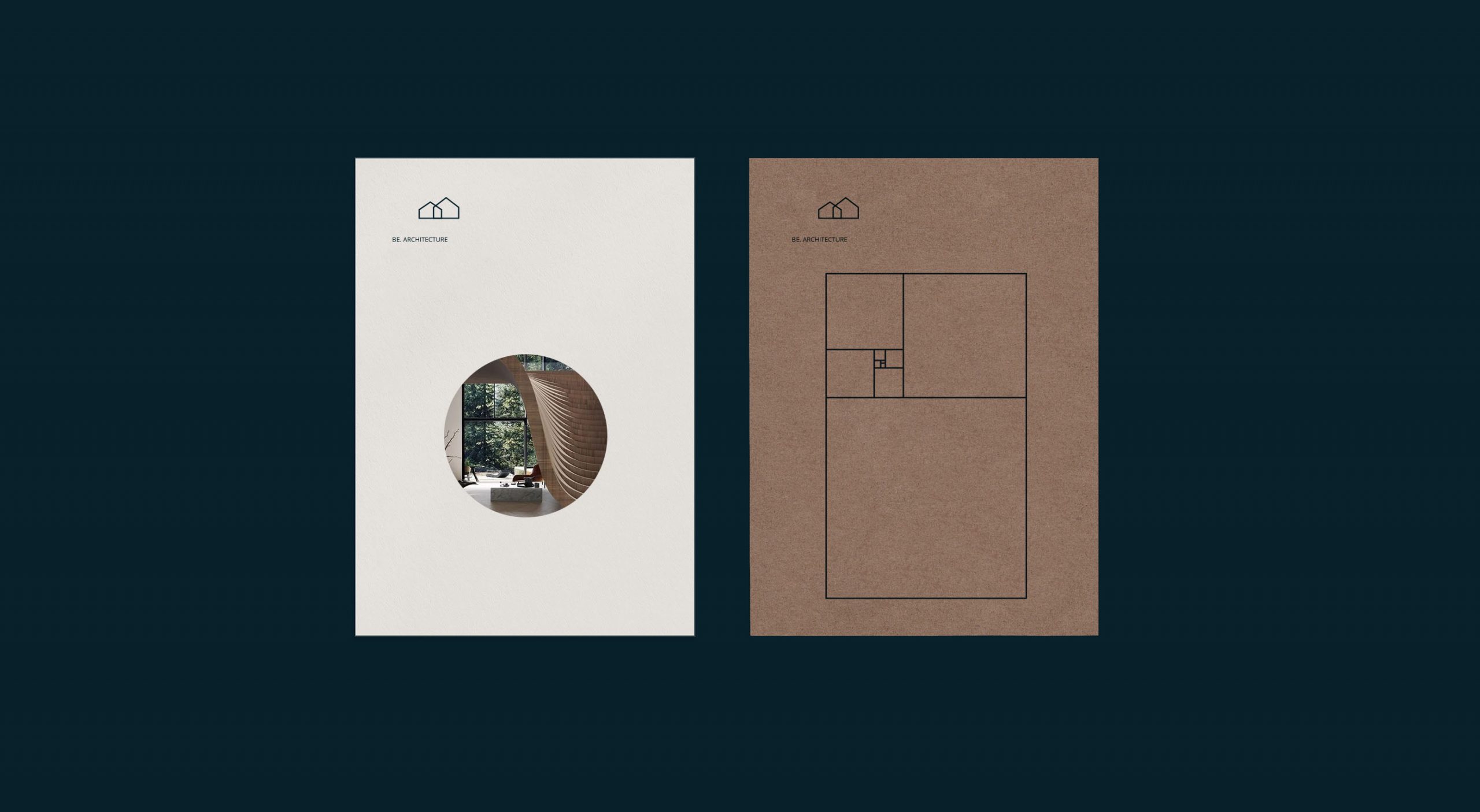
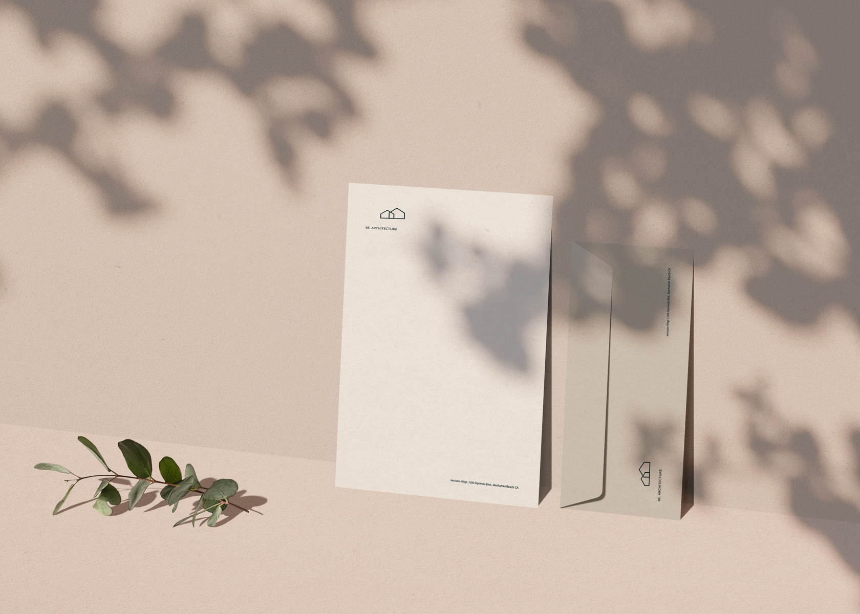
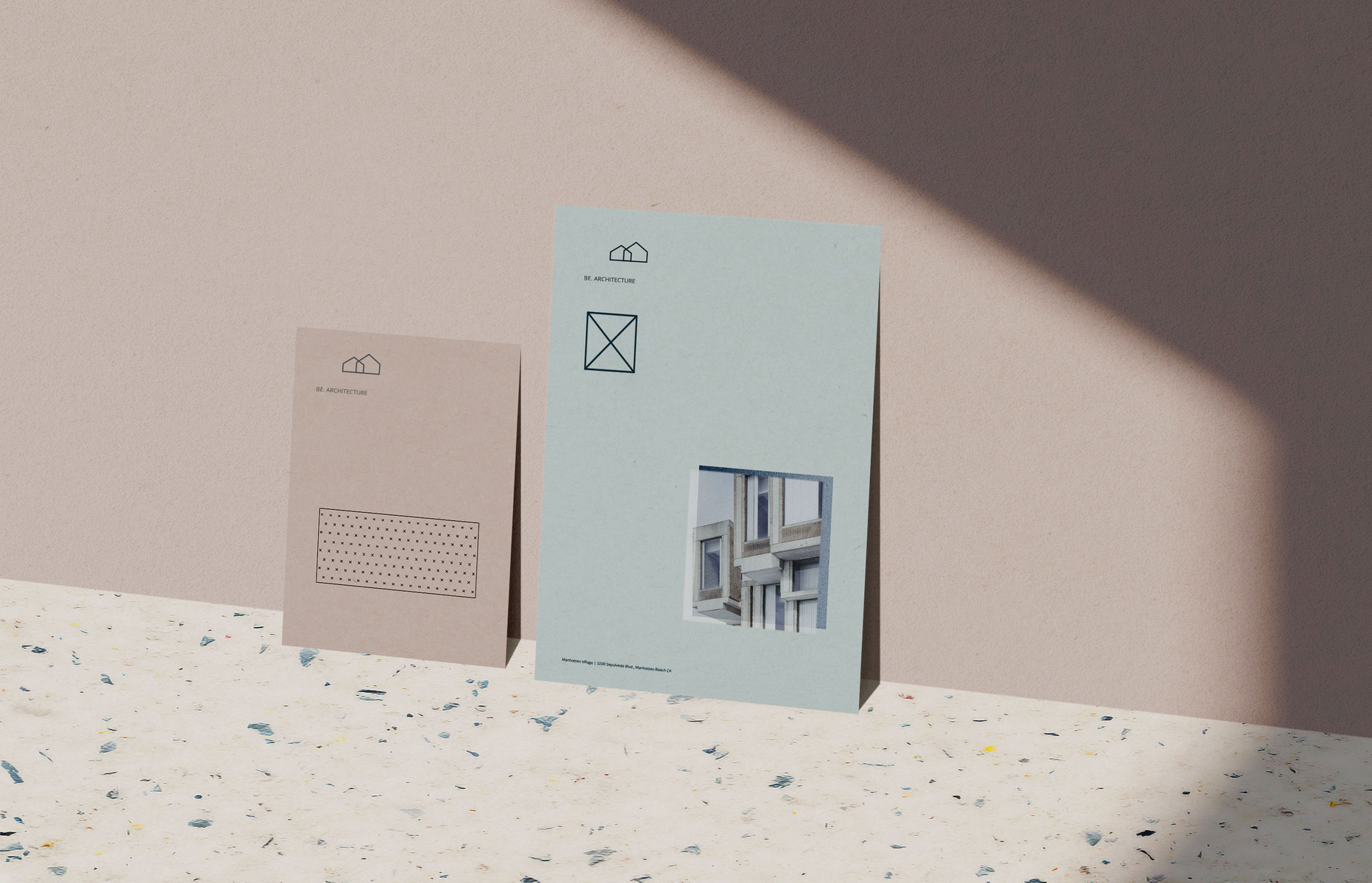
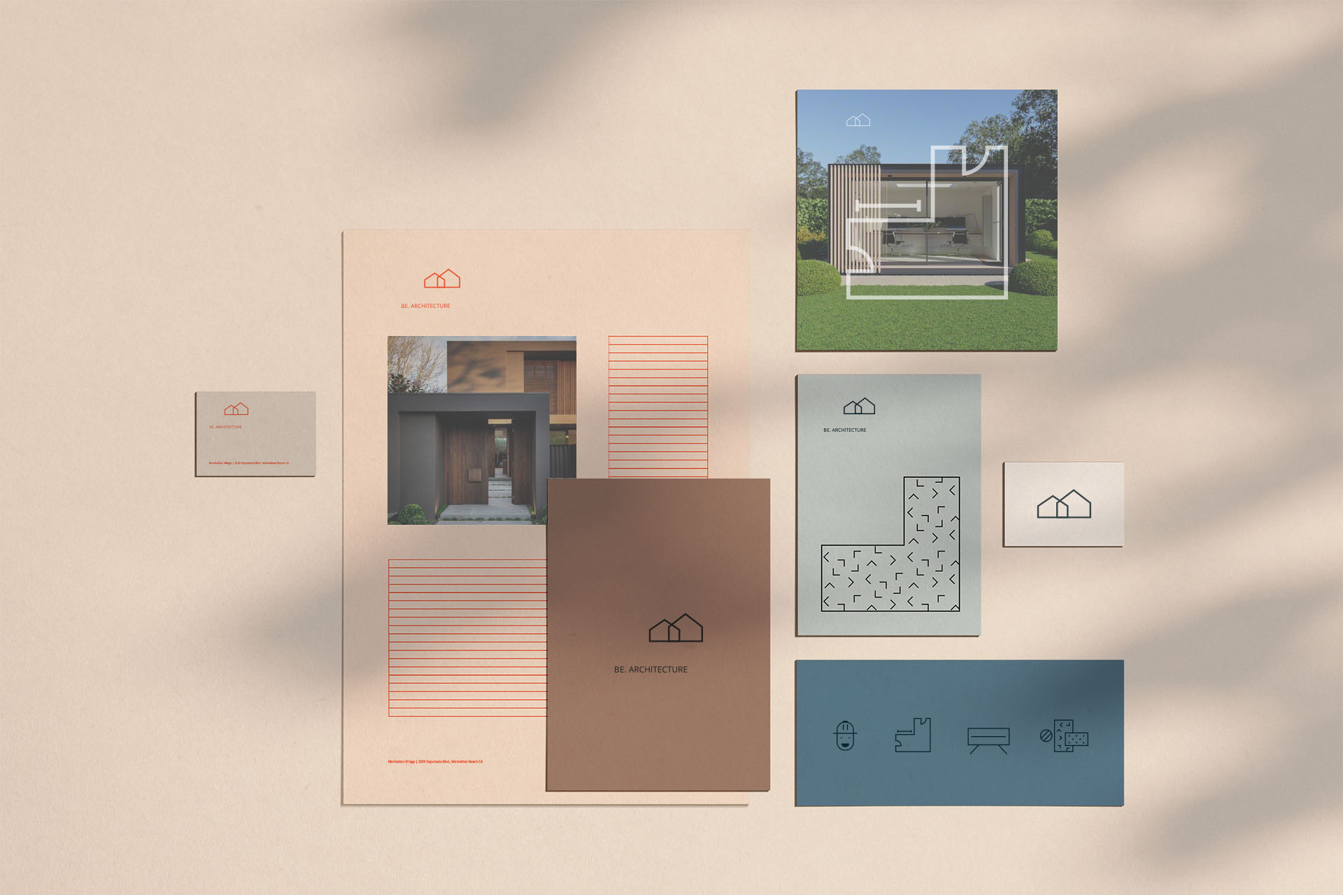
For the visual identity, I continue playing with that mood. In the logo, I combined the letters and the shapes to better represent architecture and constructions studio .
For the visual identity I continued to use the same language, I represented all construction materials with patterns as they are expressed in monochromatic planes. All this, mixed with quality materials a chromatic palette born again from the materials’ world, build a brand’s universe of which I am tremendously proud.
CREDIT
- Agency/Creative: ctrl+f / web agency
- Article Title: ctrl+f / web agency creates brand design for Be. Architecture
- Organisation/Entity: Agency, Published Commercial Design
- Project Type: Packaging
- Agency/Creative Country: Italy
- Market Region: North America
- Project Deliverables: Brand Architecture, Brand Design, Brand Guidelines, Brand Identity, Brand Naming, Brand World, Branding, Graphic Design, Structural Design
- Format: Tag
- Substrate: Pulp Carton, Pulp Paper


