Studio Defalt – Crystalhop
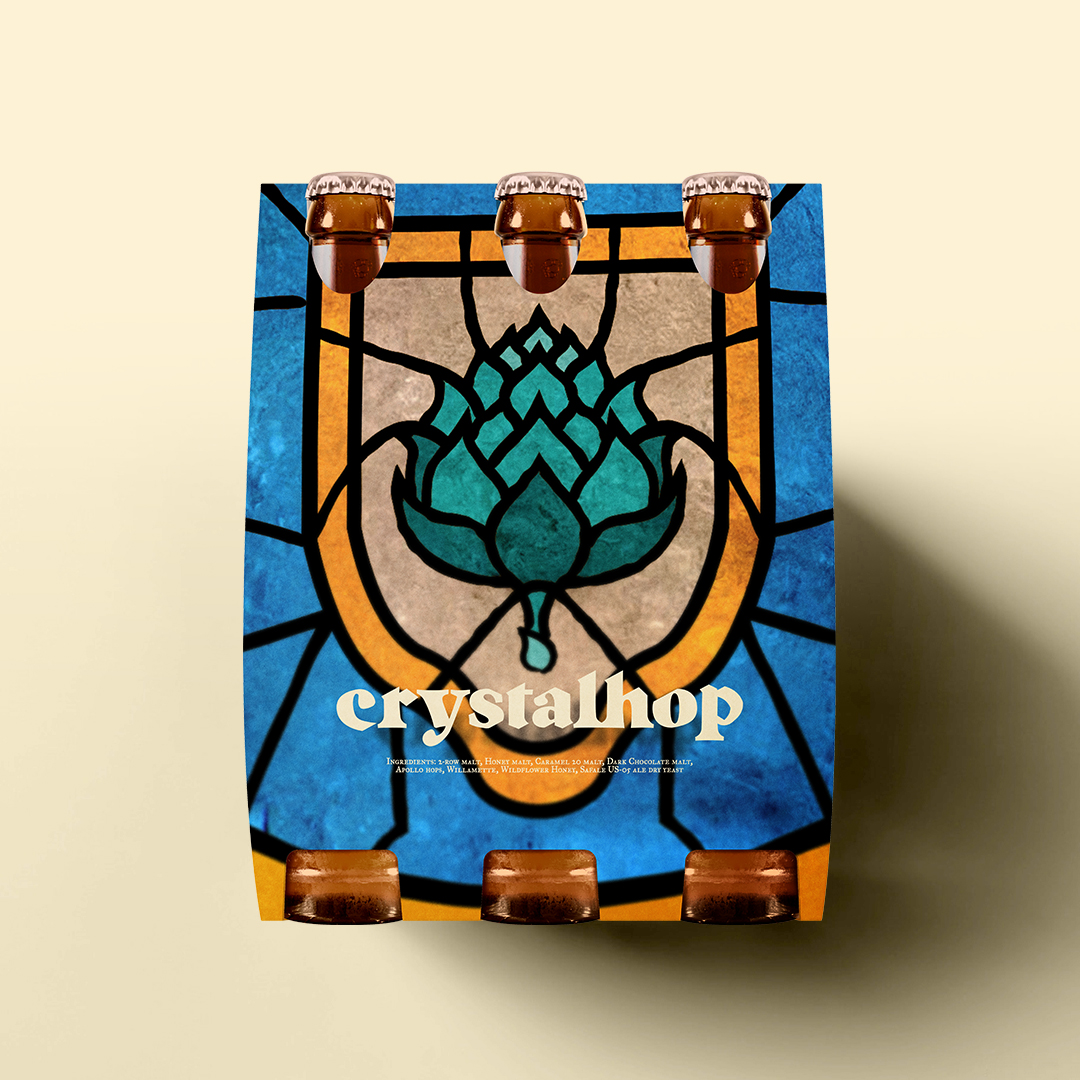
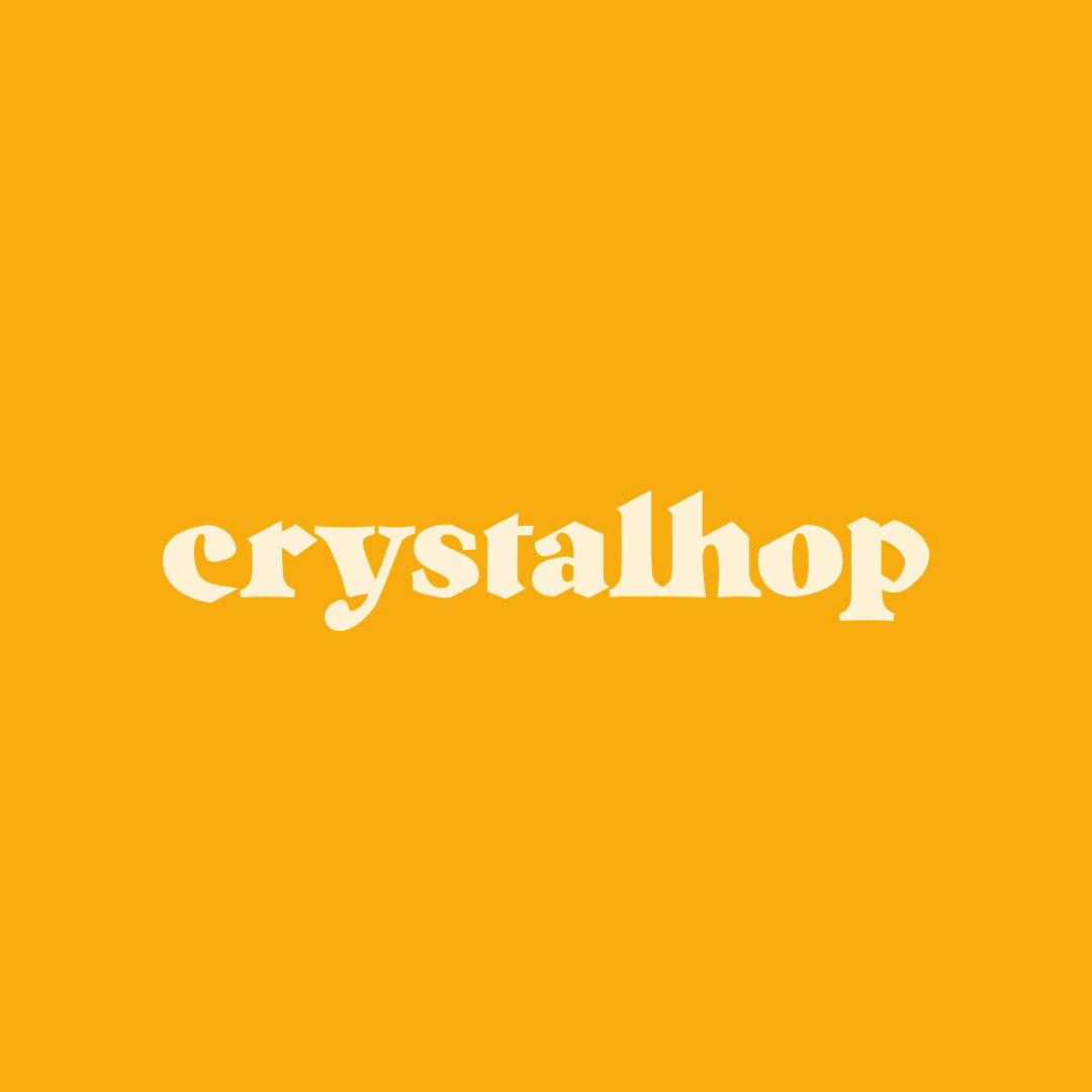
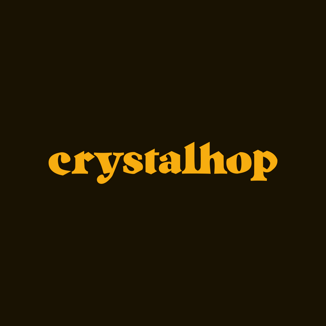
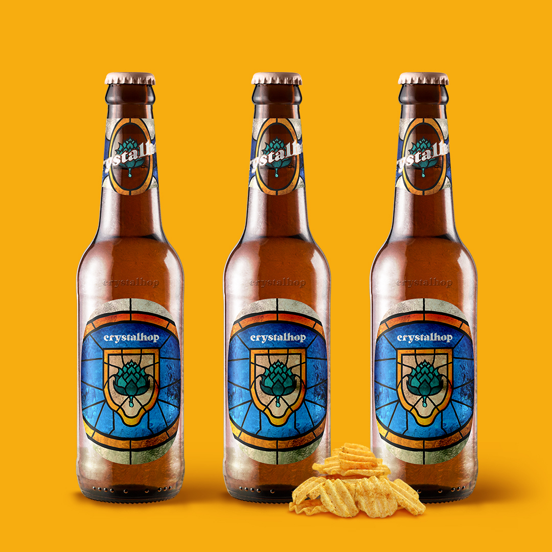
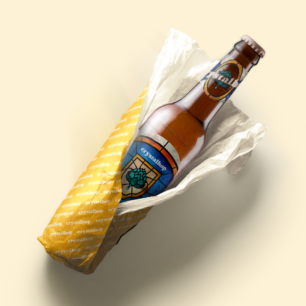
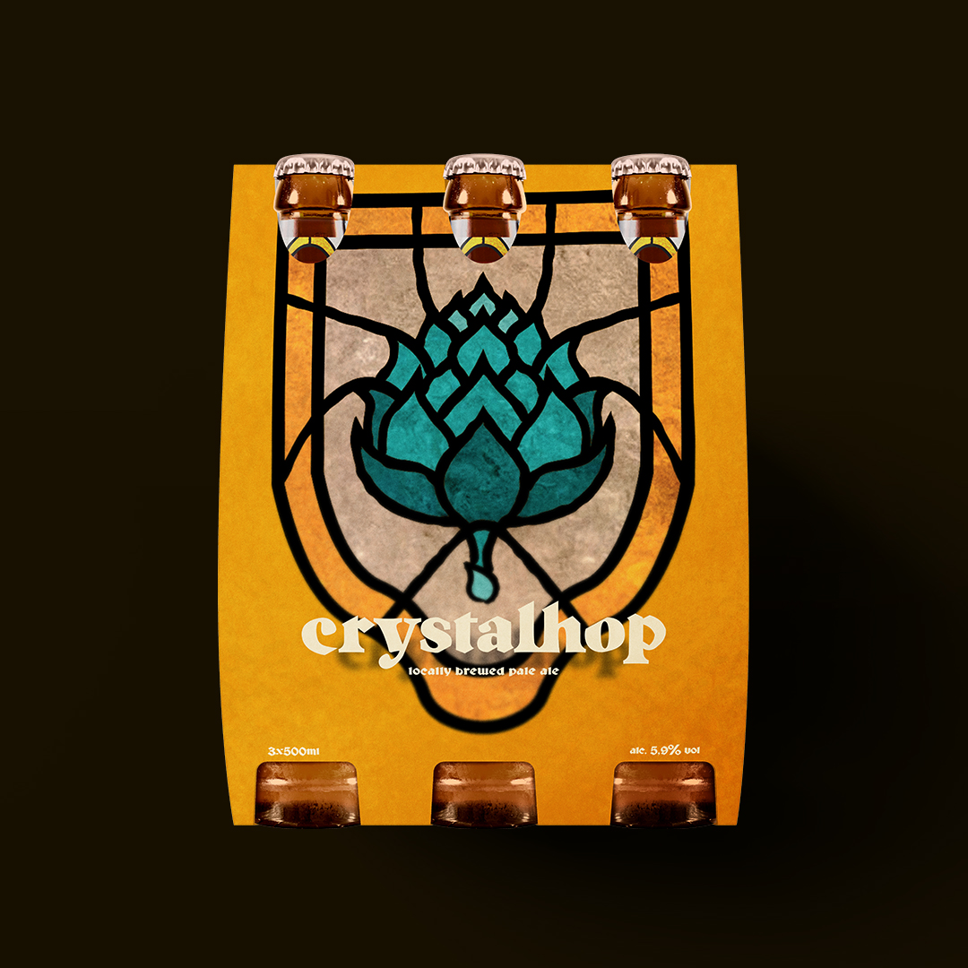
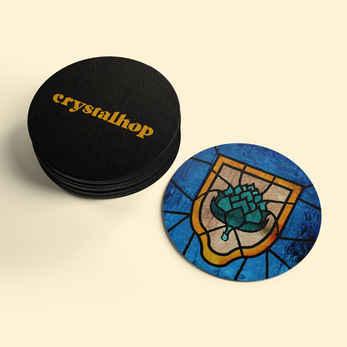
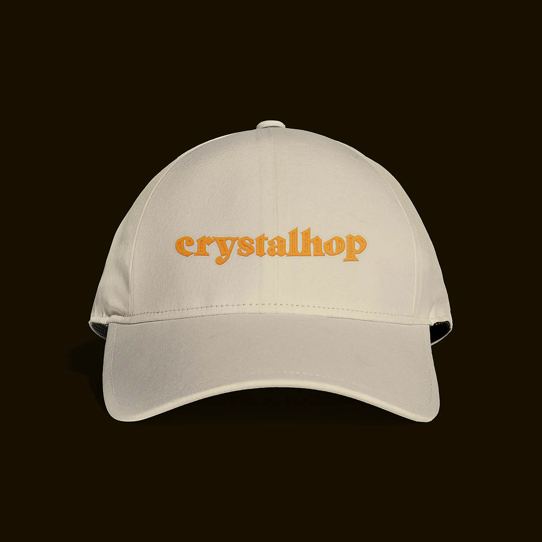
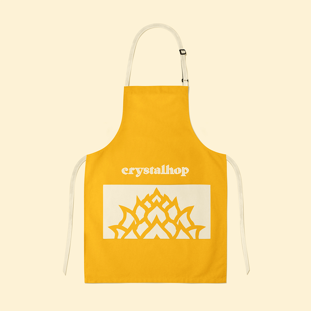
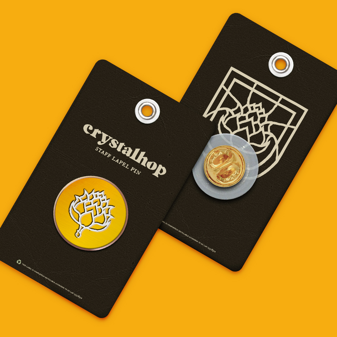
The purpose of this project was to create a beverage identity focused around the concept of stained glass. I wanted it to be a perfect combo between today’s trends and yesterday’s style.The logotype is inspried heavily by ancient brewery typefaces, combined with sharp diamond-like cuts at the top, for an unique sense of identity. It had to be rough & vintage, mimicking the breweries of old.The mark is a secondary tool in this identity’s arsenal, being used throughout the packaging in a stained glass format. It represents a rough, hand drawn hop, the shaky lines being inspired by the inner borders of stained glass artworks, which most of the time look distorted due to the glass on top. My inspiration was drawn from antique stained glass artworks than can be seen throughout the churches of Europe. The colors had to be vibrant & oversaturated, telling the story of a time when this form of art was the most beautiful thing an artist could create.


CREDIT
- Agency/Creative: Studio Defalt
- Article Title: Crystalhop Visual Identity Focused on the Concept of Stained Glass for a Brewery
- Organisation/Entity: Freelance, Non Published Concept Design
- Project Type: Packaging
- Agency/Creative Country: Romania
- Market Region: Europe
- Format: Bottle, Box, Wrap
- Substrate: Glass, Pulp Carton, Pulp Paper


