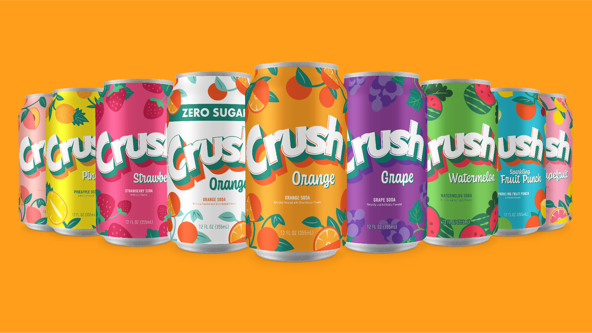
Established in 1911 Crush is America’s Original Fruit Soda. Packed to the rim with fruity fun flavor, Crush has been the go-to fruit-flavored soft drink for generations. When redesigning the packaging it was important to dig into the brand’s past for inspiration and play into the nostalgia that is connected to such an iconic brand. Merging the past with the present, the new look of Crush Soda has a refreshingly modern flavor with a splash of retro-cool. Bright, vibrant, and expressive, it brings back delicious memories of times past and promises even more phenomenally fruity moments to come thanks to Crush’s ever-growing family of fun, flavorful varieties.
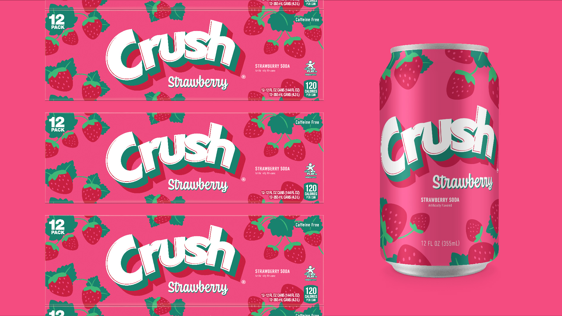
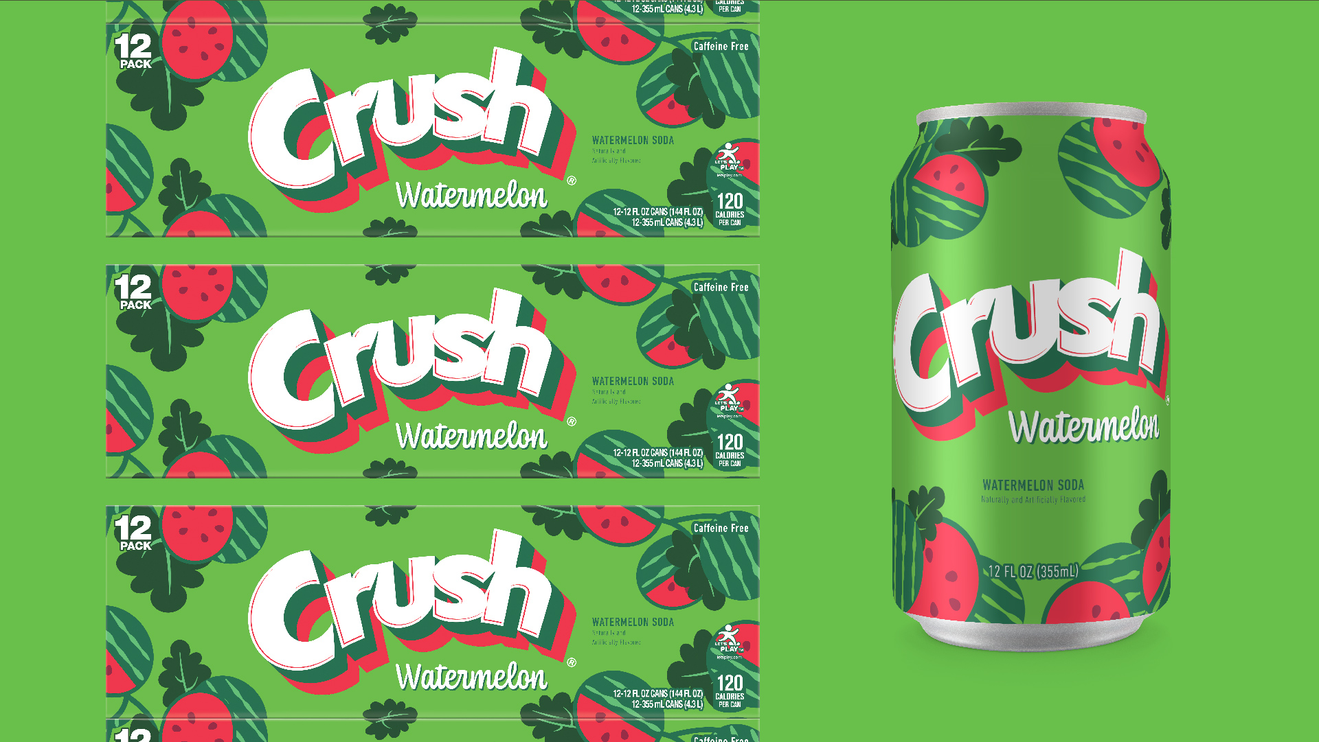
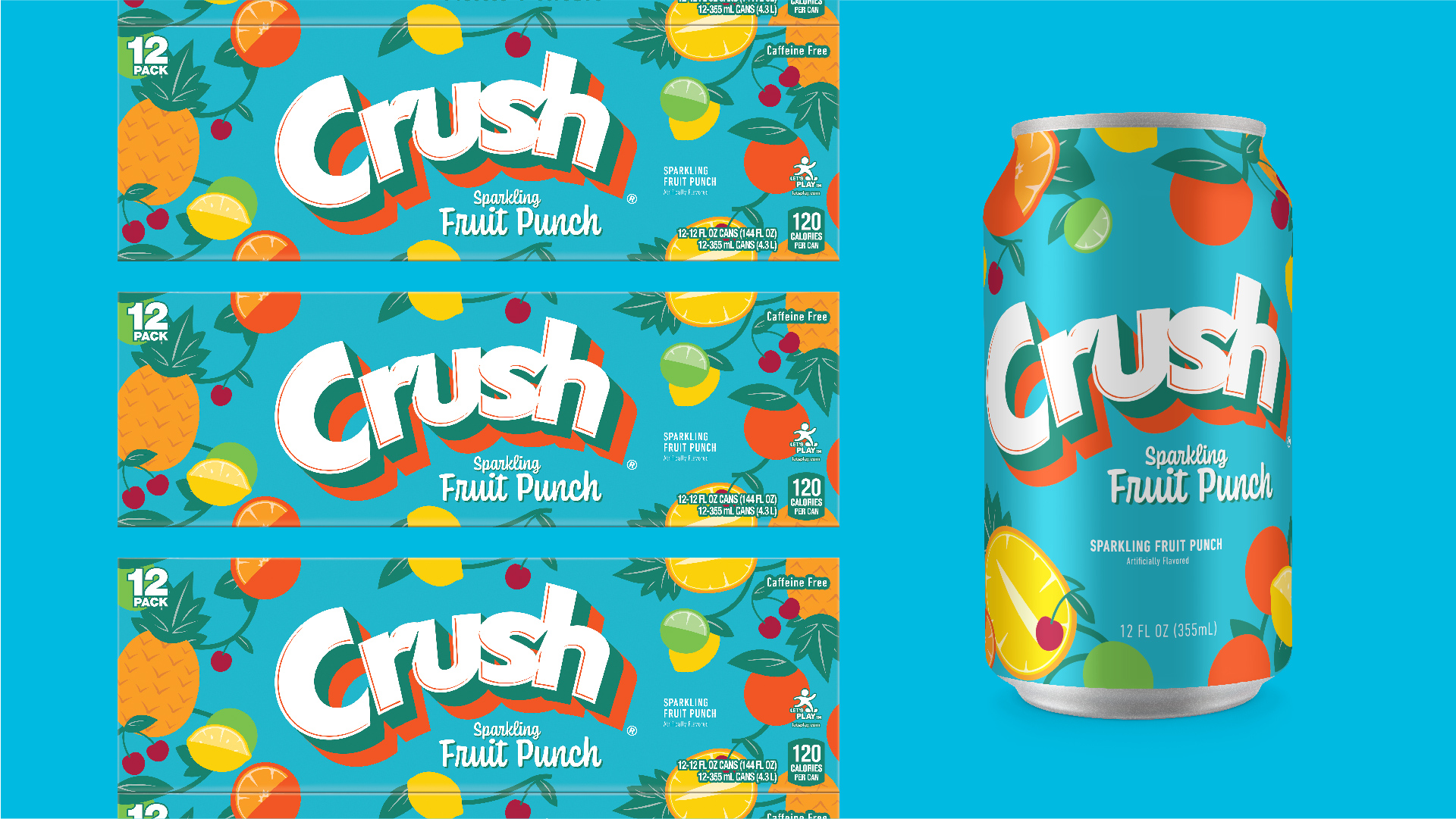
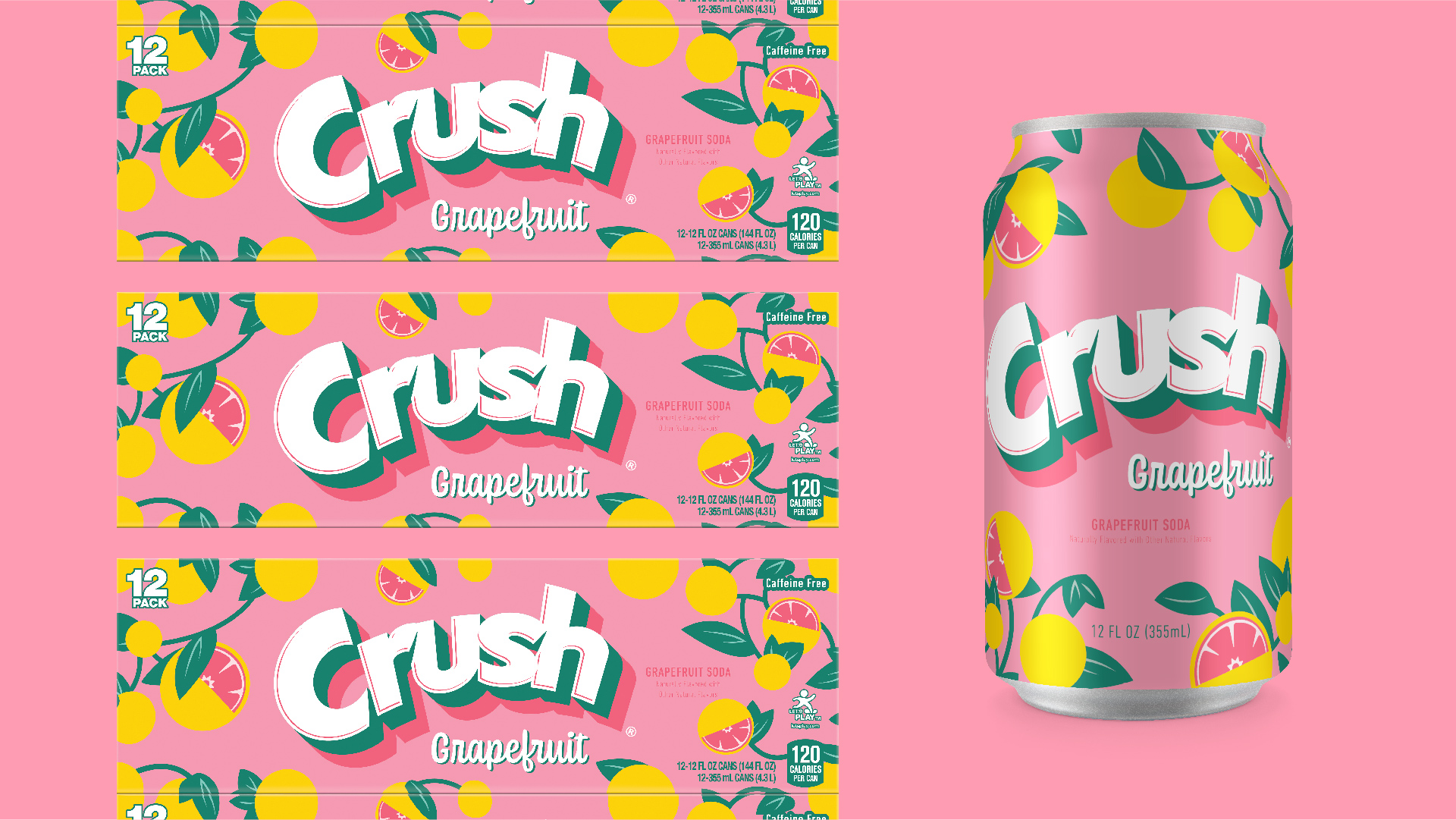
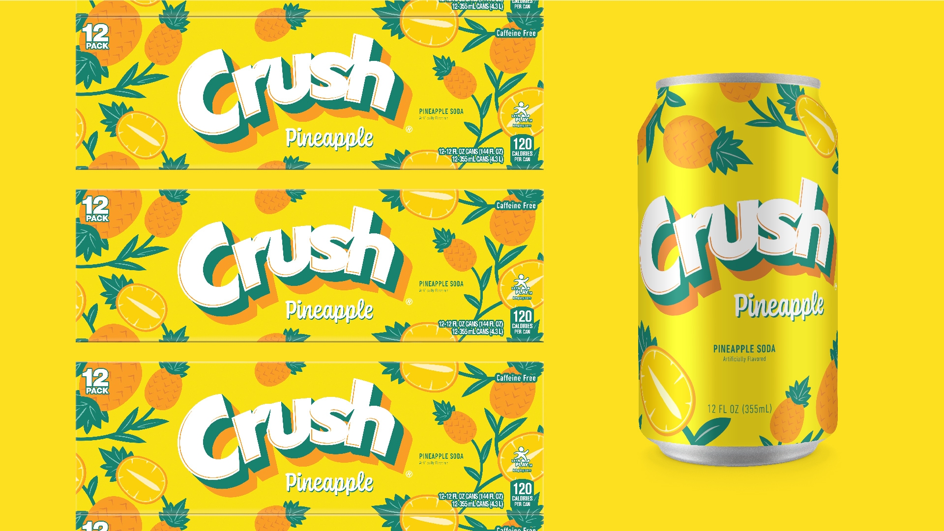
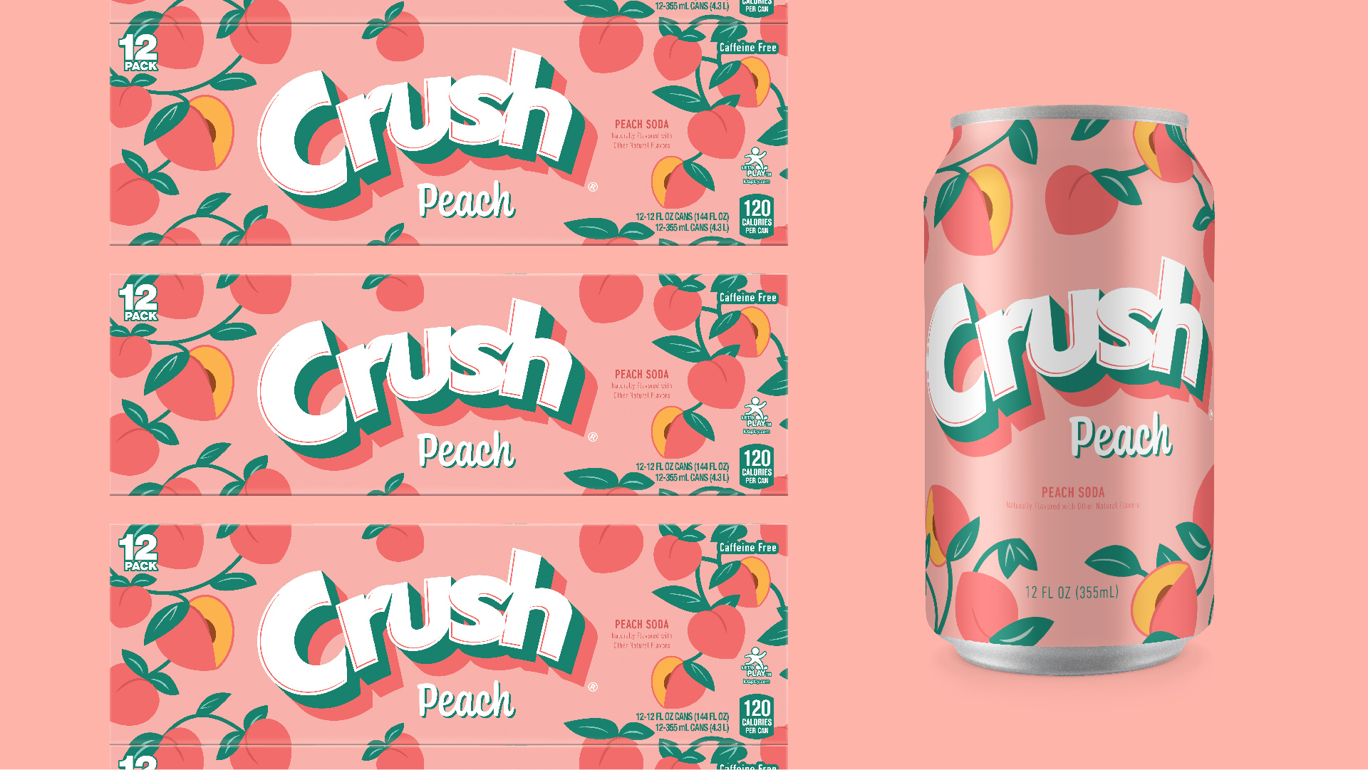
When designing the new look and feel for the Crush brand, it was important to keep the energy and excitement high, by igniting the inner kid with a fun-loving, light-hearted, and approachable look. Taking inspiration from the Crush cans of the 1970s, a flat yet bold illustration style was developed to help stir up nostalgic feelings within Crush’s long-time consumer base while at the same time creating an attention-grabbing and vibrant new look for the next generation.
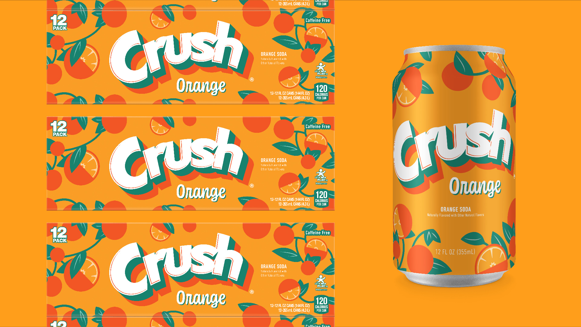
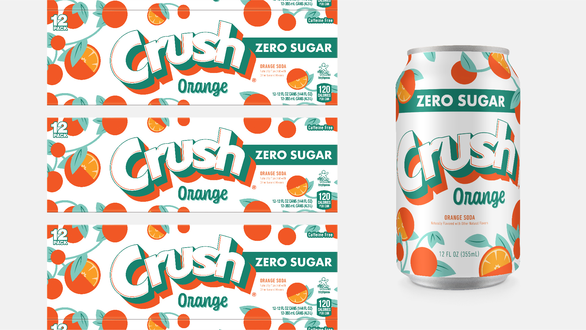
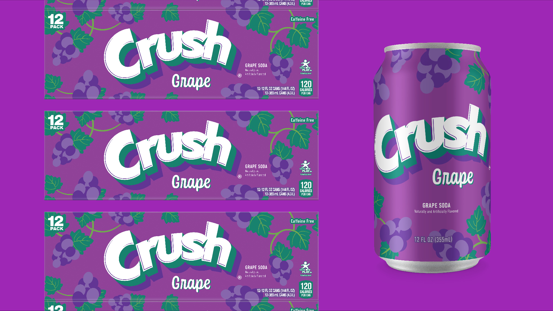
The simple yet colorful fruit patterns help dial up the taste appeal, bringing a unique personality to each flavor’s individual fruit profile. These fruit patterns create a system that helps frame the bold new logo as well as intertwine the cartons, creating a fantastically fruity billboard effect upon every self they’re placed. Extending the individualized flavor profiles of each variety is the reimagined crush logo that reaches back into the past with its retro shadow treatment while jumping boldly into the future with each pop of flavor-specific color.
The Crush brand has brought fun and flavor to the world for over a century. This new look highlights the drinks vibrant history while creating an exciting new future for this family-friendly treat.
CREDIT
- Agency/Creative: Connor Arnot & Liquid Sunsine
- Article Title: Crush Soda’s Refreshingly Fun New Look By Connor Arnot & Liquid Sunshine
- Organisation/Entity: Freelance
- Project Type: Packaging
- Project Status: Published
- Agency/Creative Country: United States
- Agency/Creative City: Burlington, VT
- Market Region: North America
- Project Deliverables: Art Direction, Brand Mark, Brand Redesign, Branding, Design, Graphic Design, Illustration, Logo Design, Packaging Design, Pattern Design, Rebranding
- Format: Can
- Substrate: Metal
- Industry: Food/Beverage
- Keywords: Crush, Soda, Packaging, Rebrand
-
Credits:
Art Director / Designer / Illustrator: Connor Arnot
SVP Design: Darren Moran
Design Director: Ryan Dreimiller


