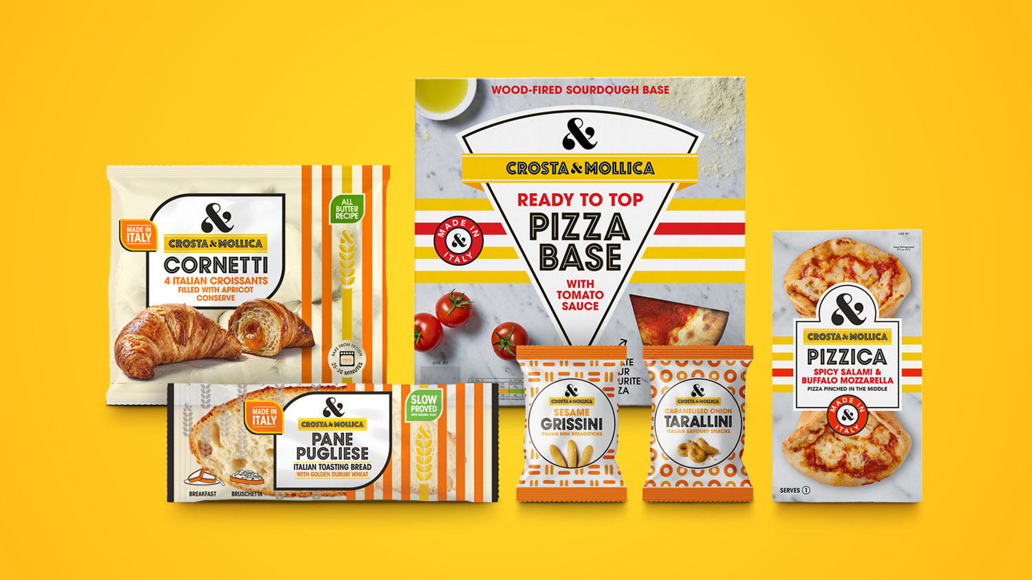
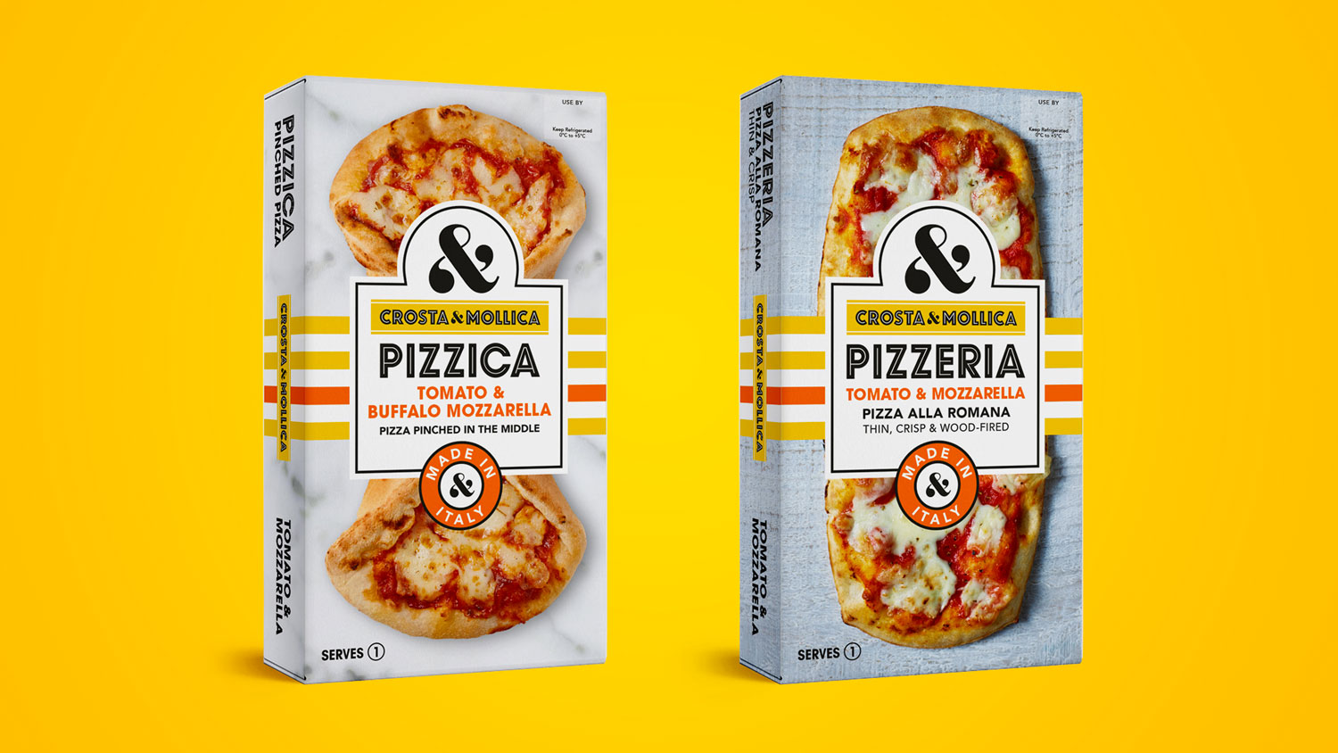
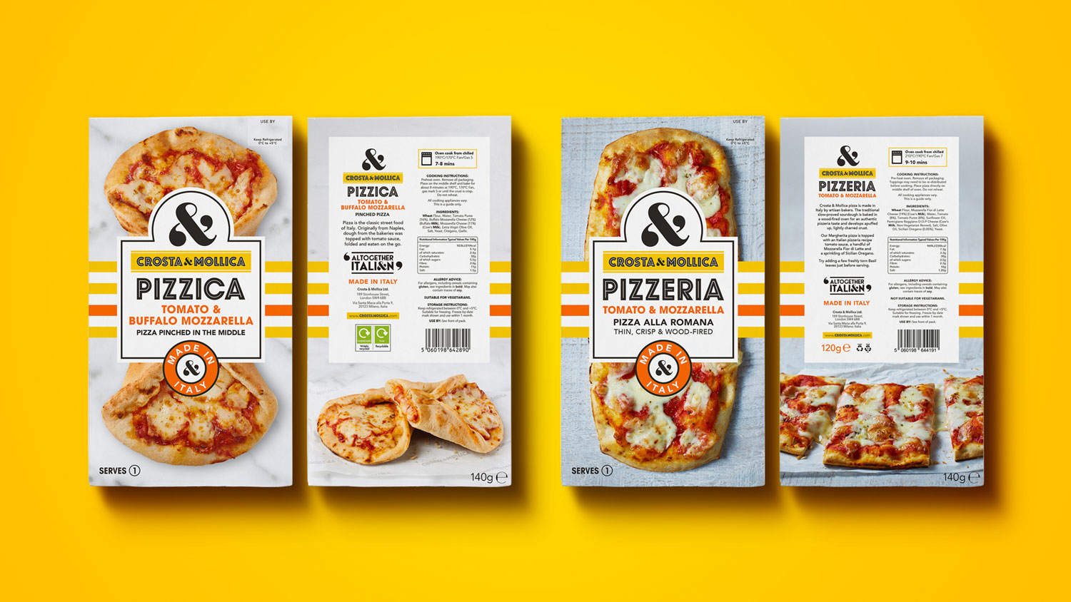
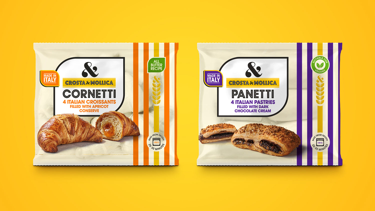
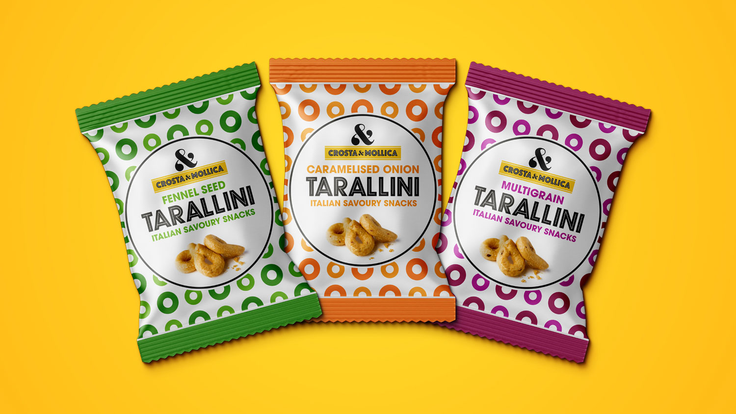
Deuce Studio has been working with Crosta & Mollica for the past couple of years, helping to expand their range of products from Italian bakery into other categories such as chilled pizzas, frozen patisserie and on the go snacking.
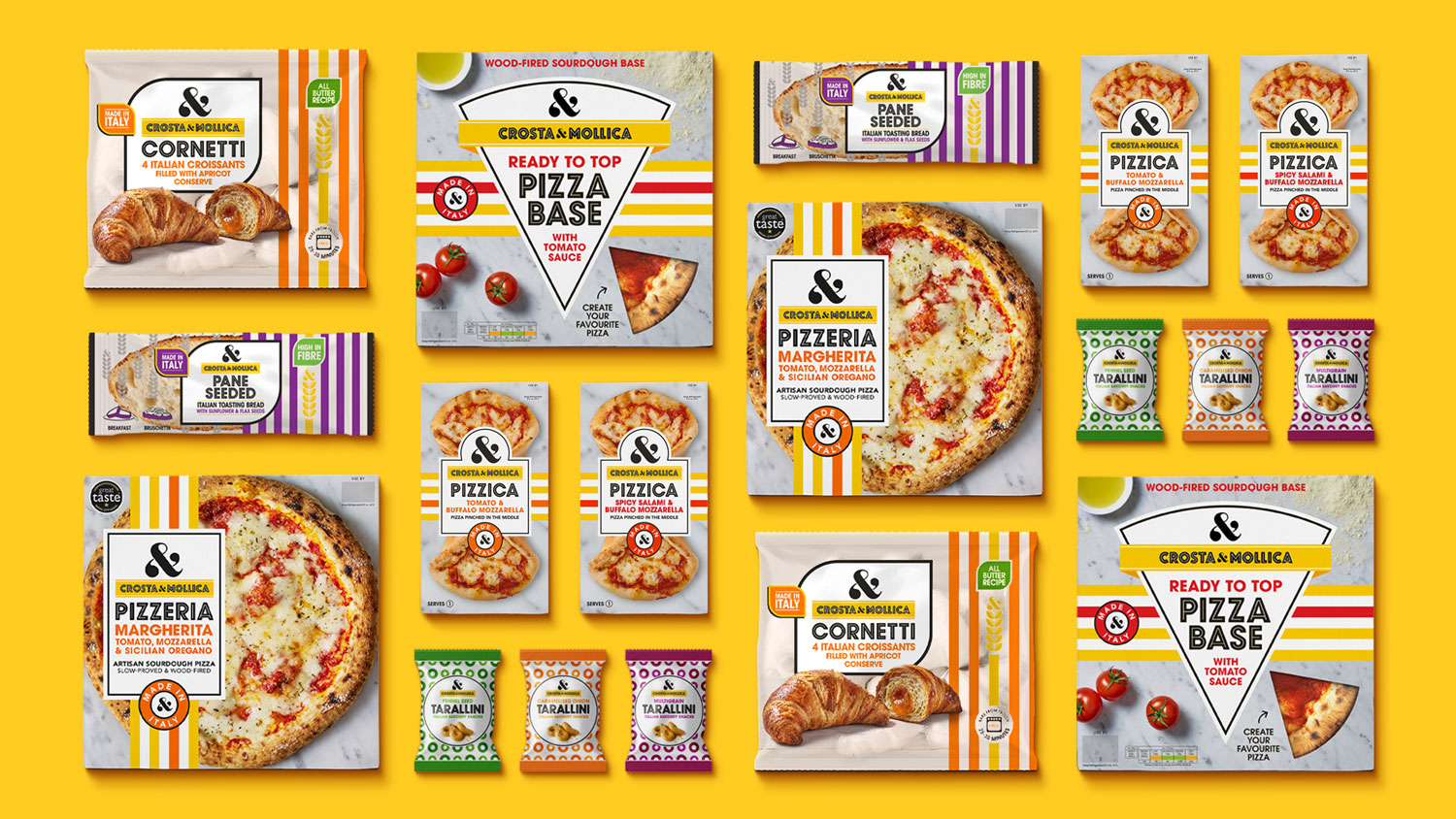
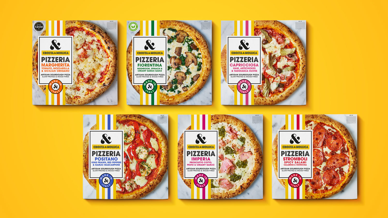
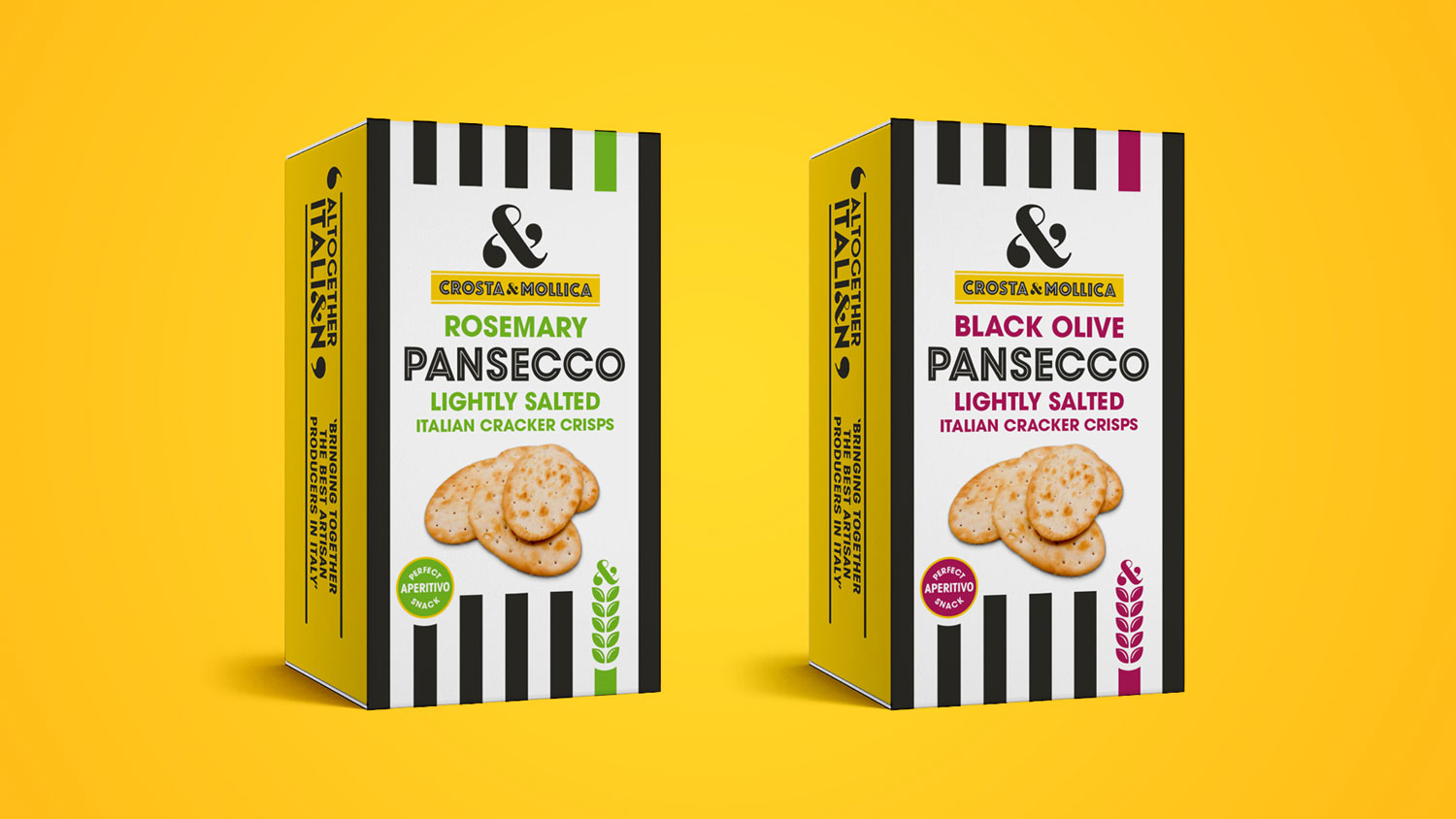
The Crosta & Mollica brand is well known for providing quality driven and authentic Italian bakery products such as breadsticks and wraps, but wanted to go further and provide even more delicious Italian products to new audiences. With there brand already in place and recognised for its bold stripes and large ampersand logo, we built upon these core assets and developed the brand and packaging system across new packaging ranges and formats. Introducing delicious looking product or ingredient photography where necessary to entice consumers to try something new from the brand, while always coming back to their strong ‘Made In Italy’ credentials.
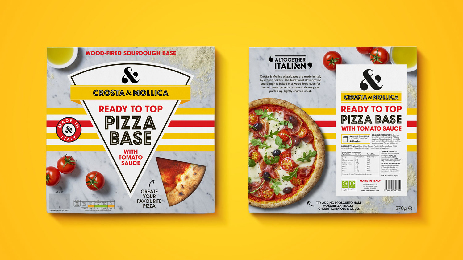
Some of the ranges even went further to explore different devices that best suited the different packaging formats, due to size constraints, which also reflected the product themselves, such as a pizza shapes device on the pizza base or circular inspired pattern to reflect the on the go snacks, all coming together to create a bold and enticing range of products, that felt visually coherent as a family, but also different enough to stand on their own against competitors.
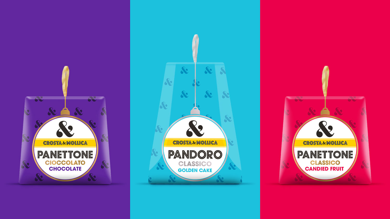
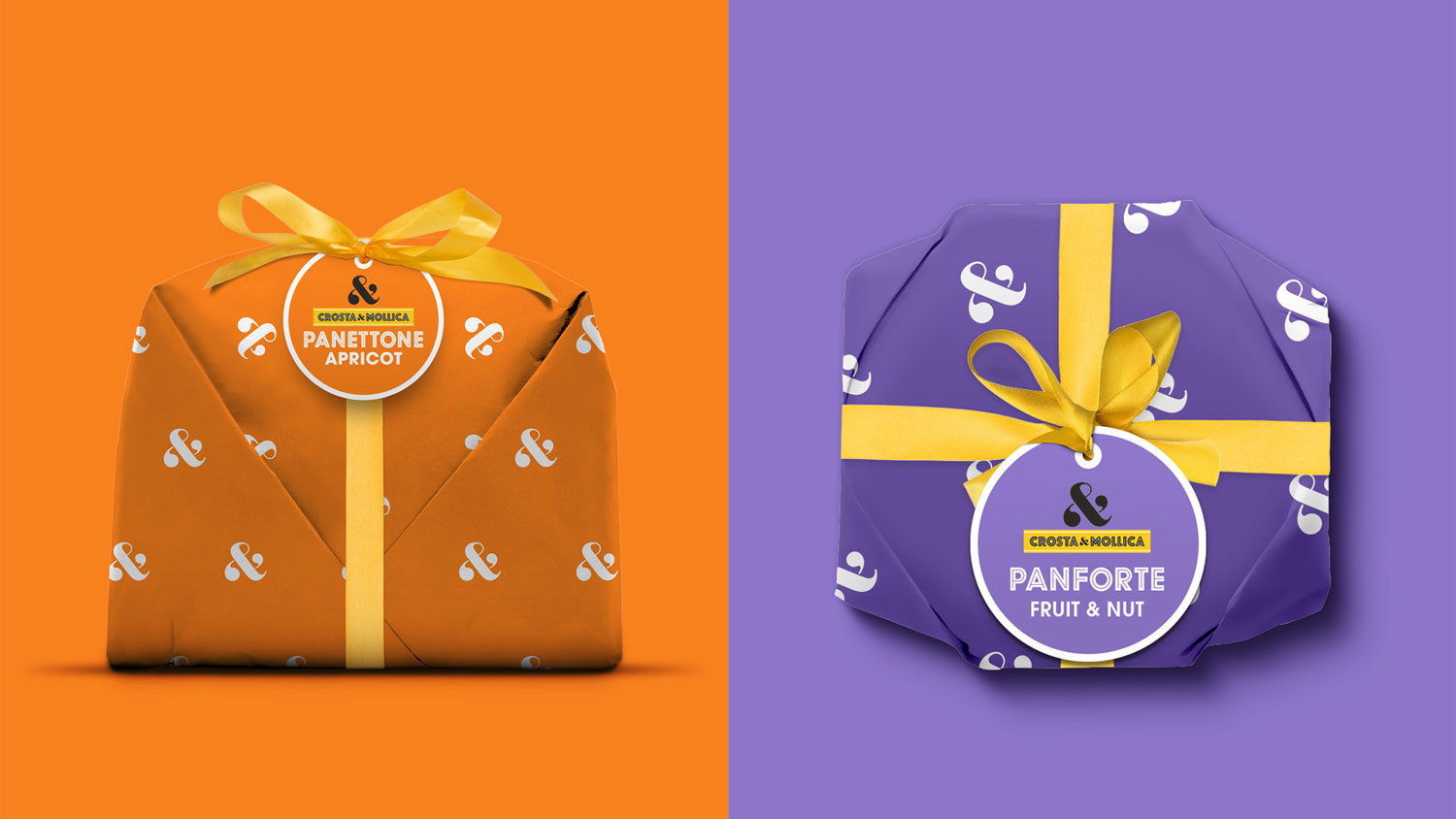
We we’re also briefed to update their seasonal Christmas range of Italian sweet treats, such as their range of Panettone, traditional Italian sponge cakes in various flavours. For this we developed a fun yet premium looking design that combined the spirit of Christmas with the quality of their product and bold look of the Crosta & Mollica brand, we then applied this to 5 different products with slightly different formats, including cake boxes and paper wrapped with bows and tags.
We have been working with Crosta & Mollica and their various sister brands for numerous years now and look forward to working with them further as we look to explore where the brand can go in future years.
CREDIT
- Agency/Creative: Deuce Studio
- Article Title: Crosta & Mollica Packaging Design Across New Categories Designed by Deuce Studio
- Organisation/Entity: Agency, Published Commercial Design
- Project Type: Packaging
- Project Status: Published
- Agency/Creative Country: United Kingdom
- Market Region: Europe
- Project Deliverables: Brand Refinement, Brand World, Branding, Graphic Design, Packaging Design, Photography, Product Architecture, Research
- Format: Box, Case, Flow-Pack, Pouch, Sleeve, Tray, Wrap
- Substrate: Plastic, Pulp Board, Pulp Carton, Pulp Fibre, Pulp Moulded Fibre, Pulp Paper
- Industry: Food/Beverage
-
Credits:
Strategy : Dan Monteith
Creative Direction: Tony Fox
Design: David Hodgson
Design: Joanne Pittard
Design : Josh White
Visualisation: Simon Thomas
Artwork: Steve Gordon
Account Direction : Layla Kammeier
Account Direction: Charlotte Oggier
Owner & Director, Crosta & Mollica: James Orr
Marketing Director, Crosta & Mollica: Paul Vita
Digital & Comms Marketing Manager, Crosta & Mollica: Ben Hyde-Hart


