


Nestled in the West Lincoln Park neighborhood, The Ludlow loft apartments bring brand new life to this industrial district. Originally erected in 1913 to house the Ludlow Typograph Company, the building has undergone a meticulous renovation, transforming it into a haven of high-end living spaces.
The Cross Street marketing team was approached by Interra Realty to create a brand for this incredible building that would reflect their vision for creating modern living in a vintage space and appeal to the right tenants.
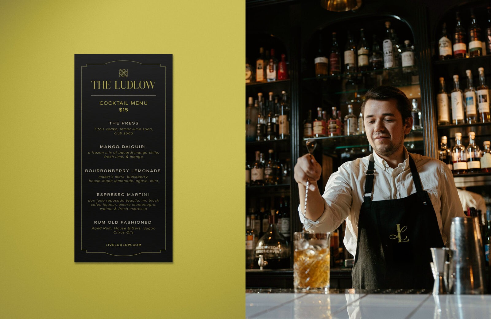
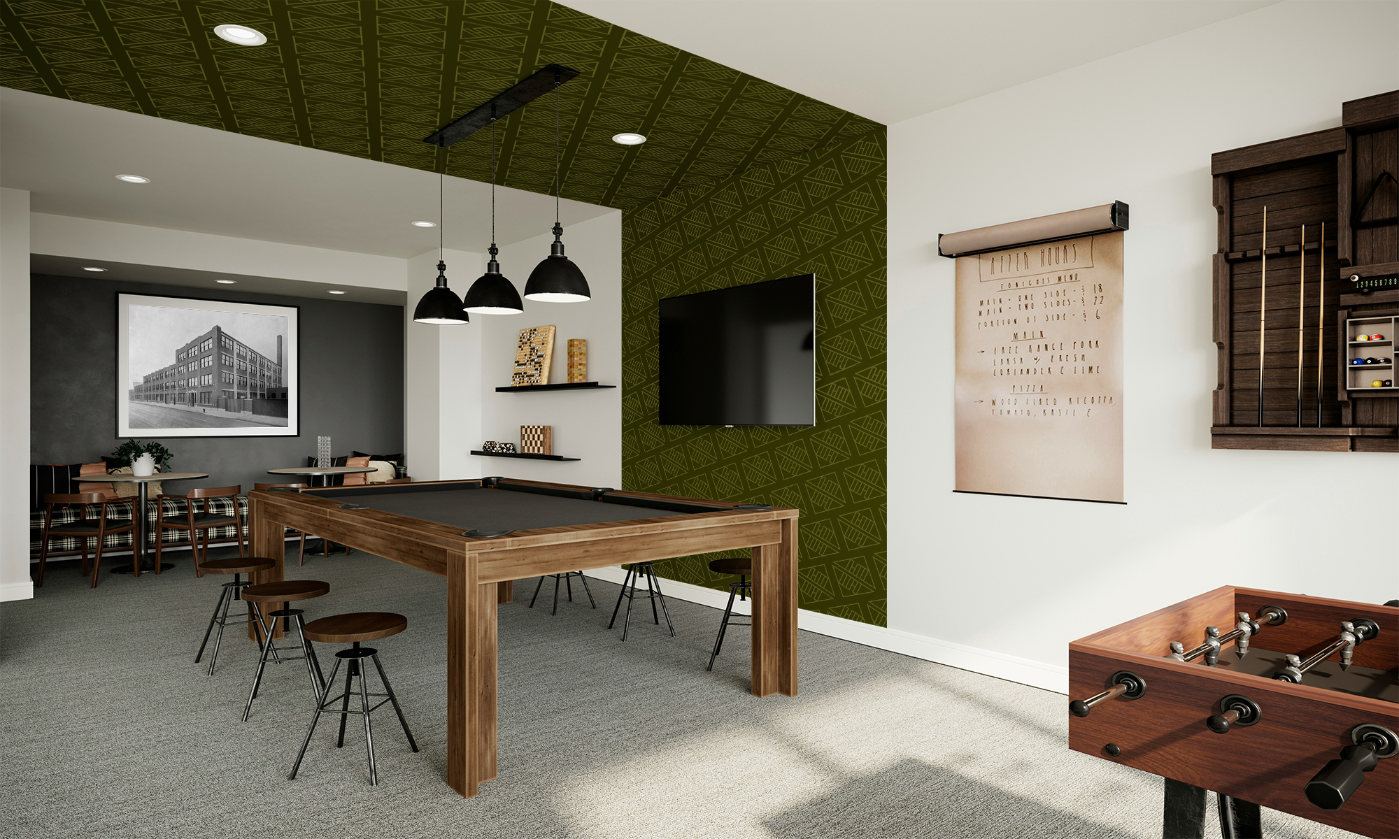
The Ludlow redefines the living experience in Lincoln Park by introducing a unique ‘hometel’ concept. Beyond its luxurious and comfortable living spaces, The Ludlow offers an array of food, beverage, and amenities just an elevator ride away. As the sun sets, residents can retreat to the rooftop bar and lounge and enjoy sweeping views of the city or travel underground to the on-site omakase restaurant owned and operated by Michelin Star chef Paul Qui.
Lincoln Park provides the perfect setting for young professionals that seek these elevated offerings. With a preference for modern luxury, these professionals are in search of an apartment that offers both elegance and convenience in equal measure. The branding needed to speak to this clientele in order to succeed.
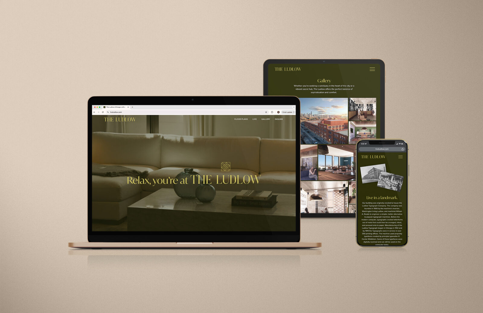
The renovation of The Ludlow by GREC Architects celebrates the building’s unique architectural details while creating a space that feels fresh and modern. The design embraces contrasts, blending finished and unfinished textures, raw materials with polished surfaces, and merging unexpected forms. The visual elements of the brand needed to reflect this existing vision to ensure that residents would have a seamless experience across all of The Ludlow’s touchpoints.
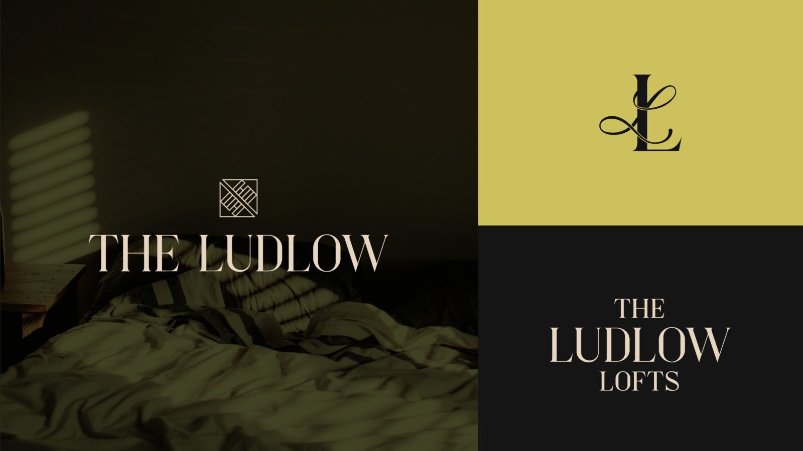
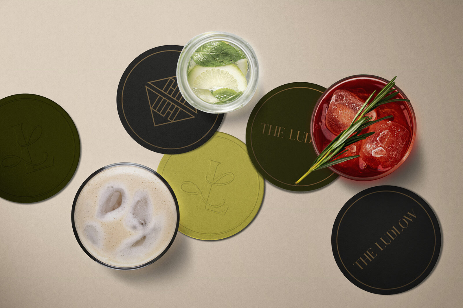
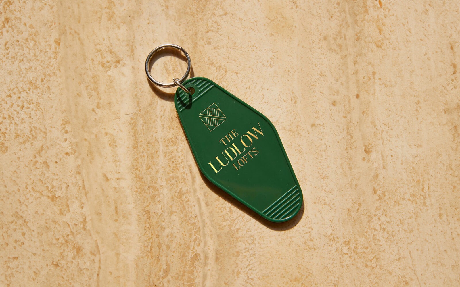
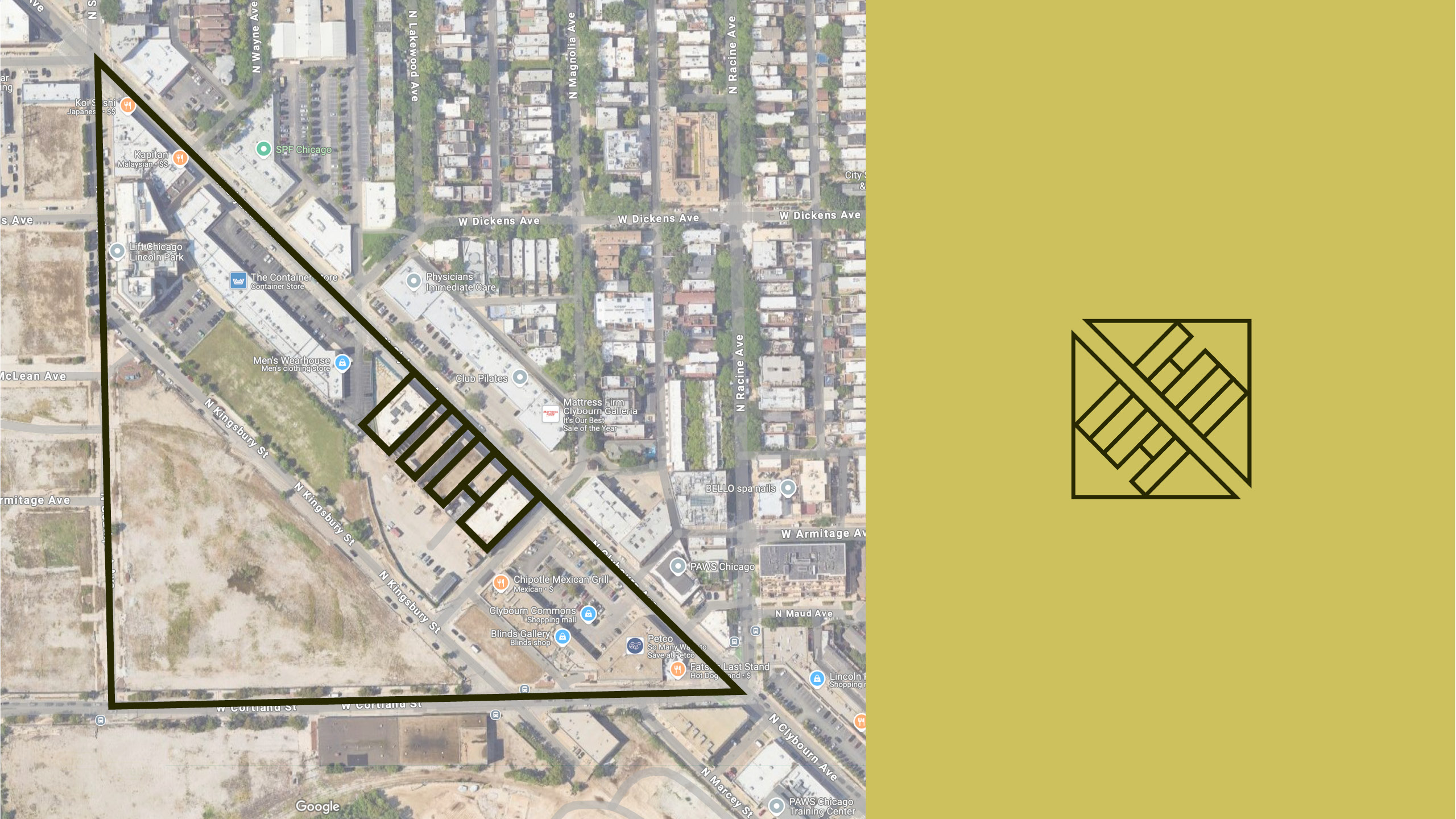
The resulting visual identity was built upon an aesthetic we labeled “Nouveau: turn of the century design meets modern luxury.” The logos use a classic serif typeface with clean, sharp lines. The Ludlow icon, reminiscent of 1920s Deco design, is a composition of geometric shapes created by the surrounding streets and the 5 buildings that comprise The Ludlow. The result is a distinctive and customized element that can be combined with the wordmark or used decoratively. The elegant monogram serves as an additional decorative element that can enhance and diversify the branded materials.
The color palette skillfully combines deep, opulent hues with lively, dynamic shades. Deep olive and charcoal pay homage to the legacy of the building and reflect the sophisticated preferences of the esteemed tenants. Simultaneously, a vibrant pear hue incorporates the contemporary spirit of the building’s modern era, infusing it with vitality. The palette is balanced with the neutral shade of cream.
The Ludlow stands as a testament to the power of thoughtful design in conveying the essence of luxury and history. Through a meticulous approach to visual identity and branding, the project successfully captures the aspirations of its discerning clientele and establishes The Ludlow as an iconic landmark within the Lincoln Park neighborhood and beyond.
CREDIT
- Agency/Creative: Grace DeWald
- Article Title: Cross Street’s Branding for The Ludlow: A Tribute to Lincoln Park’s Architectural Legacy
- Organisation/Entity: Creative
- Project Status: Published
- Agency/Creative Country: United States of America
- Agency/Creative City: Chicago
- Market Region: Illinois
- Keywords: WBDS Creative Design Awards 2024/25
- Keywords: WBDS Creative Design Awards 2024/25


