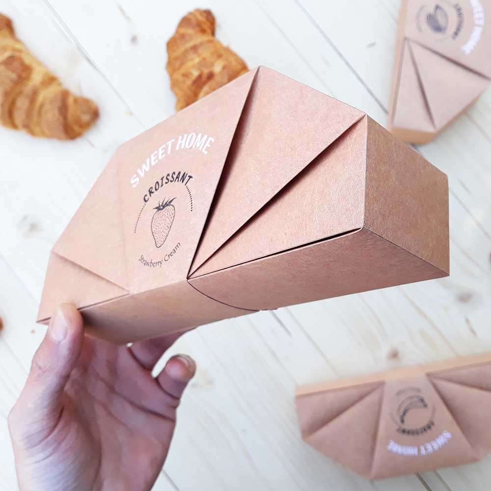
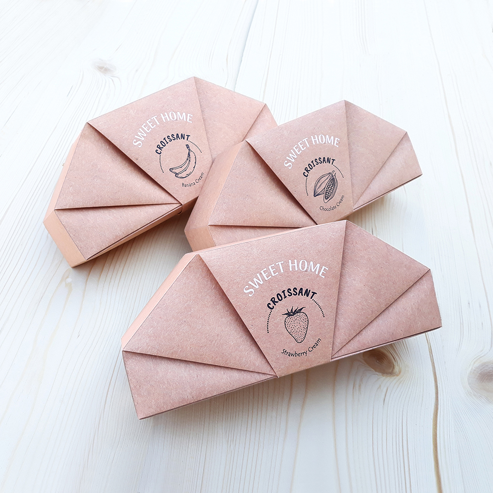
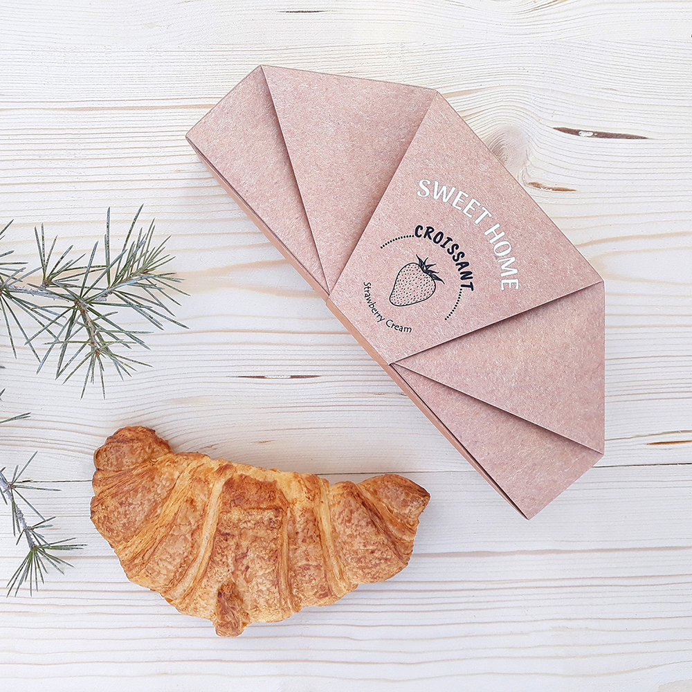
-The packaging structure is inspired by the croissant cookies structure.
-The packaging is designed to be opened and closed just by folding, without any glue.
-Another advantage is the possibility to open the package completely and use as a plate to eat croissant.
-The inside part of the package is covered by attractive colors which are relevant to the flavor of croissant, that can draw the user’s attention to opening and using the package.


CREDIT
- Agency/Creative: Nazanin Behzadi
- Article Title: Croissant Packaging Design
- Organisation/Entity: Freelance, Non Published Concept Design
- Project Type: Packaging
- Agency/Creative Country: Iran
- Market Region: Global
- Project Deliverables: Brand Advertising, Brand Creation, Brand World, Branding, Graphic Design, Industrial Design, Packaging Design, Product Architecture, Structural Design
- Format: Box
- Substrate: Pulp Paper
FEEDBACK
Relevance: Solution/idea in relation to brand, product or service
Implementation: Attention, detailing and finishing of final solution
Presentation: Text, visualisation and quality of the presentation


