Context
Launched in 1965, Crodino is an Italian non-alcoholic aperitivo. Known for its bittersweet taste and formulated from a blend of fifteen botanicals and herbs, the secret recipe has been unchanged since day one.
With increasing trends towards sobriety or moderation, particularly among younger drinkers, no- and low-alcohol (Nolo) brands are seeing massive rises in popularity. As an existing brand with a history, Campari Group see an opportunity, for Crodino to become the world’s no.1 non-alcoholic aperitif.
While a well-loved aperitivo in its Italian home, Crodino does not have a large fanbase of Gen Z consumers– the heartland of the Nolo trend. Further afield, Crodino is barely known at all. Thus, a brand refresh and a new perspective is required to launch Crodino onto the global stage and into new growth.
Brief
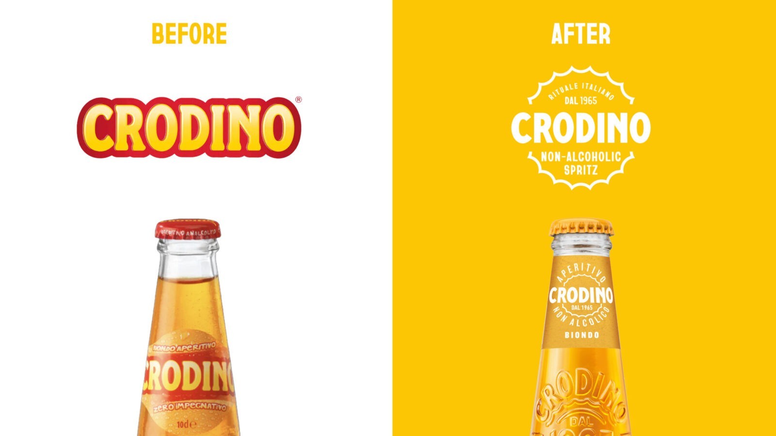
The challenge for the new brand platform and identity was twofold. On one hand to introduce a new or relatively unknown product to new markets. On the other to challenge entrenched perceptions of Crodino in Italy, appealing to younger consumers without alienating the traditional audience. Carving out a creative territory that is unique and ownable in the aperitivo and spritz landscape, we constructed the new Crodino brand world.
Strategy
Younger generations are navigating a period of uncertainty marked by economic challenges and growing global instability. Where some brands try to make the world better through purpose-led narratives, young consumers are highly sceptical of this approach, and are eschewing these holier-than-thou brands in favour of feeling good. In parallel, we observed a consumer trend towards nostalgia, and looking back to bygone eras with rose-tinted glasses. With Crodino’s 50+ years of history, the brand was well placed to authentically take advantage of this ‘newstalgia’ trend, something other new to market Nolo brands cannot legitimately claim.
Our strategic approach combined both these insights – the need for positivity plus a warm retro sensibility – to create a creative platform that addressed the real needs of our Gen Z consumers. We saw a space for Crodino to own –a respite from the doom and gloom, some escapism from the mundane. Taking inspiration from Crodino’s existing association with Italy, we wanted to offer consumers a fresh perspective on the Italian dolce vita. Adding a rejuvenating and refreshing breath of positivity and light into the conversation, Crodino brings a ray of the Mediterranean sun to anyone who drinks it. It’s distinctive, disruptive and unmistakably Italian.
Design Process
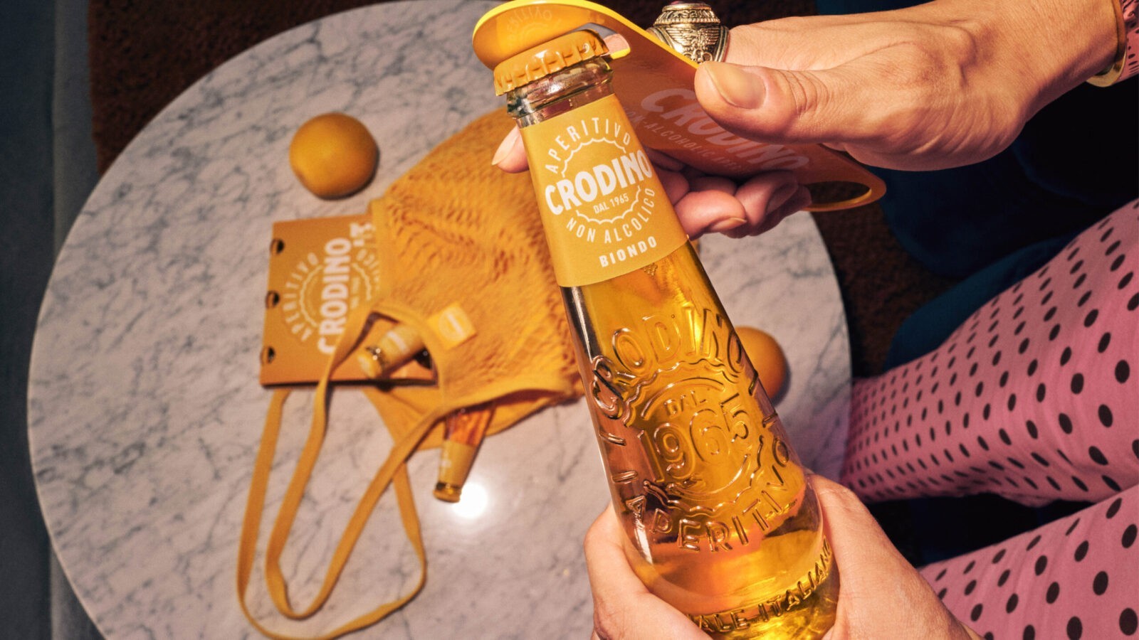
Our Open Sunshine platform is all about providing little moments of joy in the everyday. The very core properties of the product transport consumers into a more uplifting and engaging world; the tactile form of the bottle, the gentle effervescent fizz of the liquid, and the bittersweet yet velvety taste.
Taking inspiration from these inherent product qualities, injecting them with a dose of ‘70s retro feel-good vibes,and the gentle humour and innate style of Italy, we created a unique identity for Crodino.
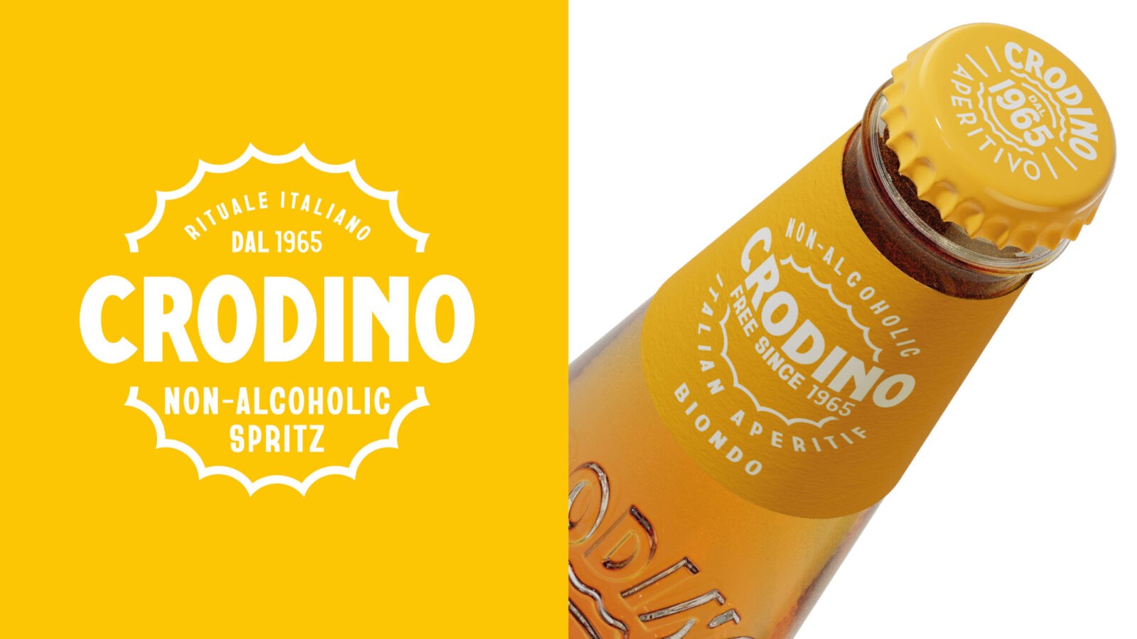
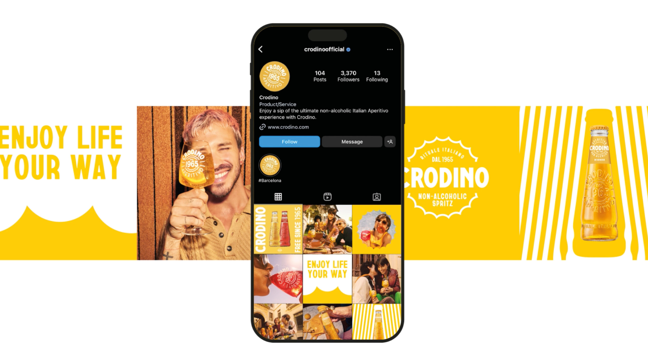
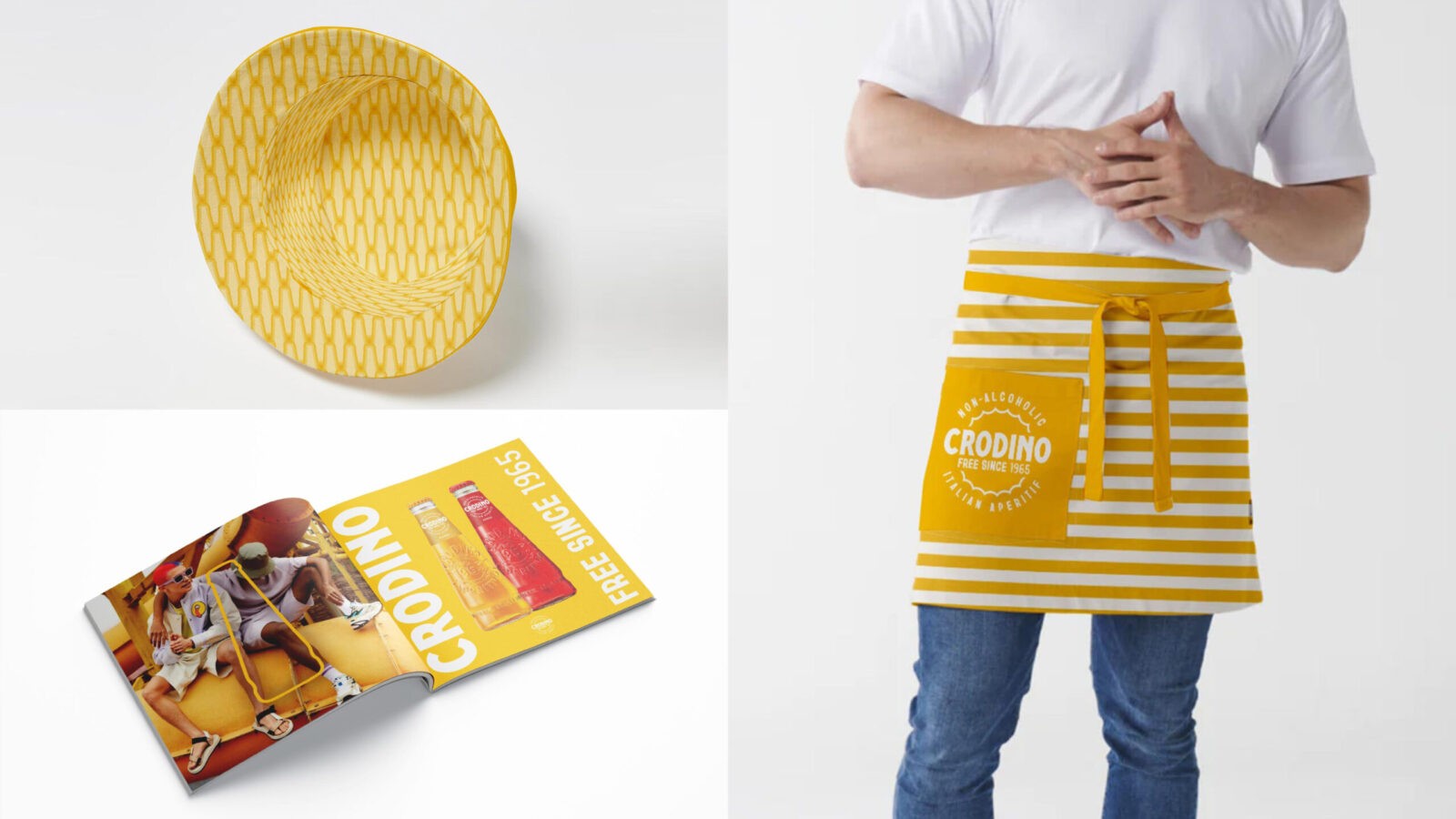
A platform called ‘Open Sunshine’ needed a source of sun. Taking the shape of the bottle cap and repurposing it as a sun motif, we could bring summer anywhere, to every touch point. Used as a graphic device, this sunny asset can be flexed for many situations and purposes. Whether a solid background or space for messaging and product photography or inspiring the forms of many POS elements, this motif is at the heart of this new identity.
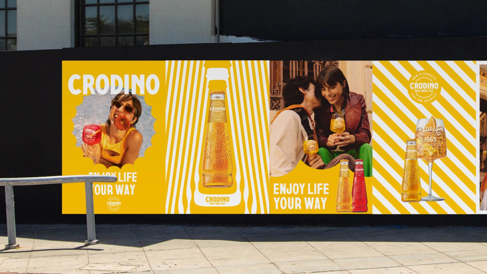
Retro Italian typography was the inspiration for our choice of font and how it’s used. Mixing up different font weights and styles, we created a playful retro typographic style which is deeply evocative of people and place.
Stripes redolent of iconic Italian beach parasols are updated with the form of the Crodino bottle to create a striking suite of brand patterns.
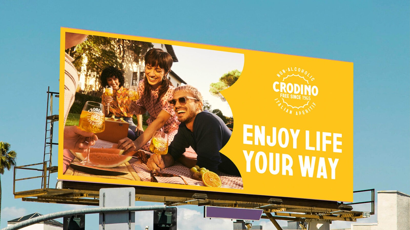
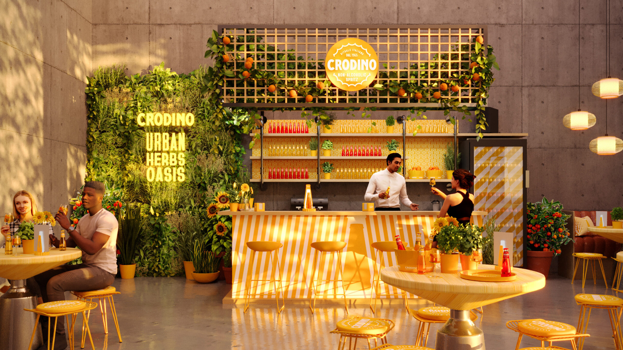
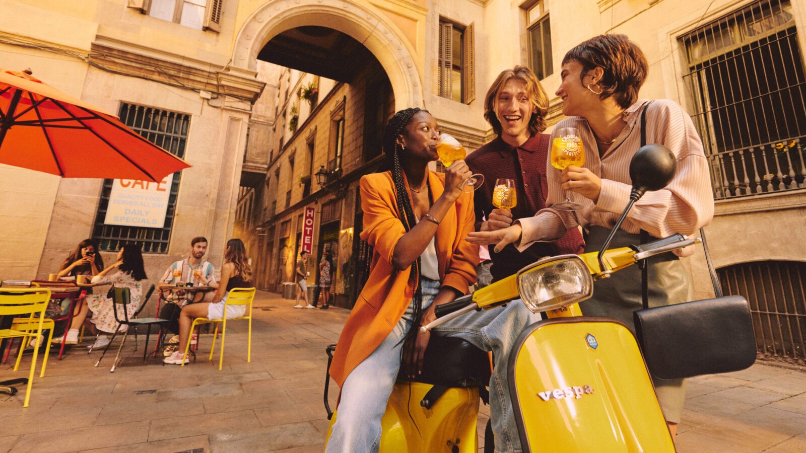
Nostalgic styling was also the guidance for our photography style. Sun bleached photos, imbued with golden hour hues and Crodino yellow accents create a photography style aligned through colour and a lively take on the ‘new dolce vita’. The lifestyle photography shows our consumers a way to live their best lives through the irresistible energy of summer. We also considered how to activate this brand platform. Crodino events transform regular urban environments into vibrant and refreshing spaces full of greenery. We encourage customers to break free from the everyday and Open Sunshine by stepping into an urban oasis.
The Results
Following the launch across europe and beyond in q2 2024, local markets love Crodino’s new BVI and by July were already seeing an uplift in sales. We’re excited to see full impact of Crodino’s new sunnier outlook on sales and brand love when summer sales figures are released later in the year.





CREDIT
- Agency/Creative: Missouri Creative
- Article Title: Crodino’s Retro Rebrand Brings a Fresh Taste of Italian Sunshine to Gen-Z
- Organisation/Entity: Agency
- Project Status: Non Published
- Agency/Creative Country: United Kingdom
- Agency/Creative City: London
- Project Deliverables: Brand Redesign
- Industry: Food/Beverage
- Keywords: WBDS Agency Design Awards 2024/25
- Keywords: WBDS Agency Design Awards 2024/25
-
Credits:
Growth Director: Andrew Mitchell
Creative: Lauren Smith
Creative: Becks Sunderlan
Creative: Jonny Reay


