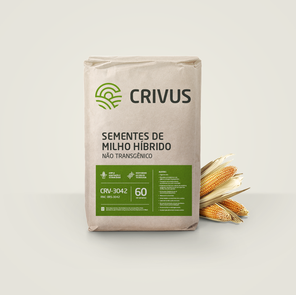
These special seeds were created to have more acceptance of the land, that is, to pass through the selection filter of nature itself. The name was created from the word CRIVO, which means choice in Brazilian protections, added by the Latin sulfix “US”, to give more sonority and impact.
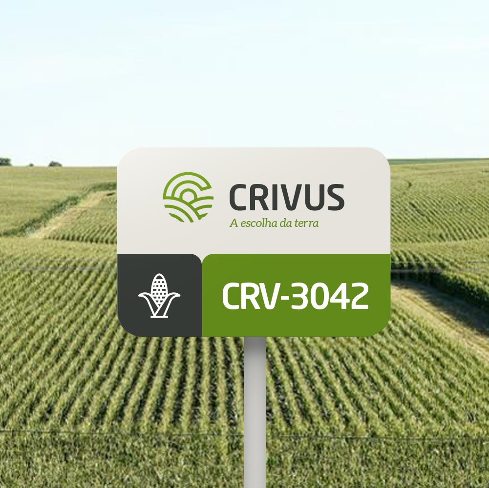
The brand was built on the junction of the letter C (initial of the name Crivus) and the symbolism of the field / crop, illuminated by the sun (fertility). The slogan was created to reinforce the concept of the name and making its position clear: Crivus, the choice of land.


CREDIT
- Agency/Creative: vbiasi
- Article Title: Crivus – A Brand to Sow Good Results
- Organisation/Entity: Agency, Published Commercial Design
- Project Type: Identity
- Agency/Creative Country: Brazil
- Market Region: South America
- Project Deliverables: Brand Architecture, Brand Identity, Brand Naming, Branding, Graphic Design, Packaging Design, Research
- Industry: Agriculture
- Keywords: seed, corn, corn seed, agrobusiness, field, crop, crivus, agriculture
FEEDBACK
Relevance: Solution/idea in relation to brand, product or service
Implementation: Attention, detailing and finishing of final solution
Presentation: Text, visualisation and quality of the presentation


