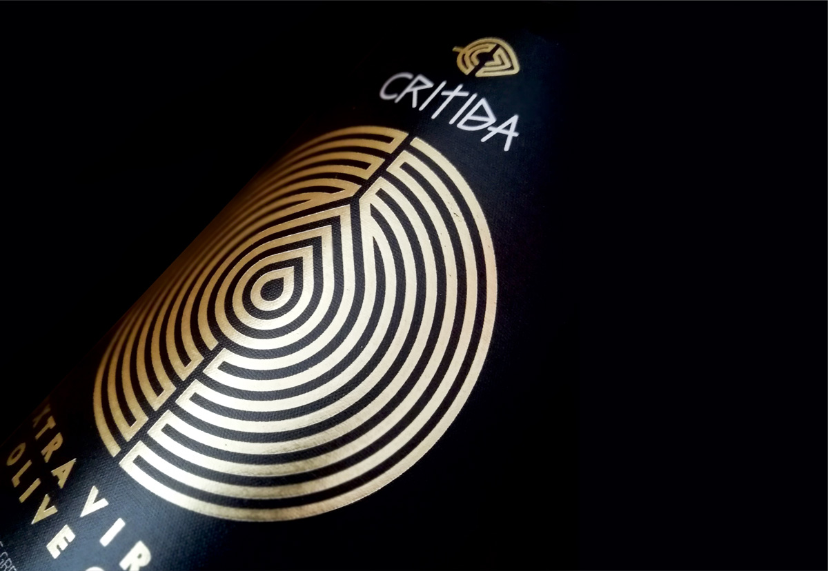
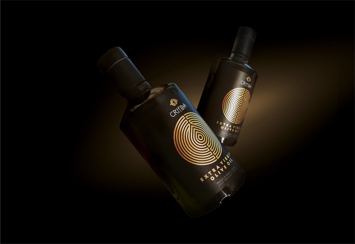
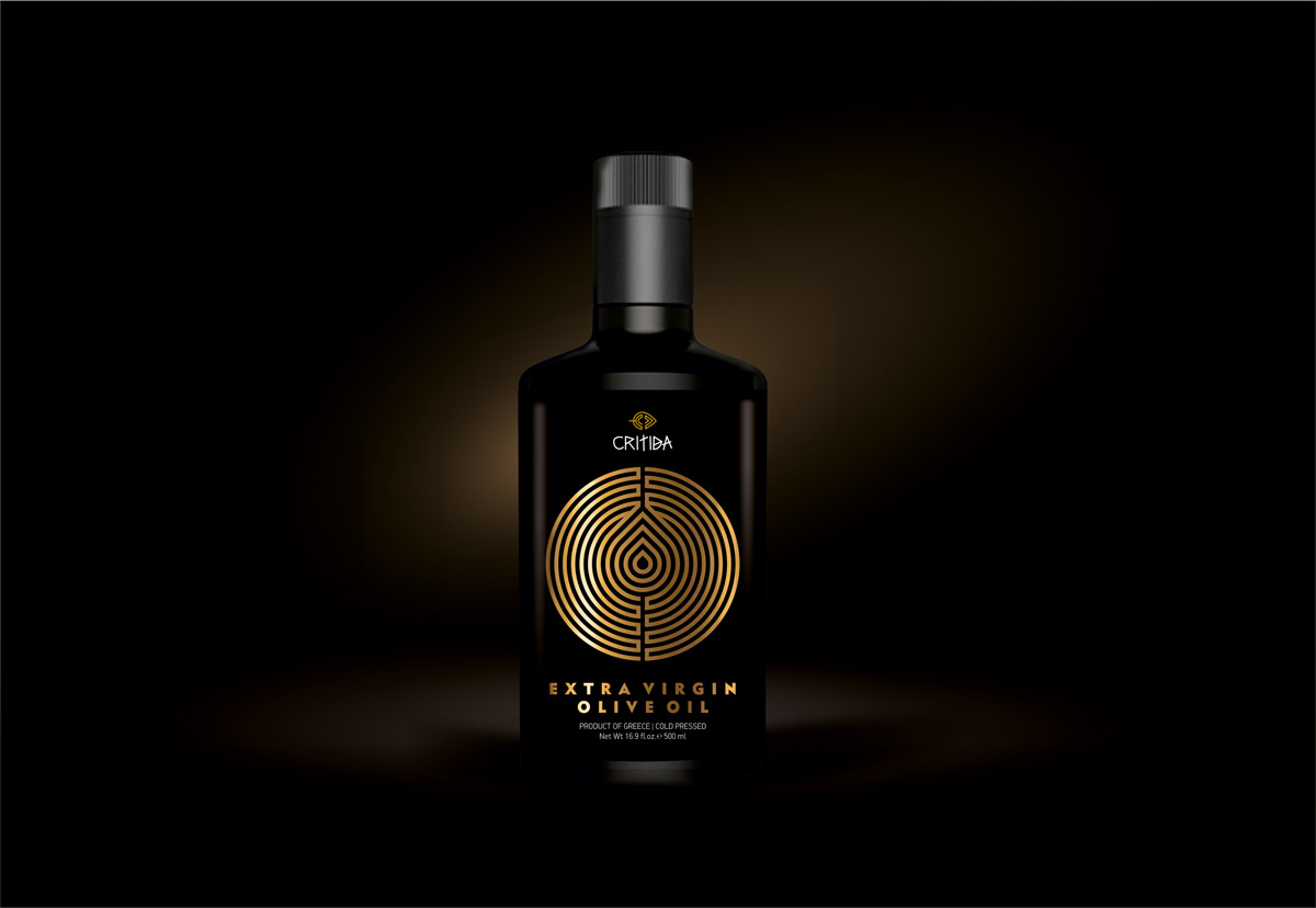
Our goal, with the new design for Critida olive oil, was to link the product with the long-standing Cretan tradition of olive oil production. We were inspired by one of the symbols of the Minoan era. The Labyrinth, which includes the shape of the droplet, symbolizing in this way the daedal path to creating a unique product.
The strict geometry combined with the plain design approach comes to overwhelm all the previous ones, impelling the consumer’s eye.


CREDIT
- Agency/Creative: Leftgpaphic - Lefteris Panagoulopoulos
- Article Title: Critida Extra Virgin Olive Oil
- Organisation/Entity: Freelance, Published Commercial Design
- Project Type: Packaging
- Agency/Creative Country: Greece
- Market Region: Europe
- Project Deliverables: Branding, Graphic Design, Illustration, Packaging Design, Product Architecture, Retail Brand Design
- Format: Bottle
- Substrate: Glass Bottle
FEEDBACK
Relevance: Solution/idea in relation to brand, product or service
Implementation: Attention, detailing and finishing of final solution
Presentation: Text, visualisation and quality of the presentation


