Challenge: Crisp ‘n Dry is the UK’s number one cooking oil brand and is synonymous with making the best roast potatoes. It is 100% rapeseed oil, but its packaging was falling short in communicating its unique selling point over own label – indeed, even many of its existing consumers were unaware of its benefits. And while many older consumers had a strong emotional connection to the brand, younger shoppers (who knew nothing of its heritage) knew very little about it.
Therefore, Crisp ‘n Dry asked us to create a brand strategy and identity that would break down barriers to purchase amongst non-customers in order to drive growth. That meant giving the brand meaning to lapsed and younger consumers to make it relevant to a much broader audience.
Solution: Research showed that many non-consumers associated Crisp ‘n Dry with deep-fat-frying and saw it as unhealthy, when in fact it has lower saturated fat than other edible oils such as olive, coconut and sunflower oil.
While Britain’s cooking habits have evolved and these more on trend and speciality oils have increased in popularity, still around 70% of households use cooking oils – but they’re not proudly displayed in kitchens up and down the country. They’re not for drizzling or guzzling or anything too fancy; cooking with Crisp ‘n Dry just makes good food great.
Our new positioning of ‘helping you create crowd pleasers for generations’ plays on this idea and speaks to the heart of the target audience who believes that a lot of what’s important in life happens around the kitchen table. It appeals to their desire to serve wholesome, feel-good classics for others.
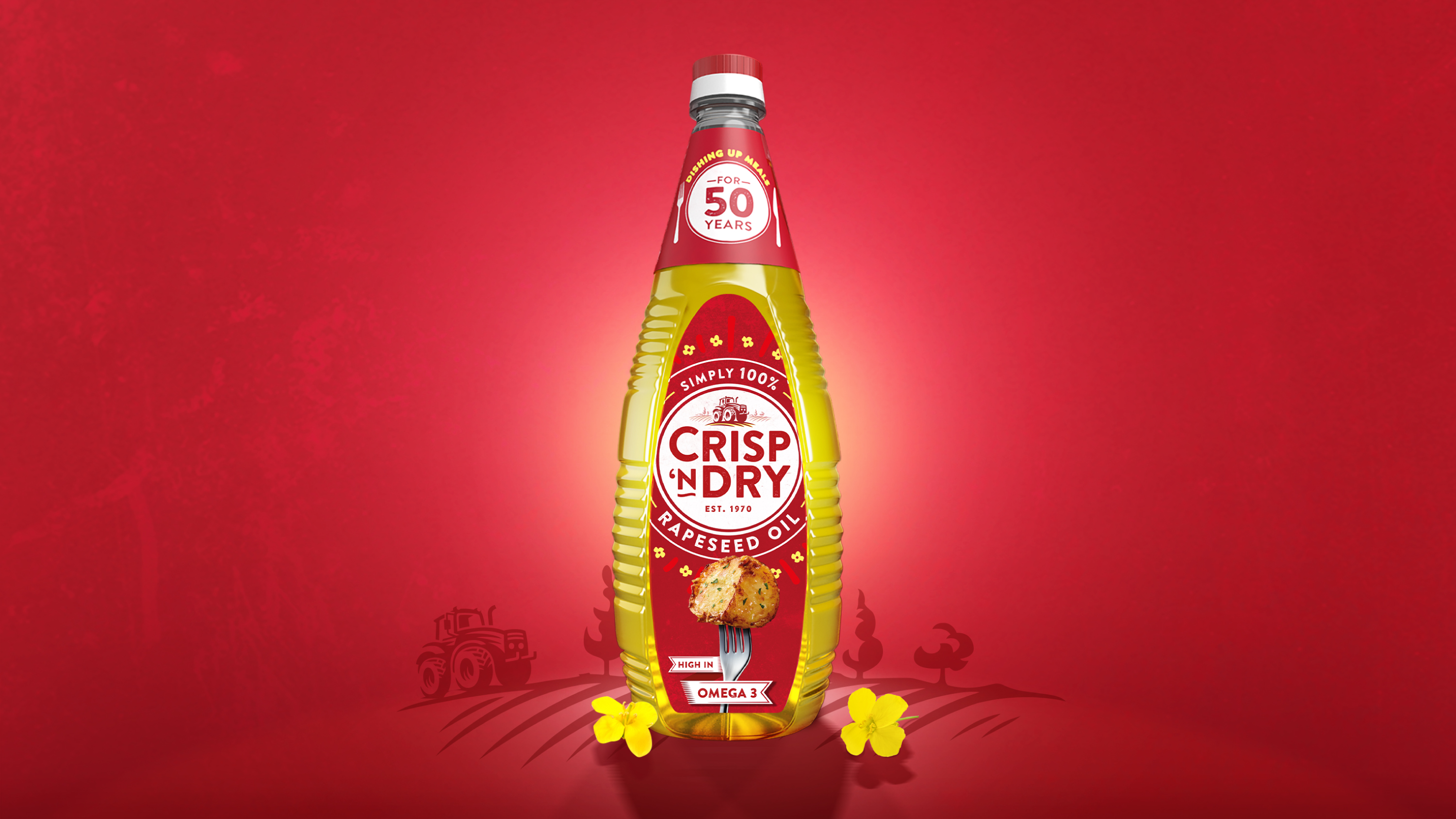
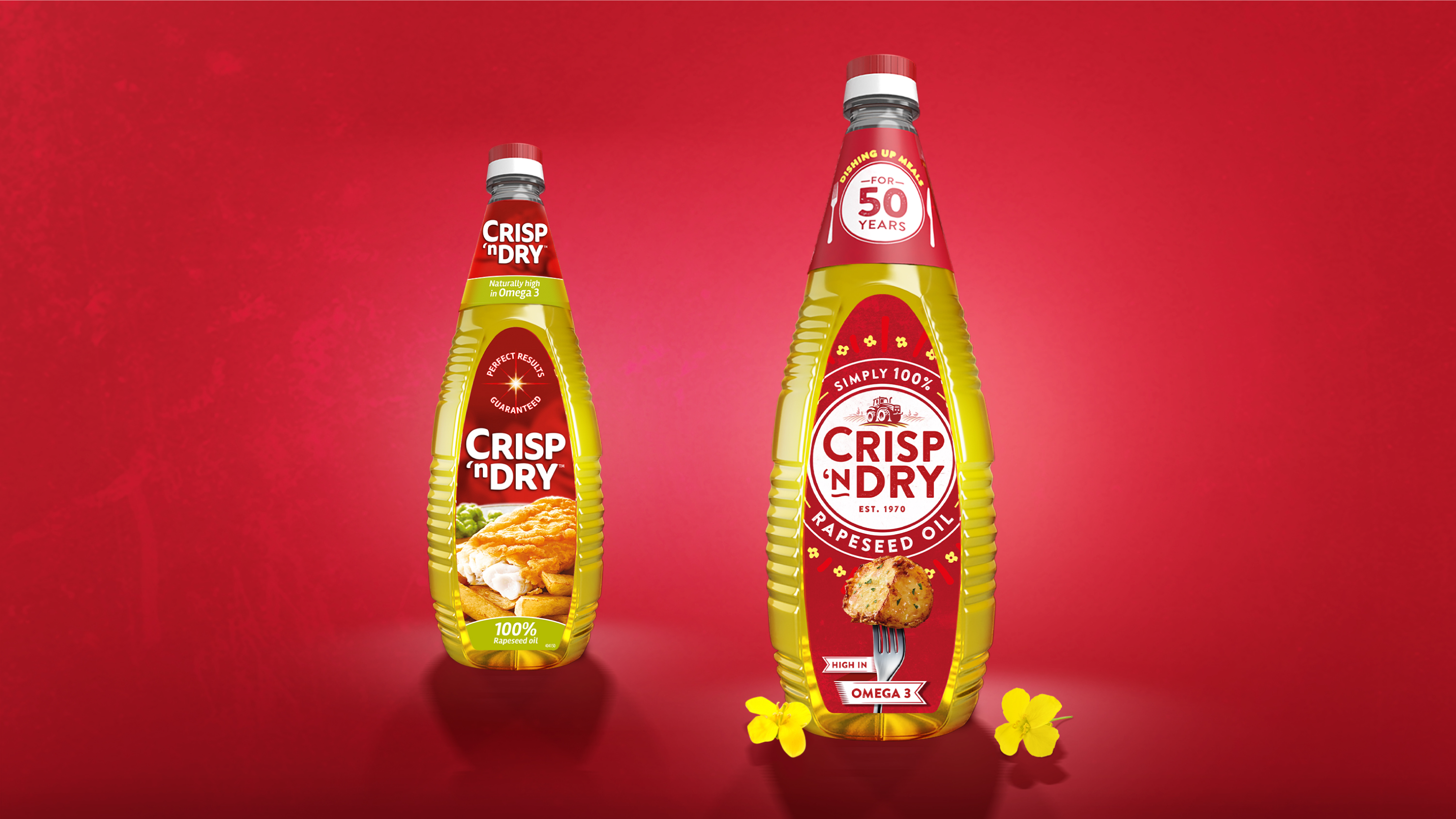
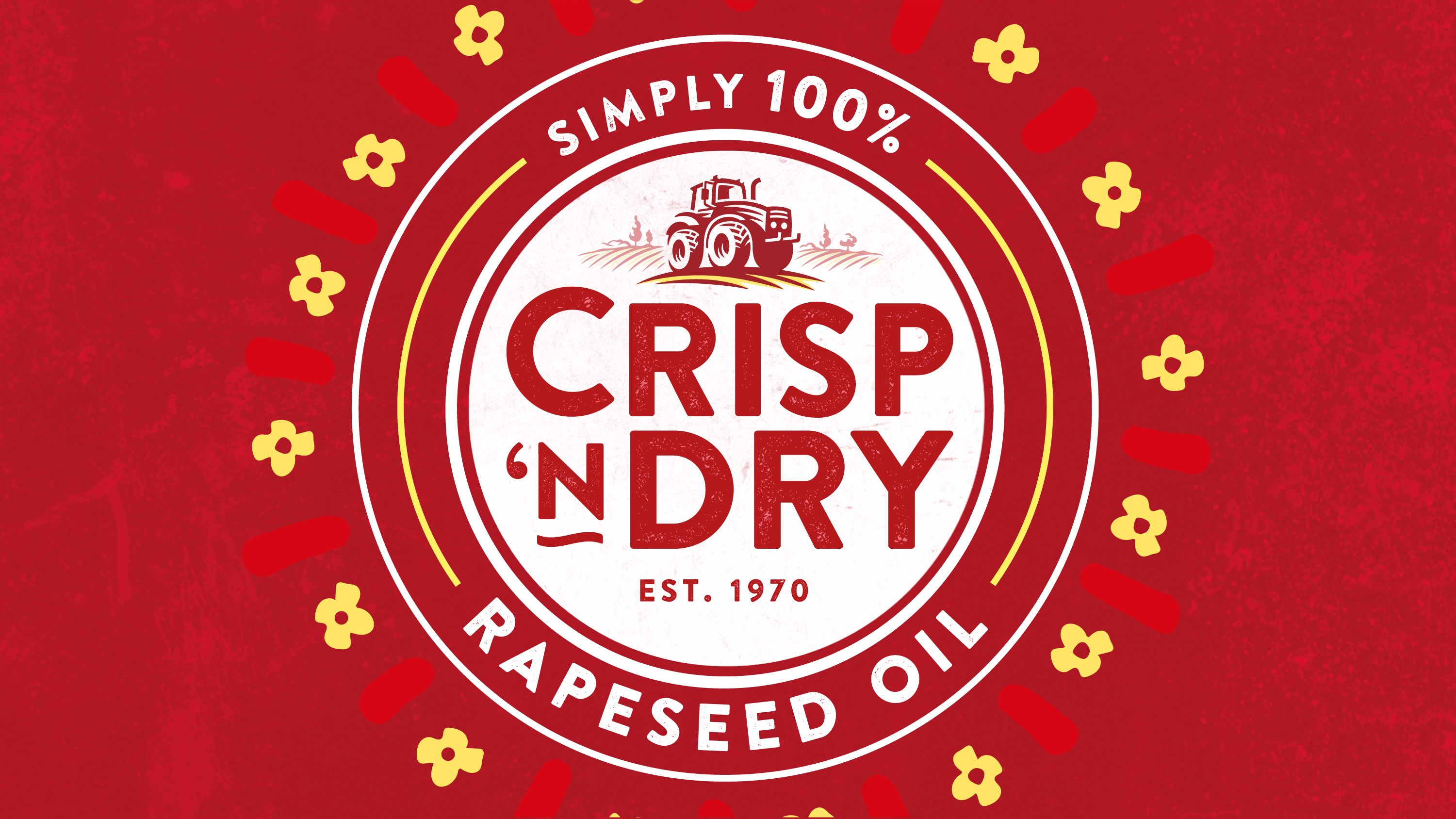
This message is reinforced by the brand’s new identity, with the addition of a tractor ploughing the yellow rapeseed fields, and the flowers circling the name to bring the natural and better for you message up front and centre. On pack, this is built on further by the 100% rapeseed oil message.
We retained the brand’s number one distinctive brand asset – the iconic red. It’s always been associated with Crisp ’n Dry and it acts as a dependable signpost to the category, which, many shoppers find overwhelming. It also gives us some guaranteed colour blocking at fixture – a win, win.
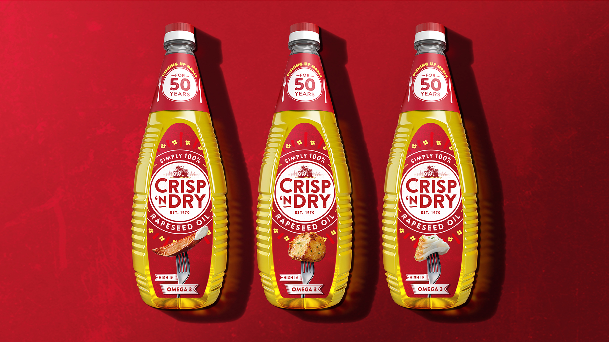
To encourage use across a more versatile range of eating occasions we’ve introduced simpler and more iconic product photography that has healthier overtones. And the finishing touch to offset the bold red blocking is the addition of texture and graphic pops of rapeseed yellow – all designed to elevate its natural properties.
For TV, we had to build on dispelling any deep-frying connotations and we needed something memorable that elevated the brand beyond the kitchen cupboard. We developed the ‘100% rapeseed’ message and ‘give it 100%’ becomes the shorthand for Crisp ‘n Dry being the brand to do things properly and without compromise.
Impact
The new Crisp ‘n Dry branding has brought its key differentiator to the fore and made it clearer to consumers why it’s worth paying more for over own label. It now has a clear and relevant proposition on which to build and is set for future growth.
Client Testimonial – Claire Graham, Senior Marketing Manager at Crisp ’n Dry
“Brandon has done a fantastic job of elevating Crisp ’n Dry, without moving us away from what our existing customers love about us. The new TV advertising clearly positions the brand as going above and beyond in helping to create crowd pleasers, and feedback on the new design is extremely positive; appealing to a younger demographic by looking more contemporary and instantly broadening the range of usage occasions.”


CREDIT
- Agency/Creative: Brandon
- Article Title: Crisp ‘n Dry Brand and Packaging Design by Brandon
- Organisation/Entity: Agency, Published Commercial Design
- Project Type: Packaging
- Agency/Creative Country: United Kingdom
- Market Region: Europe
- Project Deliverables: Brand Advertising, Brand Guidelines, Brand Identity, Brand Redesign, Brand Rejuvenation, Brand Strategy, Branding, Graphic Design, Packaging Design, Photography, Rebranding
- Format: Bottle
- Substrate: Plastic


