Crescent Simples, a New Orleans-born simple syrups company, came to Watermark to refresh their brand. Wanting their logo and packaging to match the quality of their products, they had a big vision for regional growth.
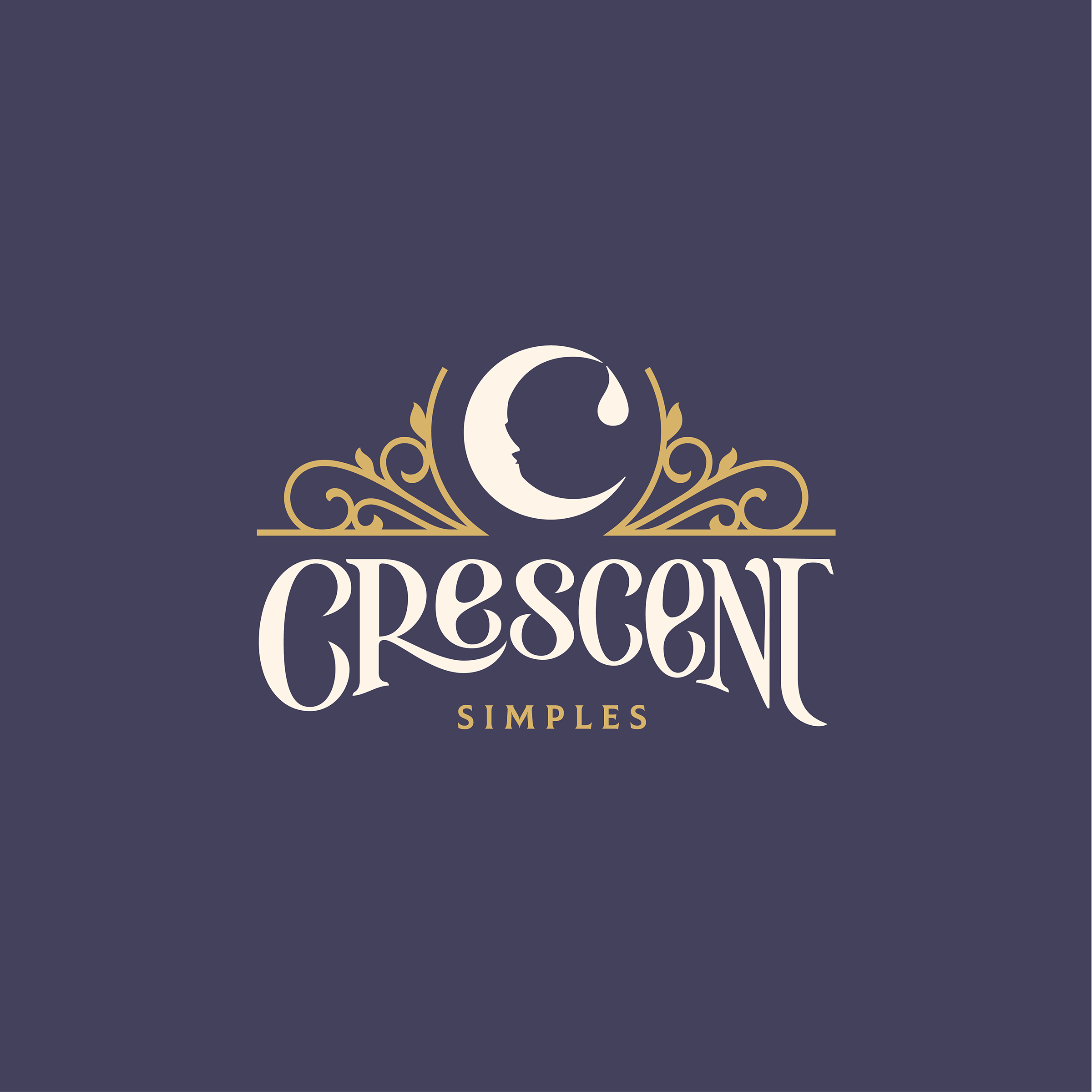
Their logo is packed with hand-lettered moments and meaningful imagery that tell the story of their vibrant beginnings in the Crescent City. Illustrative moments evoke the architectural ironwork seen a long Bourbon Street, flanking the crescent moon, a symbol seen across the city, visualizing it’s namesake and a small droplet detail to indicate these flavor-forward simple syrups.
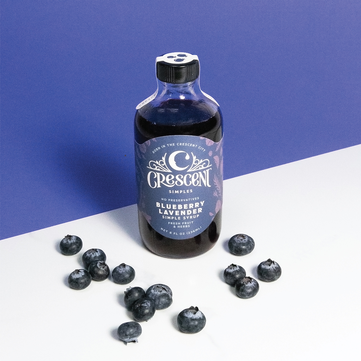
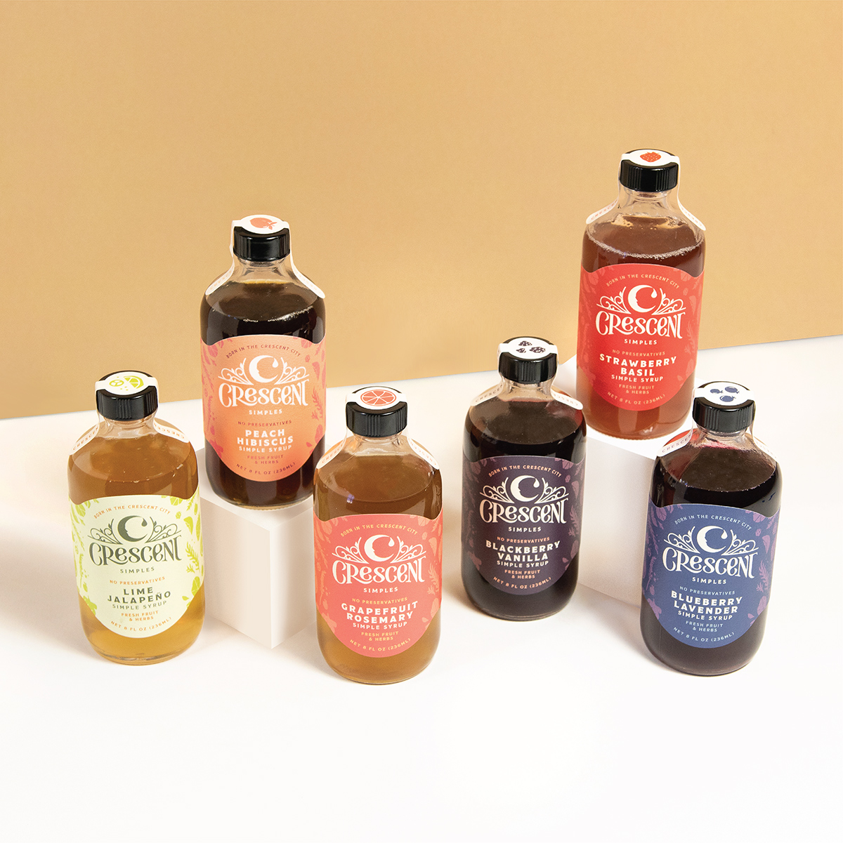
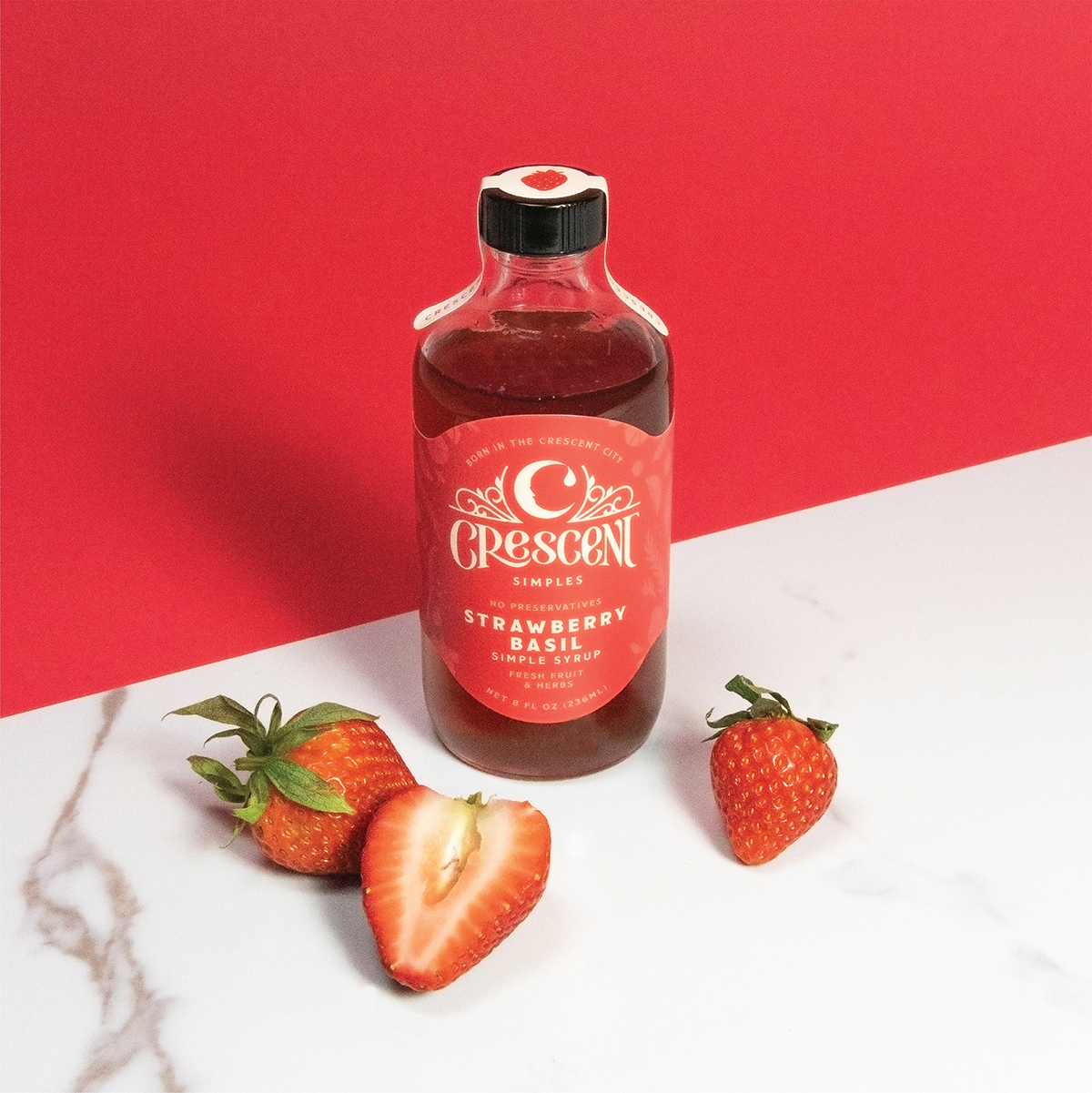
Brand continuity from the original packaging was achieved through updated illustrative patterning, continuing to convey the fresh ingredients used within the products through new stylized fruit drawings across the background of the simple syrup labels.
Each flavor is denoted through vibrant color palettes that relate to the ingredients. The color system was an important upgrade, providing an effective identifier for the individual products. The rebrand resulted in immediate accounts & orders that had been previously unattainable.
Because the background illustrations are consistent across the line-up, with the full array of all fruits that are used in the syrups, we added a tax tape to each bottle so that the specific flavor could called out on the top of the bottle by extracting the specific fruit illustration out of the background array and placing that on top of the tax tape to signify which flavor it is.
We love to see a client’s trust and investment in their brand pays off in spades, which so far this rebrand has:
“We are directly seeing this work pay for itself with increased website traffic and orders and relationships with new wholesale partners. I truly believe your label and logo design changed us from a brand that would be regionally carried to a brand that can be nationally carried.“


CREDIT
- Agency/Creative: Watermark Design
- Article Title: Crescent Simples Brand Refresh by Watermark Design
- Organisation/Entity: Agency
- Project Type: Packaging
- Project Status: Published
- Agency/Creative Country: United States
- Agency/Creative City: CHARLOTTESVILLE
- Market Region: North America
- Project Deliverables: Branding, Label Design, Logo Design, Packaging Design
- Format: Bottle
- Substrate: Glass Bottle
- Industry: Food/Beverage
- Keywords: Simple Syrup branding and package design
-
Credits:
Creative Director: Darcey Lacy
Designer: Rebekah Seiler


