Bitwoo, a fictional company, specializes in crafting high-quality sea-salt dark chocolates in India. The brand uniquely focuses on introducing dark chocolates to children who are more accustomed to the sweetness of traditional chocolates. The primary objective is to shift their taste preferences towards the richer, more nuanced world of dark chocolates, all while maintaining a sense of fun and excitement. Unlike conventional dark chocolate packaging that tends to be bold and serious, Bitwoo aims to infuse joy into the experience.
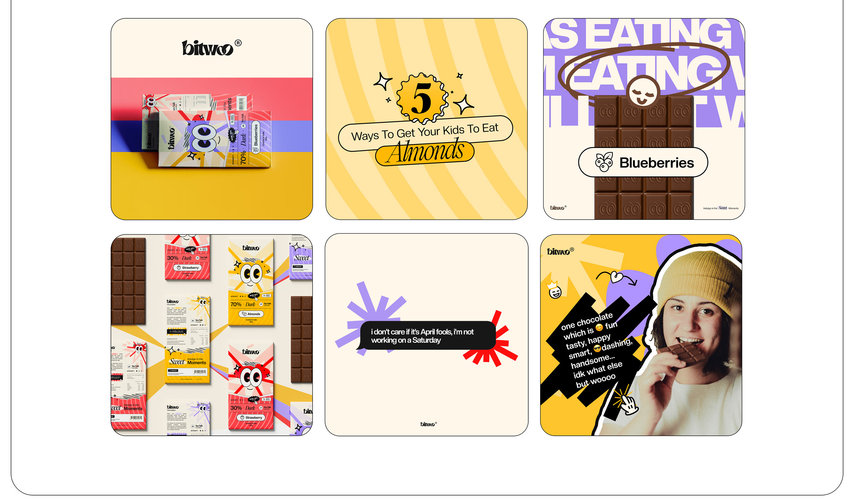
In redesigning the brand, the overarching theme was to create a fresh and playful identity that would resonate with a younger audience. The journey began with a comprehensive overhaul, starting from the logo and extending to the website. The result is a harmonious blend of creativity and functionality that reflects the essence of Bitwoo.
The logo, a crucial element of brand identity, underwent a transformation to embody the brand’s spirit. It strikes a balance between sophistication and approachability, incorporating playful elements to appeal to children. The color palette chosen is vibrant and inviting, steering away from the traditional darker tones associated with dark chocolates. This choice not only adds a youthful energy to the brand but also distinguishes Bitwoo from its competitors.
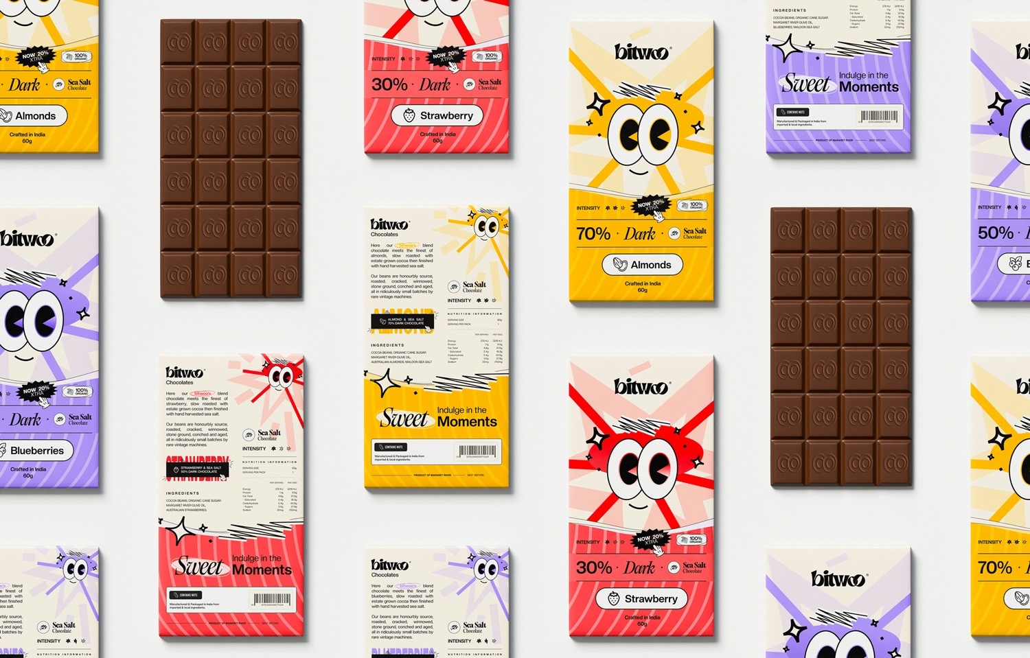
The packaging design is a visual feast, skillfully merging the concept of sea-salt dark chocolates with elements that resonate with children. Engaging illustrations and whimsical graphics adorn the packaging, creating a delightful visual narrative. Each package tells a story, making the experience of unwrapping a Bitwoo chocolate as exciting as savoring its contents.
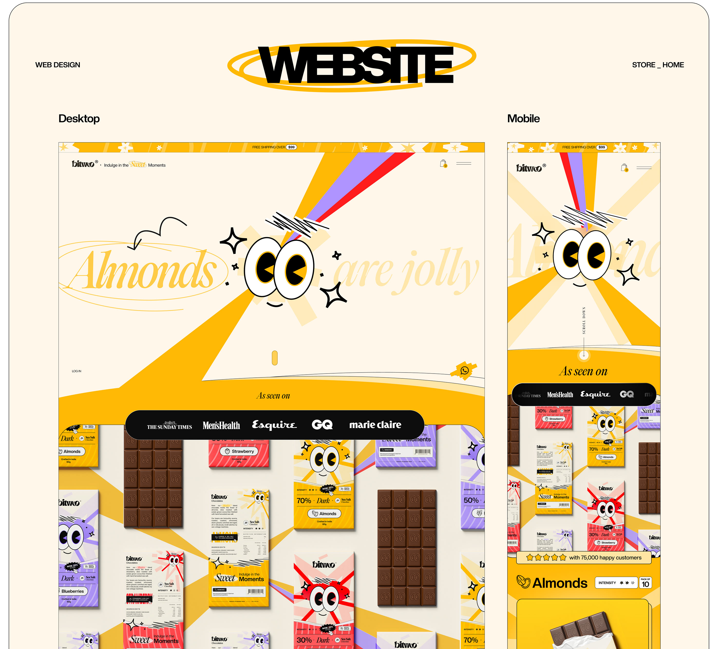
The website, a virtual storefront for Bitwoo, mirrors the brand’s identity. It is user-friendly, with intuitive navigation that allows visitors to seamlessly explore the product range. The website design incorporates the vibrant color palette and playful graphics, providing a cohesive brand experience. Engaging content is strategically placed to educate parents and intrigue children about the unique qualities of sea-salt dark chocolates.
In conclusion, the Bitwoo project showcases a successful marriage of creativity and strategy. The brand transformation, from logo to website, achieves the goal of introducing dark chocolates to a younger demographic in a way that is both fun and visually appealing. The project on Behance serves as a visual testament to the meticulous design process undertaken to breathe new life into Bitwoo, making it a standout player in the world of chocolates.


CREDIT
- Agency/Creative: creativecue
- Article Title: Creativecue Deliver Packaging Design for Bitwoo Dark Chocolate Aimed at Kids
- Organisation/Entity: Agency
- Project Type: Packaging
- Project Status: Published
- Agency/Creative Country: India
- Agency/Creative City: Lucknow
- Market Region: Asia
- Project Deliverables: Brand Naming, Packaging Design, Web Design
- Format: Box
- Industry: Food/Beverage
- Keywords: dark chocolate, bitwoo, dark chocolate for kids
-
Credits:
Designer: Lakshya Sangwani


