BADA, which means “sea” in Korean, is the rebranding project for Busan City. Located on the southeastern coast of South Korea, Busan is the country’s second-largest city. It offers a stunning mix of scenic beaches, majestic mountains, vibrant cultural scenes, and a bustling port, blending urban and natural attractions.
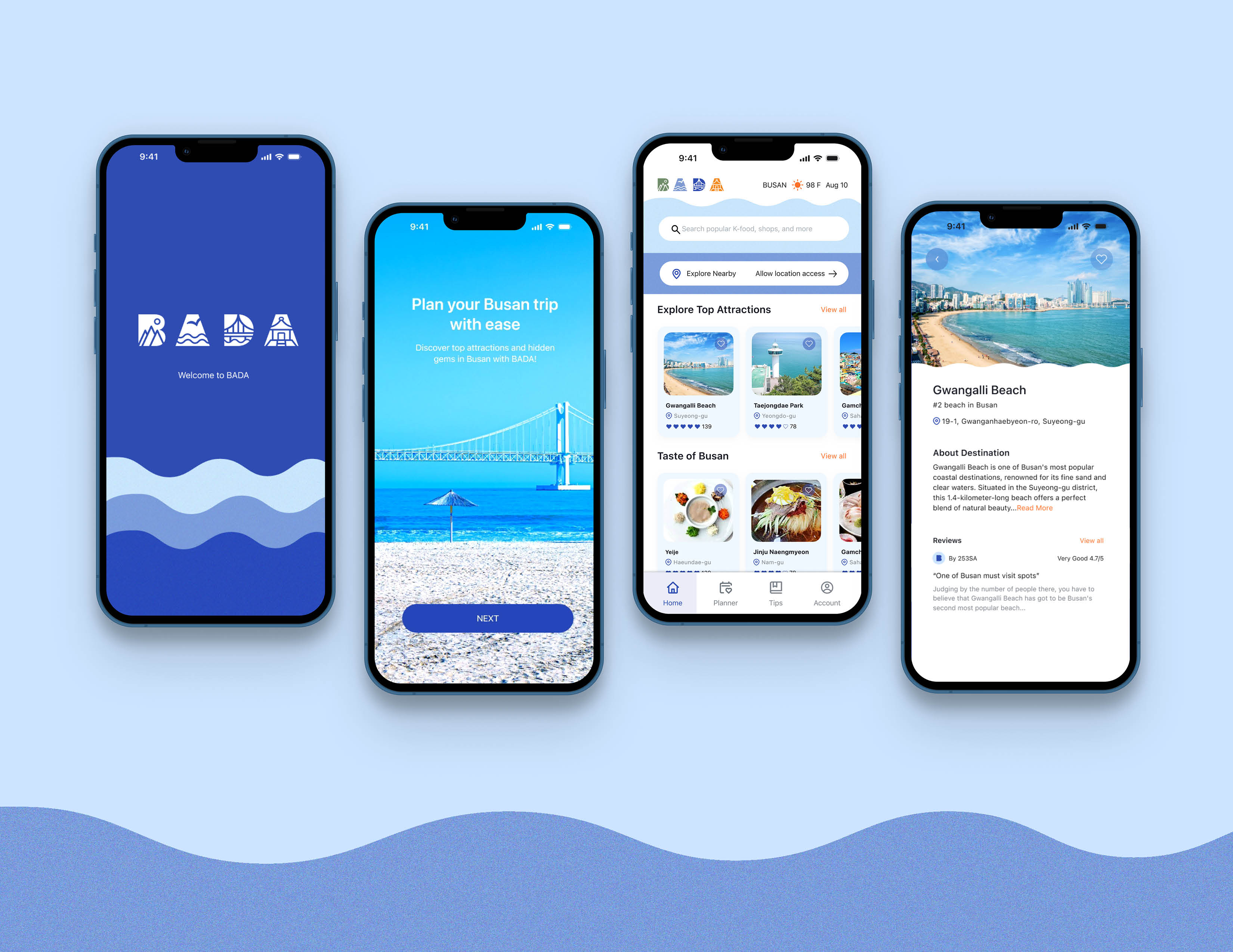
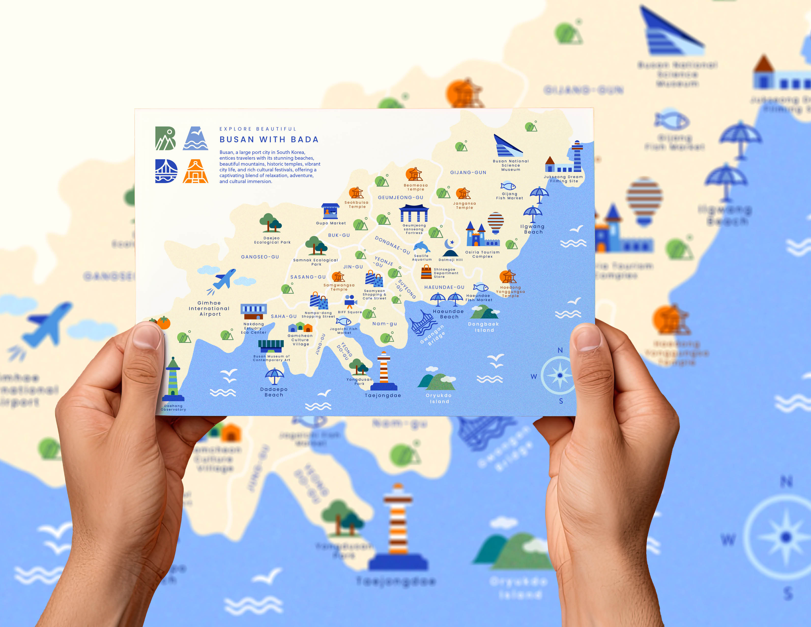
The aim of the BADA project is to showcase the city’s unique cultures and attractions to attract more visitors. It aims to make exploring Busan easier with a combination of engaging visuals and practical information. The design concept is thoughtfully developed to appeal to tourists seeking local gems and distinctive cultural experiences.
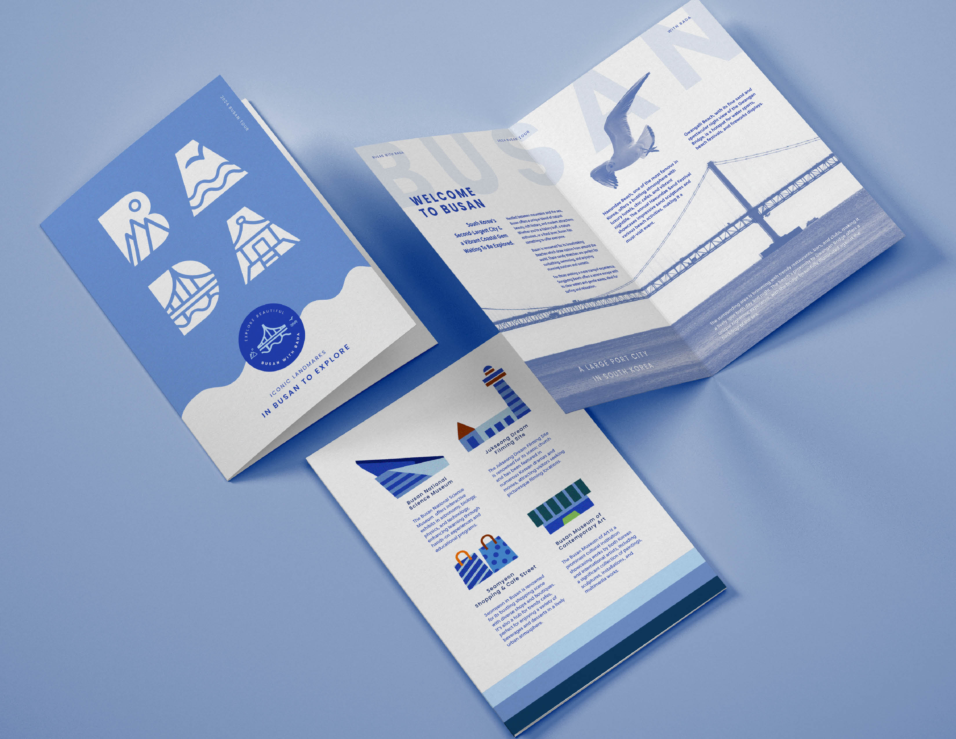
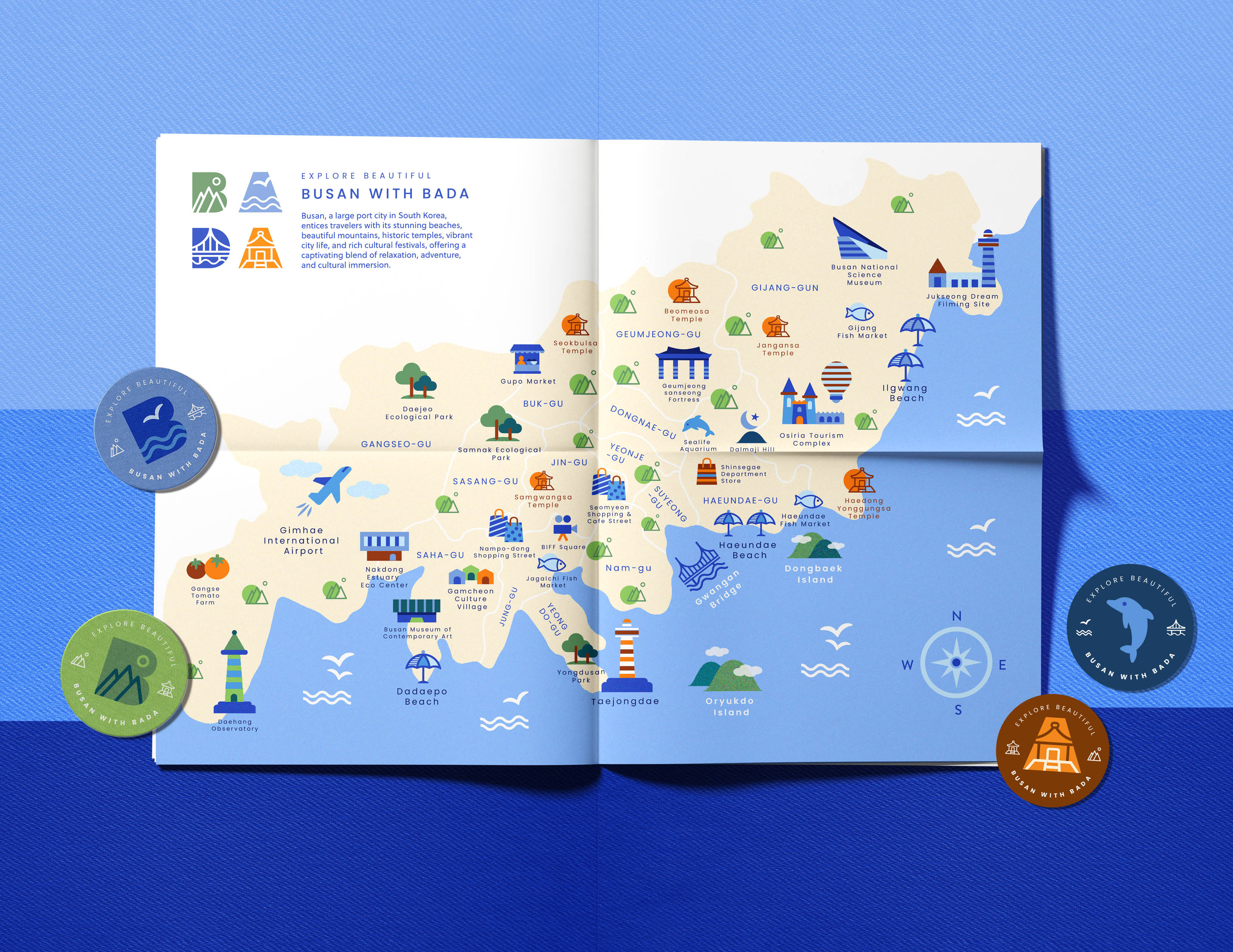
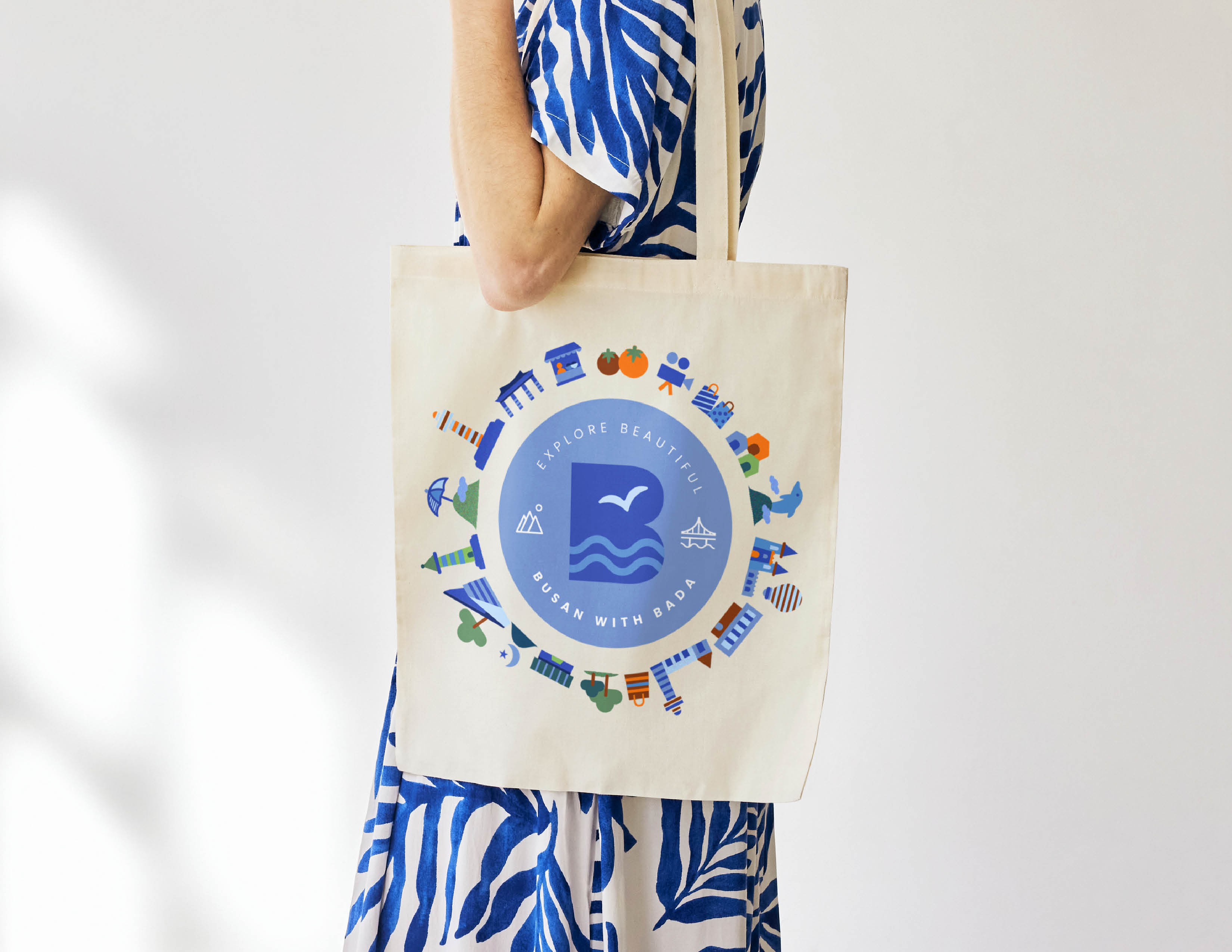
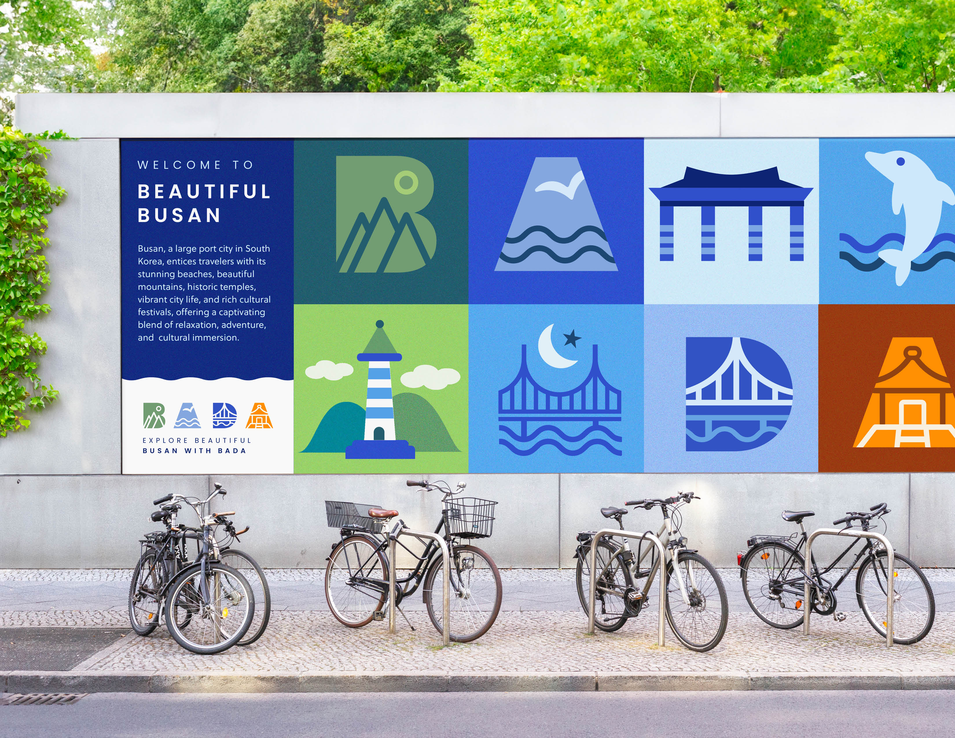
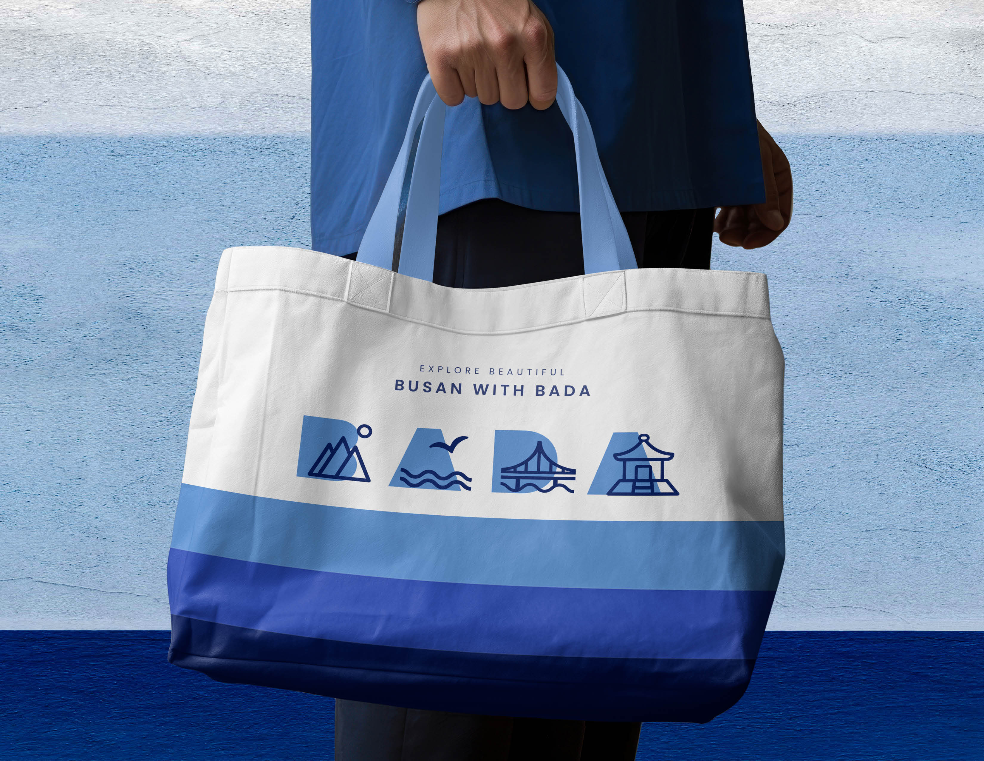
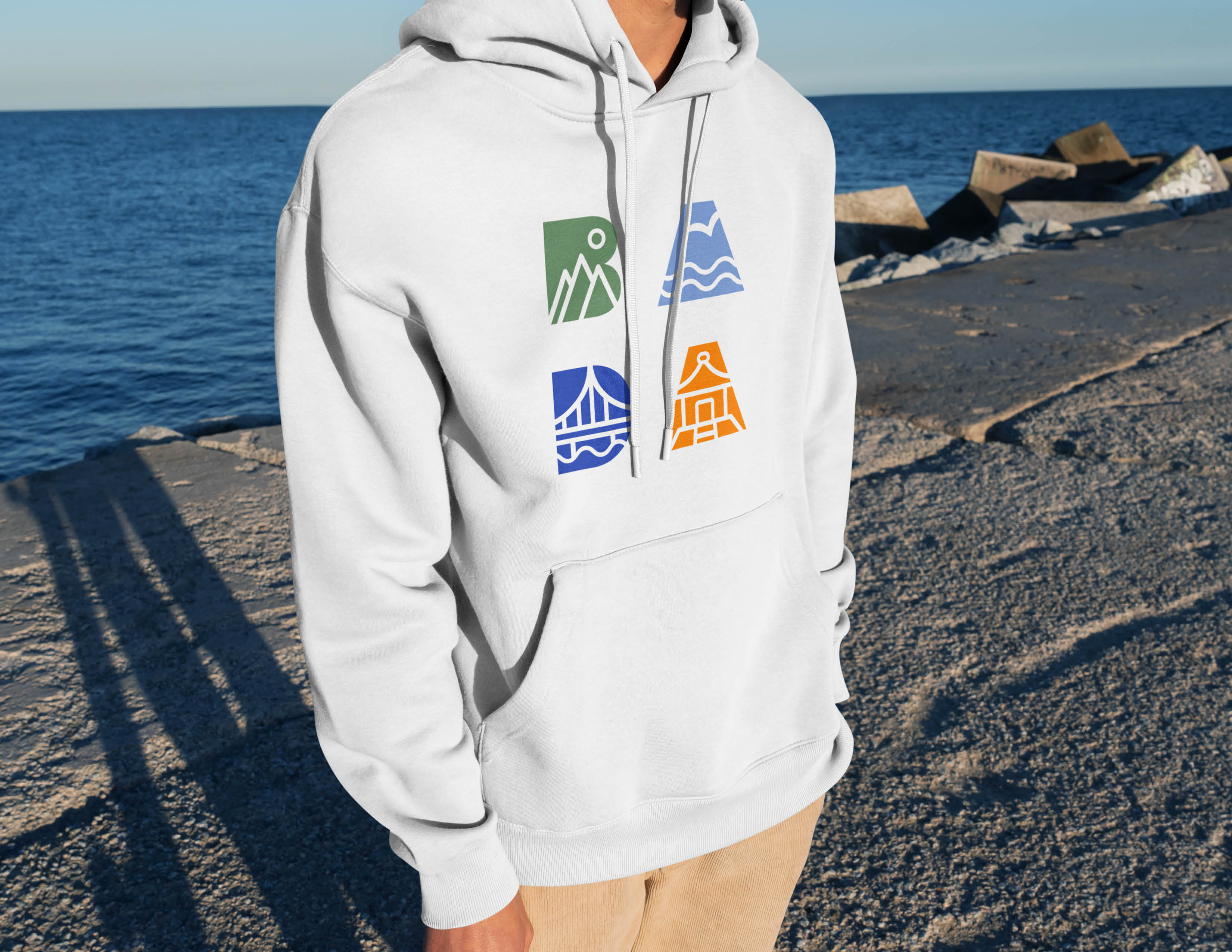
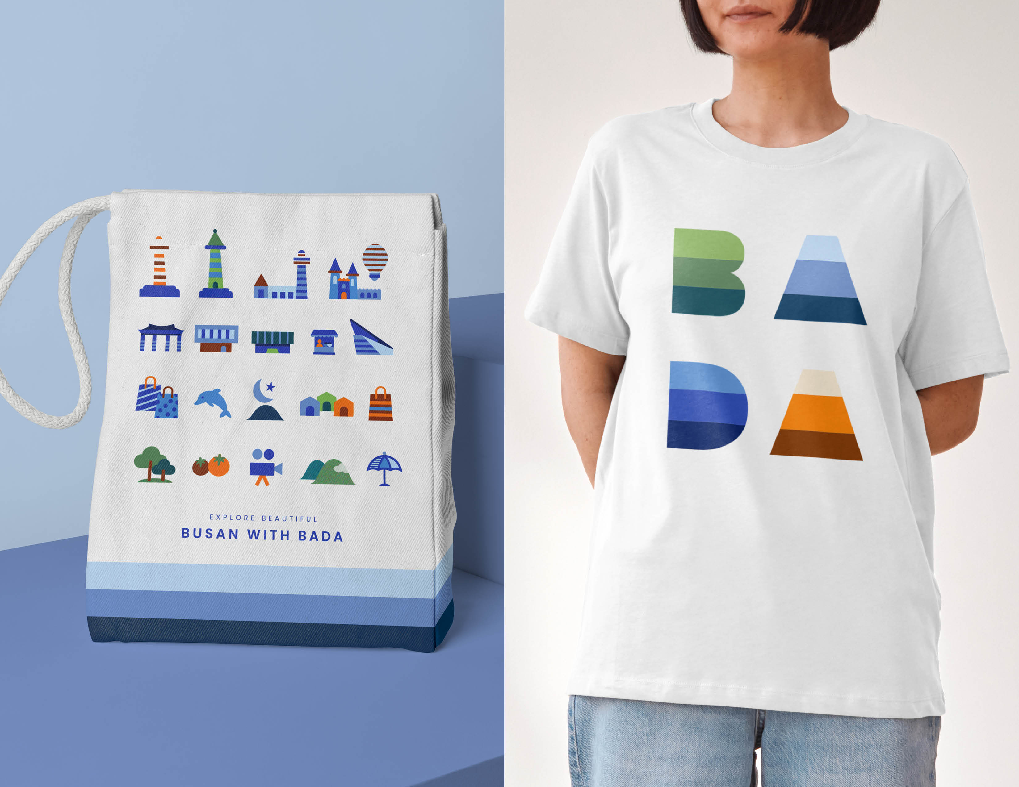
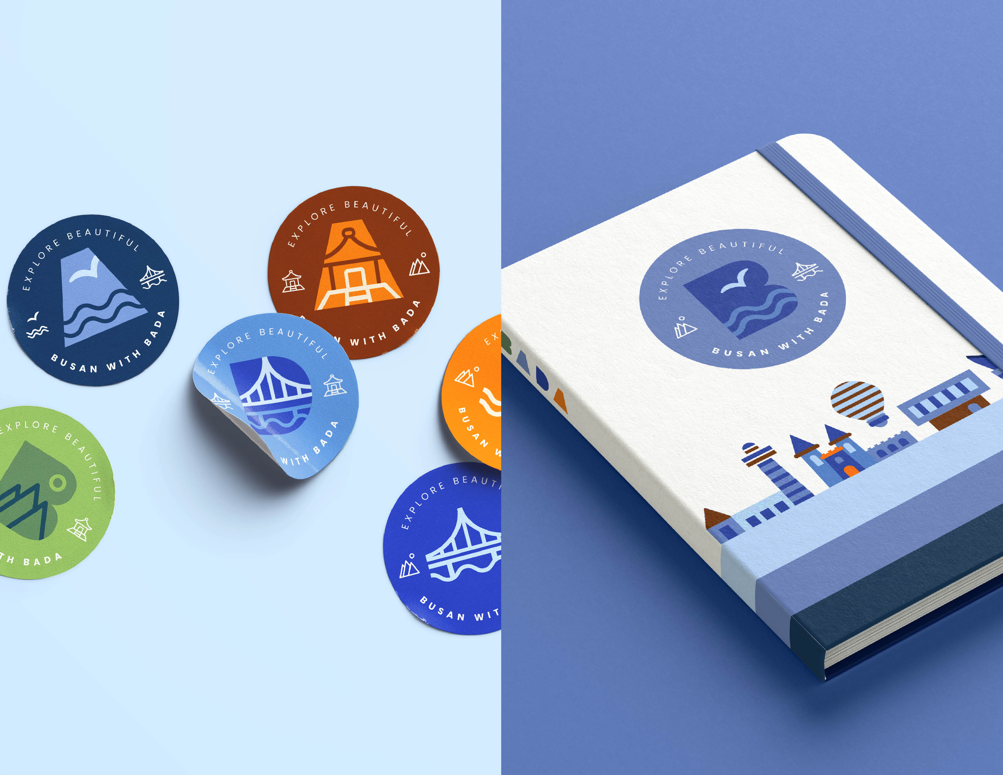
To visually convey Busan’s beautiful beaches, majestic mountains, and historic temples, the logo was carefully designed using minimalistic representations. Additional visual graphics have been created to highlight each attraction, promoting Busan’s famous sites and helping visitors explore the city. This cohesive visual identity not only captures Busan’s unique features but also emphasizes the city’s cultural diversity.
The branding colors—blue, green, and orange—are strategically chosen to highlight Busan’s unique features and strengthen its identity. Blue represents the sea, green symbolizes the mountains, and orange reflects the temples and vibrant culture of the city. The combination of these colors aims to visually capture the dynamic experiences and distinct characteristics of Busan, creating a memorable and engaging brand presence for the city.
CREDIT
- Agency/Creative: Hyena Nam
- Article Title: Creative Touch in Rebranding Busan City by Hyena Nam
- Organisation/Entity: Freelance
- Project Type: Identity
- Project Status: Non Published
- Agency/Creative Country: United States
- Agency/Creative City: West Desmoines
- Market Region: Asia
- Project Deliverables: 2D Design, App Design
- Industry: Non-Profit
- Keywords: Rebranding, Graphic and UX Design
-
Credits:
Art Director & Lead Designer: Hyena Nam


