


Project Overview:
We refreshed the logo and visual system for GreenHomeNYC, a non-profit that advocates for sustainability within New York City. Our primary focus was crafting an icon for the brand, refresh the typography with something modern and flexible, and provide assets that allow for easy-to-create branded collateral.
Project Process:
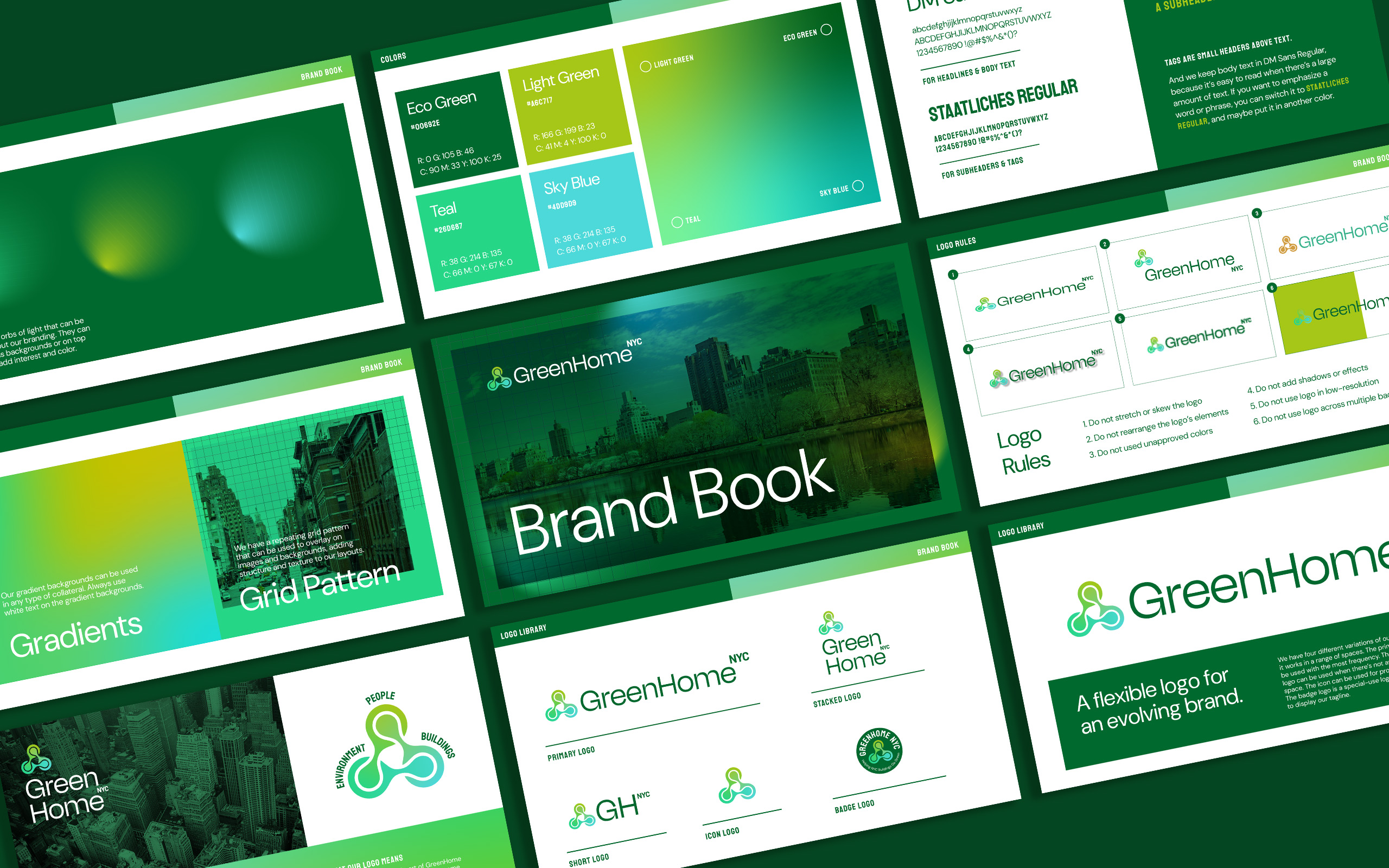
The old identity had been in use from the start and the team felt like it was not reflective of the forward-thinking spirit of the organization. We had three problems to tackle in the rebrand. First, the new logo needed to be flexible and adaptable. Second, there needed to be guidelines for visual consistency across all of GreenHomeNYC’s marketing efforts. And thirdly, we needed to add an icon to give the brand a unifying element.
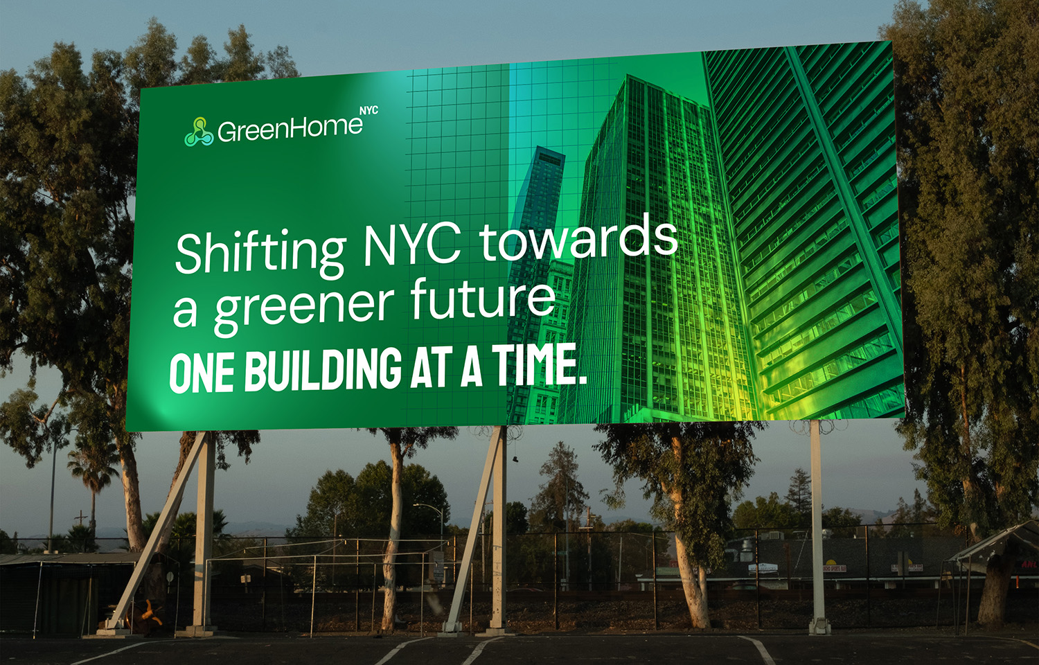
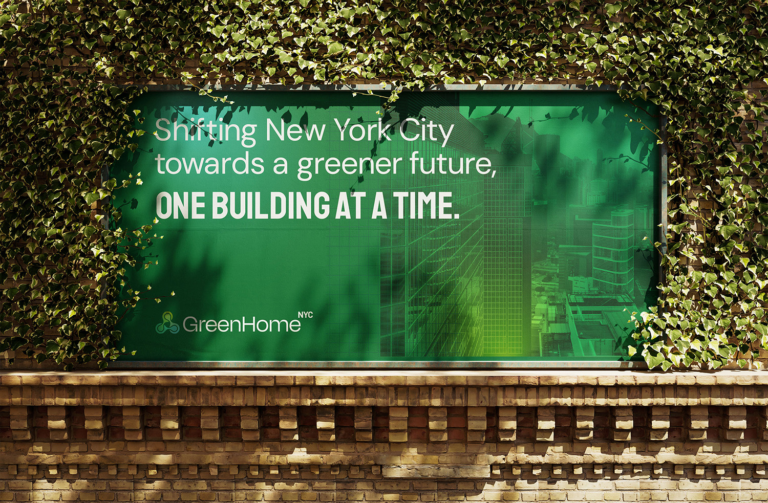
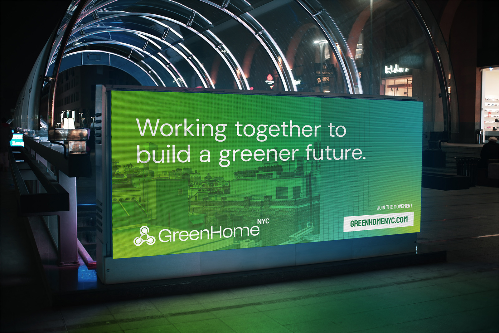
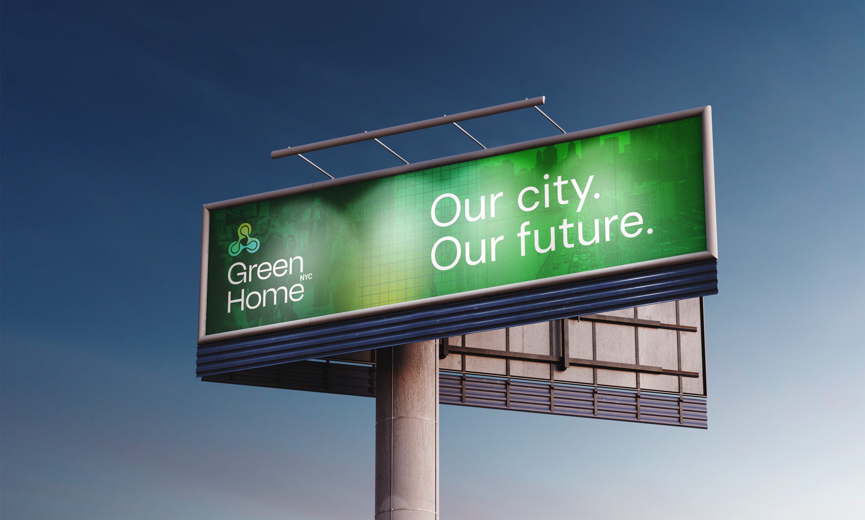
We started by identifying the right visual direction through a moodboard. The green had to stay in the palette, but we focused on infusing more energy into the look through secondary colors. Overlays and big uses of typography were two other elements that seemed to feel like a good evolution.
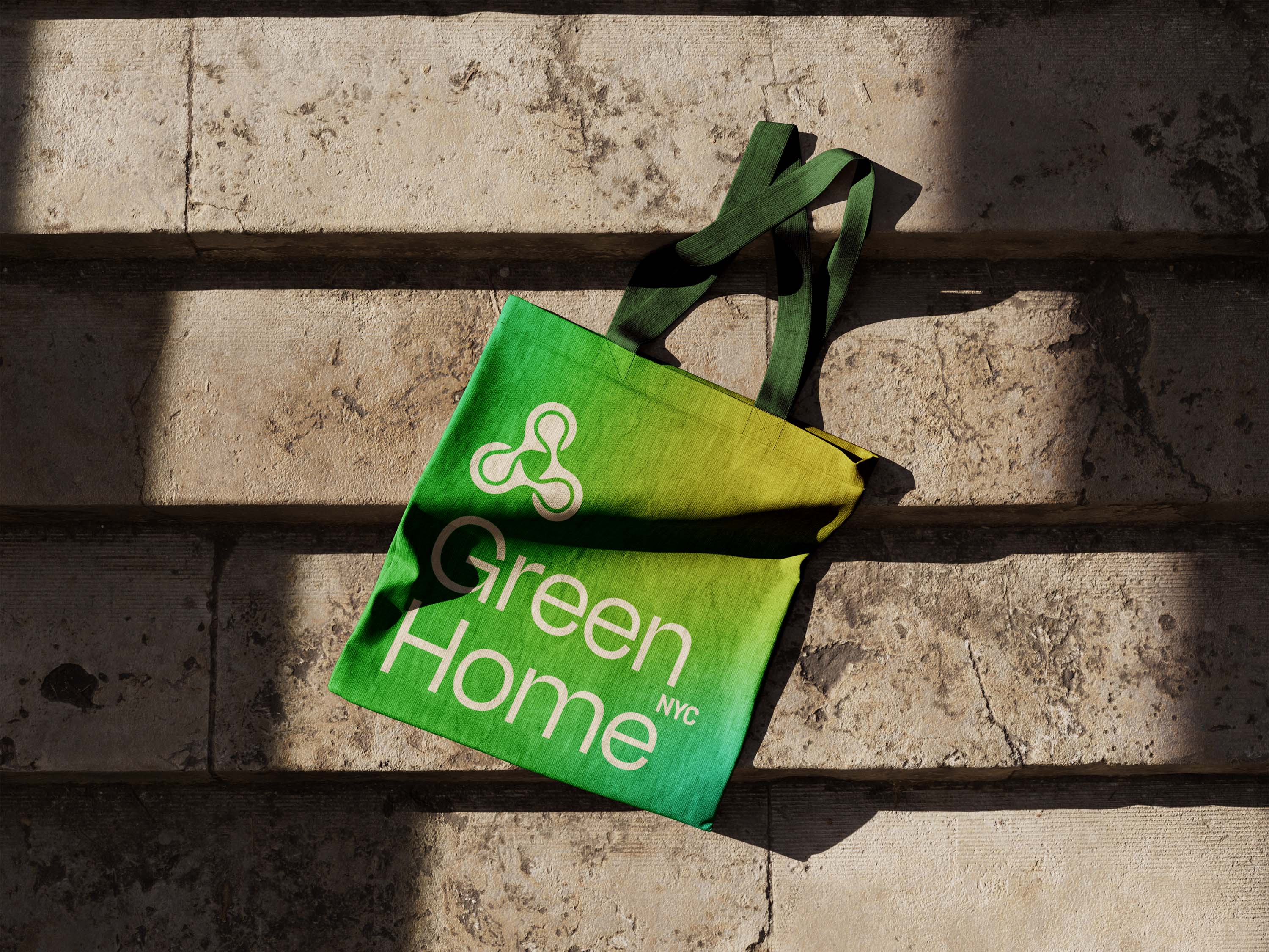
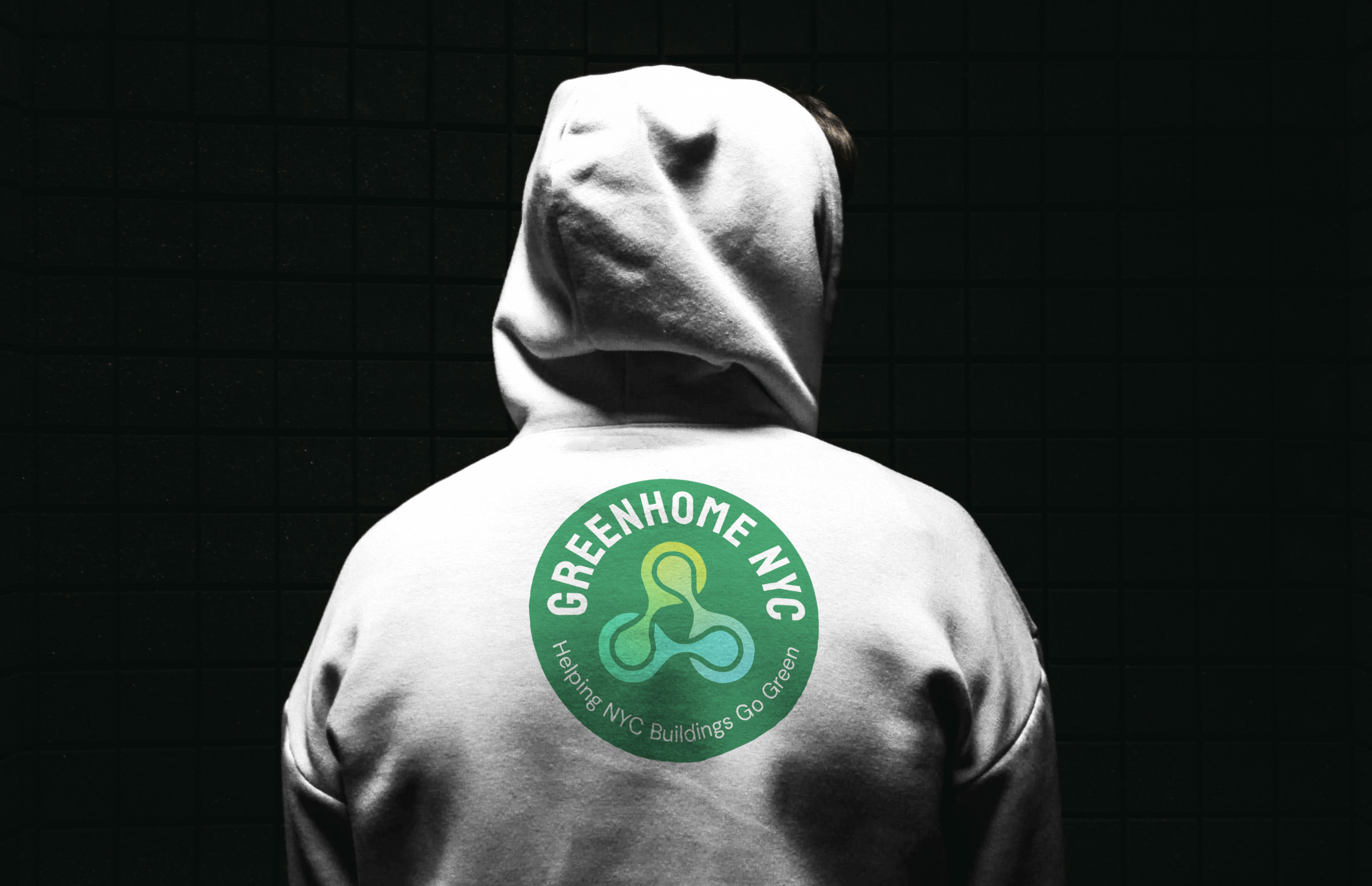
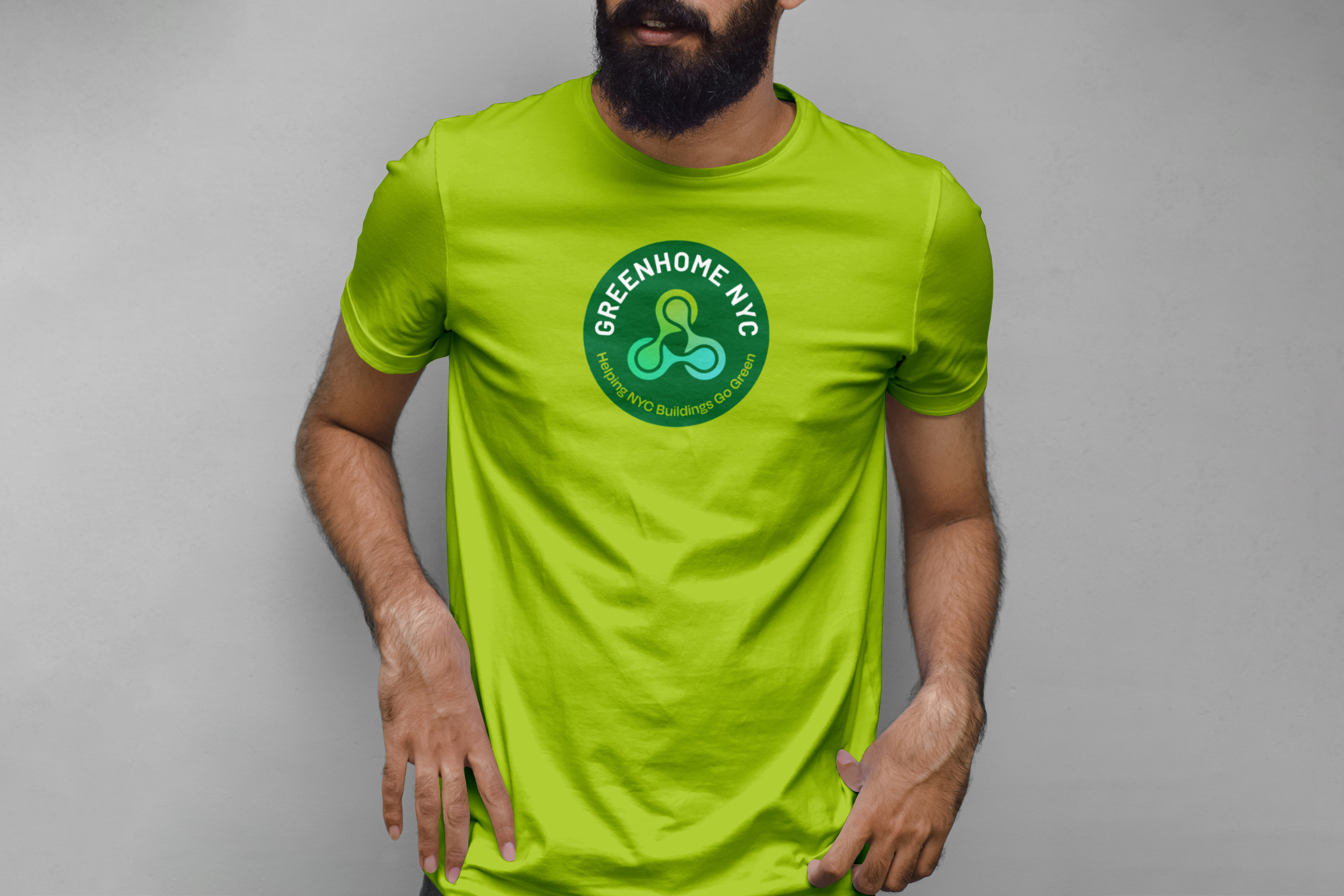
The final icon selected is an abstract representation of three elements coming together in harmony: people, Earth, and buildings. These three areas capture the full expanse of GreenHomeNYC’s influence.
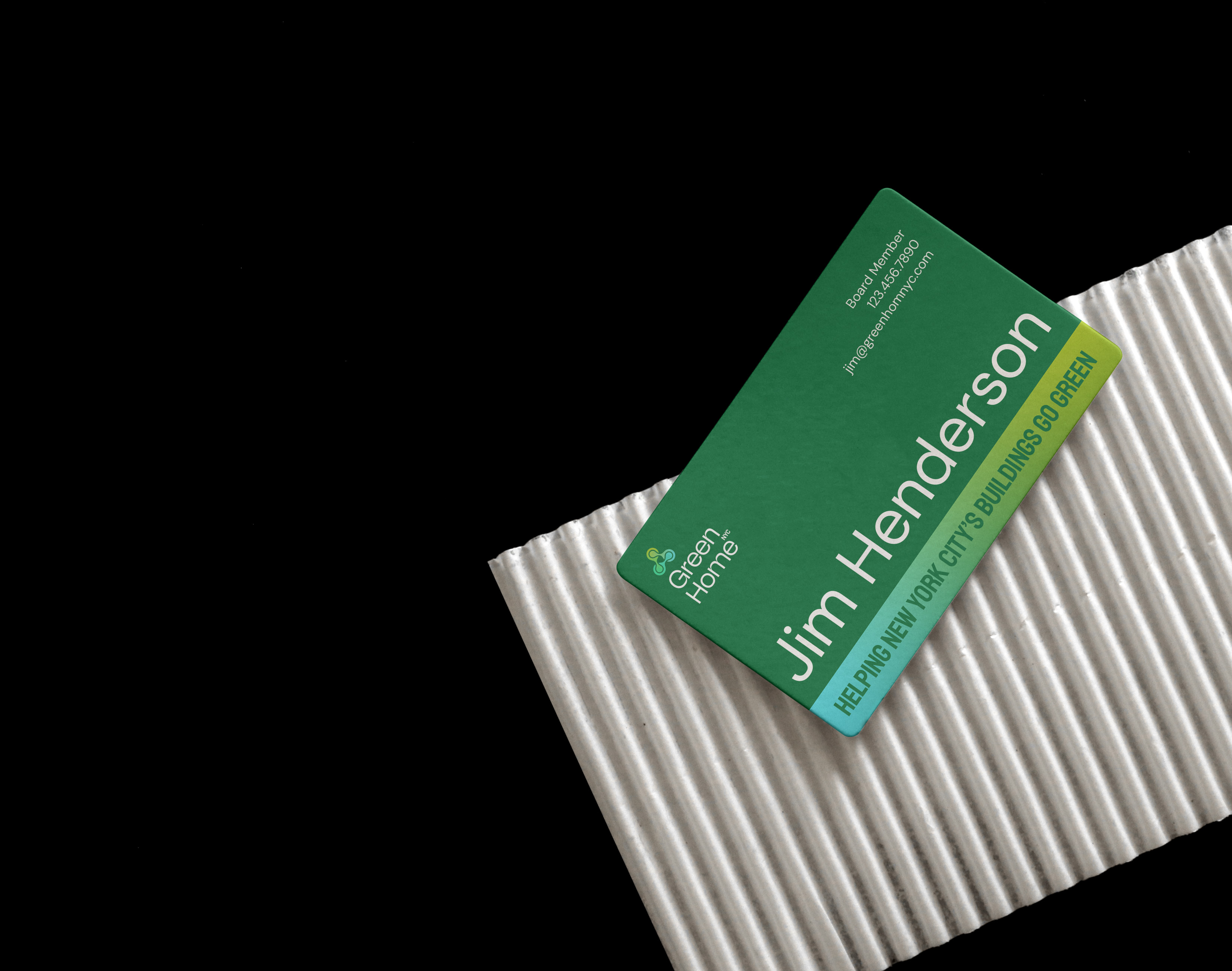
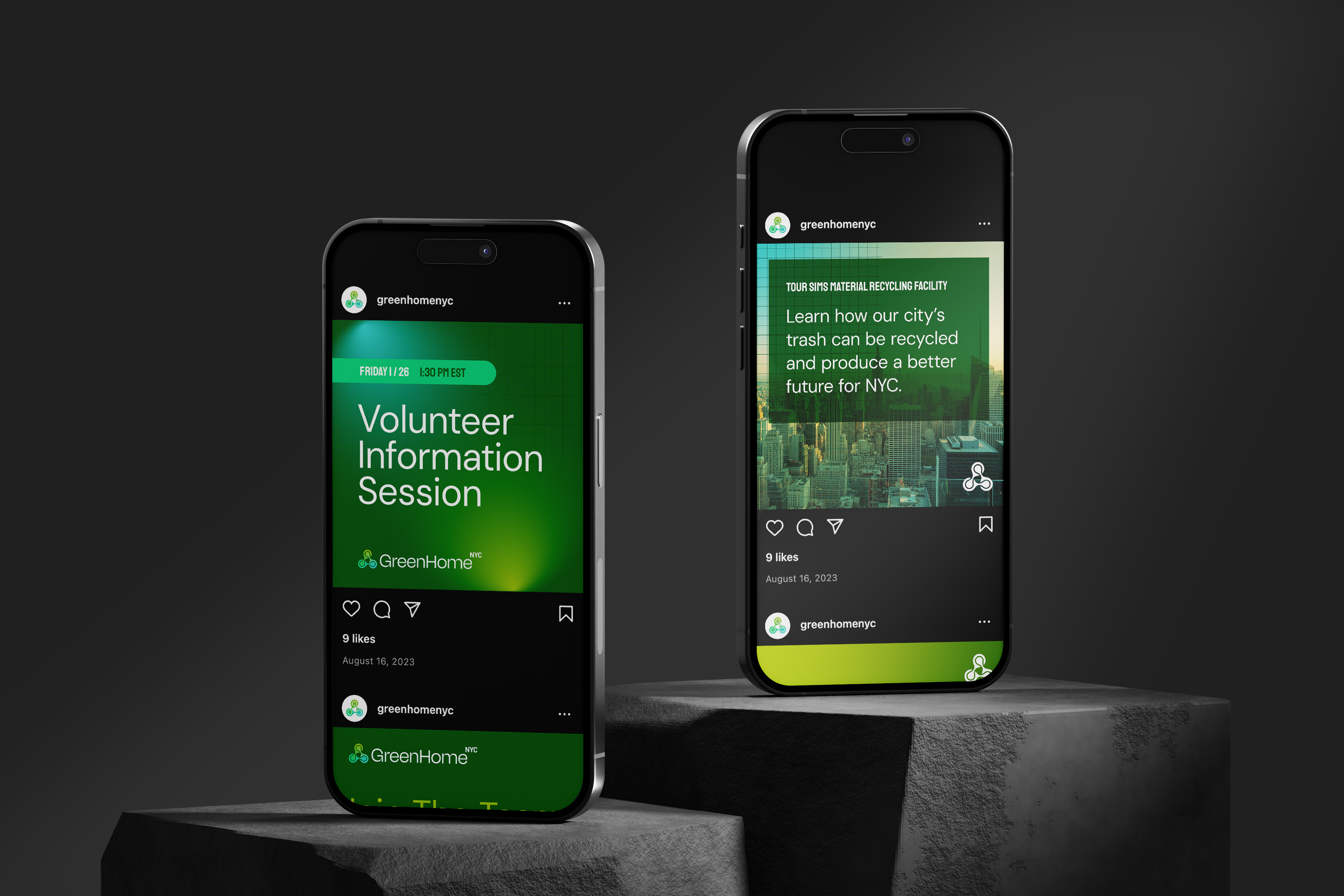
We built out a visual style that utilizes their new colors through gradients, overlays, and a repeat grid pattern. The primary goal was creating a system that is easy to work within, ensuring consistency across all branded collateral. Because GreenHomeNYC is volunteer-lead, we wanted to give everyone who will create collateral easy to use assets that can be seamlessly mixed and matched. We developed brand guidelines that gave enough structure to keep everything consistent, but enough freedom that the brand can continue to grow and evolve.
Project Praise:
“I was very impressed by Madison’s project management, especially by the discovery portion of the project. Talking through our goals before any designs were created set us up for success. She listened carefully to all our feedback and came up with strong designs that align with the future we envision for our organization.” – Rhonda Hilario-Caguiat, Communications Lead
CREDIT
- Agency/Creative: Creative Chameleon Studio
- Article Title: Creative Chameleon Studio Energized Identity For NYC Green Non-Profit
- Organisation/Entity: Agency
- Project Type: Identity
- Project Status: Published
- Agency/Creative Country: United States
- Agency/Creative City: Cleveland, Ohio
- Market Region: North America
- Project Deliverables: Brand Design, Brand Guidelines, Brand Identity, Brand Mark, Brand Redesign, Branding, Graphic Design, Logo Design
- Industry: Non-Profit
- Keywords: new york city, green, non profit
-
Credits:
Creative Director: Madison Carr


