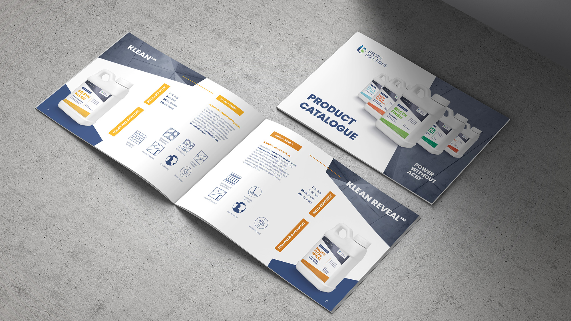
Having a quality product isn’t always enough to get into the shopping carts of consumers. Belsyn Solutions faced a problem of having disjointed company visuals, and a label design that didn’t capture the value that their concrete-treating products provided. Four steps were determined to help Belsyn Solutions revitalize their look and establish a brand framework moving forward.
1. Refine the copy of their current collateral to be succinct, while establishing a brand voice that better communicates with their market.
2. Establish a visual style that is clean, portrays high-quality, and will easily connect with their target market.
3. Produce supporting visual elements within that style that can be used across various collateral, resulting in a cohesive look across the entire company.
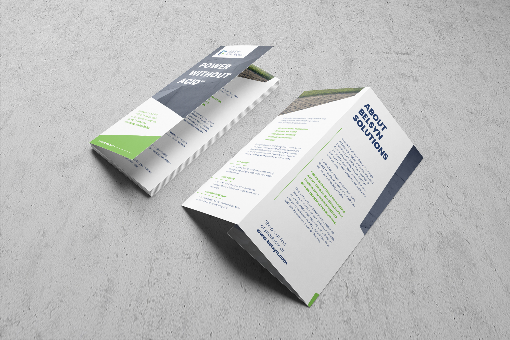
4. Redesign their labels, marketing brochure, and product catalogue to fit the new brand look.
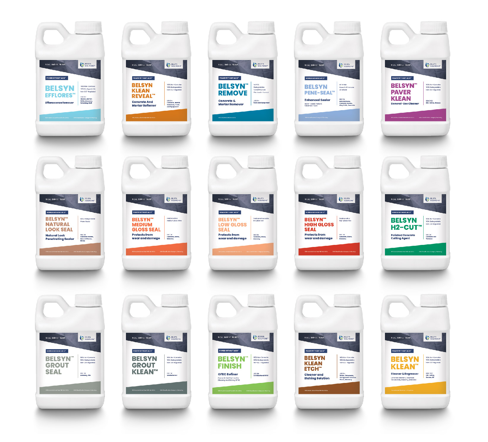
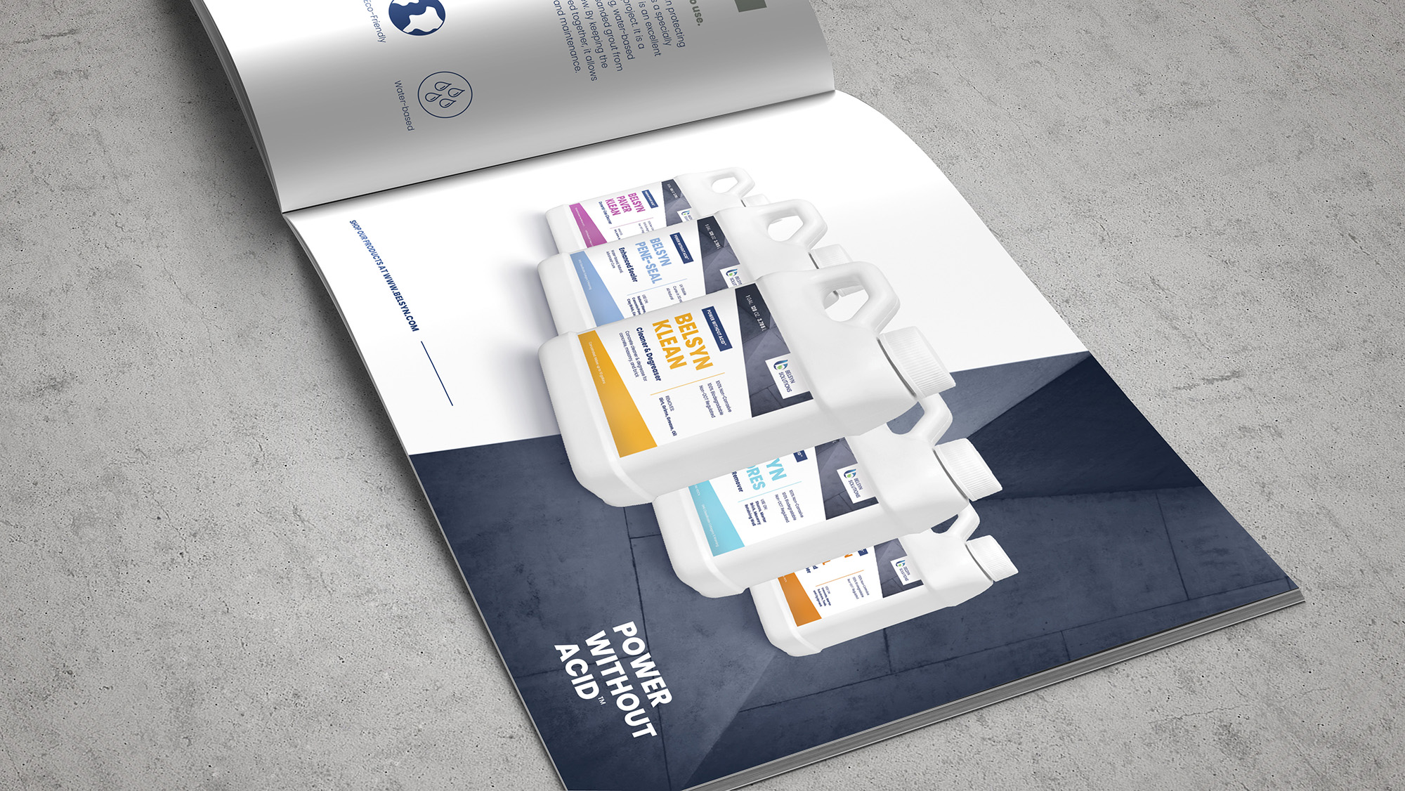
The biggest design overhaul was the labels for Belsyn’s line of products. The bottles needed to improve the perceived value, appeal to the target market, and be flexible enough to work across various products.
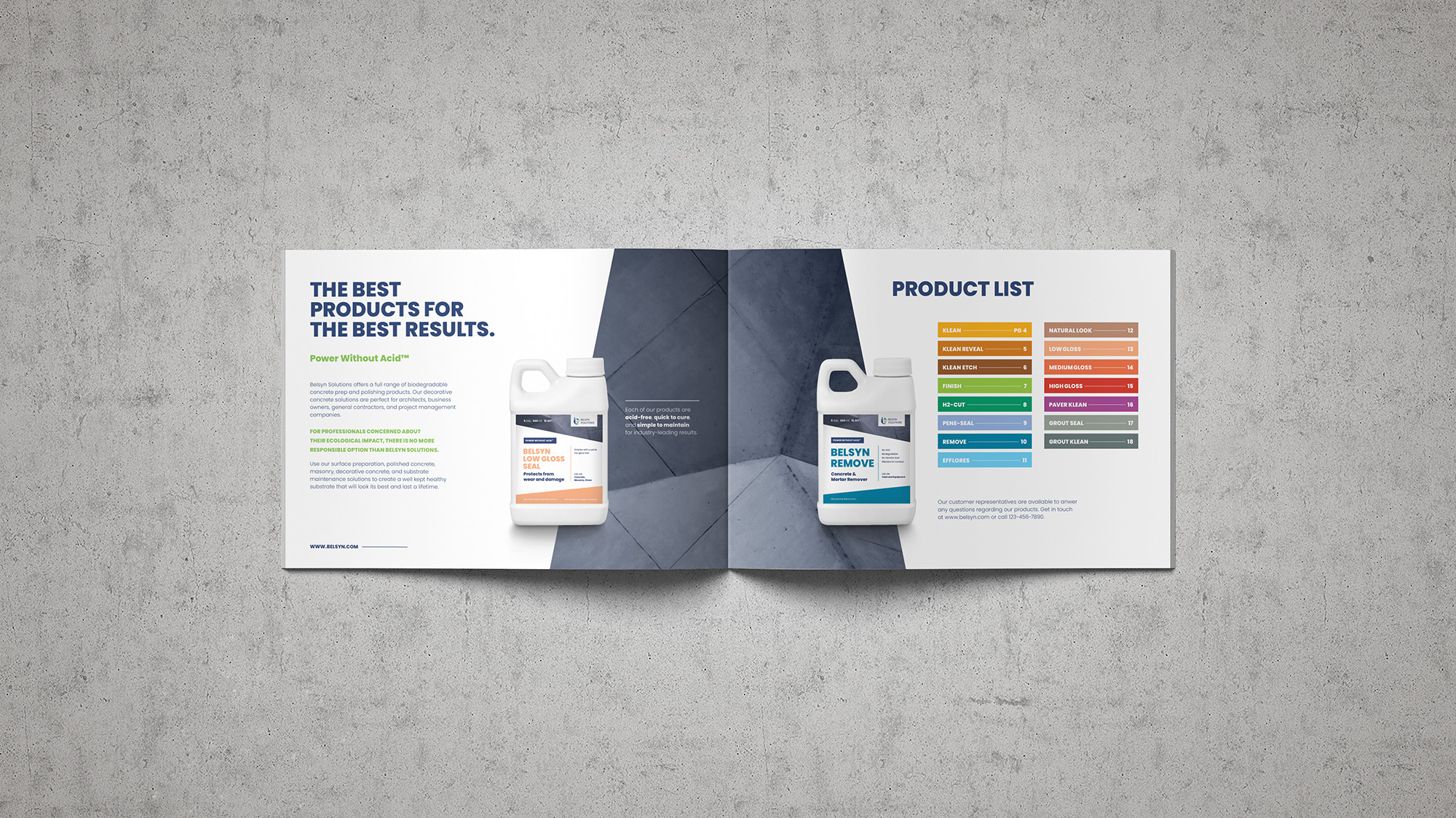
Visual hierarchy was the primary goal. It had to be very easy to distinguish the product and determine its function. Having the product name in bold, strong letters allowed differentiating products to be easy. Introducing a large amount of white space, book-ended by slabs of color, gave the product a high-end look and let the important information be easy to find. The only brand element Belsyn had established was their logo. Everything else they had wasn’t visually cohesive. The new look uses the deep blue from their logo as a foundational color, and a range of new colors that differentiate between products were introduced.
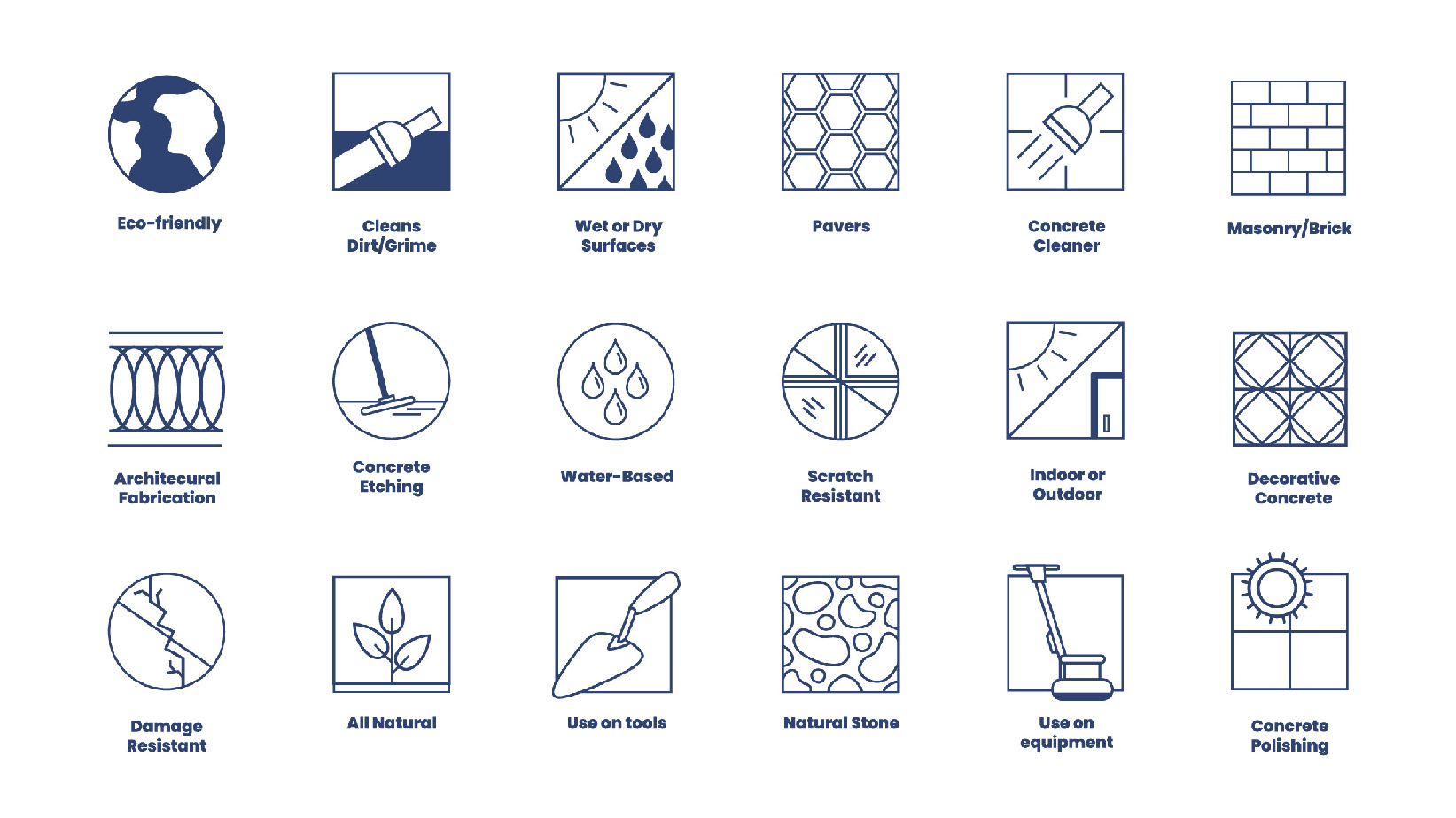
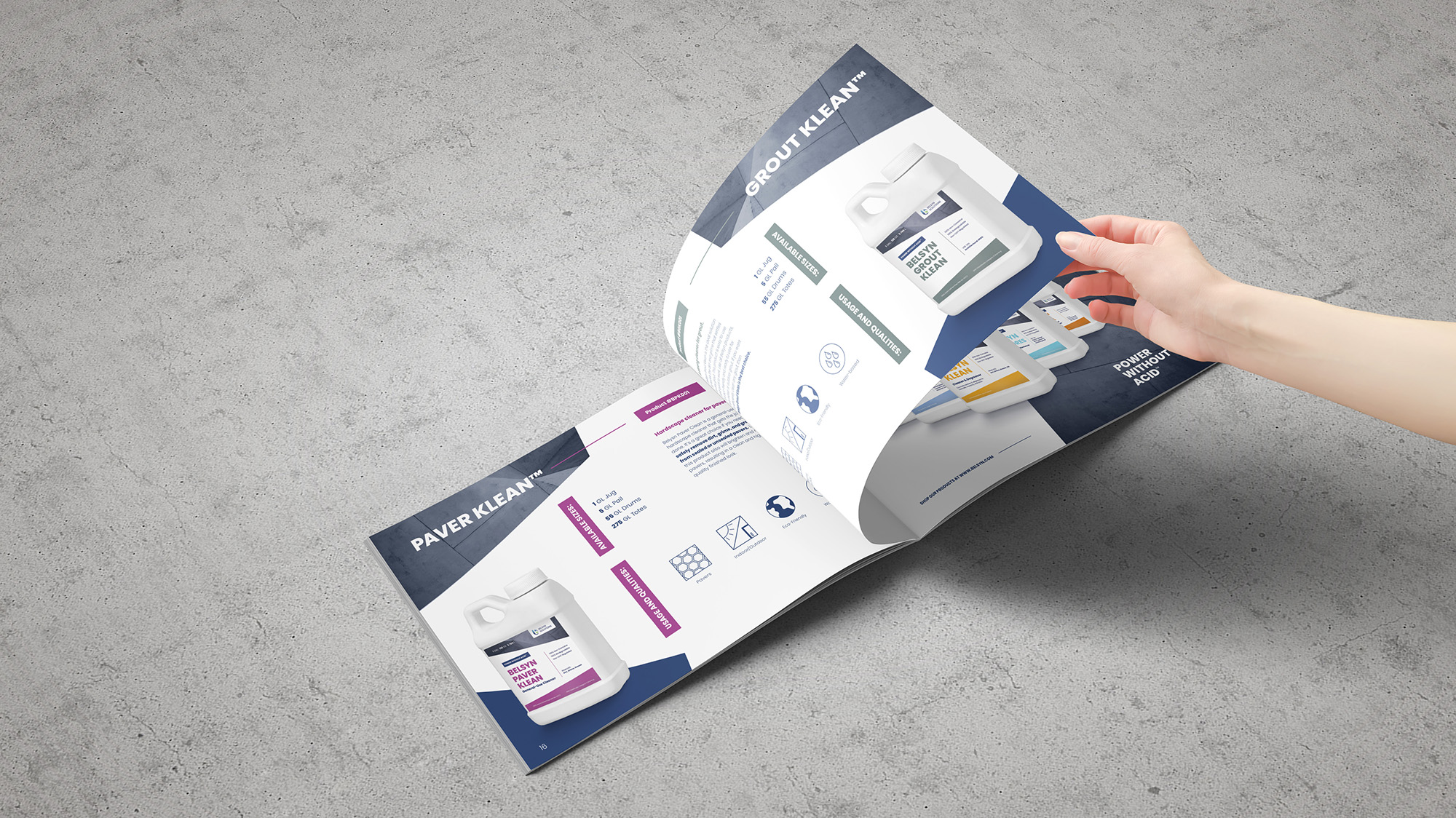
Once the visual system had been finalized, the next step was designing a catalogue showcasing the products. Belsyn offers a range of products for various uses. To easily provide important information to their customers, Creative Chameleon Studio developed a set of icons that covered the different callouts for each product. The final catalogue design fit within the new look of Belsyn and displayed what interested customers need to know about the products in an effective, concise way.
CREDIT
- Agency/Creative: Creative Chameleon Studio
- Article Title: Creative Chameleon Studio Create Packaging and Catalogue Design For Concrete Products
- Organisation/Entity: Freelance, Published Commercial Design
- Project Type: Packaging
- Agency/Creative Country: United States
- Market Region: North America
- Project Deliverables: Brand Architecture, Graphic Design, Packaging Design, Tone of Voice
- Format: Bottle
- Substrate: Plastic


