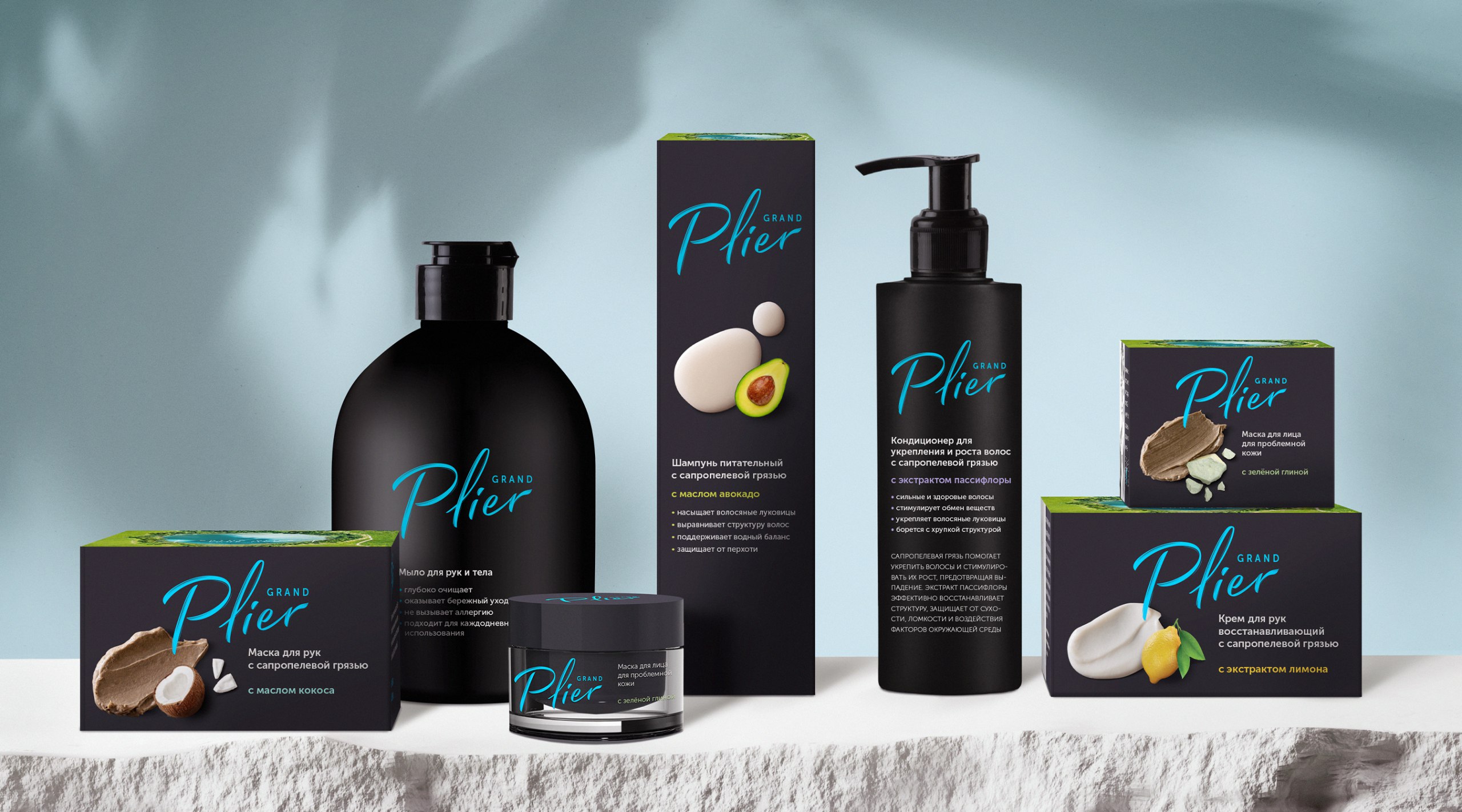
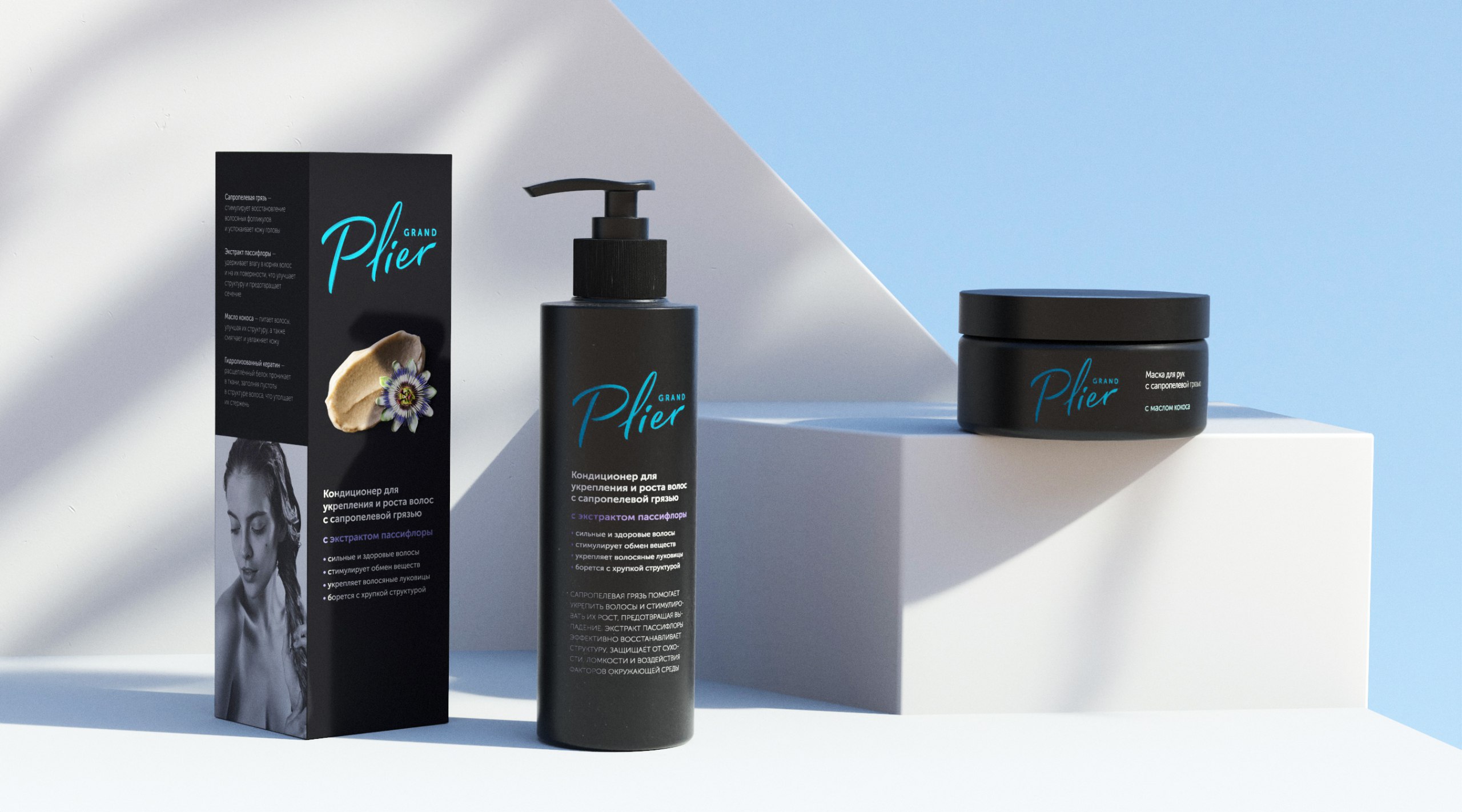
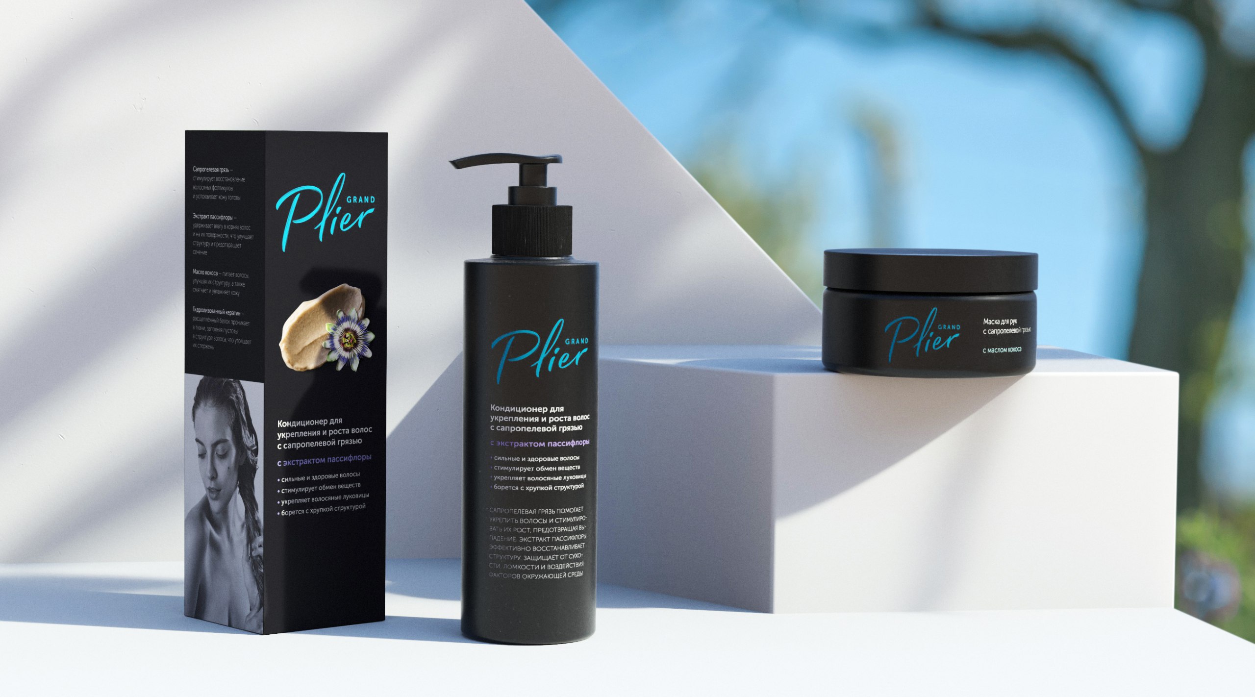
Grand Plier is a Russian brand of skincare and haircare products. Its uniqueness lies in offering natural products based on proprietary formulas that incorporate the healing muds of Lake Bolshoy Plier and a complex of essential oils. The branding process encompassed the development of a distinctive name, logo and corporate identity. These elements served as the foundation for designing packaging that evolved across the product range. The project also encompassed studio photography and videography, as well as the development of a multilingual website for the Grand Plier brand.
Concept: The overarching goal of the project was to unveil the essence of Grand Plier: a brand that harnesses the power of natural remedial components to create effective solutions for preserving natural beauty and youthfulness.
Name: The naming of Grand Plier draws from the translation of the original name of the lake with its healing muds «Bolshoy Plier». The toponymic approach in the naming process achieves the formation of positive associations and a high level of audience engagement by forging a solid link between the brand’s products and an ecologically pristine natural entity.
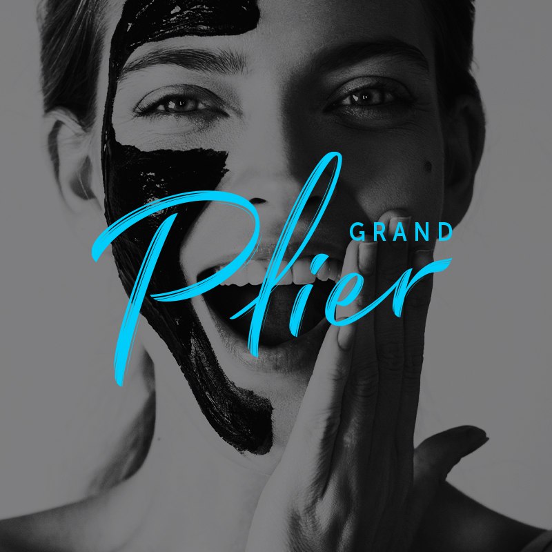
Logo and Identity: The brand’s identity is characterised by lightness, purity, and simplicity, which, combined with the effective associative visual communication, cultivates high expectations of product quality among the audience.
The distinctive calligraphic rhythm in the logo mirrors the brush strokes of an artist while evoking the stroke of a healing cream.
The fusion of a black graphite background with a sky-blue logo establishes an original blend that facilitates the effective positioning of the brand’s products, setting them apart from competitors.
Packaging Design: The visual concept involves showcasing a prominent image of the key ingredient in Grand Plier’s products, the therapeutic sapropel mud, on the front face of the packaging. This approach enables easy identification of the product and engrains the brand’s functional segment into memory.
The concept also integrates depictions of components alongside strokes, contributing to the formation of the brand’s product range and distinguishing products by their intended purposes.
Special attention is dedicated to efficiently conveying information that reveals the uniqueness, curative properties, and origins of the cosmetic products’ ingredients.
To illustrate the functionality of each product in the brand’s lineup packaging design features images of models vividly demonstrating the application area of each item.
Outcome: Through a comprehensive effort, the Grand Plier brand has been brought to life, representing a path to natural beauty and youthfulness inspired by nature and scientific exploration.The brand’s products are available through an array of specialized retail points, major marketplaces, as well as the official Grand Plier website.


CREDIT
- Agency/Creative: BRANDEXPERT
- Article Title: Creation of Grand Plier Natural Cosmetics Brand
- Organisation/Entity: Agency
- Project Type: Packaging
- Project Status: Published
- Agency/Creative Country: Russia
- Agency/Creative City: Москва
- Market Region: Europe
- Project Deliverables: Design
- Format: Bottle, Box, Jar
- Industry: Beauty/Cosmetics
- Keywords: Cosmetic's brand
-
Credits:
Agency: Ostrov Svobody


