


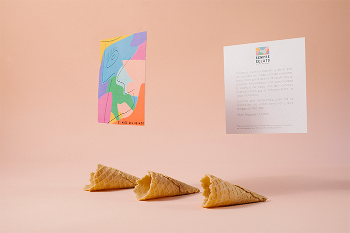
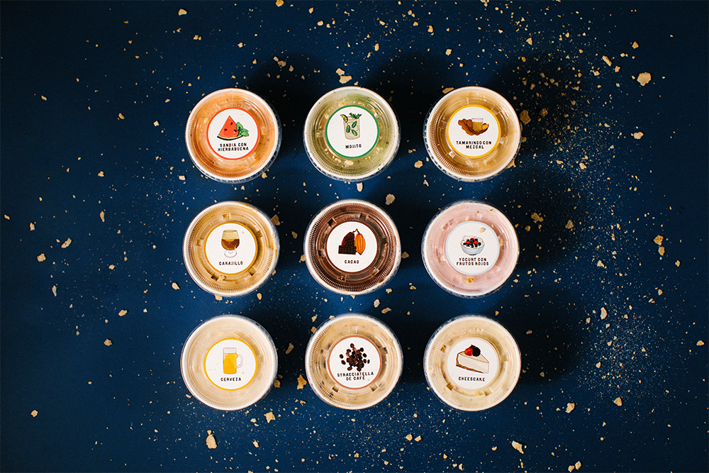
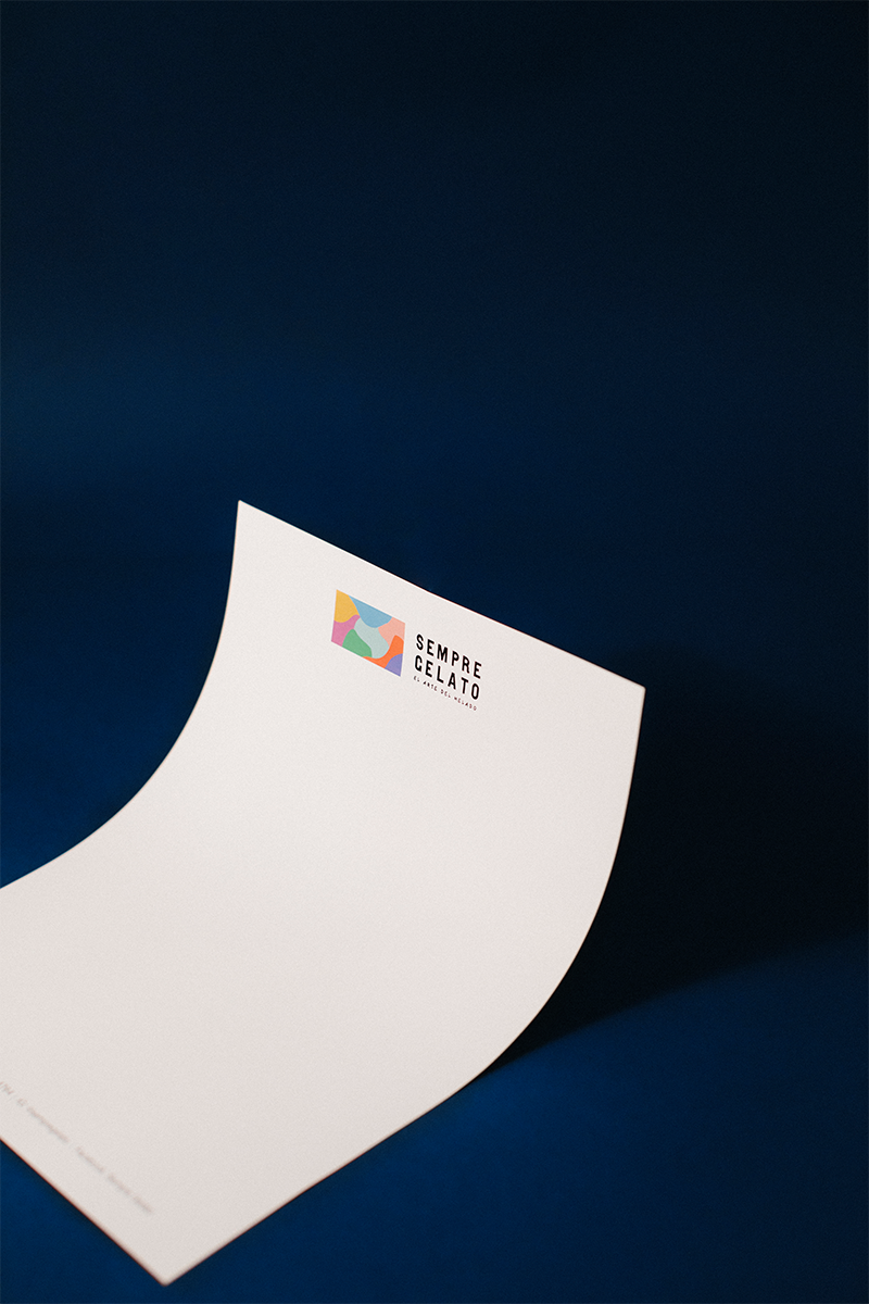
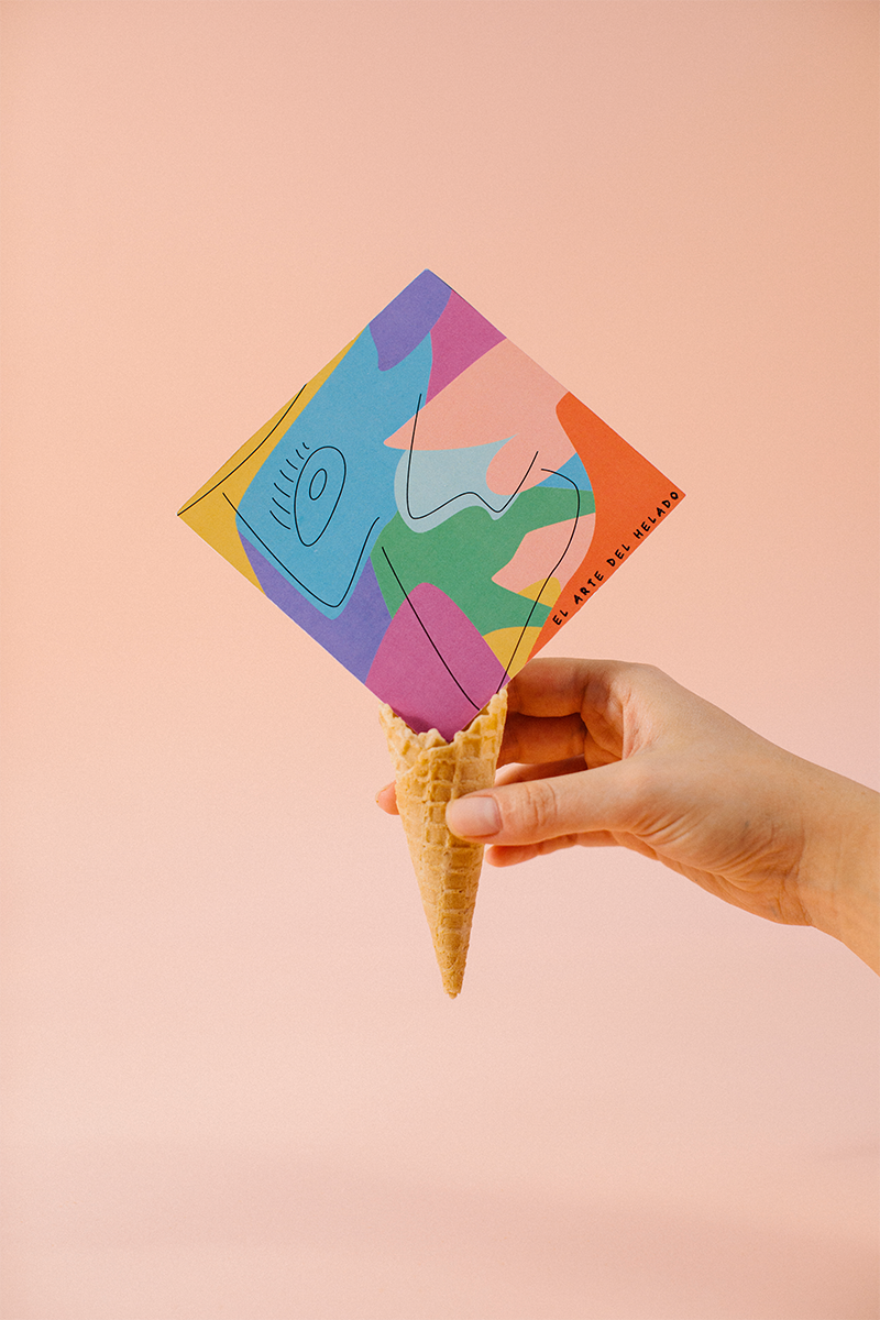
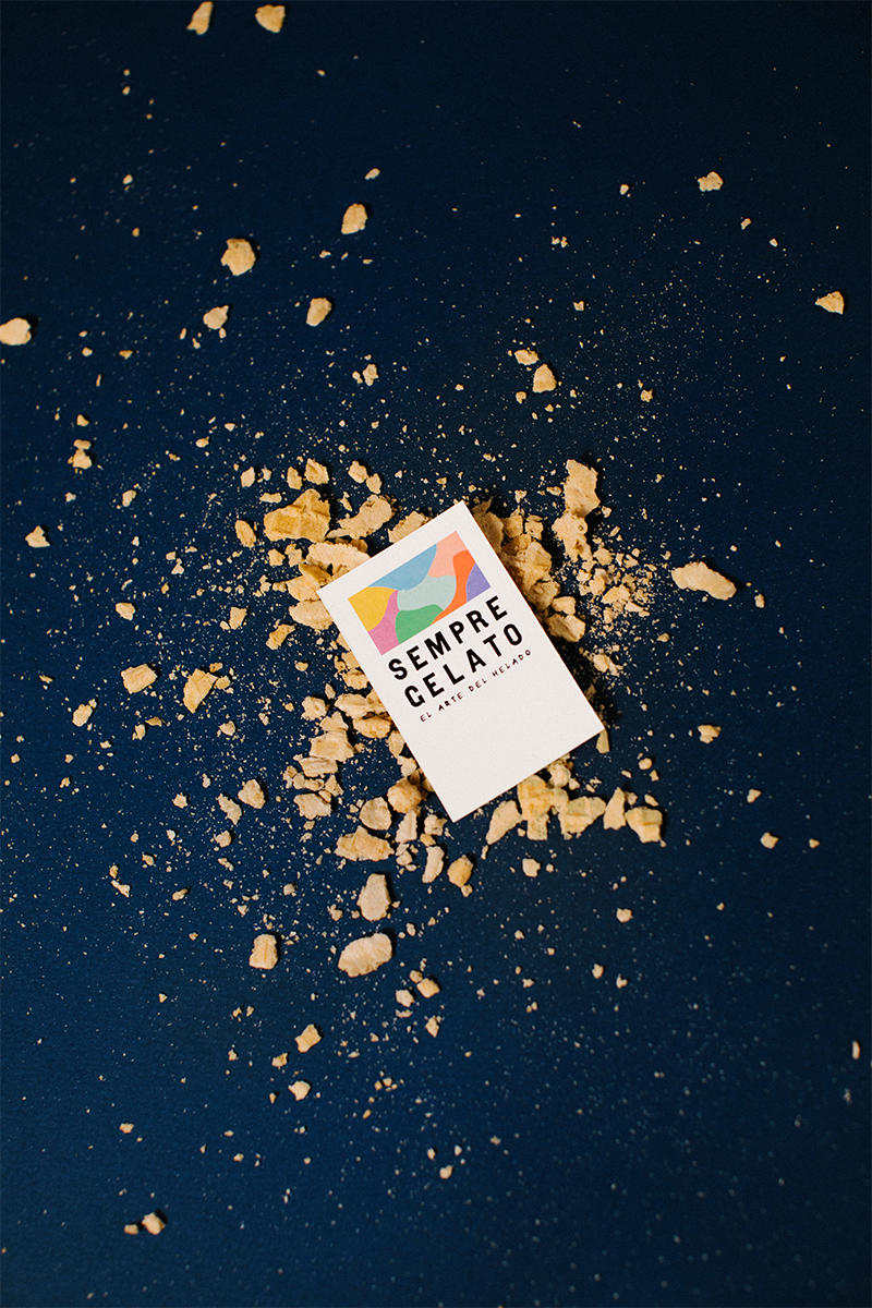
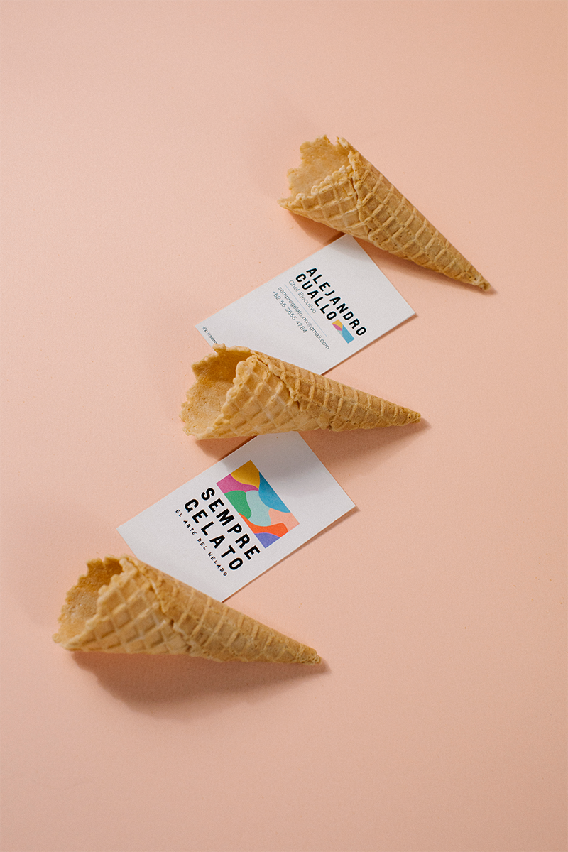
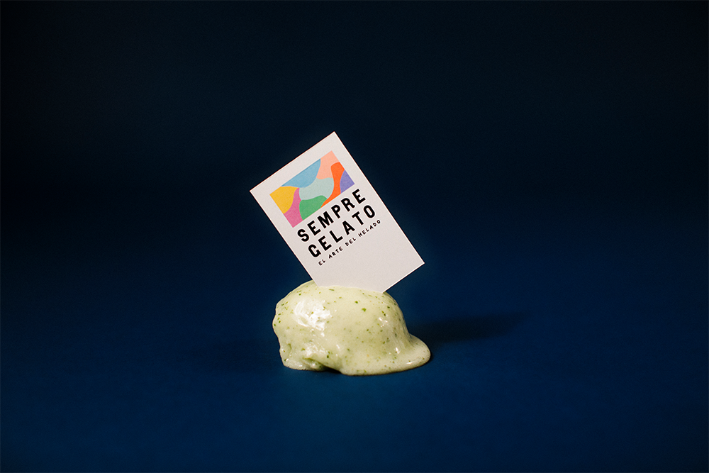
Sempre Gelato plays on the creativity of bringing flavours together to offer an original product for its clients. The Chef and creator of these Gelatos constantly experiments with different flavours to create new and exciting tastes. This is why the logo of Sempre Gelato represents different flavours melting into one to create a new flavour. The rectangle shape is meant to represent the ice cube which is used to create the gelato and within this ice cube you can see the flavours melting into one. As a second phase, the package design for a tasting menu came to place. A separate illustration was created for each flavour. This was in order to maintain the spirit of creativity flowing. This brand is inspired and wants to inspire creativity, to allow for constant growth and change, by bringing new and exciting tastes every season. Sempre Gelato is not only a Gelato but a creative and artisanal, locally made Gelato Shop.
CREDIT
- Agency/Creative: Michelle Epelstein
- Article Title: Creating Unity Through Design With Sempre Gelato´s Branding
- Organisation/Entity: Freelance, Published Commercial Design
- Project Type: Identity
- Agency/Creative Country: Mexico
- Market Region: North America
- Project Deliverables: Branding, Illustration, Packaging Design, Product Naming
- Industry: Food/Beverage


