


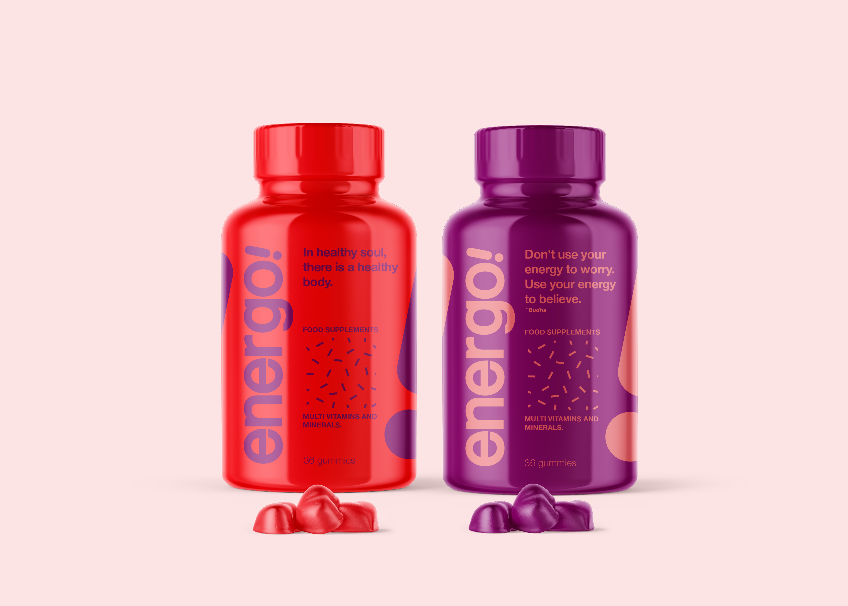
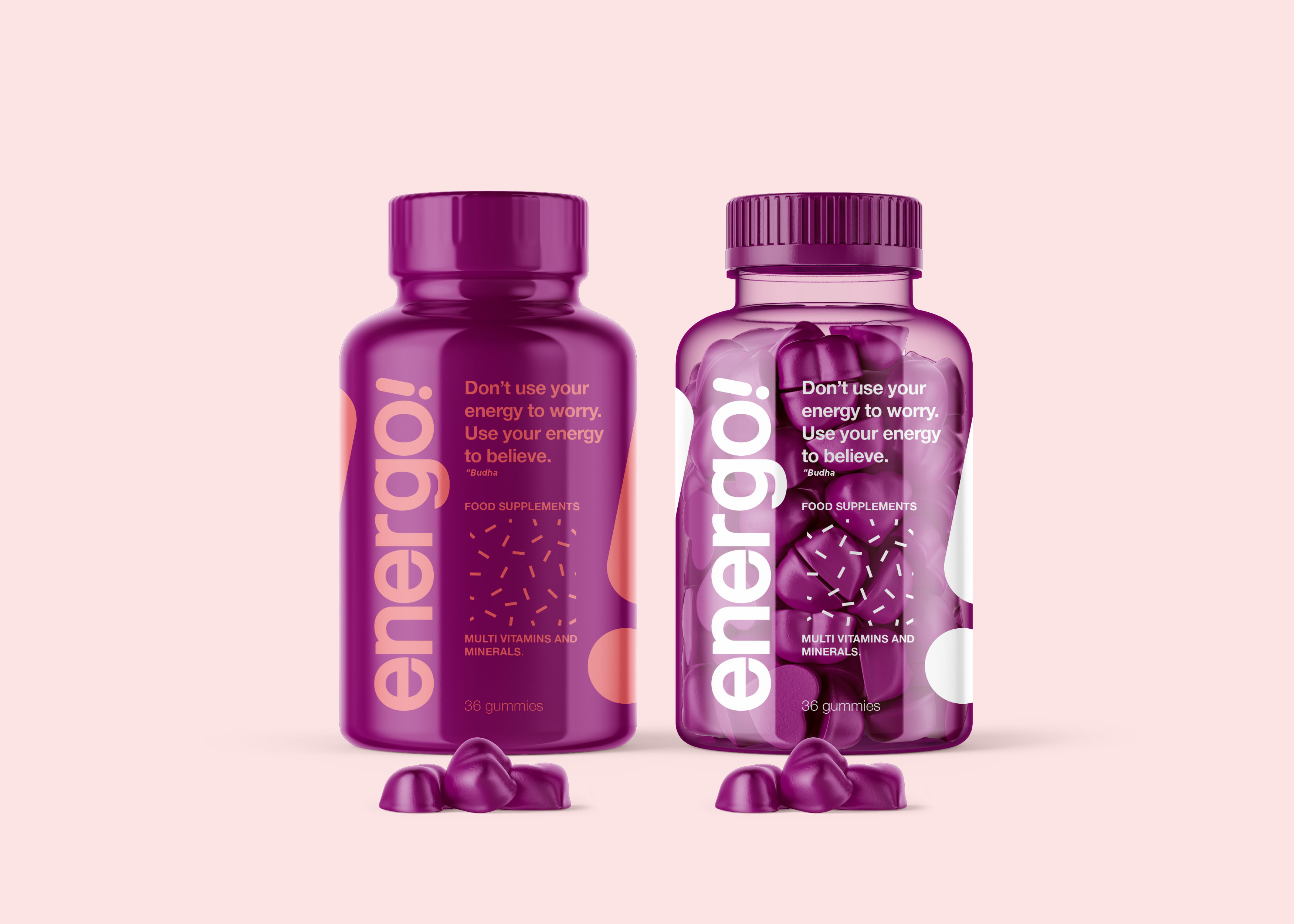
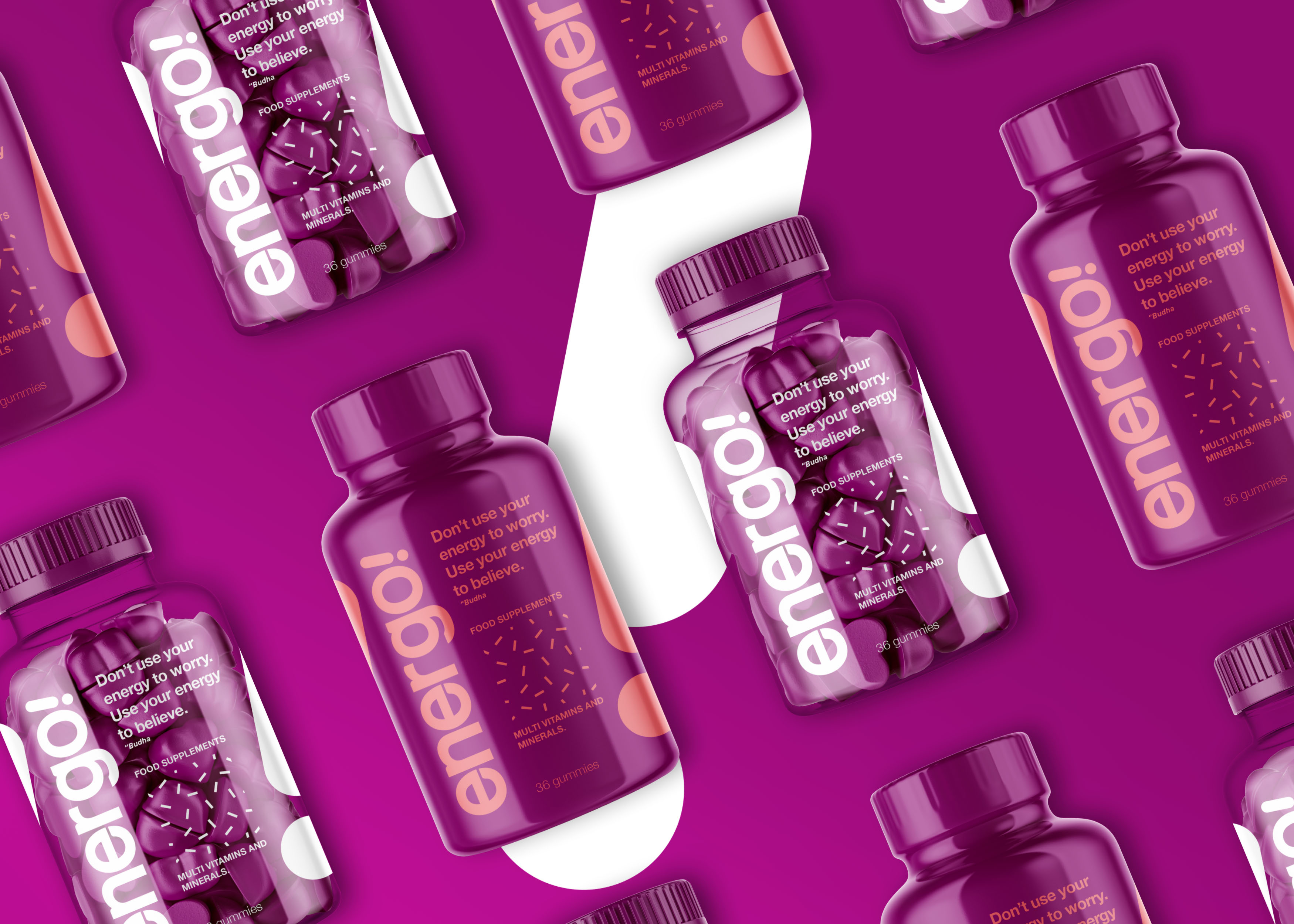
Energo! Is a food supplement product brand that is made for the middle and upper market segments that have very dense activities. Through analysis and benchmarks with several competing products, we help our clients to design brand names, brand identity colors, brand identity, packaging design and design for branding.
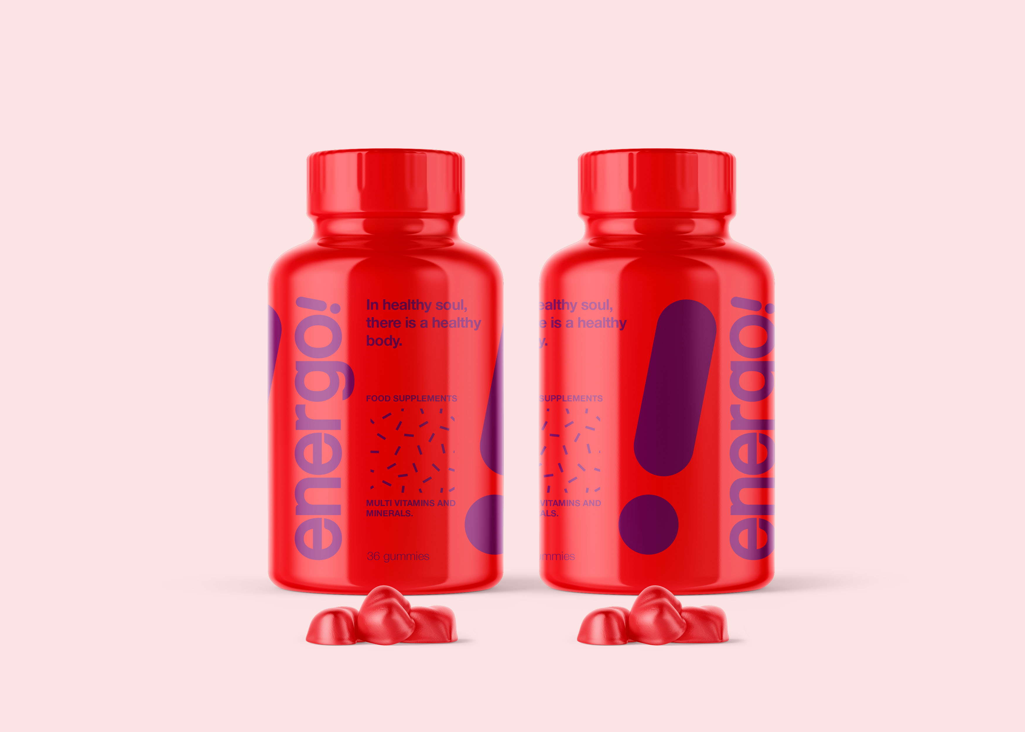
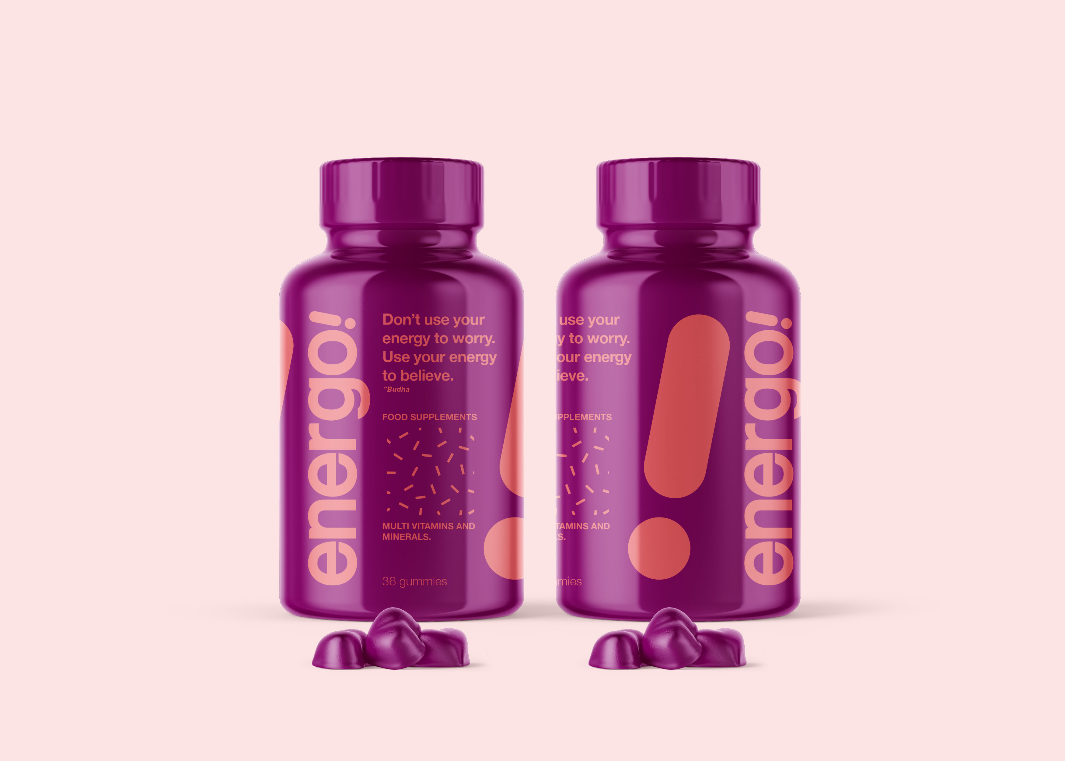
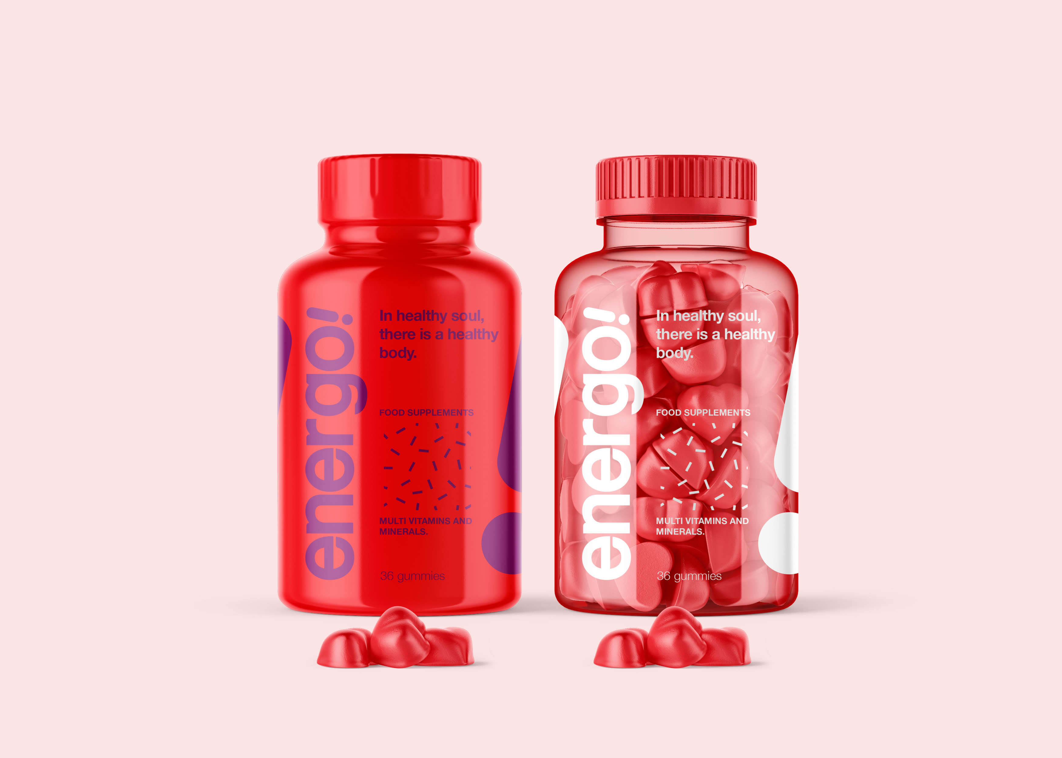
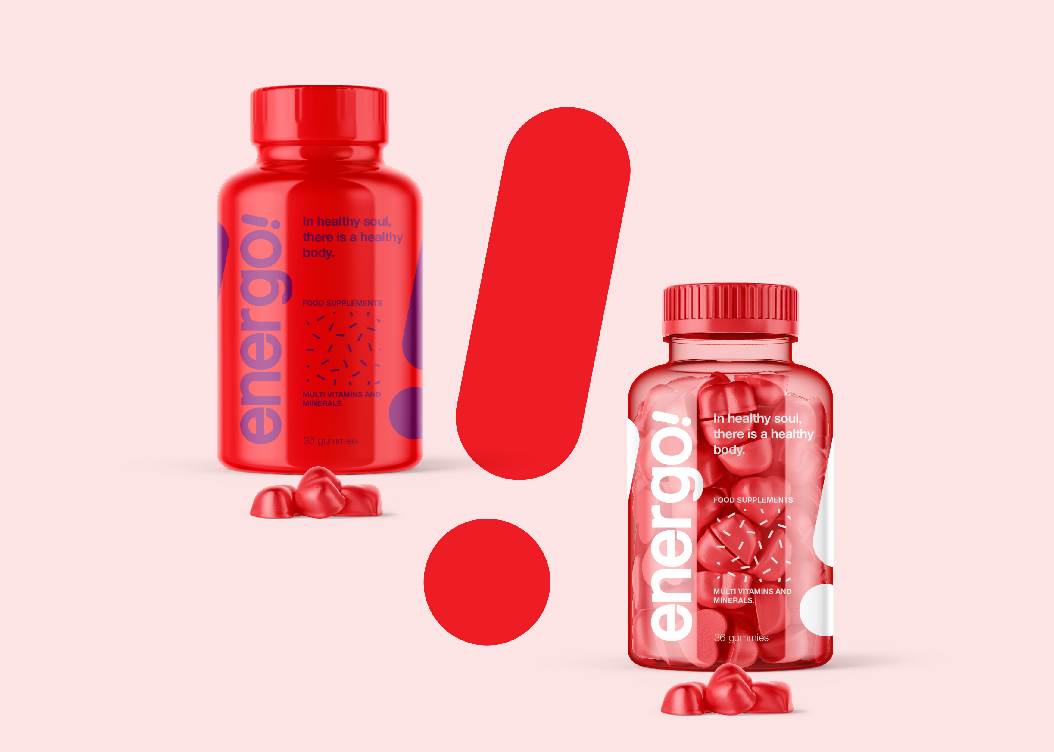
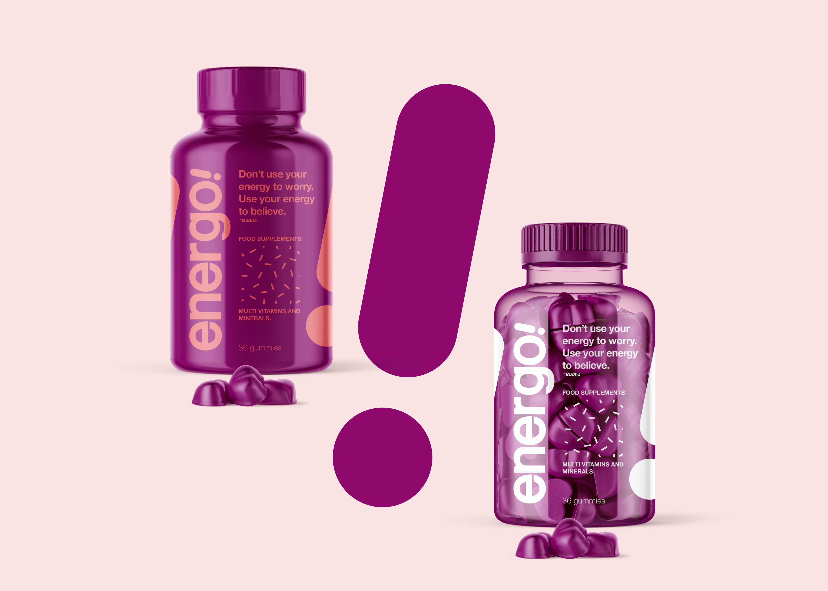
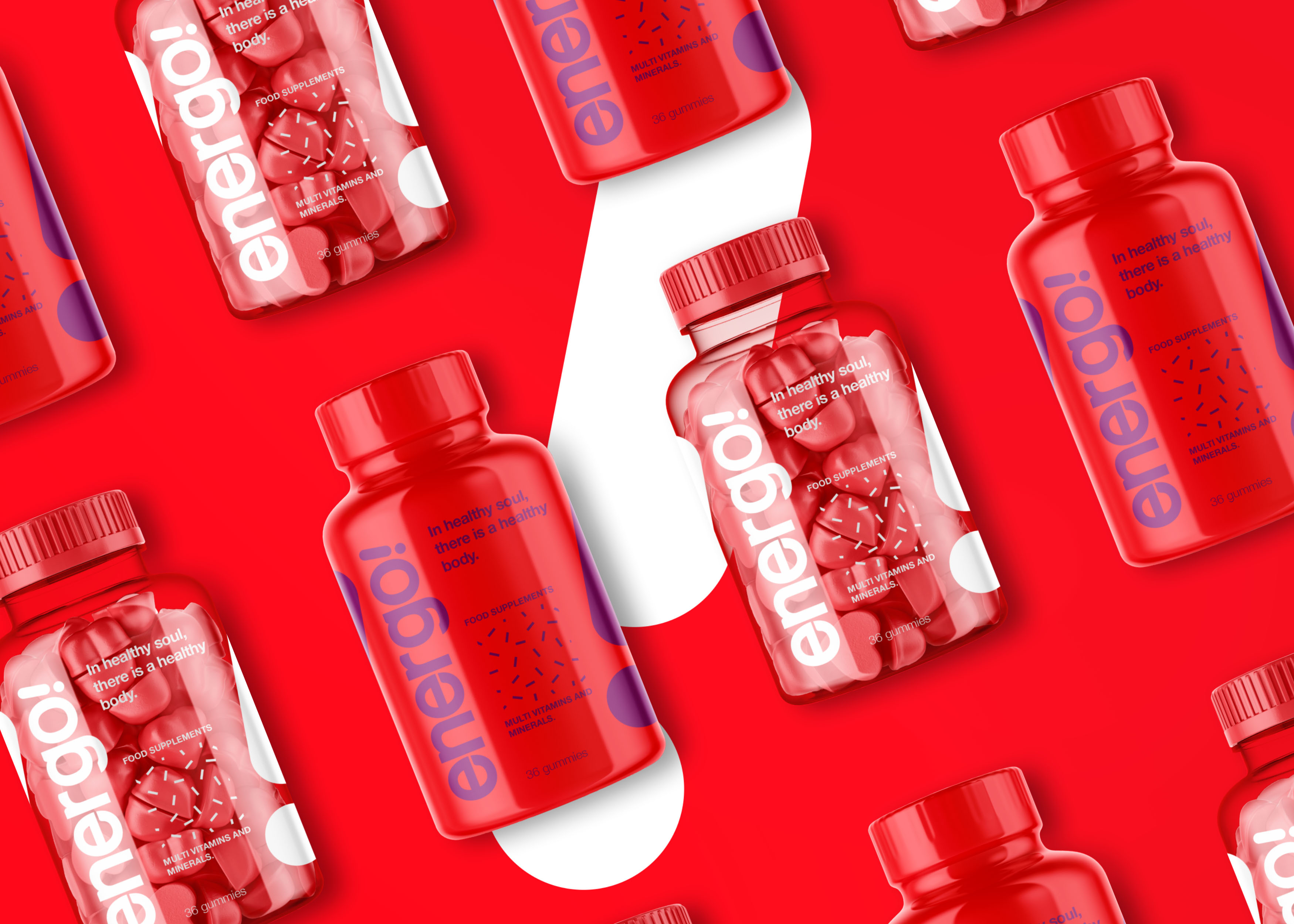
In this packaging design session, we made bold colors of red and purple flank. Besides being conspicuous on store shelves, this color gives a unique, uplifting and premium impression. Exclamation mark symbols as brand icons, still appear as markers of brand identity. This design combination provides a stopping power effect when potential customers are looking for food supplements.
CREDIT
- Agency/Creative: Widarto Impact
- Article Title: Creating New Packaging Design for Energo! Food Supplements
- Organisation/Entity: Agency, Non Published Concept Design
- Project Type: Packaging
- Agency/Creative Country: Indonesia
- Market Region: Asia
- Project Deliverables: Brand Advertising, Brand Architecture, Brand Creation, Brand Guidelines, Brand Identity, Brand Naming, Brand Strategy, Branding, Graphic Design, Identity System, Packaging Design, Product Naming, Research, Structural Design
- Format: Bottle
- Substrate: Plastic
FEEDBACK
Relevance: Solution/idea in relation to brand, product or service
Implementation: Attention, detailing and finishing of final solution
Presentation: Text, visualisation and quality of the presentation


