


Haceka packaging restyling
Haceka produces bathroom accessories with more than 300 products divided into different lines (styles), which are for sale in the hardware stores and specialty shops (DIY category). Our challenge; how do you package all these different products in a package so that together they have 1 clear brand image, which communicates clearly to the consumer and makes great strides in the field of sustainability.
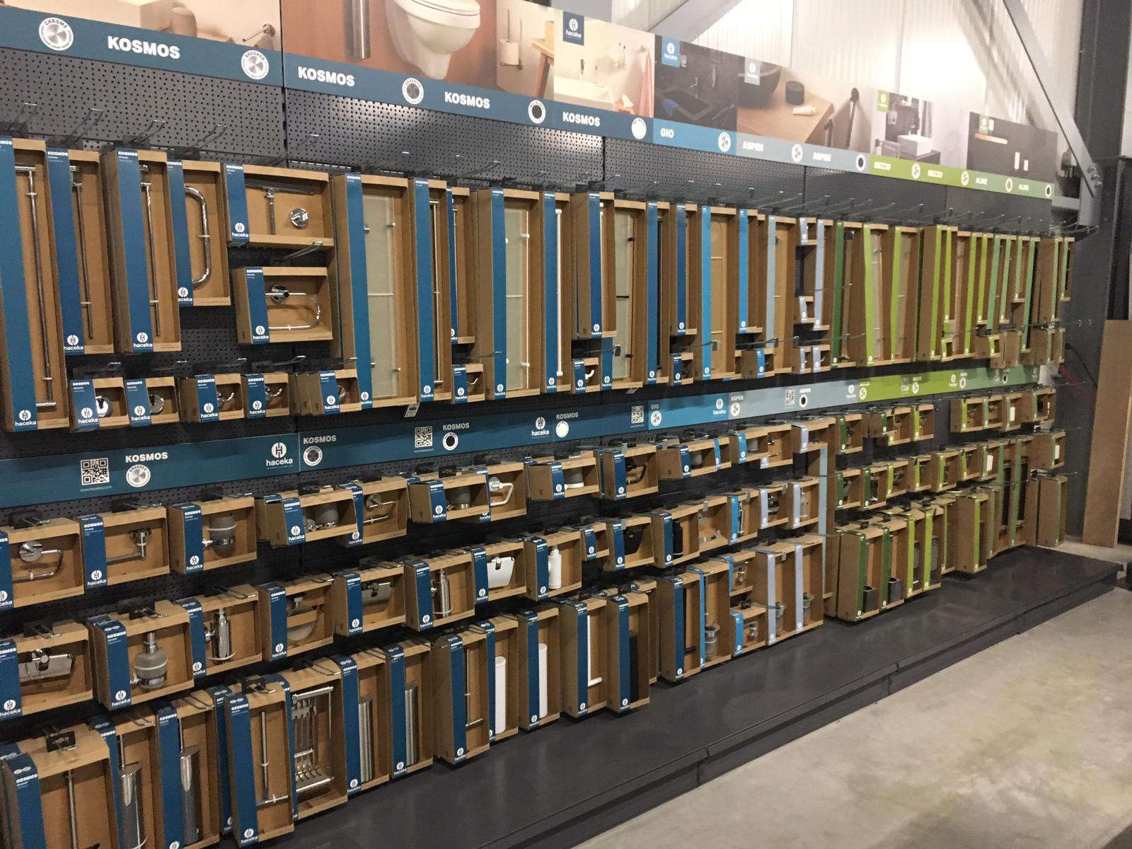
This is a restyling of an existing line. The old packaging consisted of open boxes, made of laminated cardboard with many photos and images on it. These boxes were closed by plastic sleeves that covered the entire packaging. Due to the many images, as often happens in this DIY category, the complete shelf becomes very cluttered, and it is very difficult for the consumer to find a product from an existing line (if they want to buy something extra). Or to see which products exactly belong together.
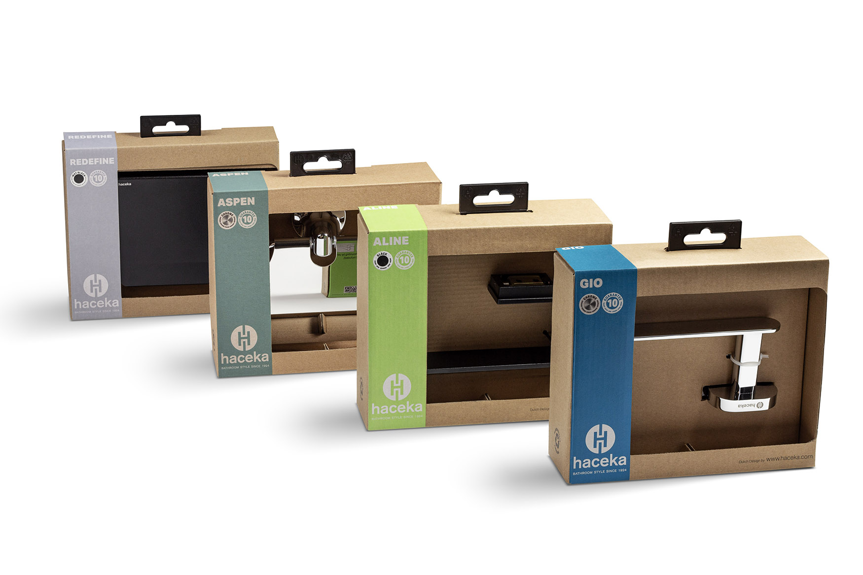
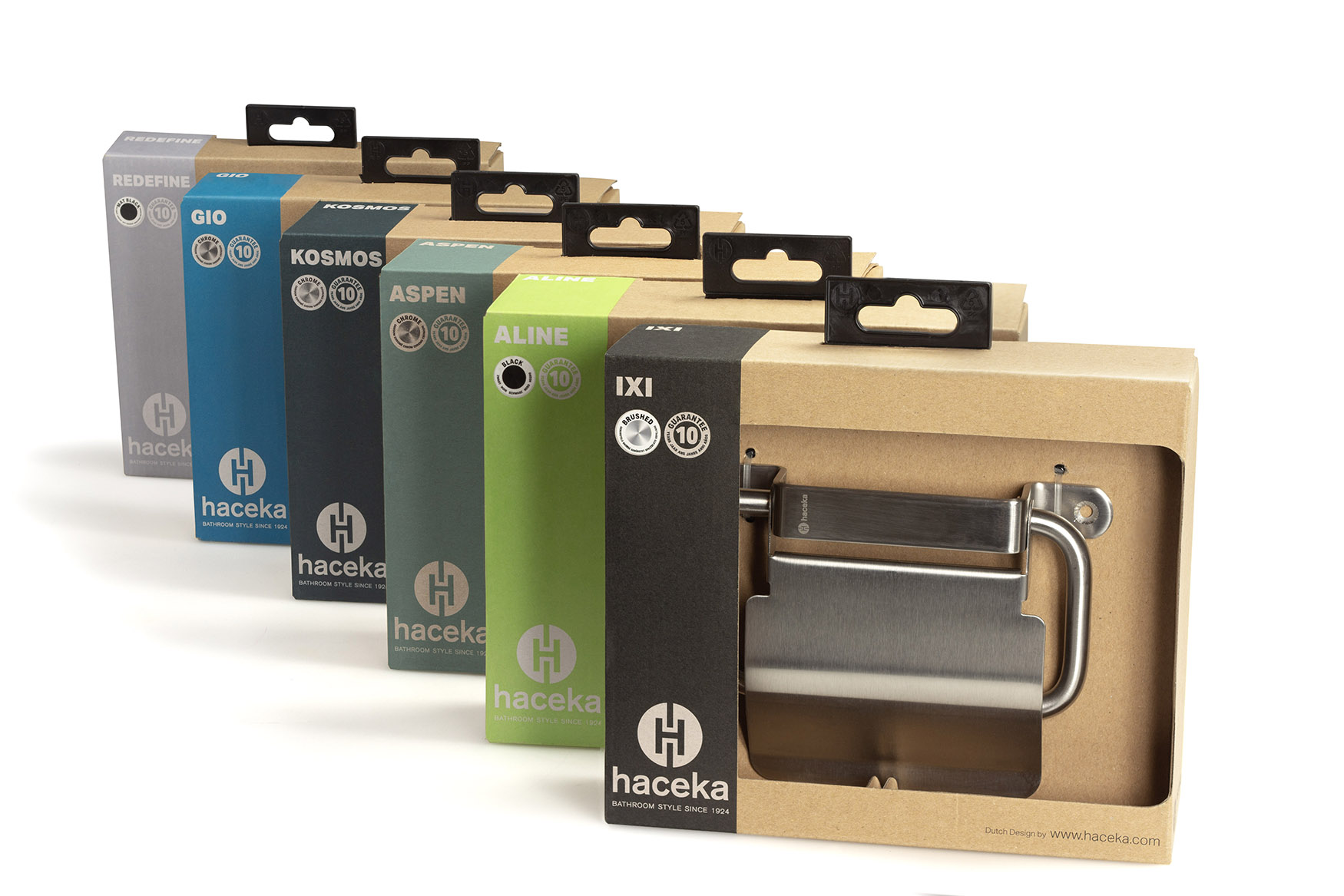
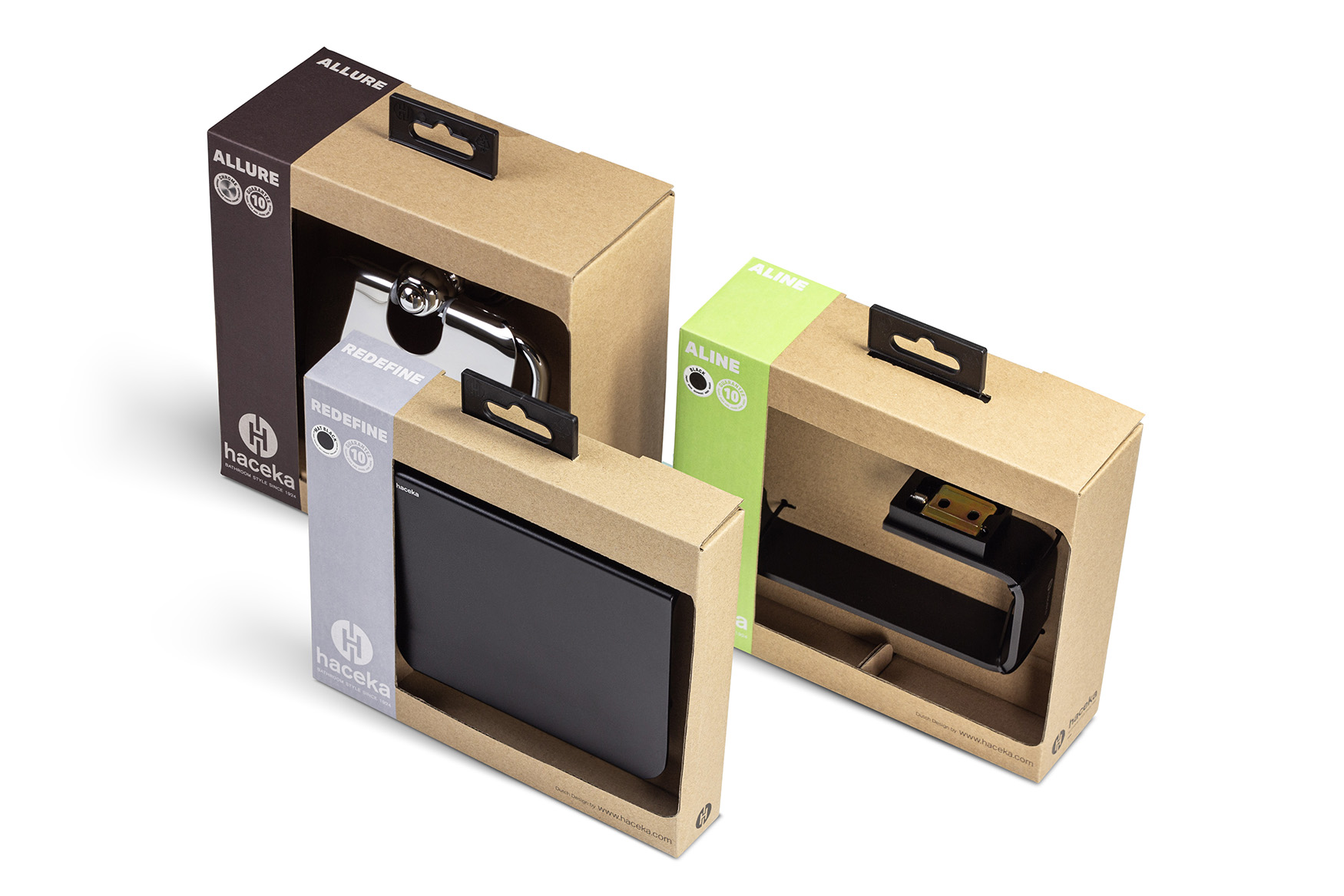
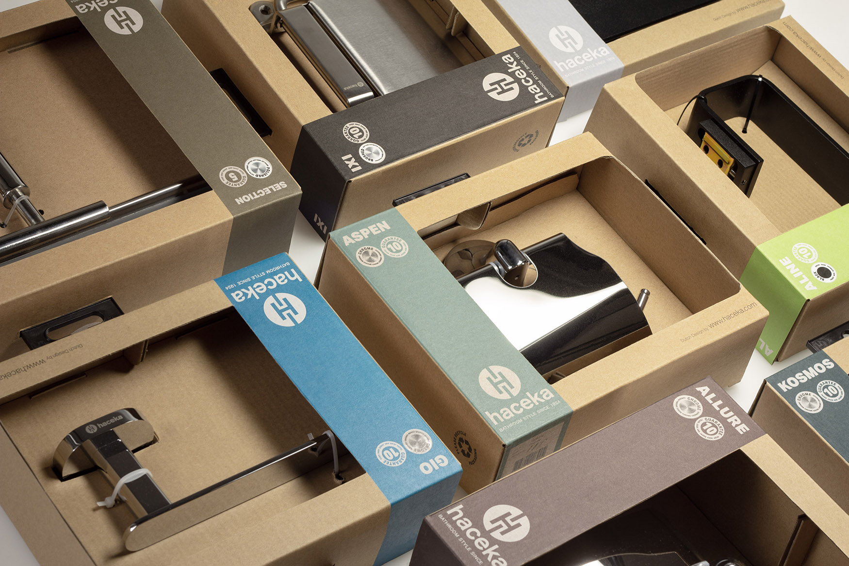
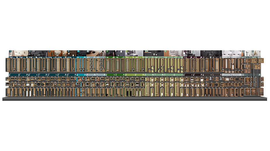
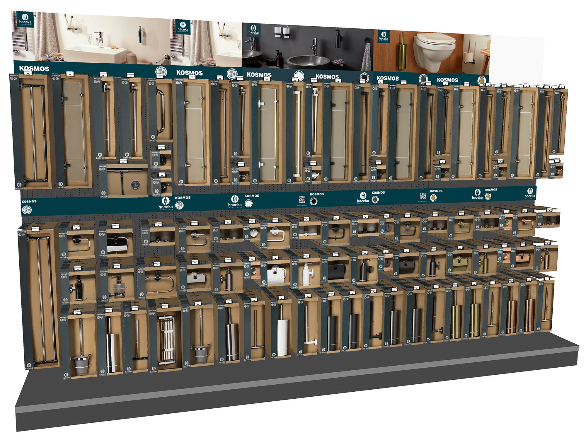
Together with Fetim (brand owner) and Topa packaging we have developed a packaging form that is basically the same for all products and that has the same appearance for all products. The brand is therefore immediately recognizable on the shelf. We use a semi-open box (a small colored strip on the left closes the box “a bit”) so that the product can be clearly seen by the consumer (so no photos are needed). the box contains a double bottom where all products can be properly sealed (by means of sturdy tie wraps, for example).
Due to the design of the new box, we could use normal cardboard (no longer necessary to print photos) instead of laminated cardboard and a plastic sleeve was no longer necessary, which saves a large amount of plastic. In addition, the strong eurolock (on which the packaging is hung on the shelf) is made of PP and is easy to separate and recycle.
We have opted for normal untreated brown cardboard to create a natural look in the construction market and to distinguish it from the competition. Each different line has been assigned a certain color for clear communication with the consumer. This is applied on the left side of all packaging in the same width (as a kind of printed banderole around the packaging) with brand information on the front and confirmation information on the back.
On the shelf, the consumer now walks directly to his/her required line without having to search forever for the right product.
CREDIT
- Agency/Creative: Van Heertum Design VHD
- Article Title: Creating a Sustainable and Distinctive Packaging Design for Haceka’s Bathroom Accessories
- Organisation/Entity: Agency
- Project Type: Packaging
- Project Status: Published
- Agency/Creative Country: Netherlands
- Agency/Creative City: Tilburg
- Market Region: Europe
- Project Deliverables: 2D Design, 3D Design, Packaging Design
- Format: Box
- Substrate: Pulp Carton
- Industry: Retail
- Keywords: bathroom, utilities, DIY, Haceka, restyling, packaging, sustainable
-
Credits:
design agency: Van Heertum Design VHD


