


Our story with Jean-Daniel Heiniger begins in a restaurant. He eats with his wife at a table close to ours and the conversation begins. Jean-Daniel is a winegrower, he took over from his father the Domaine de la Recorbe, a small vineyard in the region of Geneva, Switzerland. He and his wife Alexandra want to modernize the image and labels of their wines.
Our first visit to the estate confirms that the project is humanly and intellectually fascinating. Jean-Daniel Heiniger is young, he loves the terroir, he is interested in new winemaking methods that respect the environment and health, and he produces small quantities but of high quality. However, the labels of its wines do not reflect any of this. An engraving from his farm attempts to reproduce the codes of Bordeaux wines. This imitation is tasteless and makes no sense for a product that represents the diversity of regions and cultures.
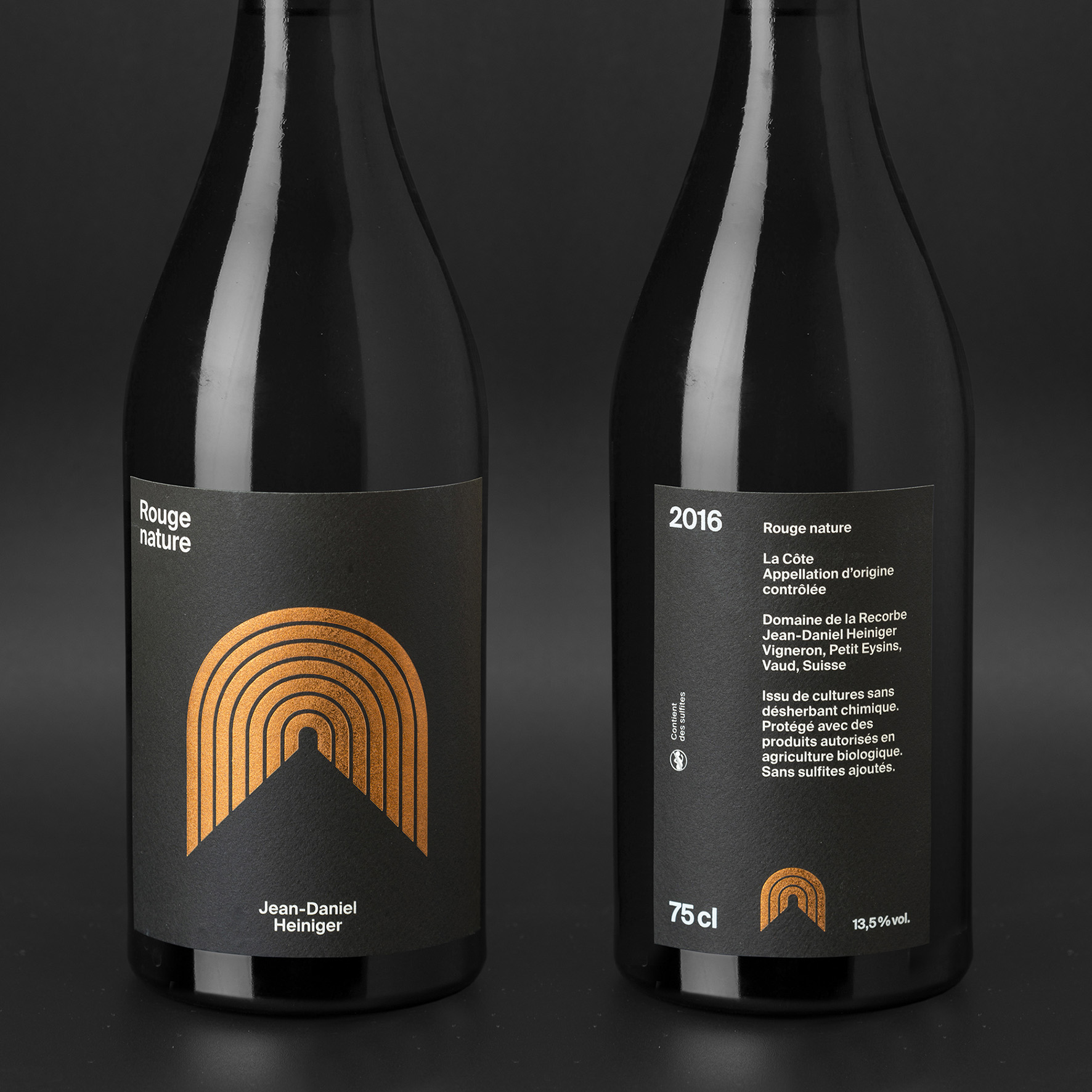
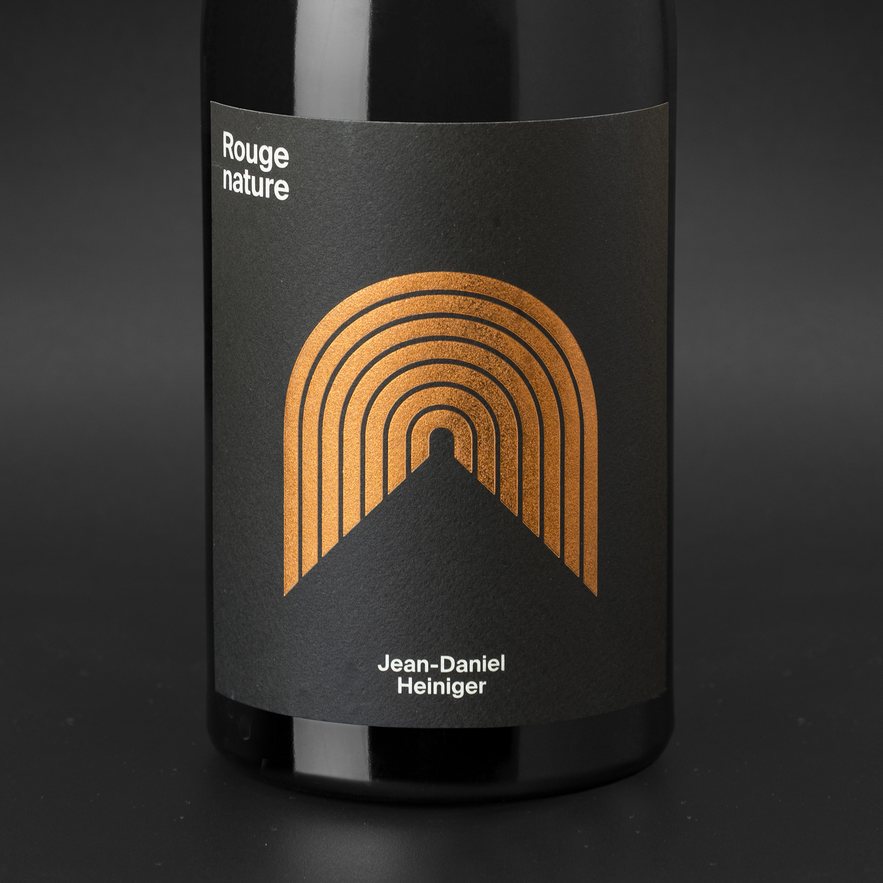
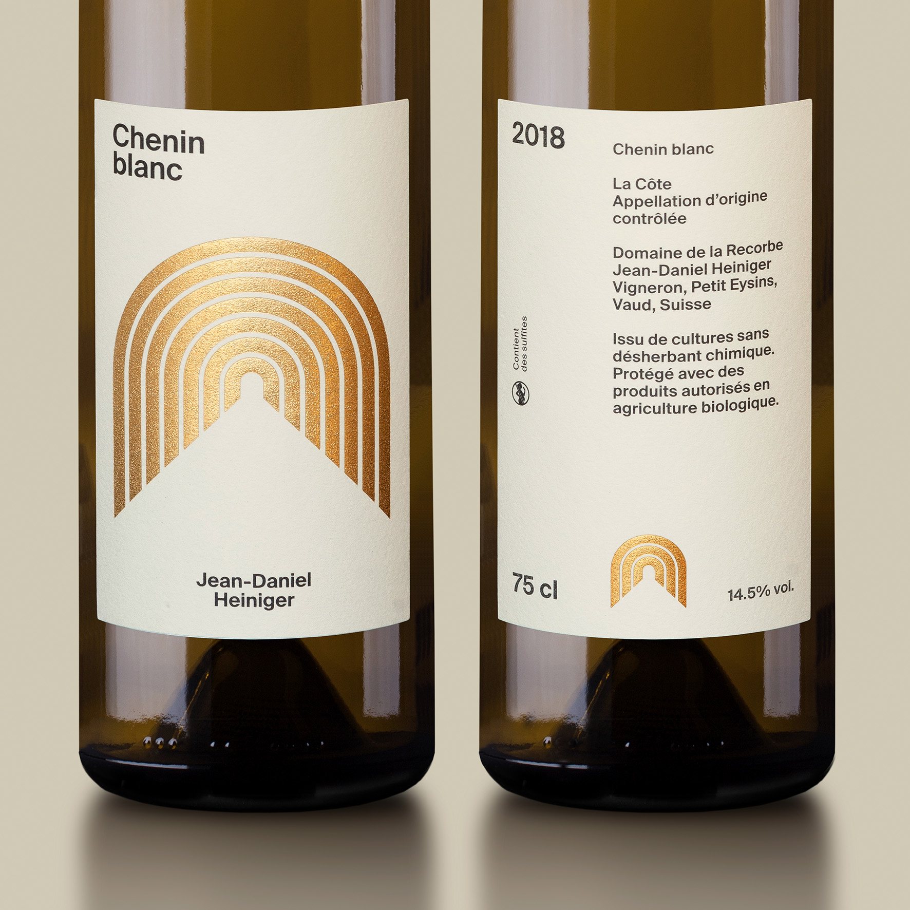
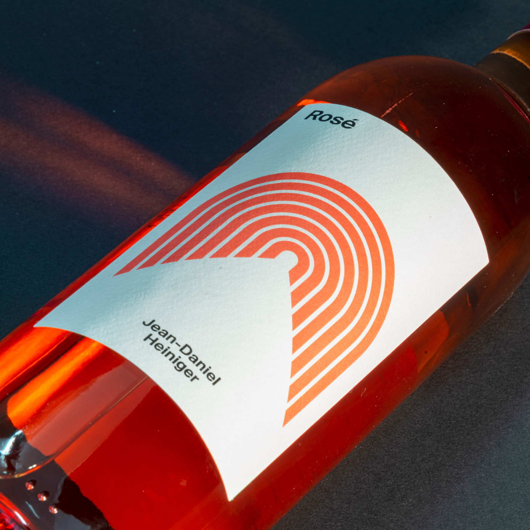
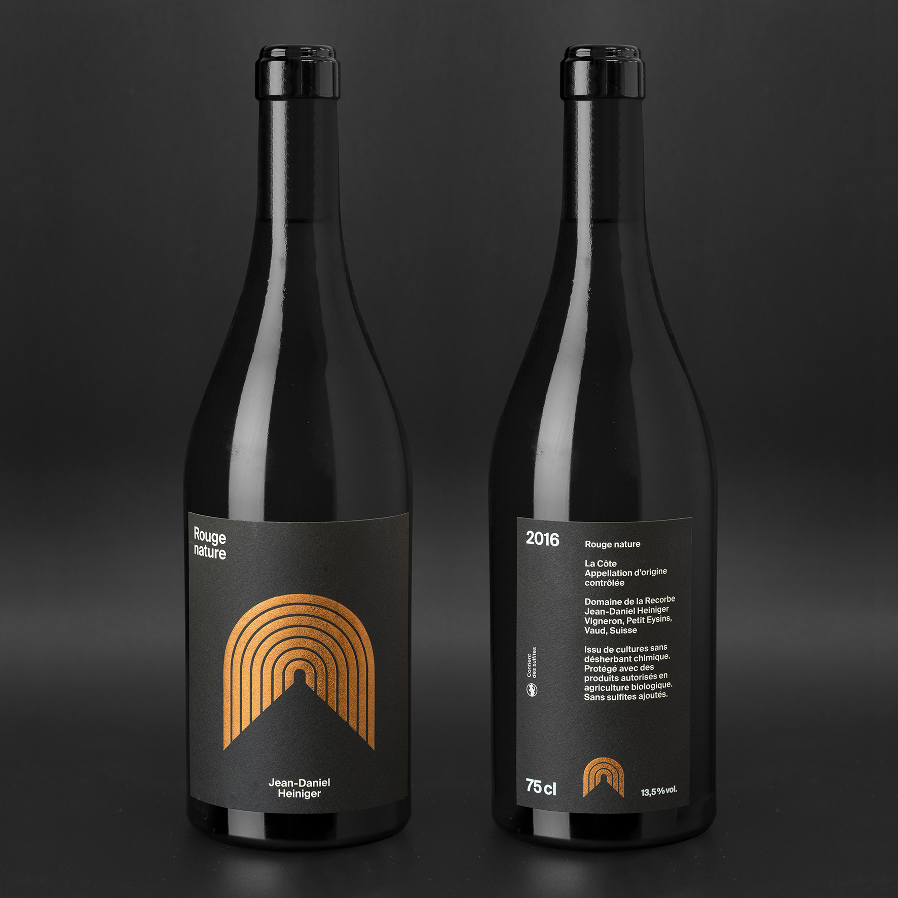
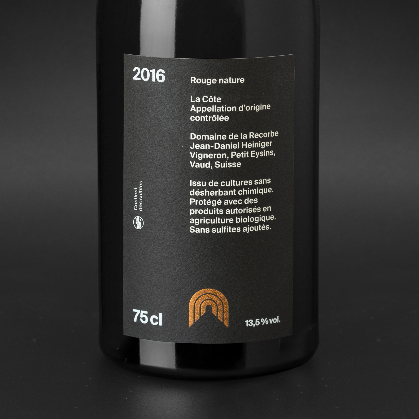
In their departure brief, Jean-Daniel and especially Alexandra tell us about their desire to have a strong and recognizable identity. Competition exists and producing good wines is not enough to sell them. They tell us about the estate and its history, and share with us an anecdote that will be decisive in the final design: a Roman aqueduct runs under the estate. It is also clearly visible since it generates a mound in the middle of the vines.
Exploiting this symbol is obvious. It marks the history of this land, creates a link between the Romans’ desire for progress in the past and that of Jean-Daniel Heiniger today. It’s a great story to tell that brings him closer to his clients.
The stylization of the aqueduct generates a strong, immediately recognizable motif. The Swiss-style design and processing of the typography inherently carries the Swiss identity of the estate. It also makes it possible to respect one of the initial conditions, namely to limit production costs: the motif is identical on the different wines but its color changes to differentiate them. Finally, to showcase Jean-Daniel Heiniger’s attachment to the quality of his wines, we placed his name on the front of the bottle and moved the estate name to the back label.
CREDIT
- Agency/Creative: Z+Z
- Article Title: Creating a Regional Identity for a Quality Wine
- Organisation/Entity: Agency, Published Commercial Design
- Project Type: Packaging
- Agency/Creative Country: Switzerland
- Market Region: Europe
- Project Deliverables: Brand Strategy, Graphic Design, Packaging Design
- Format: Bottle
- Substrate: Glass Bottle


