The presence of a large Lebanese community in Portugal allowed a group of like-minded individuals to get together and create a movement. They wanted to form a non-profit association in Portugal that could represent the Lebanese community, facilitate their lives in the country, and celebrate their heritage in the context of Portuguese society.
With that main drive of deepening the connection between the two cultures, Caram Portugal was created as a hub that connects the Lebanese people living in Portugal while also being a space for discussing issues and launching initiatives that can impact the Lebanese community and those wishing to move to Portugal. They commissioned Blue Hat to create an identity that reflects and celebrates the association’s story, mission and aims.
Intervention
More than what we see and know, Portugal and Lebanon have a lot in common. With the union of these two cultures together, the branding exercise got quite exciting for Blue Hat’s Design Team. A direction was created with a motivation to depict the different common elements from each country and showcase why Portugal feels a lot like home to every Lebanese there.
Results
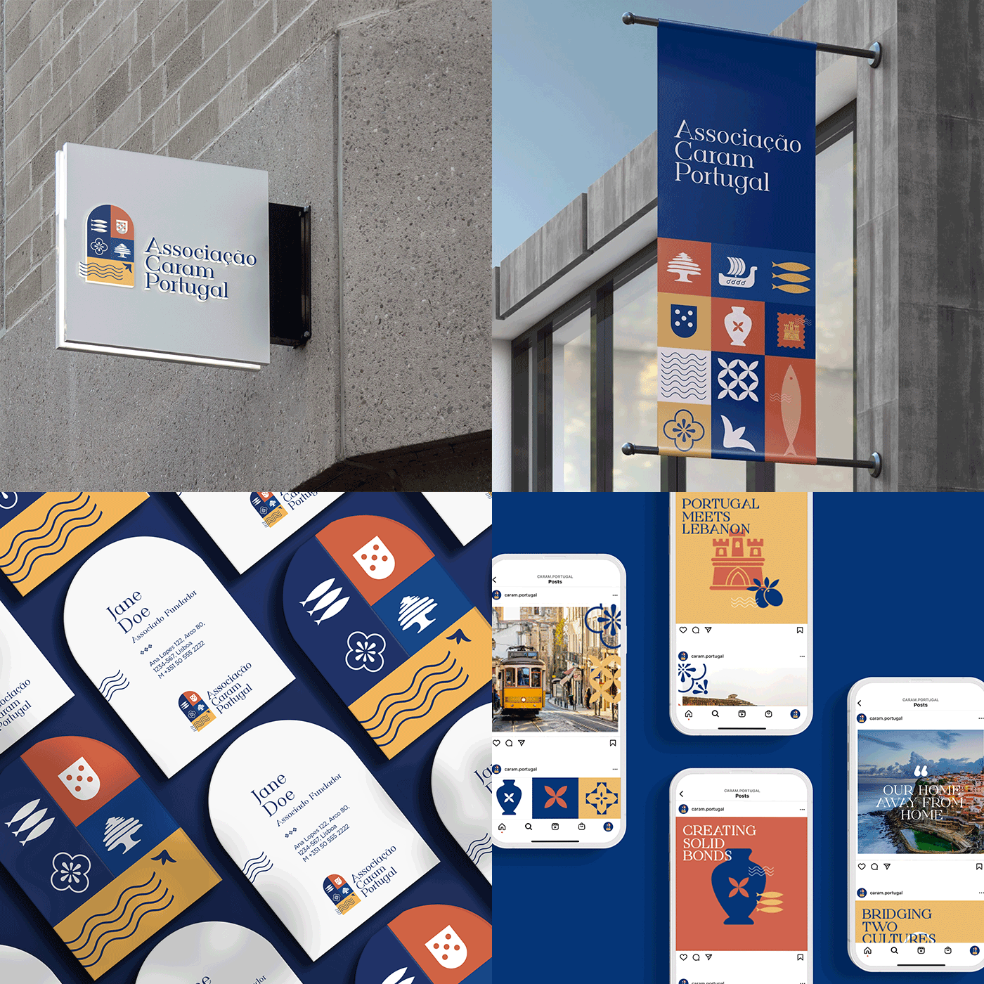
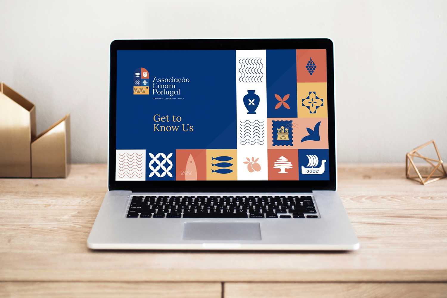
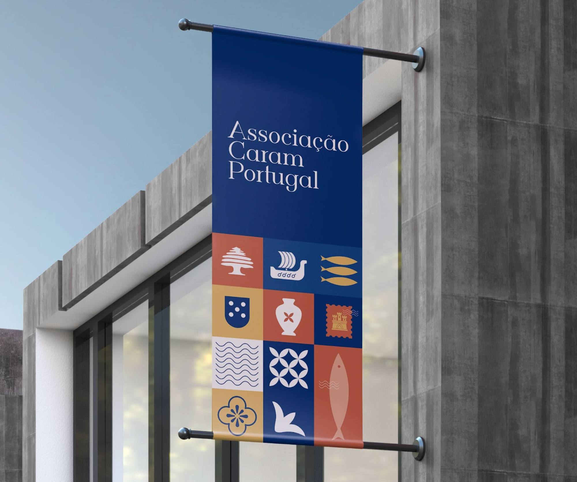
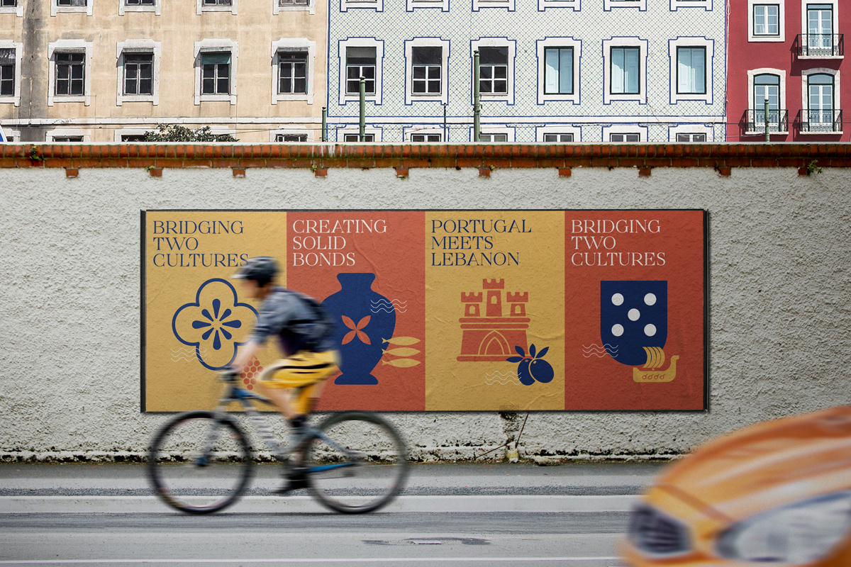
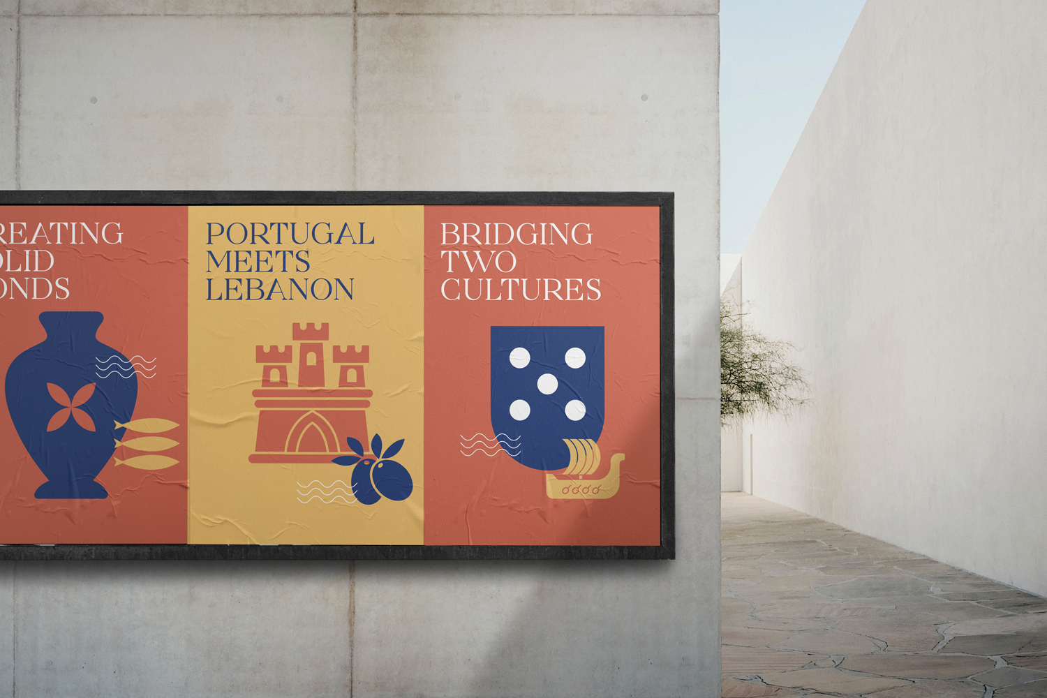
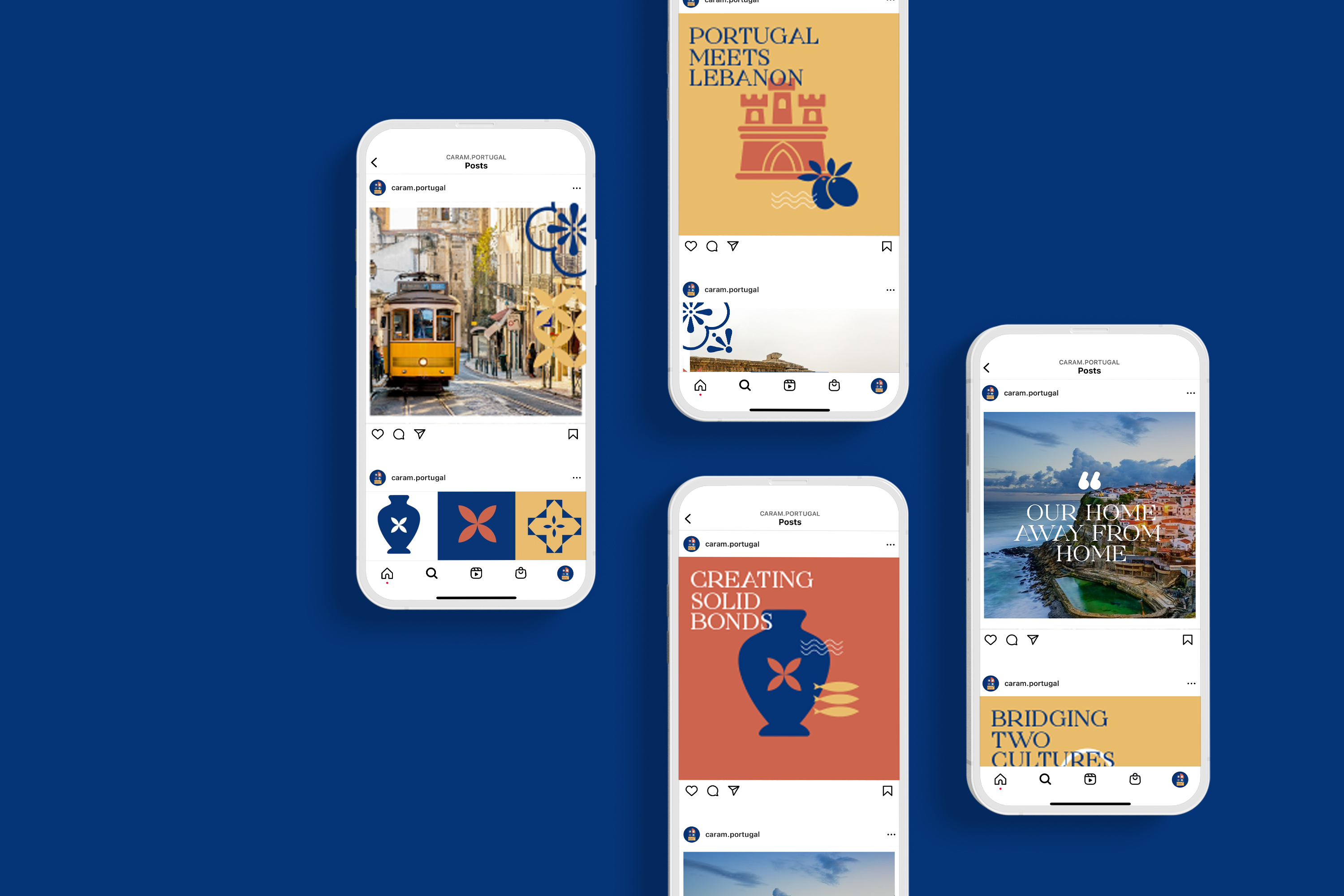
The primary motifs manifested in the logo were the architecture and nature of both countries, focusing on elements such as the Portuguese tiles, Lebanese ornaments, and both countries’ seas, mountains, and vineyards. Another interesting common motif was the strong family and friendship ties and the need for a sense of belonging.
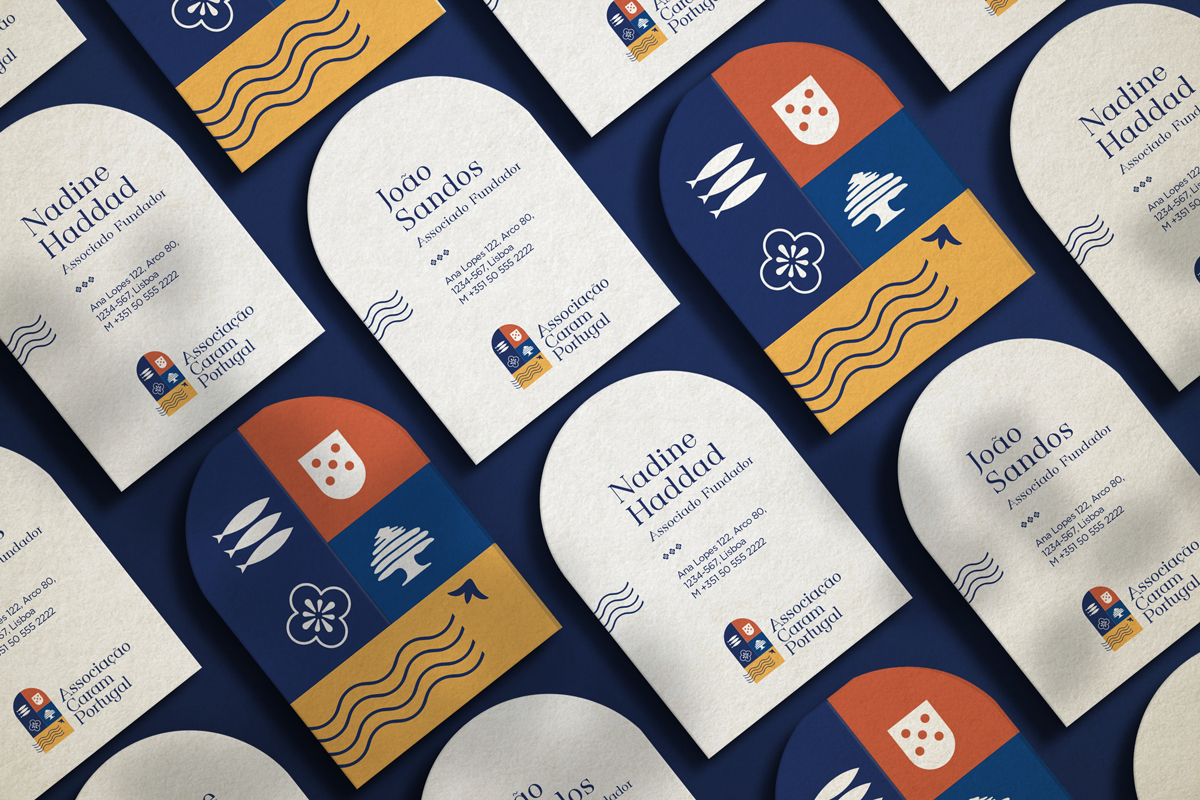
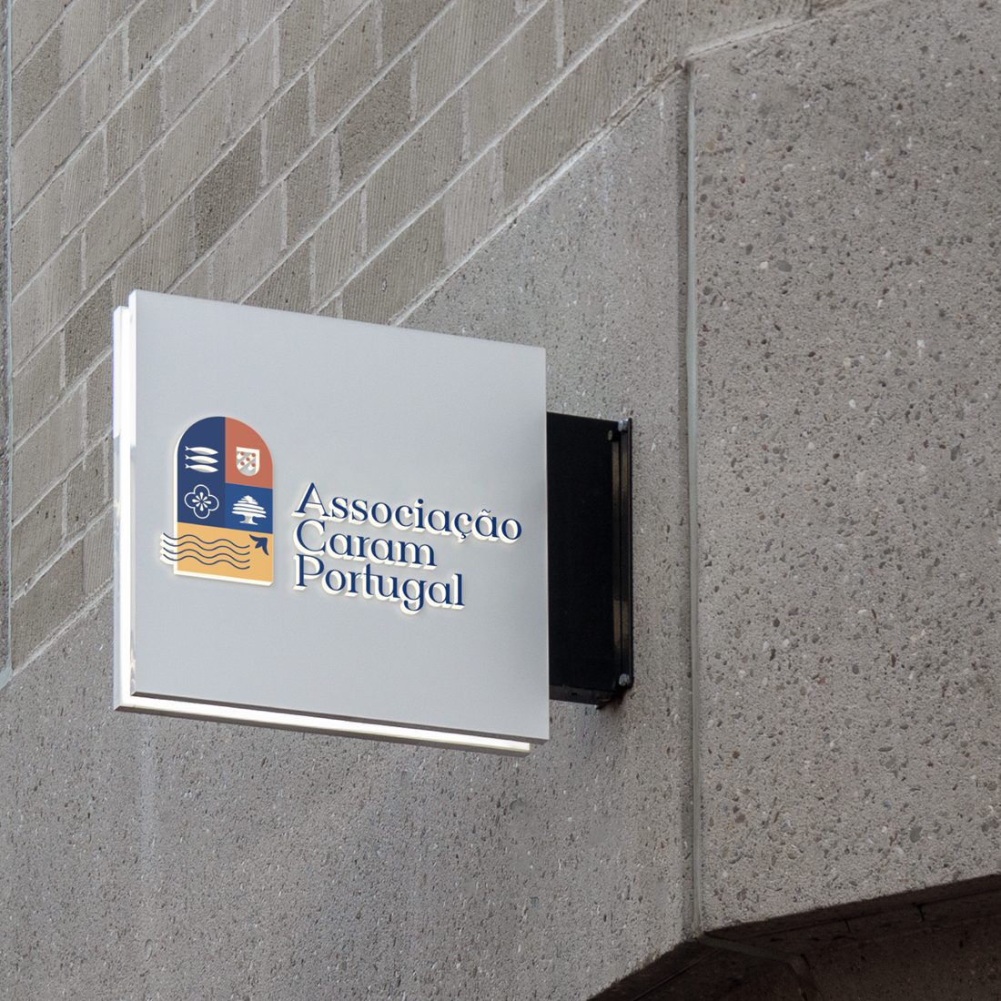
The logo boasts of an emblem type with illustrated symbolism. Our design team made sure to illustrate every single symbol to represent a part of the culture in either Lebanon or Portugal. From Portuguese Tiles to the Lebanese Jarra (vase), from the Portuguese Sardines to the Lebanese Vines, every single detail in the logo was meant to tell a story.
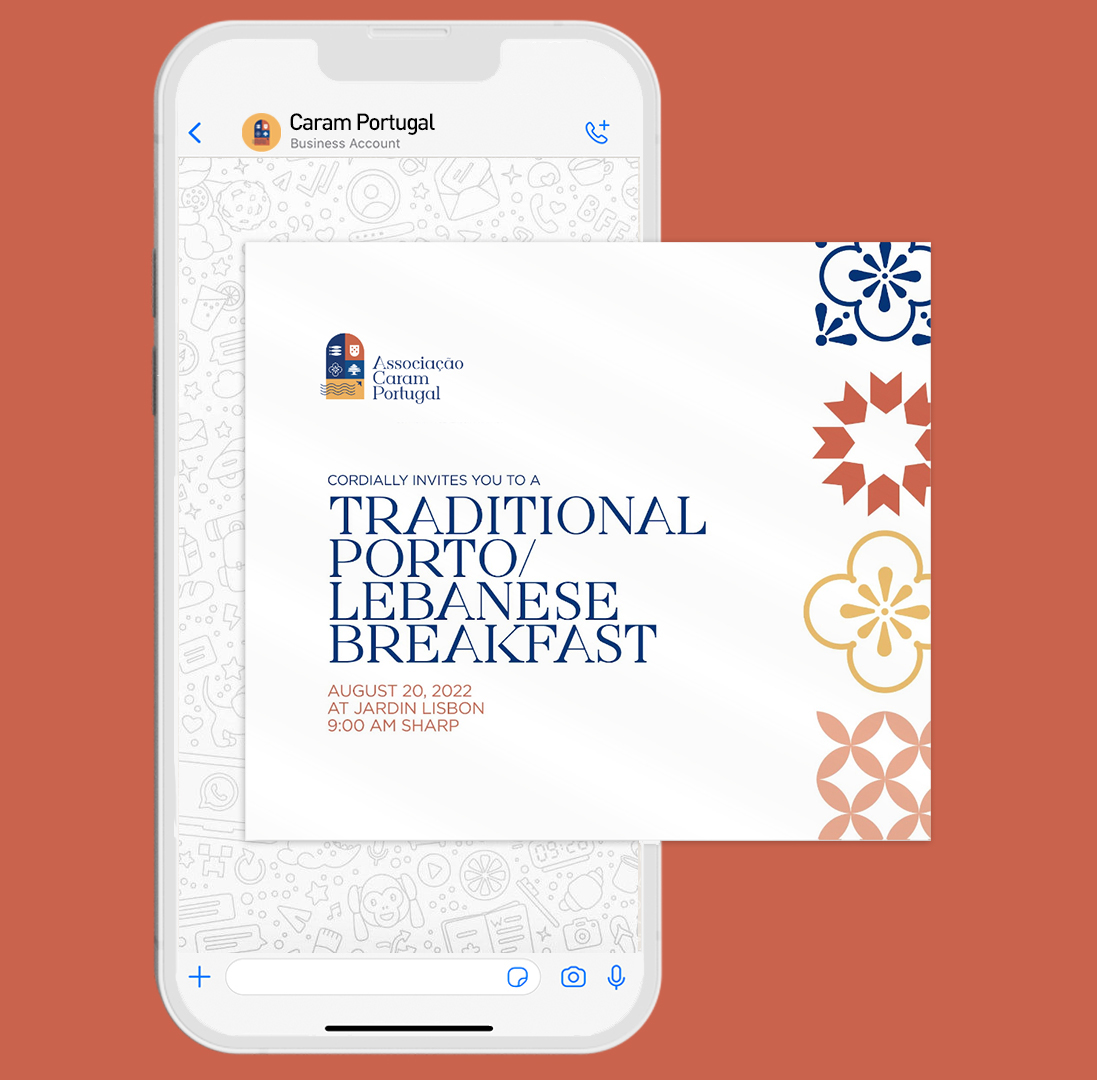
Typefaces used were Gunterhaus and Gotham for their modern serif, friendly curves, and timeless attributes. The color palette manifested the same warmth as the entity’s mission, with hues of deep and light navy, salmon pinks, yellow and red.
CREDIT
- Agency/Creative: Blue Hat
- Article Title: Creating a Brand Identity for an Interesting Meet of Culture & Community
- Organisation/Entity: Agency
- Project Type: Identity
- Project Status: Published
- Agency/Creative Country: Lebanon
- Agency/Creative City: Blue Hat, Lisbon and Beirut
- Market Region: Europe
- Project Deliverables: Brand Creation, Brand Design, Brand Identity, Brand Strategy
- Industry: Non-Profit
- Keywords: NGO, empower, Impact, Equity, Community, Expertise, and Optimism, graphic design, design, brand strategy, brand design, brand naming, web design, progressive thinking, blue-hat, bluehatting, design and innovation consultancy, Community
-
Credits:
Co-Founder | Managing Director: Sami Hmaidan
Co-Founder | Director of Innovation: Judy Maamari
Head of Design: Hayat Sheikh
Brand and Communication Strategist: Yara Jaber


