


Project Overview:
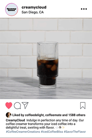
Creamy Cloud is a plant-based coffee creamer brand designed to bring joy and a sense of playfulness to the everyday coffee-drinking experience. Specifically crafted to appeal to the vibrant and fun-loving Gen Z demographic, Creamy Cloud aims to stand out on the shelves with a design that evokes a sense of lightheartedness and delight. By combining fun visuals with a comforting product, Creamy Cloud invites consumers to add a splash of personality to their daily routines.
Design Approach:
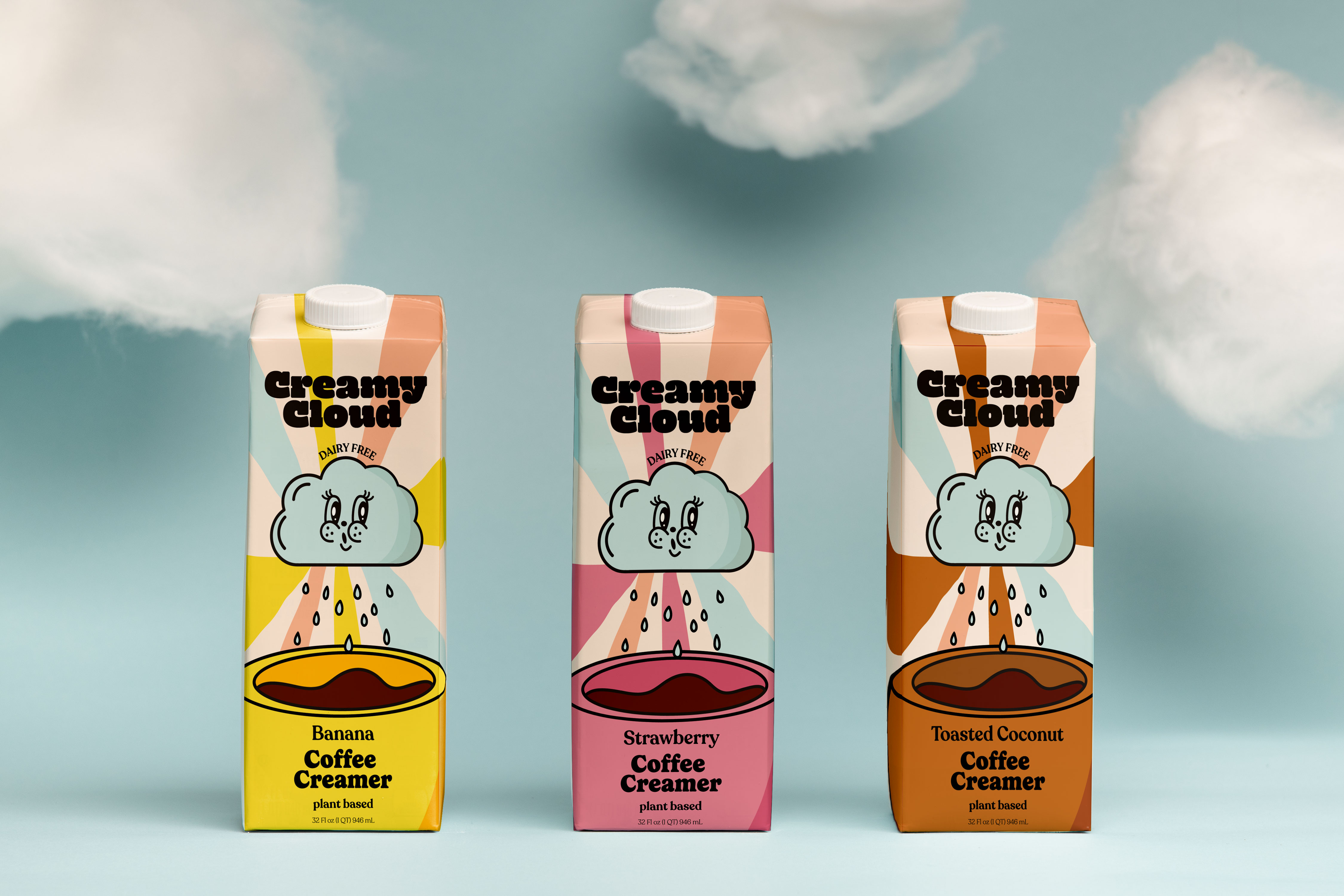
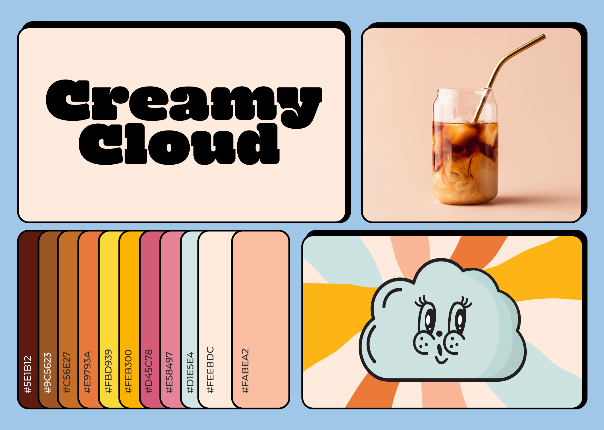
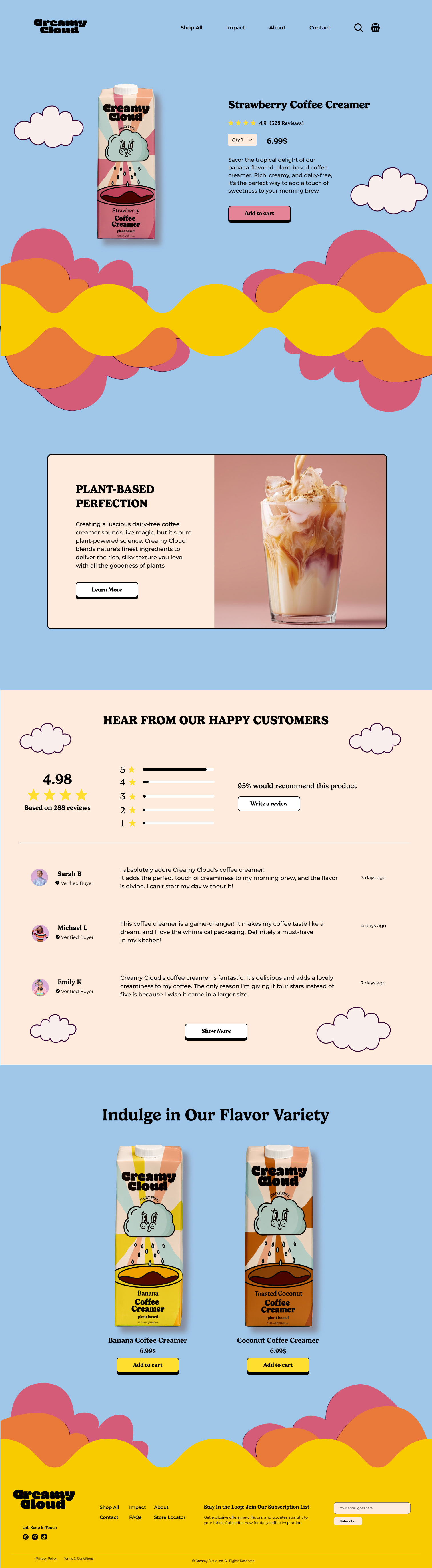
The Creamy Cloud packaging is characterized by its playful and approachable design, featuring a blend of bright colors, friendly illustrations, and a simple yet effective layout. The centerpiece of the design is a charming cloud mascot, which symbolizes the lightness and creaminess of the product. This mascot, with its cheerful face and inviting demeanor, is a key visual element that creates a memorable brand identity.
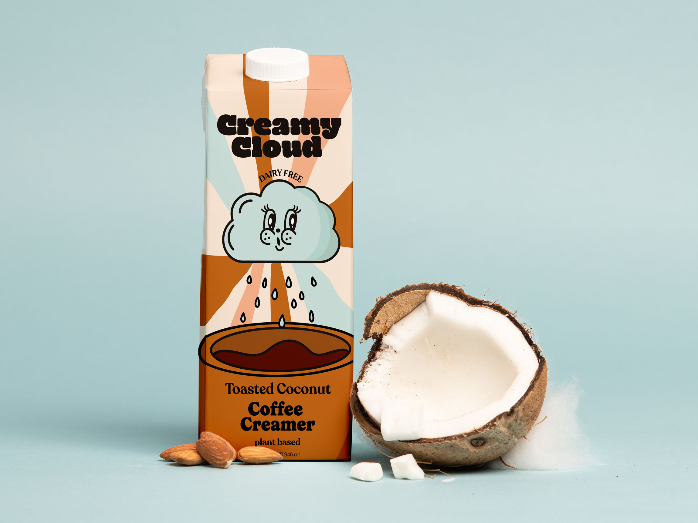
Each flavor of Creamy Cloud is represented by a distinct color palette: a sunny yellow for Banana, a soft pink for Strawberry, and a warm brown for Toasted Coconut. These pastel colors not only correspond to the flavor profiles but also create a cohesive and visually appealing range. The use of these colors ensures that the packaging is eye-catching without being overwhelming, striking a balance between vibrancy and simplicity.
Logo and Typography:
The Creamy Cloud logo is designed using a bold, rounded typeface that complements the softness of the cloud mascot. This choice of typography is straightforward, making the brand name easily recognizable. The logo’s placement at the top of the packaging ensures strong brand visibility, and the black font provides a striking contrast against the pastel backgrounds, enhancing readability and brand recall.
Illustrations and Graphics:
The packaging features a whimsical illustration of the cloud mascot raining down droplets into a cup of coffee, visually communicating the role of the creamer in enhancing the coffee experience. This visual metaphor is simple yet effective, reinforcing the idea that Creamy Cloud adds a touch of magic and delight to every cup. The graphics are minimal, with clean lines that maintain a modern and uncluttered appearance.
The packaging background includes soft, wave-like patterns that add a sense of motion and fluidity, reflecting the smooth texture of the creamer. These subtle design elements help to create dynamic visual interest without detracting from the main illustrations or the overall message of lightness and joy.
Market Competitor Insight:
In the competitive landscape of plant-based coffee creamers, brands like Califia Farms, Chobani, and Oatly often feature minimalist designs focused on natural ingredients and health benefits. In contrast, Creamy Cloud uses its playful cloud mascot and vibrant color palette to create a sense of comfort and fun. This approach differentiates Creamy Cloud by appealing directly to consumers who appreciate a product with personality and charm, aligning with a desire for everyday moments of happiness and creativity.
Target Audience and Emotional Engagement:
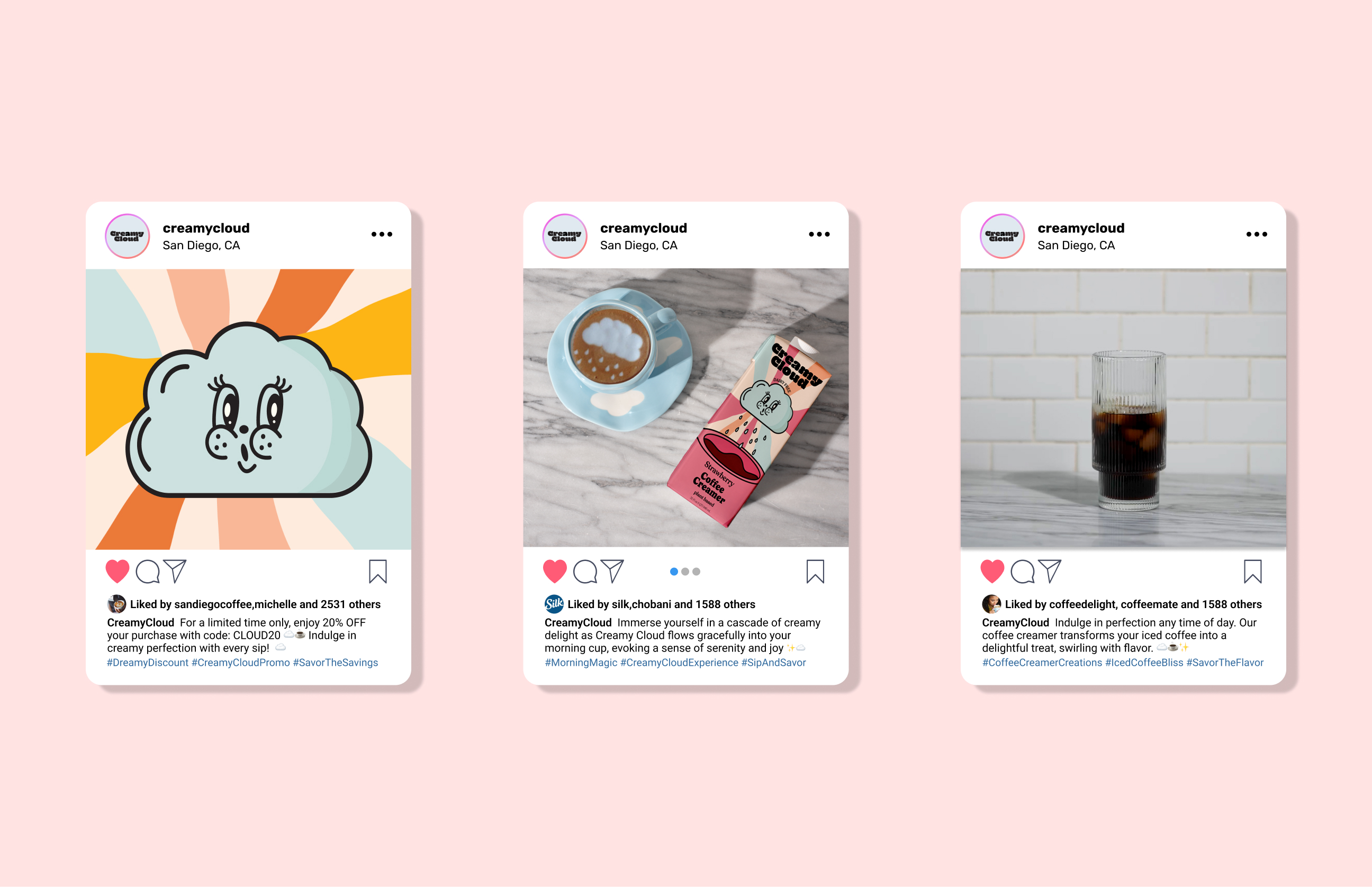
Creamy Cloud primarily targets Gen Z consumers who are drawn to products that are both fun and relatable. The playful design elements, along with the cloud mascot, evoke a sense of nostalgia and joy, making the coffee creamer more than just a functional product. This emotional engagement helps build a connection with consumers, encouraging them to choose Creamy Cloud as a staple in their morning routines.

CREDIT
- Agency/Creative: Alfiia Osipova
- Article Title: Creamy Cloud Packaging Design for Plant-Based Coffee Creamer Designed by Student Alfiia Osipova
- Organisation/Entity: Student
- Project Type: Packaging
- Project Status: Non Published
- Agency/Creative Country: United States
- Agency/Creative City: San Diego
- Market Region: North America
- Project Deliverables: Brand Identity, Packaging Design
- Format: Box
- Industry: Food/Beverage
- Keywords: WBDS Student Design Awards 2024/25
-
Credits:
San Diego City College: Sean Bacon and Bradford Prairie


