


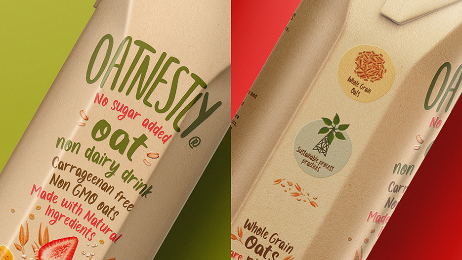
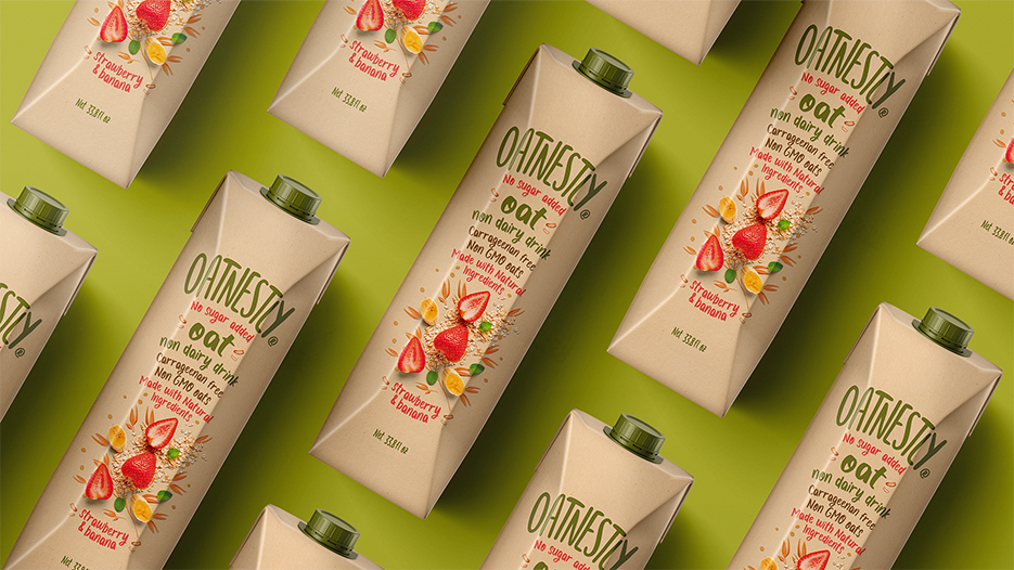
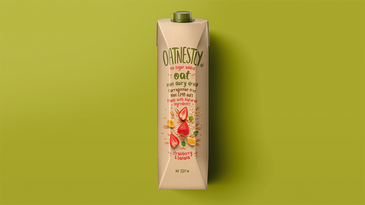
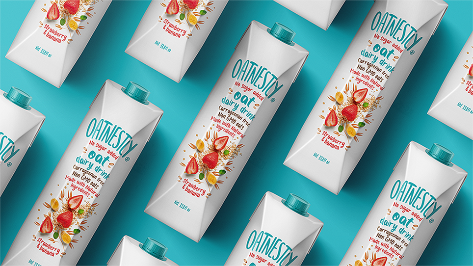
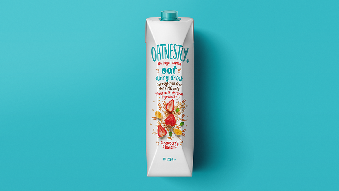
We create for our client Oatnestly, their logo and packaging design. With a fresh, organic and eye-catching proposal, we managed to bring a new brand to North American audiences. A brand who is honest in its processes, which speaks up front and clearly to its consumers.
A brand that is able to bring naturalness in its ingredients and in its communication, to people who did not find it easily in their day to day. Oatnestly is framed in naturalness and comes to join its audience in their process of reconnecting with nature, as them has lost confidence in what it claims to be natural.
This project responds to the trends of the new luxury, which is evidenced in the naturalness and self-care given through the routine and daily life of people. So its graphic codes, its communication, its value proposition and its name respond to give people confidence and bring them closer to the balance between self-care and enjoyment.
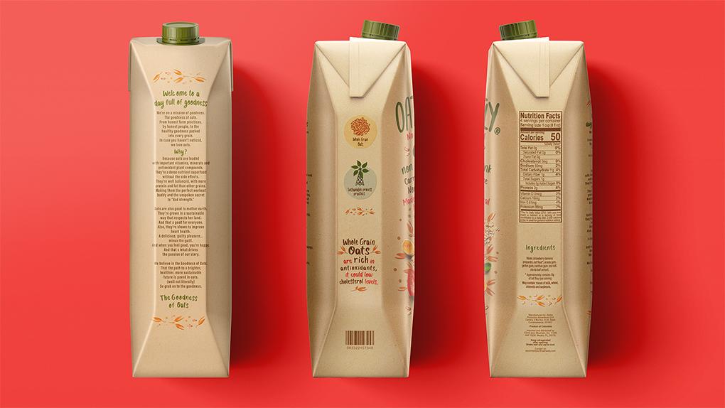
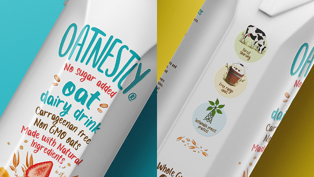
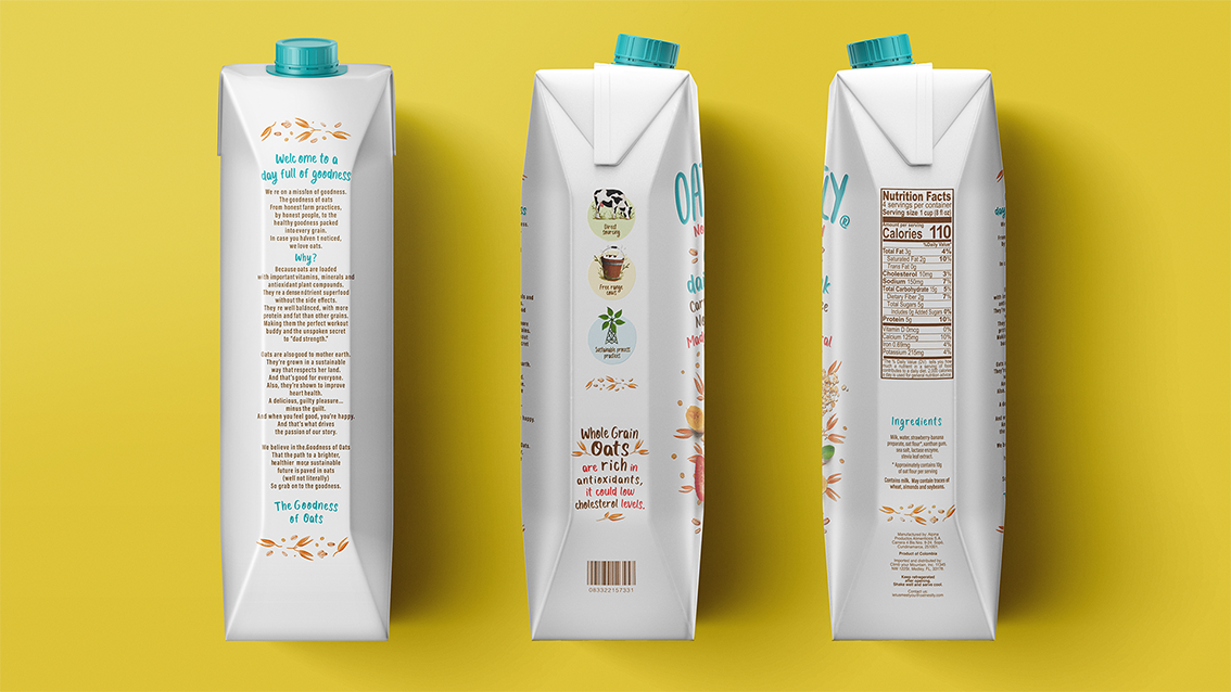
This is why we use organic codes, such as an earthy color palette, which although sober, has the freshness of bright colors such as yellow, red, orange and blue, giving a positive and trustworthy vibe to the brand’s audience. We also use a handwritten and loose typography that reflects the closeness and honesty that the brand has with its audience, giving a more realistic appearance and confidence. The combination of photos and illustrations gives the feeling of being aspirational but without leaving the closeness and kindness that makes people feel the brand as part of their natural lifestyle and daily life.
We create for our client Oatnestly, their logo and packaging design. With a fresh, organic and eye-catching proposal, we managed to bring a new brand to North American audiences. A brand who is honest in its processes, which speaks up front and clearly to its consumers.
A brand that is able to bring naturalness in its ingredients and in its communication, to people who did not find it easily in their day to day. Oatnestly is framed in naturalness and comes to join its audience in their process of reconnecting with nature, as them has lost confidence in what it claims to be natural.
This project responds to the trends of the new luxury, which is evidenced in the naturalness and self-care given through the routine and daily life of people. So its graphic codes, its communication, its value proposition and its name respond to give people confidence and bring them closer to the balance between self-care and enjoyment.
This is why we use organic codes, such as an earthy color palette, which although sober, has the freshness of bright colors such as yellow, red, orange and blue, giving a positive and trustworthy vibe to the brand’s audience. We also use a handwritten and loose typography that reflects the closeness and honesty that the brand has with its audience, giving a more realistic appearance and confidence. The combination of photos and illustrations gives the feeling of being aspirational but without leaving the closeness and kindness that makes people feel the brand as part of their natural lifestyle and daily life.

CREDIT
- Agency/Creative: Creamos
- Article Title: Creamos Create a Brand and Packaging Design for Oatnestly
- Organisation/Entity: Agency, Published Commercial Design
- Project Type: Packaging
- Agency/Creative Country: Colombia
- Market Region: North America
- Project Deliverables: Brand Creation, Brand Identity, Branding, Graphic Design, Illustration, Packaging Design, Photography, Product Architecture
- Format: Box
- Substrate: Pulp Fibre


