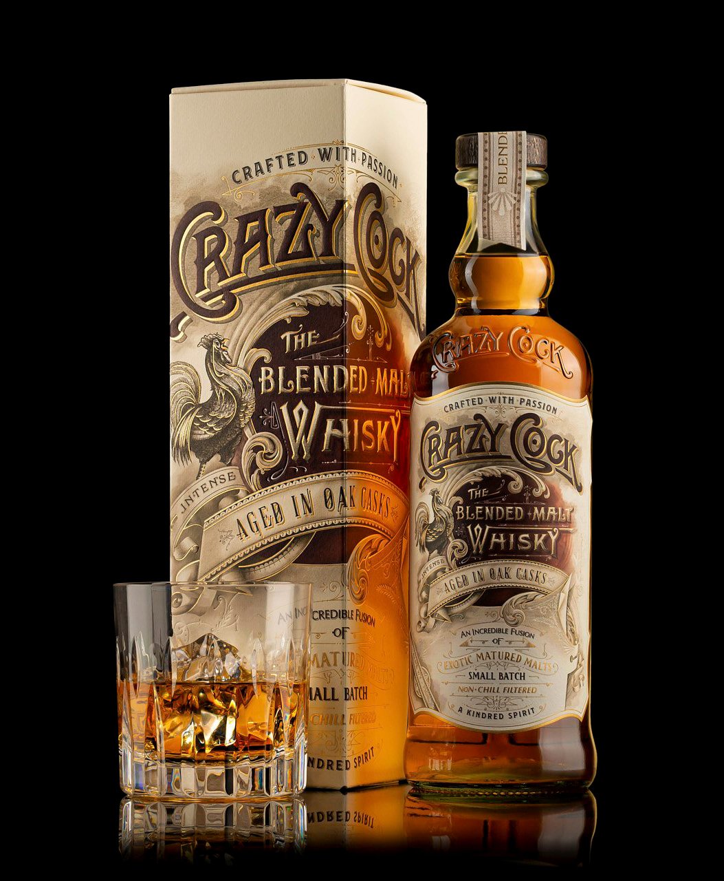
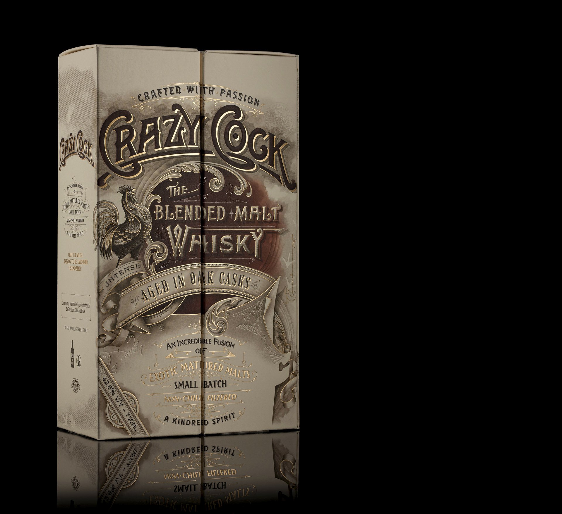
The design of the Crazy Cock Whisky is a stunning blend of sophistication, elegance, and attention to detail. It showcases a unique and memorable aesthetic that captures the essence of the brand and distinguishes it from other whisky offerings.
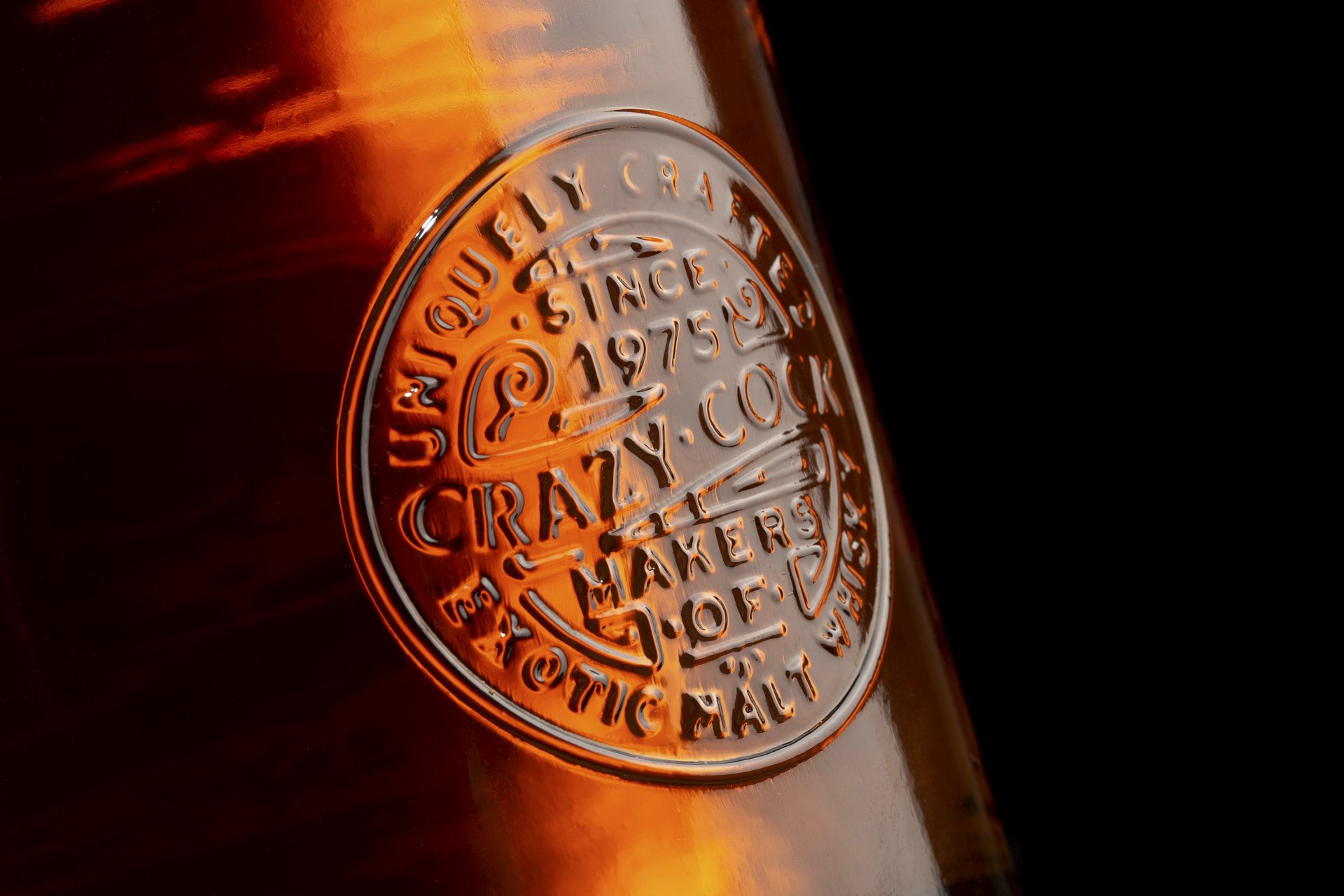
The bottle itself is crafted with precision, featuring a sleek and classic silhouette that exudes refinement. Its shape is robust and well-proportioned, embodying a sense of strength and confidence. The use of high-quality glass gives it a crystal-clear appearance, allowing the rich amber color of the whisky to shine through.
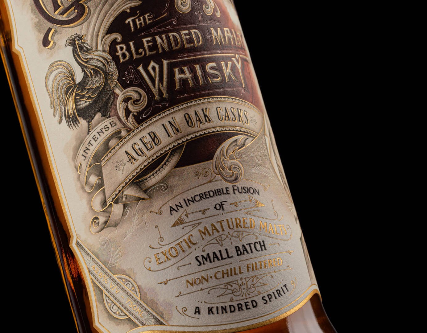
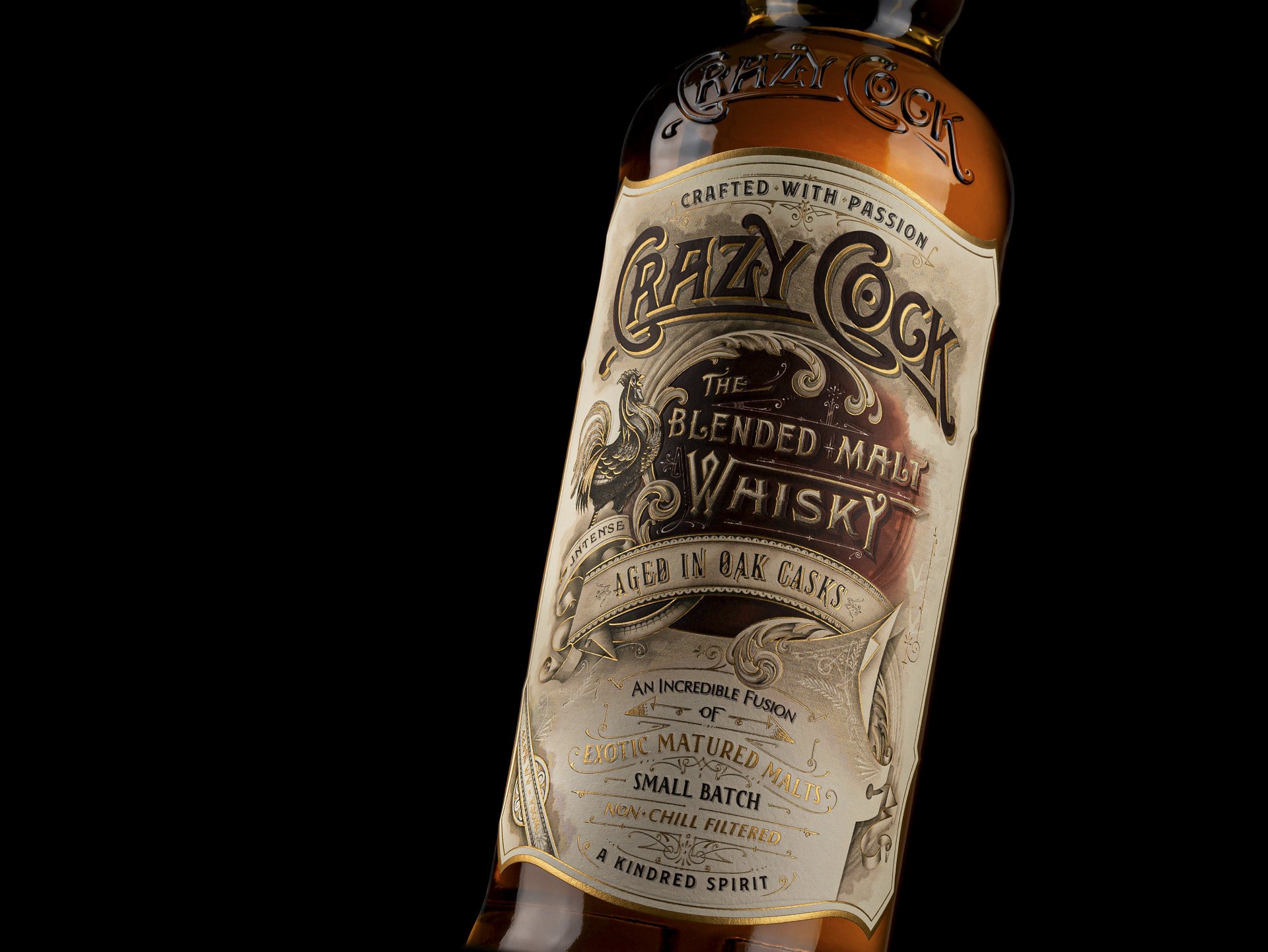
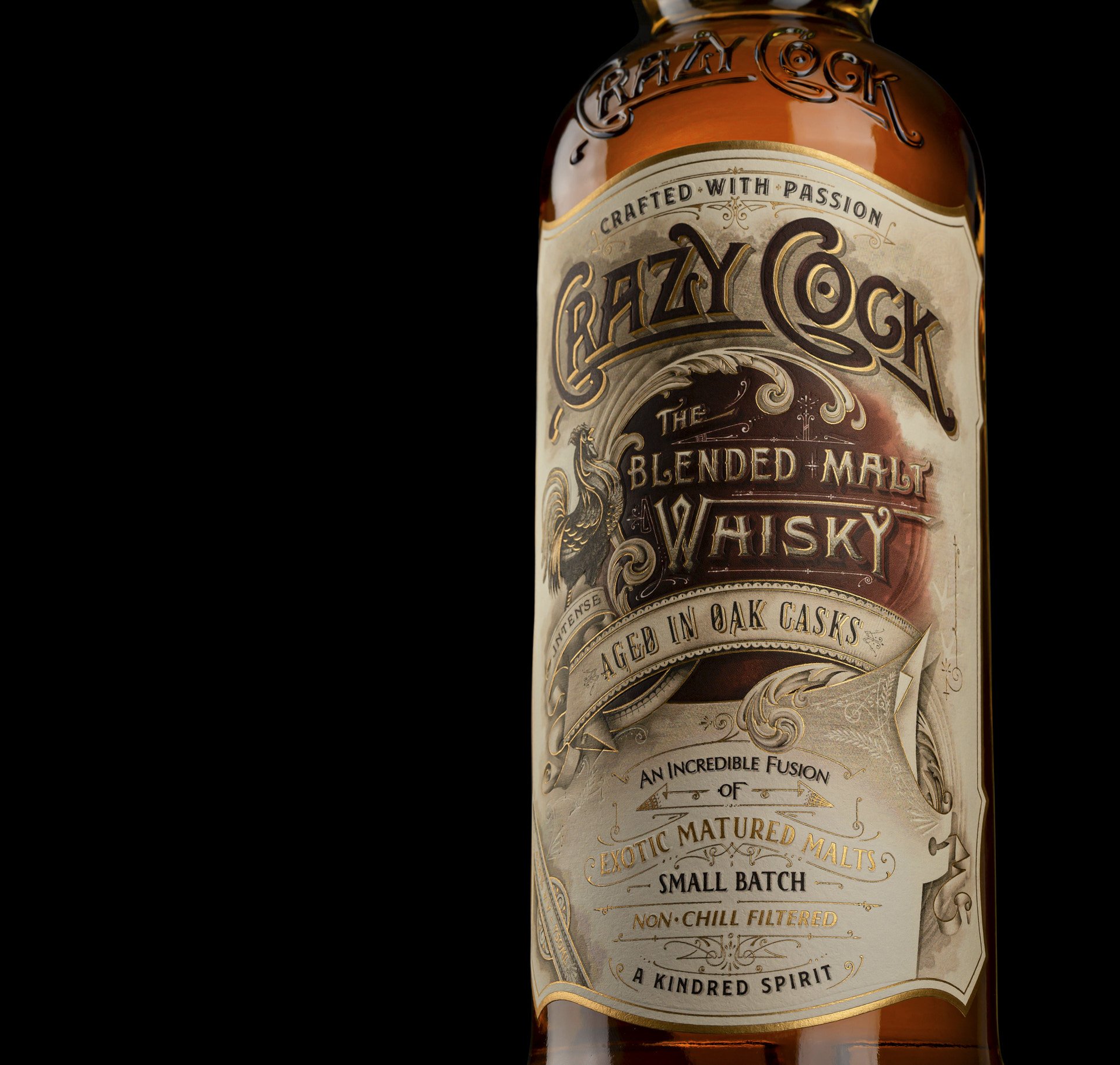
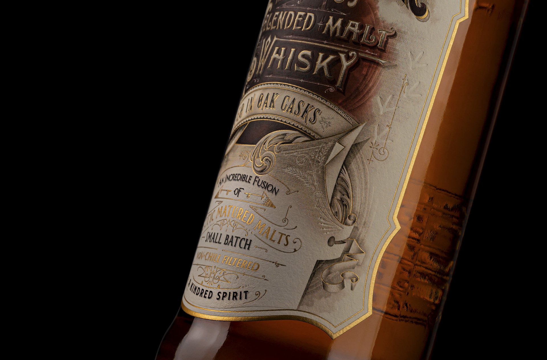
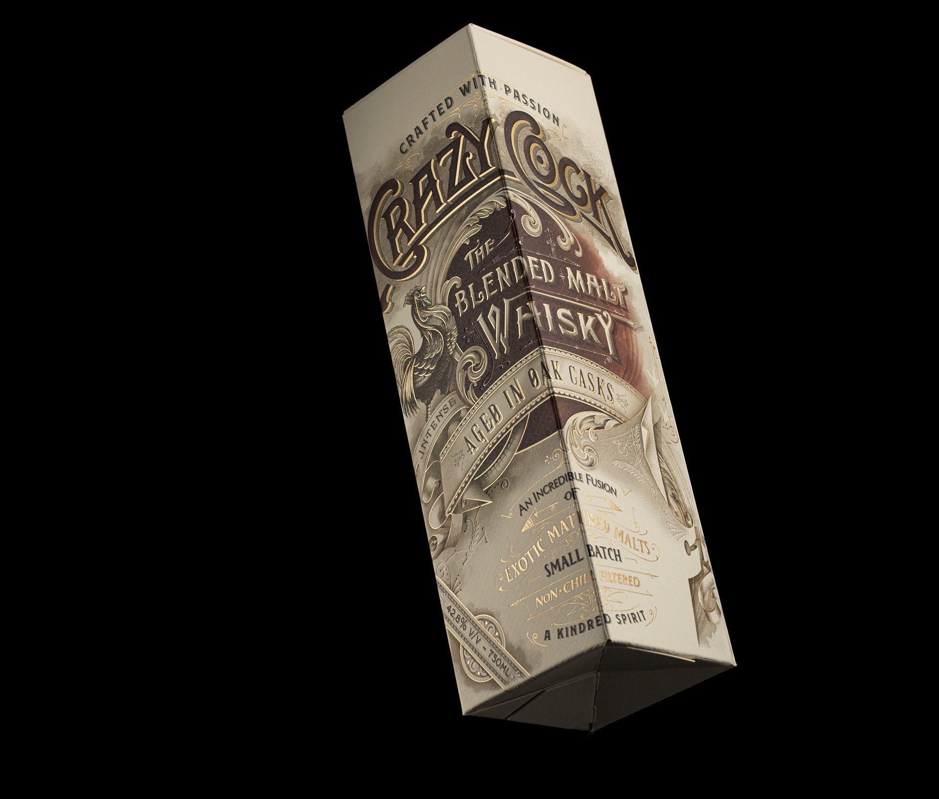
The label features intricate detailing and fine typography that harmoniously blend modernity with a hint of vintage charm. The choice of fonts reflects the brand’s character, striking a balance between boldness and sophistication. The use of embossing or foiling techniques further elevates the label, adding a luxurious touch and enhancing its visual appeal. The brand’s logo, prominently displayed on the label, captures attention with its distinctive and memorable design.
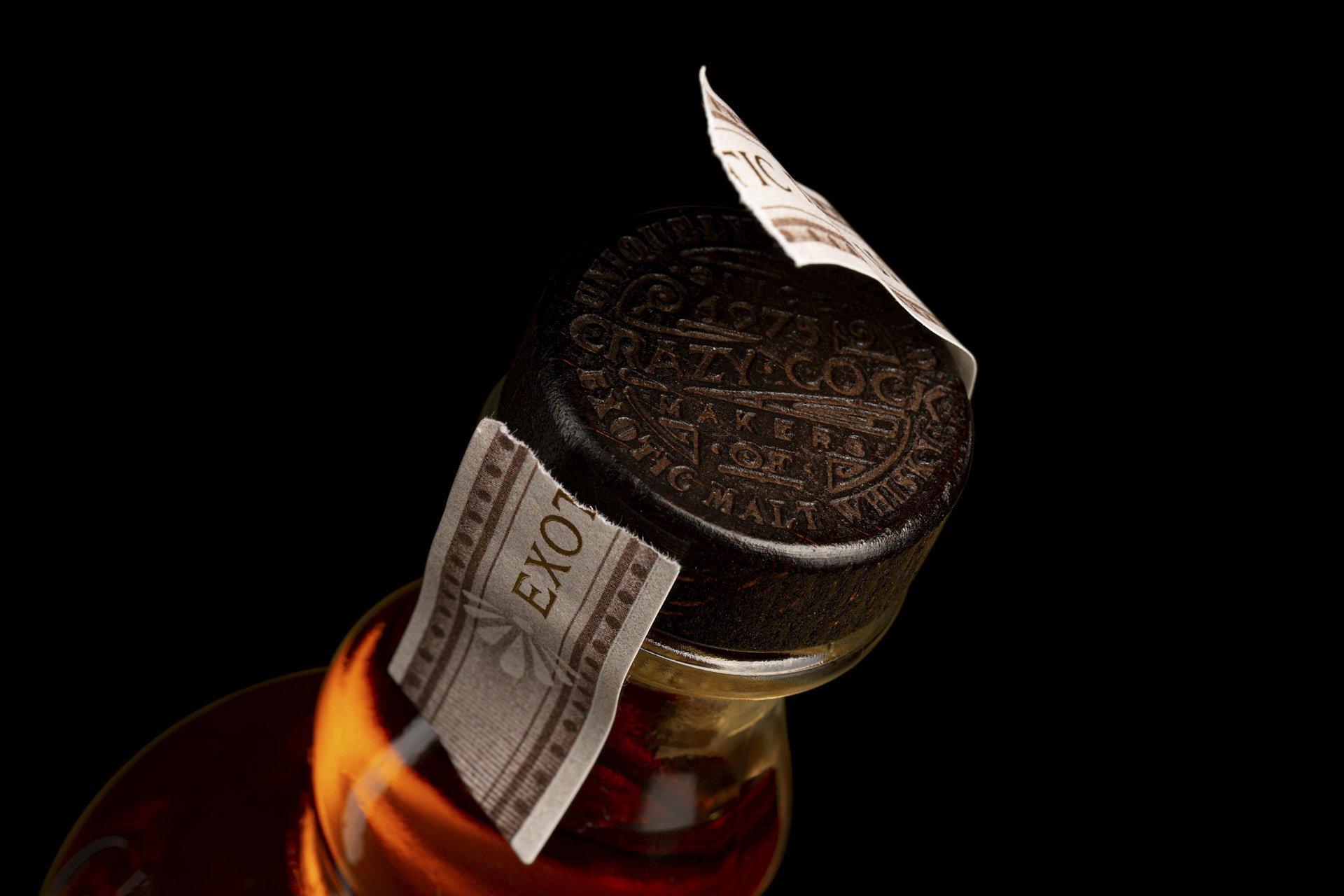
Overall, the design of Crazy Cock Whisky is a captivating composition that embodies the brand’s commitment to excellence. Every aspect, from the sleek bottle silhouette to the intricate label detailing, showcases a meticulous attention to detail. This thoughtfully crafted design not only sets Crazy Cock Whisky apart from its competitors but also serves as a visual representation of the exceptional quality of the tasting experience that awaits within each bottle.
CREDIT
- Agency/Creative: Think Bold Studio
- Article Title: Crazy Cock Packaging Design by Think Bold Studio
- Organisation/Entity: Agency
- Project Type: Packaging
- Project Status: Published
- Agency/Creative Country: Portugal
- Agency/Creative City: Aveiro
- Market Region: Europe
- Project Deliverables: 2D Design
- Format: Bottle
- Substrate: Pulp Fibre
- Industry: Food/Beverage
- Keywords: label design agency, packaging design agency, whiskey label design, packaging design
-
Credits:
Creative Director: Hugo Marques


