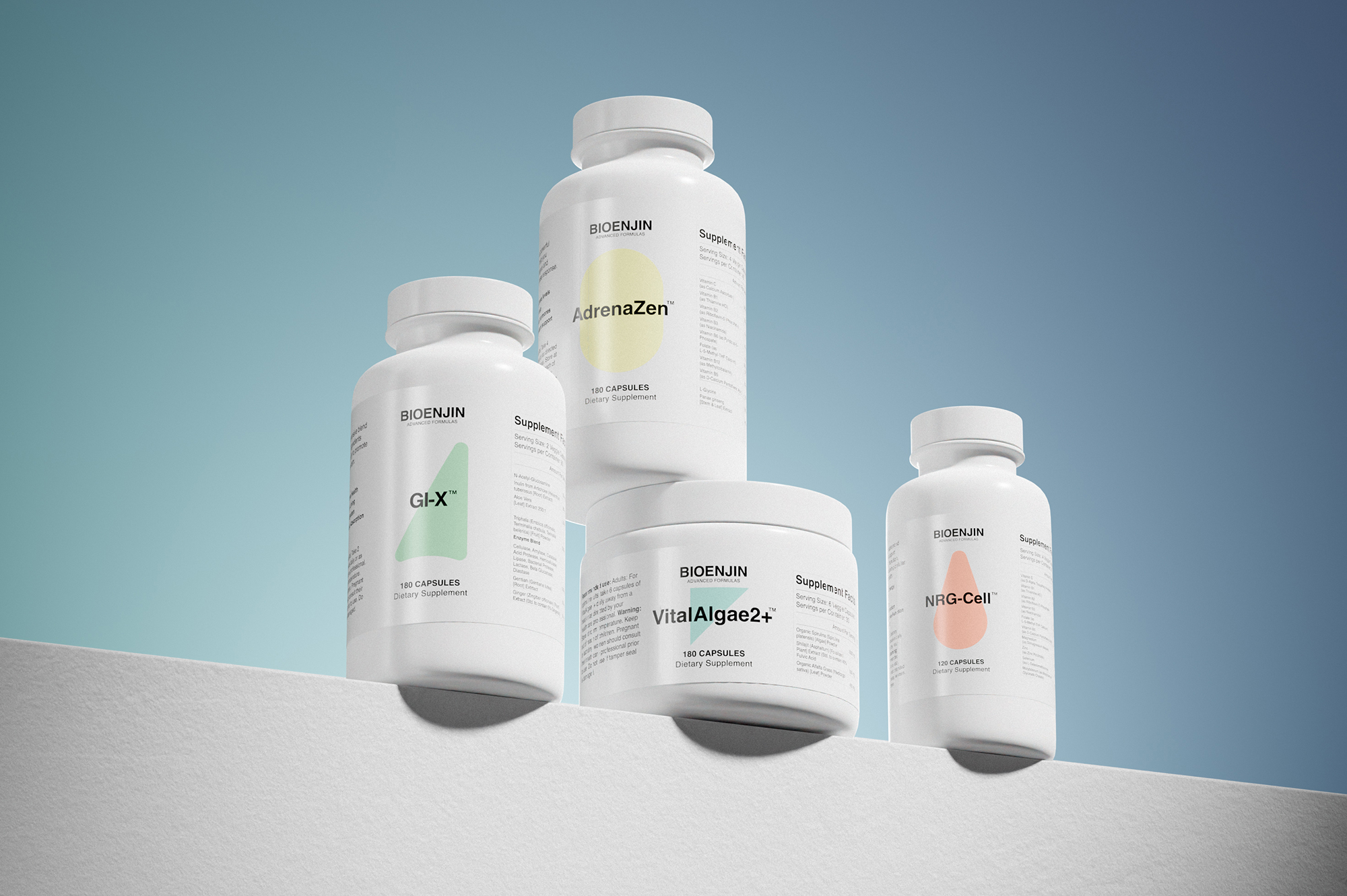
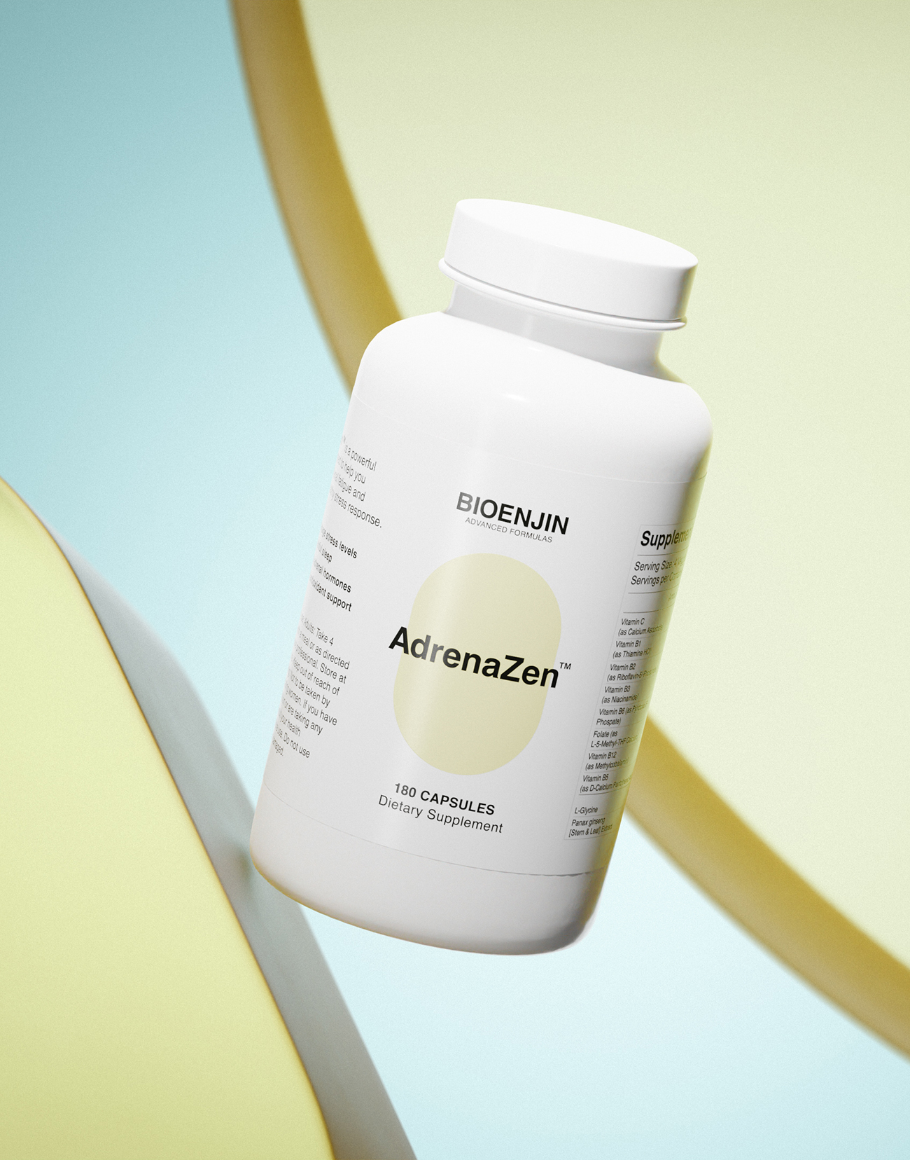
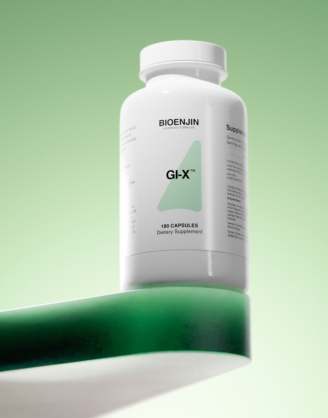
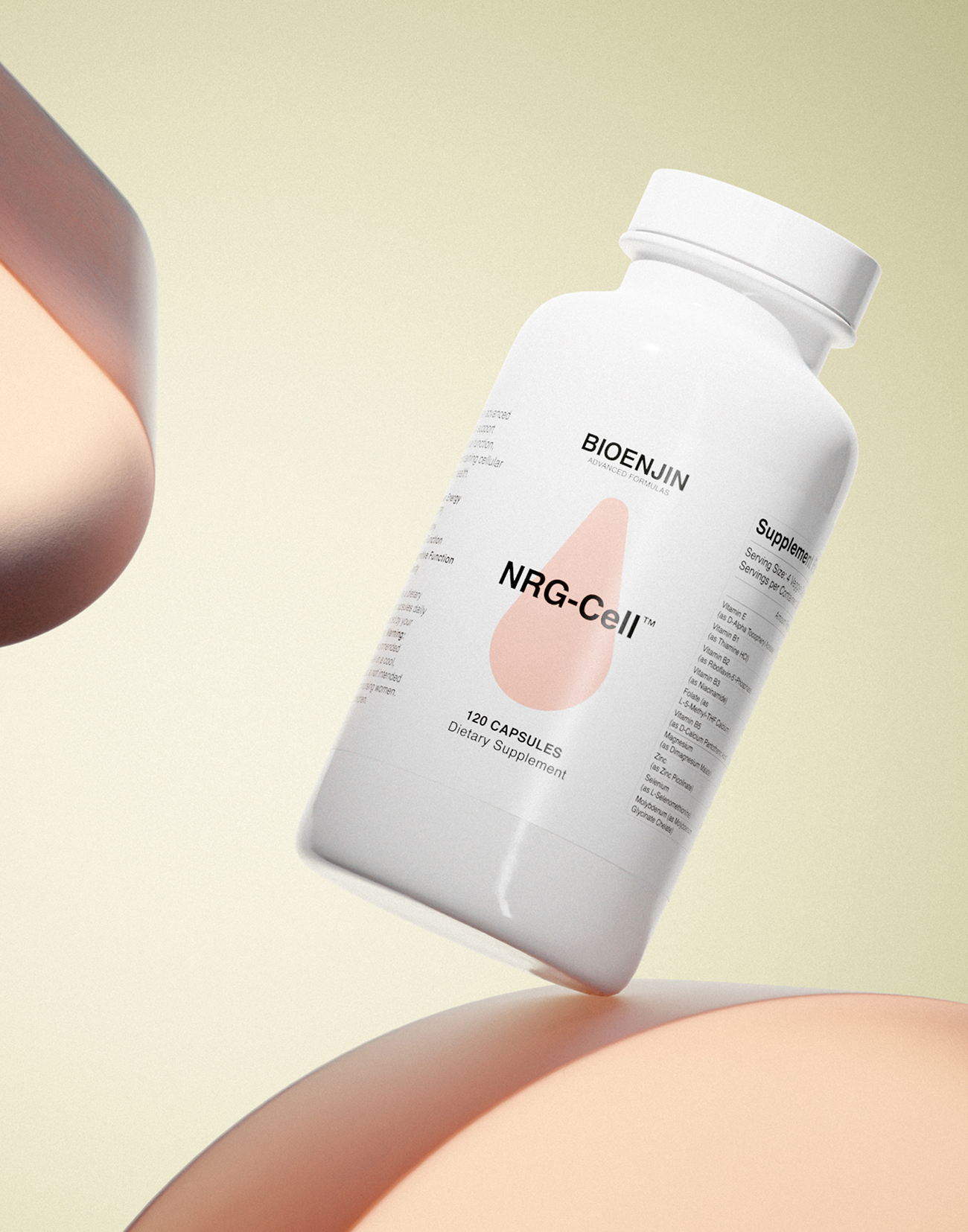
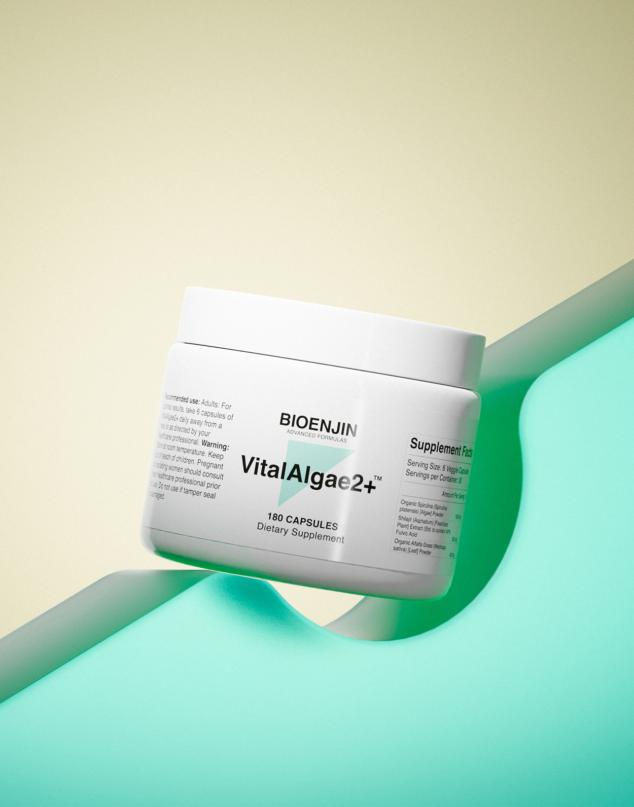
The pastel colors and simple shapes chosen for this brand identity are carefully crafted to evoke a sense of calmness and relaxation. This is appropriate for a supplement brand that focuses on overall health and well-being. The colors are soft and inviting, and the shapes are simple and uncluttered. This creates a sense of peace and harmony, which is exactly what people look for when choosing supplements to support their health.
In addition to being visually appealing, the simple shapes also represent the brain, heart, kidney, lung, and liver. These are some of the most important organs in the body, and the fact that they are incorporated into the brand identity sends a message to consumers that the supplements are designed to support all aspects of their health.
The overall design of the brand identity is both visually appealing and professional. This is important for a supplement brand that wants to establish itself as a trusted and credible source of health and wellness products. The design is modern and sophisticated, and it conveys a sense of quality and confidence. This is essential for building trust with consumers and convincing them to choose the brand’s supplements over those of the competition.
Here are some specific examples of how the pastel colors and simple shapes in the brand identity evoke a sense of calmness and relaxation:
The soft pink color is often associated with love, compassion, and nurturing. It creates a sense of warmth and comfort, which is what people look for in supplements that support their overall health and well-being.
The calming blue color is often associated with peace, tranquility, and trust. It creates a sense of security and confidence, which is essential for consumers to feel comfortable taking supplements.
The simple shapes are easy on the eyes and help to create a sense of order and harmony. They also convey a sense of modernity and sophistication, which is important for a supplement brand that wants to be seen as credible and trustworthy.
Overall, the pastel colors and simple shapes in the brand identity are a perfect fit for a supplement brand that focuses on overall health and well-being. The design is both visually appealing and professional, and it effectively conveys the brand’s message of calmness, relaxation, and trust.
CREDIT
- Agency/Creative: Cesar Coellar
- Article Title: Crafting Calm and Trust: Brand Identity Design for a Wellness Supplement Brand Bioenjin
- Organisation/Entity: Freelance
- Project Type: Packaging
- Project Status: Published
- Agency/Creative Country: Ecuador
- Agency/Creative City: Cuenca
- Market Region: North America
- Project Deliverables: Packaging Design
- Format: Bottle
- Industry: Health Care
- Keywords: Supplements, health
-
Credits:
Creative Director: Cesar Coellar


